The Stow Brothers by Build
Opinion by Richard Baird Posted 18 December 2014
The Stow Brothers is an estate agent working within the area of Walthamstow, a place where urban London meets the Epping Forest, and is described by the estate agent as a rapidly expanding community of like-minded people looking for a place with a strong sense of community, plenty of culture, good food and a decent pint.
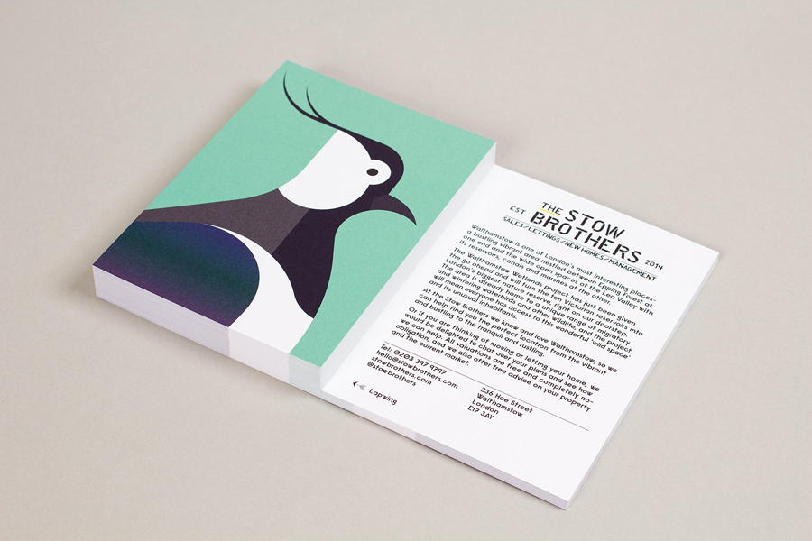
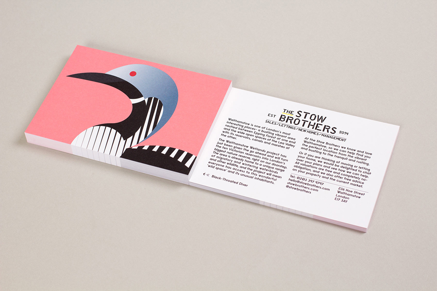
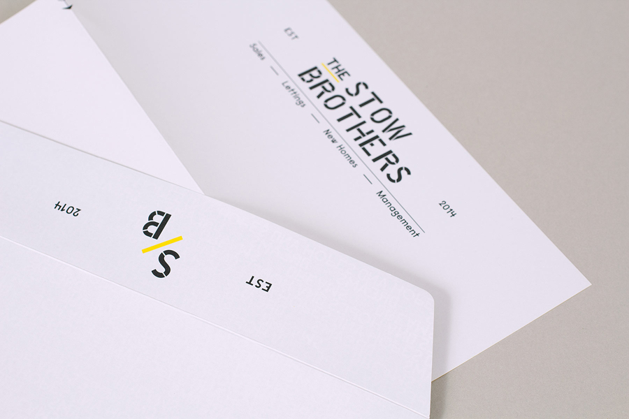
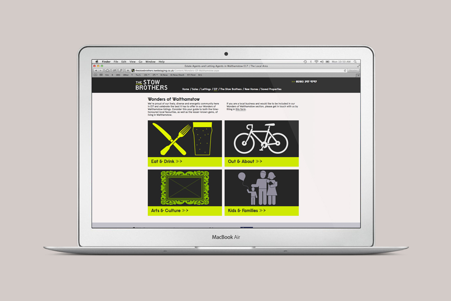
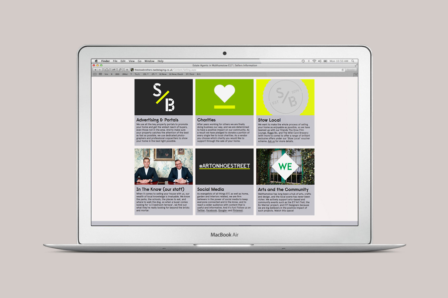
UK-based graphic design studio Build worked with The Stow Brothers to develop a new brand identity—which went on to include monogram, stationery, business cards, website, copywriting, sale, sold and to let by boards, with assets created by local trade, craftsmen and artists—that reflected their love for the area and would distinguish them from the other estate agents operating in the same postcode. The identity was expanded upon later in the year to include a mini exhibition and a distinctive direct mail campaign in support of the nearby Wetlands project.
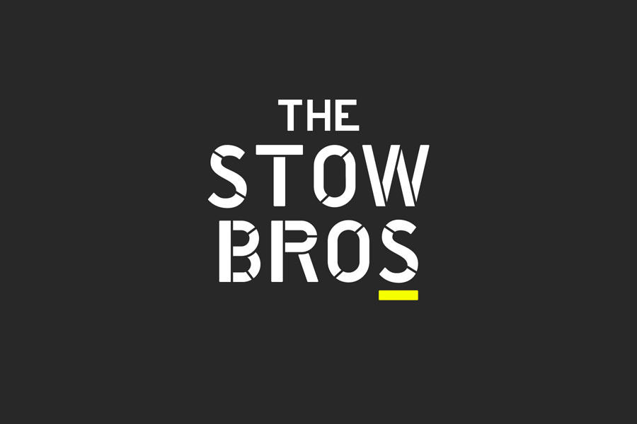
There has been a resurgence of stencil cut type this year, and for good reason, its industrial utility and absence of superfluous detail lend businesses, across a variety of industries, an air of practicality, honesty and robustness, and can convey a hardworking mentality when trust is perhaps a little low. It is surprising that, with its continued adoption and saturation, that many of these stencil cut sans-serif and serif type treatments are often absent significant variation. Frequently relying on familiar letterforms and obvious cut locations when there are plenty of chances to secure distinction whilst retaining the communicative values the approach embodies by simply mixing these components up.
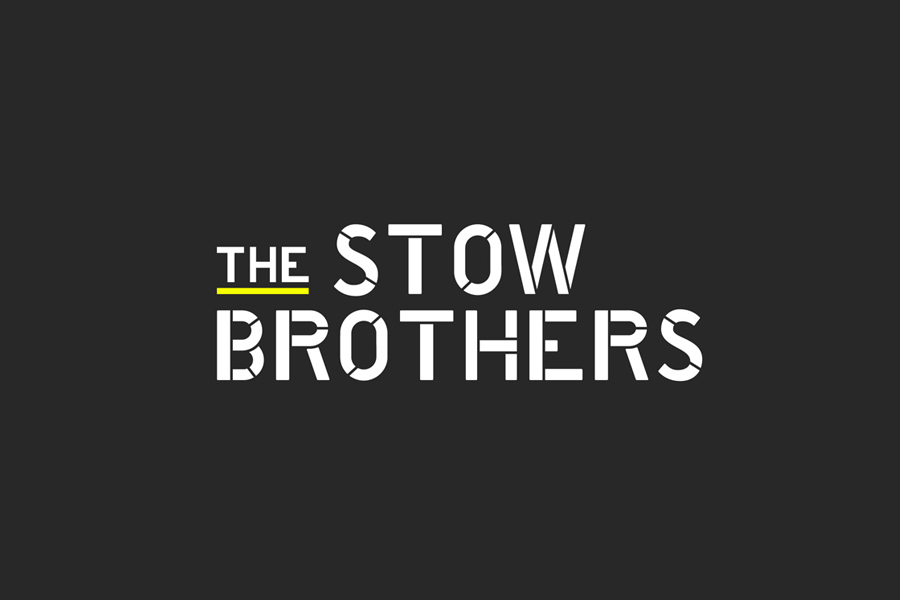
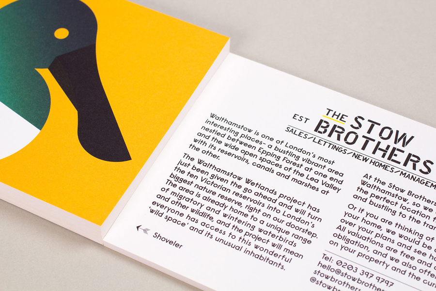
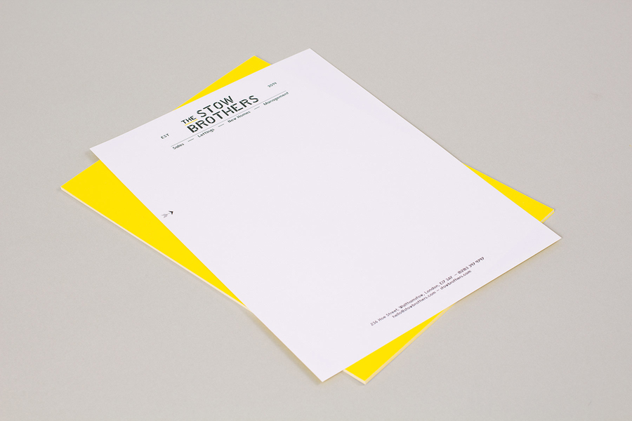
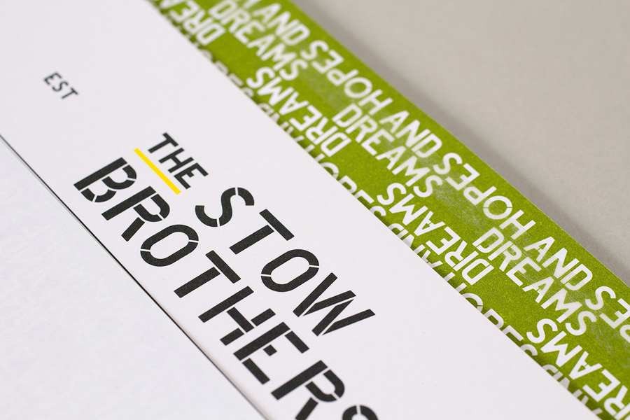
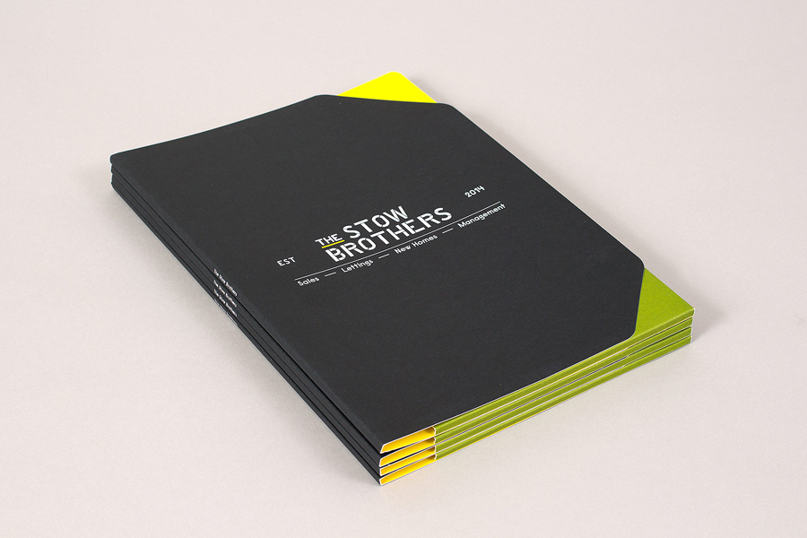
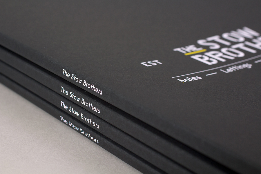
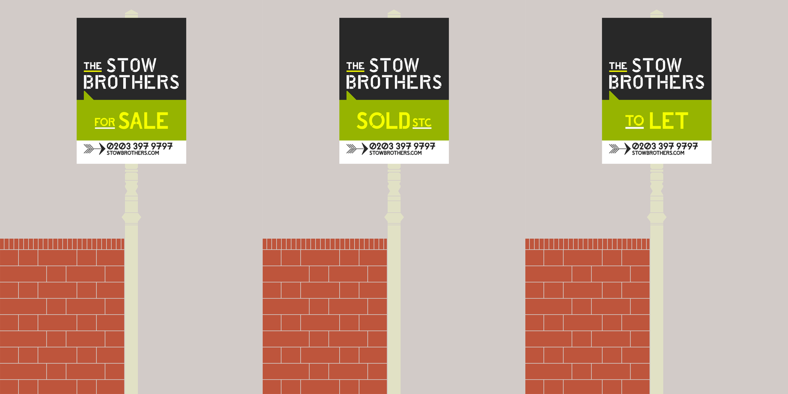
Build’s logotype for The Stow Brothers is a good reminder that there still is an abundance of creative opportunity to draw unique character from such a widespread aesthetic. A simple change in cut location across the H, additional cuts through the B and R, the angled cuts across the S and O, the high waist of the R, pill shaped O and the dissimilar horizontal strokes of the E, effectively draw a proprietary quality from ubiquity without undermining its hard working communicative values. This complemented by the sans-serif Raisonne from London and New York based type foundry Colophon. Much like the logotype, the character set mixes the familiar with the unusual, remains functional and is informed by the concept of locality.

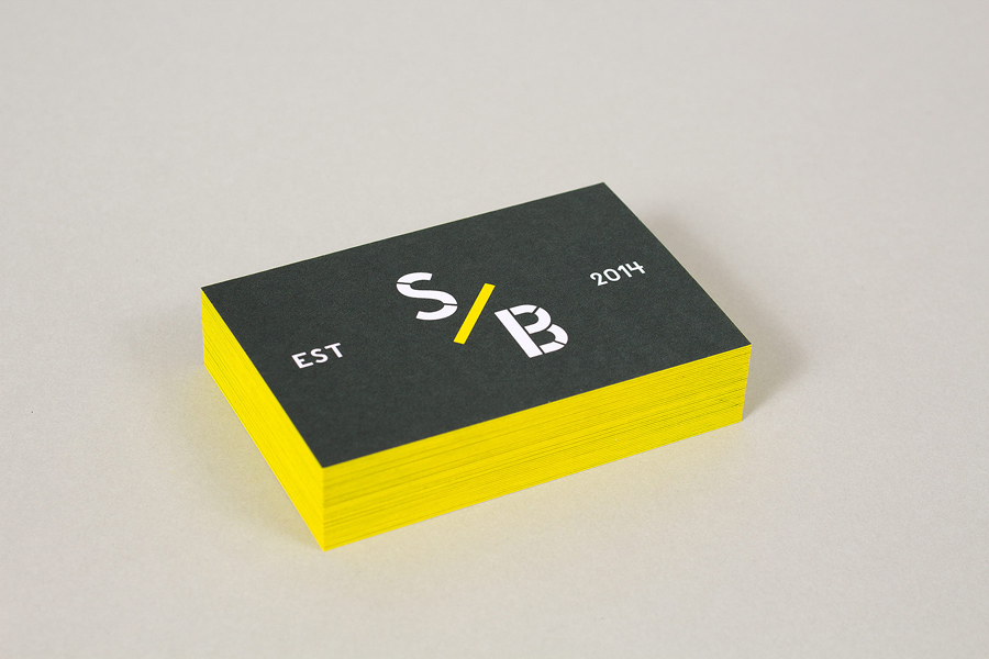
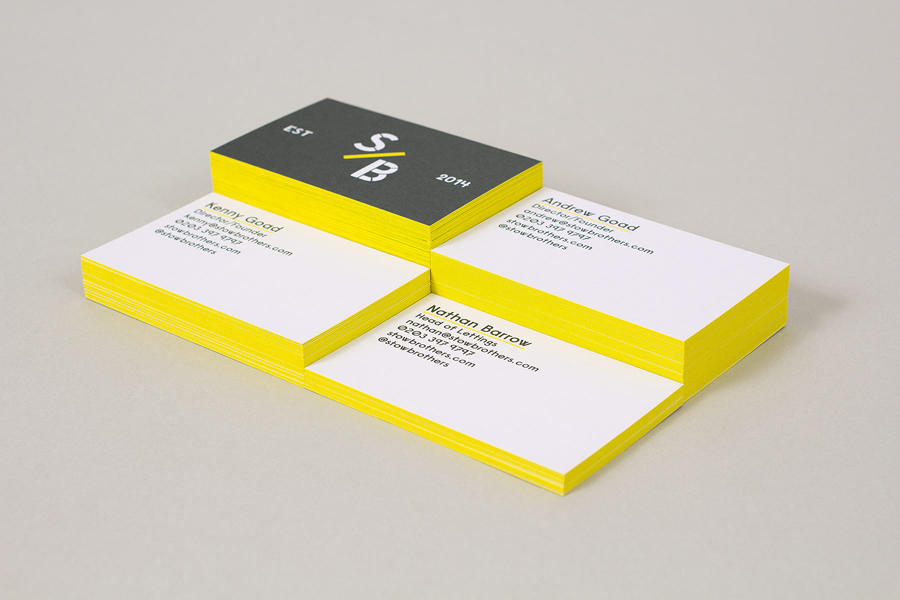
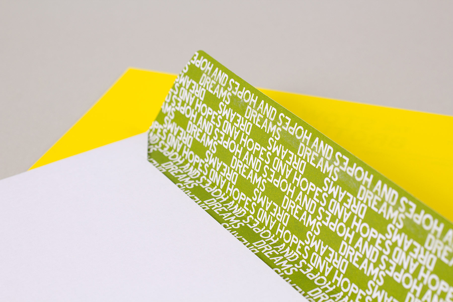
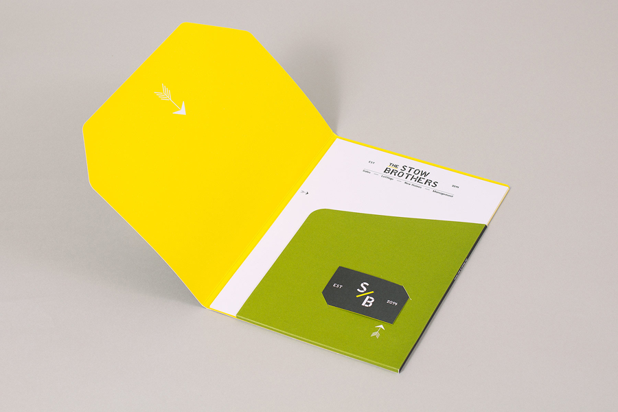
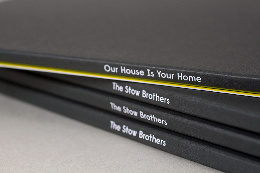
The industriousness of the type makes its way into the colour palette through a cool dark grey / black and a bright yellow ink and board combination. It is arresting and distinctive within the industry, and likely to function well to draw attention to Sold, For Sale and To Let signage. Like the unusual twist on the familiar stencil cut characters of the logotype, print finish such as edge painted detail and white inks across uncoated boards draw a high quality from a combination associated with heavy industry. This is tempered slightly by the use of an earthy green.
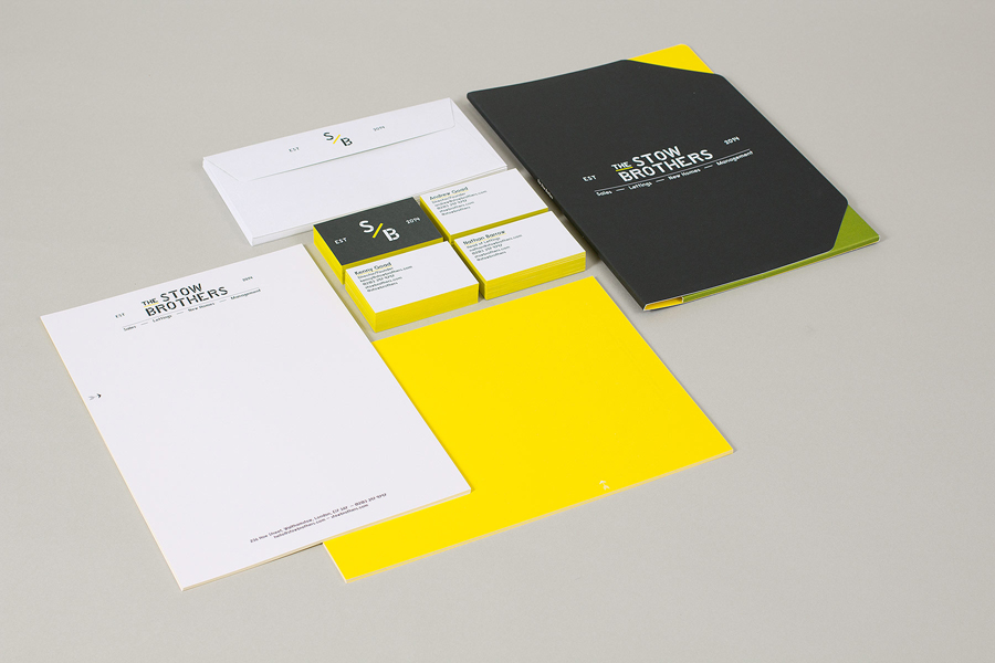
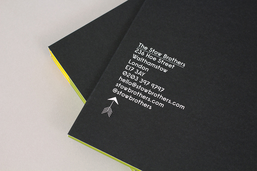
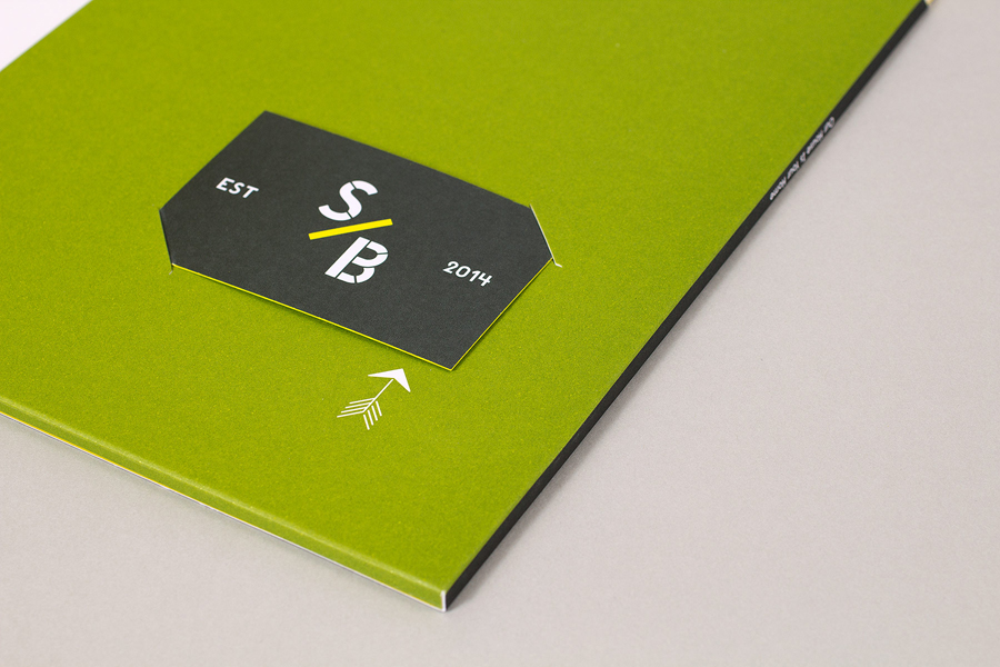
The stationery layouts are bold and unfussy in their use of the logotype, while small elements like the EST date, the underline elements and the flourish of the arrows play a little of the heritage card, a sensible reassurance within the context of a modern design direction. An original die cut folder, much like the logotype and the finish of the colour treatment, takes a functional and typically off-the-shelf piece and gives it a strong proprietary quality.
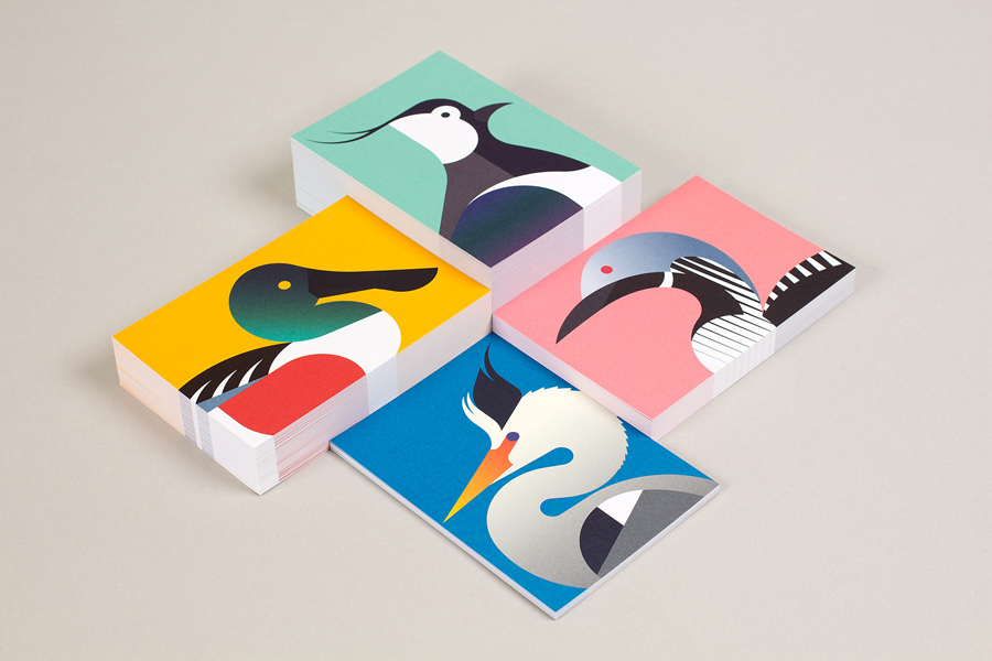
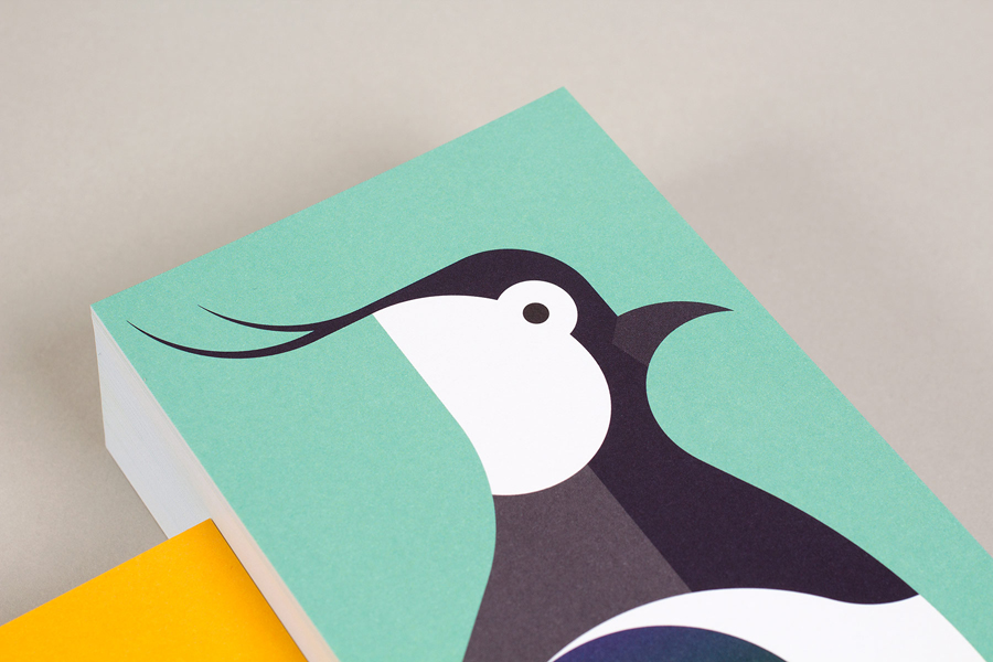
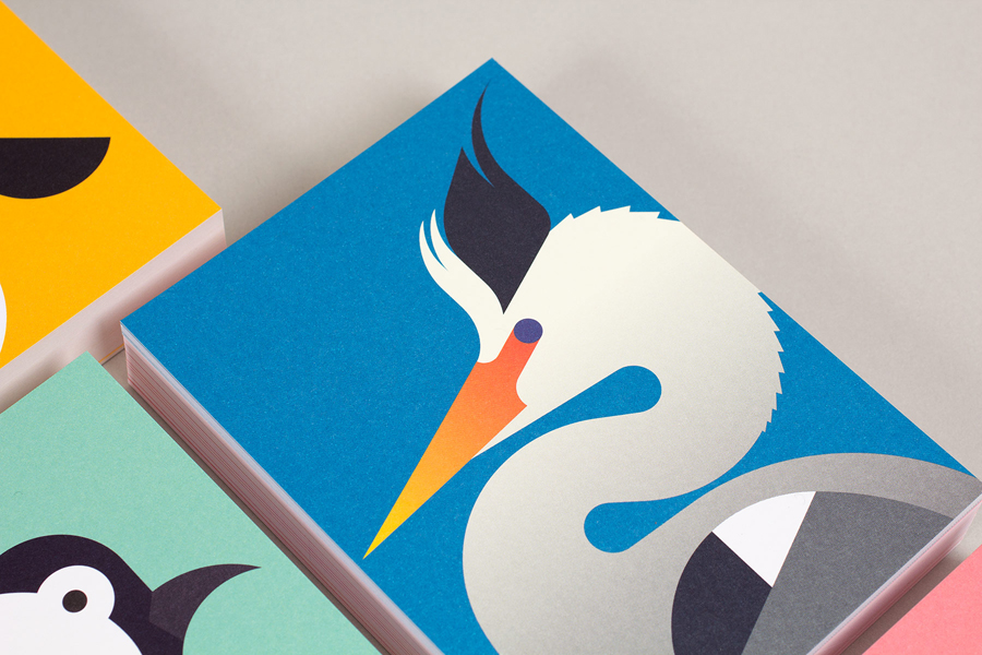
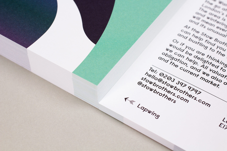
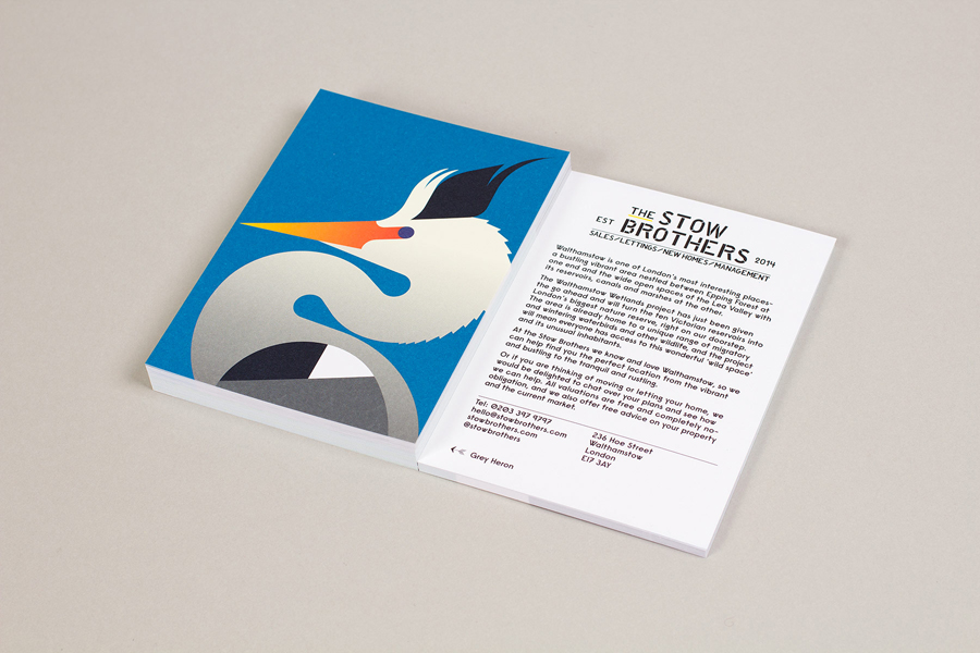
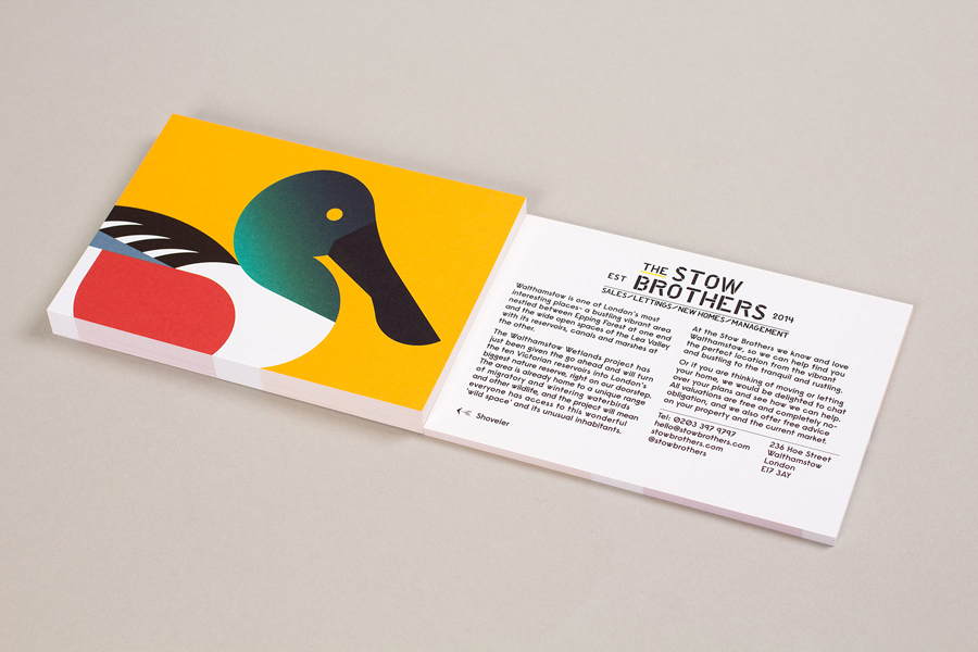
The direct mail campaign for the Wetlands project, a particular highlight, add a layer of aesthetic and linguistic detail through bold form, colour and intelligent copywriting. These highlight the robustness of Build’s type treatment and its ability to sit alongside compelling illustrative imagery. The illustrations are very well rendered, blending an own-able geometric character and bright colour palette with good ornithological detail and a compelling message that ties brand to local projects.
Design: Build
Opinion: Richard Baird
Fonts Used: Raisonne
