Two of Us by Two of Us
Opinion by Richard Baird Posted 11 February 2015

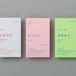
Two of Us is a new British design studio run by Ash O’Brien and Ian Caulkett working from Brighton and Birmingham. Together they specialise in brand identity design, have a philosophy that is based around an honesty and openness in the sharing of feedback, and individual styles and skill sets that when working together complement each other. As an alternative to large studios, the duo choose to pick out the small-scale and personal two-man nature of their business with a simple naming strategy and visualised as a contrast of type detail, type size and of colour. this runs across business cards, letterhead, parcel stickers and website.

The duality of the business and the honesty placed at its heart is distilled down into a simple brand identity solution. The use of two contrasting colours in print, but changing across each asset, an absence of consistent brand colours, stock from G . F Smith, the use of the font Simplon, a bold outlined sans-serif and pastel colours online mixes the current and flexible with the technical and utilitarian, and are bound by the concept of individuality and partnership.


The work has elements of reduction and a straightforwardness that manages to secure aesthetic distinction but also introduces, albeit rather subtly, a sense of transparency both in its use of outline type, by avoiding anything too flashy, superficial or distracting and through a good use of language online. The oversized logotype suggests a confidence but avoids dominance, is tempered and juxtaposed alongside smaller typographical detail, while its cropped application, splitting it in two and set across dyed, uncoated and glued paper, give the stationery a hands-on, cut paper and crafted quality.

Social media appears to have been well-leveraged and placed at the centre of communication, using Instagram to deliver compelling imagery that furthers the themes of contrast, complementary partnership and duality through colour and texture, and by using Twitter, unsurprisingly, to keep everything personal and one-on-one. A combination that covers both potential client and design community engagement.

The absence of portfolio shots online, instead favouring to convey process and principles through language, is unconventional yet resonates well with the studio’s philosophy, describing this omission as one that focuses on the future rather than a past of agency work, playing to the bespoke nature of each project. As Ash kindly took the time to explain, the publishing of either his or Ian’s previous work would not be an honest reflection of the ideals and ethos of their new studio.
The website essentially acts as a text-based introduction. However, while I love good copy — the significant distance between the two designers is effectively spun as the ability to reach clients across the country — and I appreciate the studio’s commitment to hiring a professional copywriter, it is difficult to really grasp its effectiveness in a visual industry and the reassurance past work can offer potential clients, but it is clearly a well-intentioned and an honourable approach.
Design: Two of Us
Copy: Seth Rowden
Opinion: Richard Baird
Fonts: Simplon & Neuzeit S
Papers: Colorplan Sapphire & Mandarin