Balclis by Mucho
Opinion by Richard Baird Posted 5 March 2015

Balclis is a leading Spanish auction house, founded in 1979, with a varied catalogue of antiquities including jewellery, fine art, books and furniture. Quick to recognise the changing nature of the market and the way that people engage with the auction process, Balclis moved from local business to secure international recognition. With this in mind, and to keep up with industry changes, the auction house engaged graphic design studio Mucho to redesign their visual identity and simplify experience. This included custom logotype, signage, editorial, business card and brochure, but also a revised and refined buying and selling process that is now more visual and understandable.

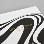
Balclis’ new visual identity is described by Mucho as reflecting the value of antiques in an elegant, contemporary and crafted way. This successfully comes through in the merging of plenty of white space, much like a modern gallery, across stationery, white walls with white signage—the logotype picked out with light and shadow rather than paint—and the long-serving traditions, perceived quality and antiquity of gold block foil and gilded edges. This dual nature is expanded upon in print using green tinted papers, pastel coloured bands, metallic gold ink, angled intersections, full view and cropped product photography, grid based layouts, bold serif and light sans-serif, and embossed surface textures.


Built from the rational serif characters of Harriet, the logotype honours the considered and well-drawn letter shapes, stroke contrast and fluidity inherent to the typeface. Its spacing, which avoids forming ligatures, places an emphasis on an adventurous, custom and rather nice cl combination. This, alongside the flourish of the the B, introduces proprietary character without appearing fussy and in keeping with the character of the typeface, and is well-suited to a business that deals in the ornamental and crafted.

The exaggerated weight of the ball terminals, tittles, vertical strokes and the loop of the B, in opposition to finer strokes, provides contrast, visual interest and balance, and takes the gold foil particularly well. These are classic letterforms rendered and spaced with a contemporary appreciation, working well isolated across the stationery or in conjunction with images and text detail in print and online. While the visual identity treatment is well-handled, it is good to read that a revised experience was at the heart of reshaping how the Balclis brand is perceived and experienced. More from Mucho on BP&O.
Design: Mucho
Photography: Roc Canals & Roger Casas
Opinion: Richard Baird
Fonts Used: Harriet