The National Institute of Dramatic Art by Maud
Opinion by Richard Baird Posted 21 April 2015
The National Institute of Dramatic Art is a national education and training organisation for the performing arts in Australia, and is responsible for developing the talents of some of the country’s biggest stars. With the continued democratisation of performance through digital platforms such as Youtube, and concerns that this had the potential to undermine NIDA’s conservatoire approach, NIDA pursues a technical mastery as a way to preserve a high standard of education.
NIDA looked to design studio Maud to help redesign its visual identity system in a way that help a world-renowned organisation maintain its international presence, prominence and authority within an increasingly accessible field, and broaden its appeal beyond the dramatic arts to include performance skills across a wide range of industries. The project included logotype, signage, prospectus, business cards, brand guidelines and brochure.
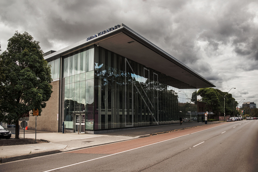
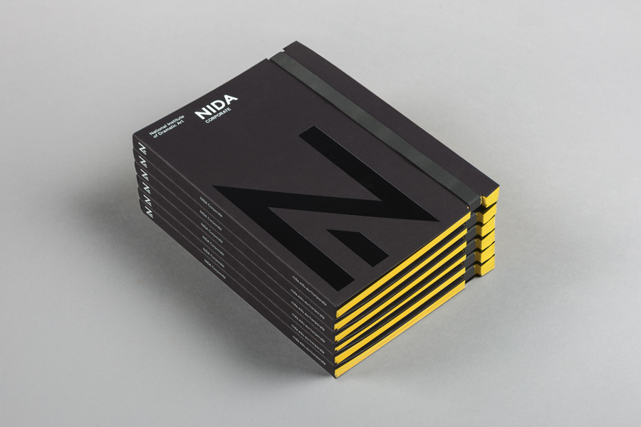
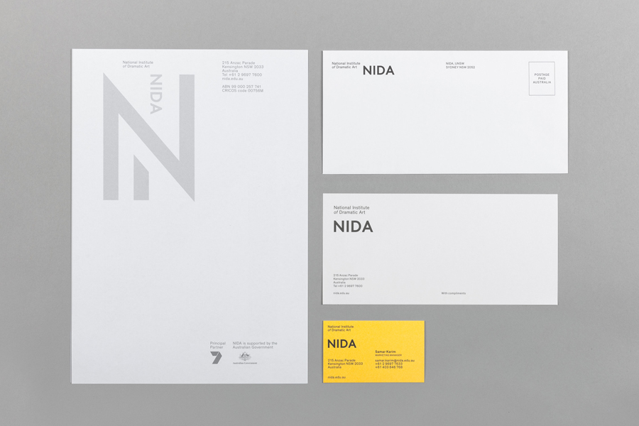
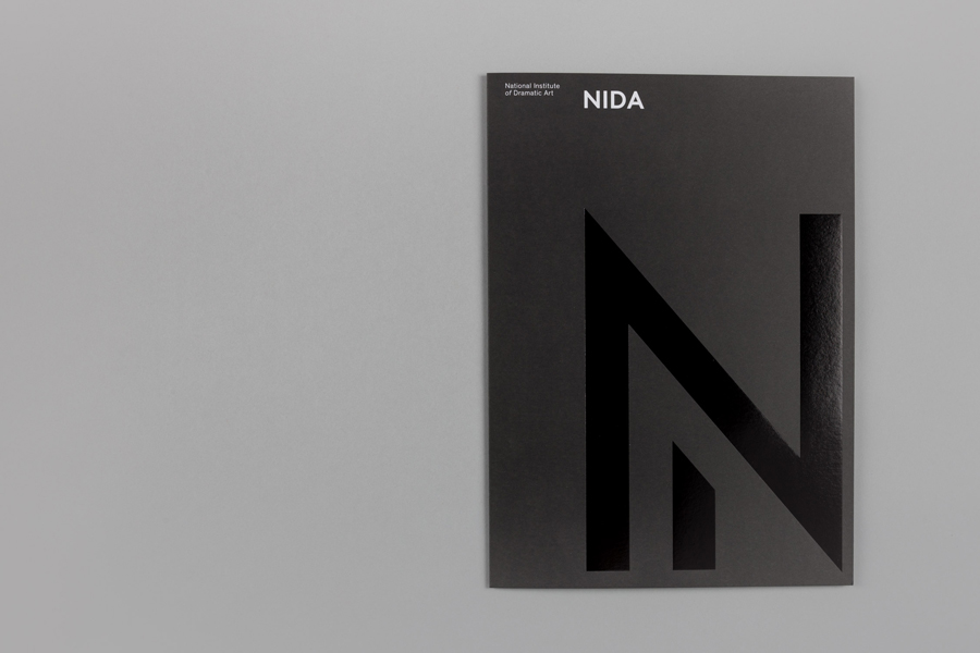
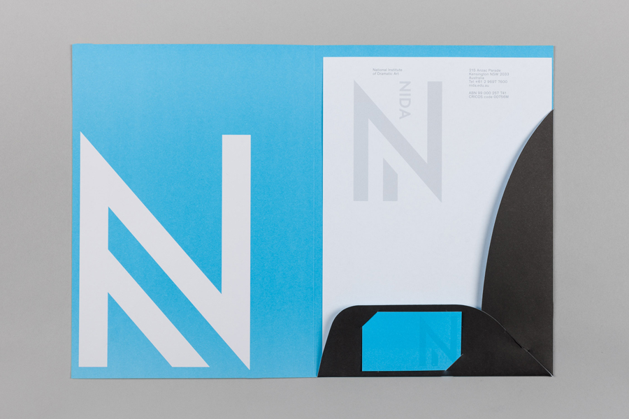
Black and yellow boards, heavy rubber bands, a geometric monolinear monogram oversized in its application, a single sans-serif typographical consistency and large window decals gives NIDA a bold and robust industrious and architectural quality. These communicate confidence and authority, secure visual impact and lay the foundation for more communicative detail delivered through colour, material choice, print finish, digital experience and campaign photography.
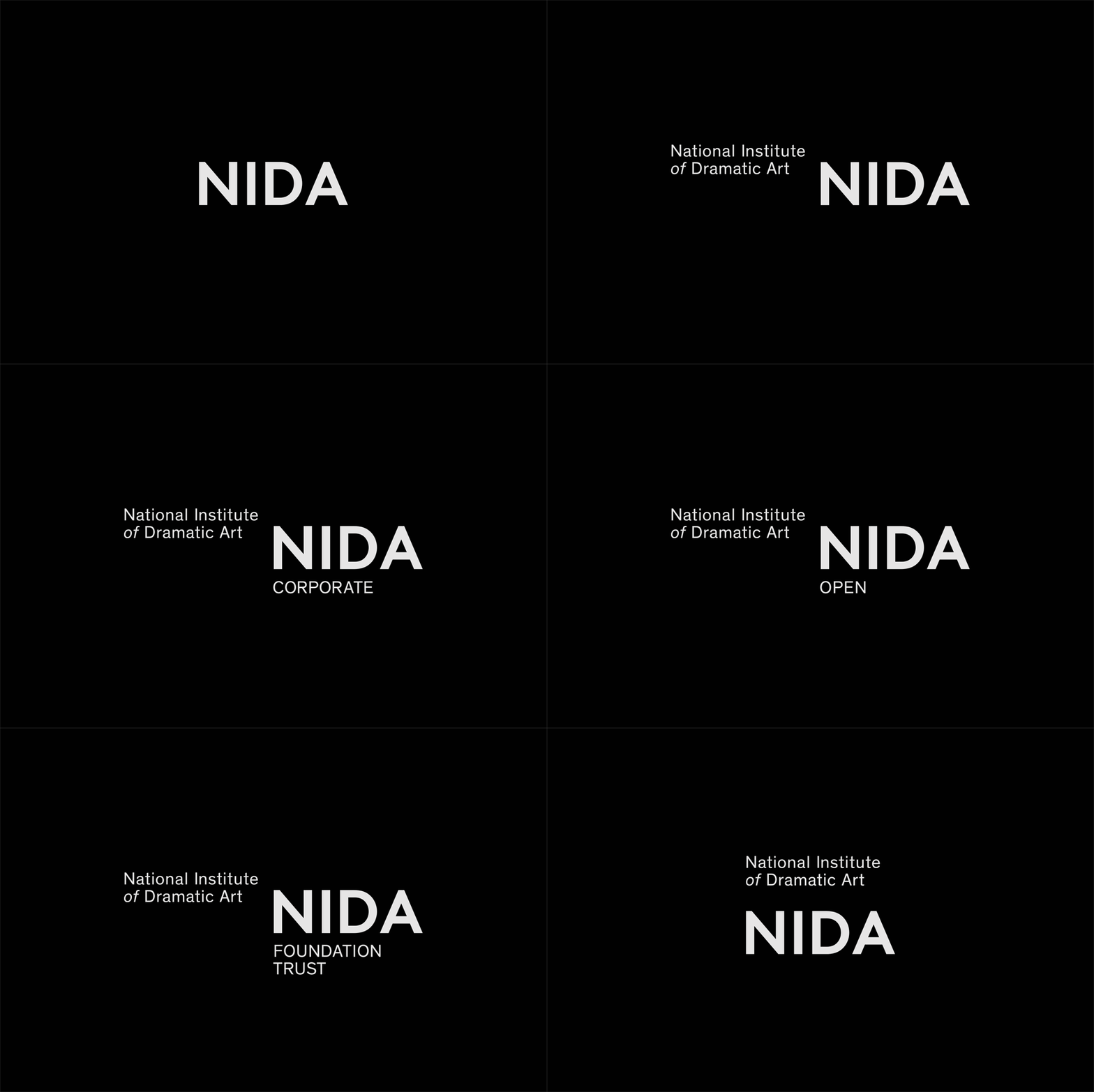
The typographical simplicity of the logotype, and the consistent and unwavering use of Optima’s Theinhardt, applied across all platforms, accommodates a variety of partners, trusts and theatres, is practical in its application and layout and contemporary in its aesthetic. It is well-executed, leans more towards the corporate but appropriately uses weight, space, structure and case to establish hierarchy, and avoids unnecessary flourishes, acknowledging the increasing breadth of NIDA’s endeavours.

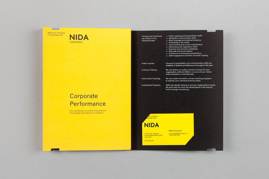
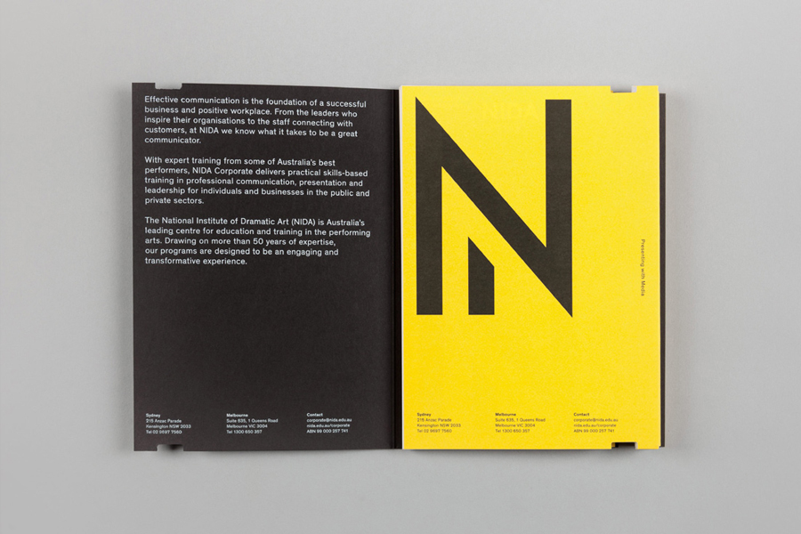
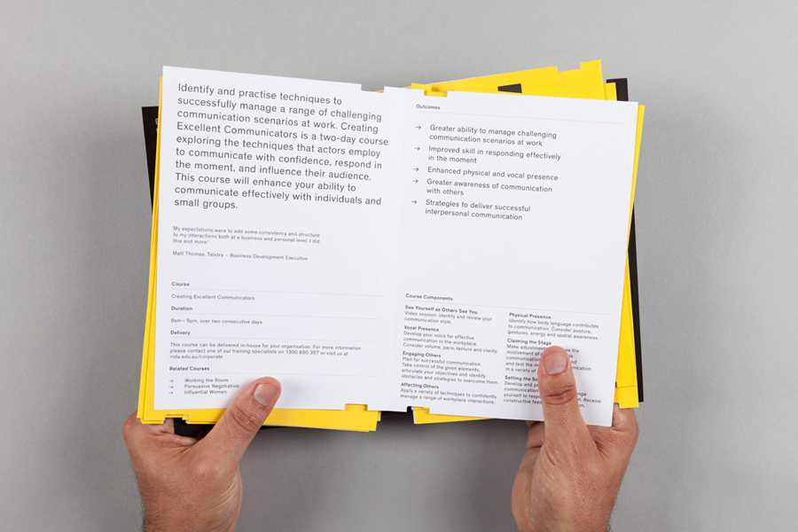
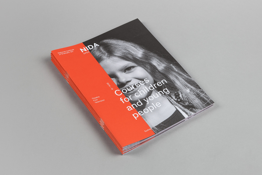
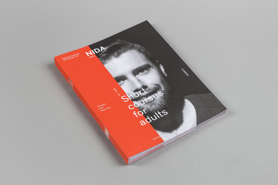
Panels of flat colour bring life to and temper the a typographical and corporate consistency, both serving a functional role to divide corporate and educational communication, but also introducing a vibrancy, energy and youthfulness you would expect from the performing arts organisation. White and black foils across coloured papers and boards, spot colours, a mix of paper weights, die cuts and the flourish of envelopes with printed internal walls, layer the identity with a high quality and considered finish.
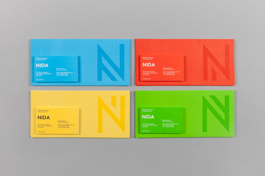
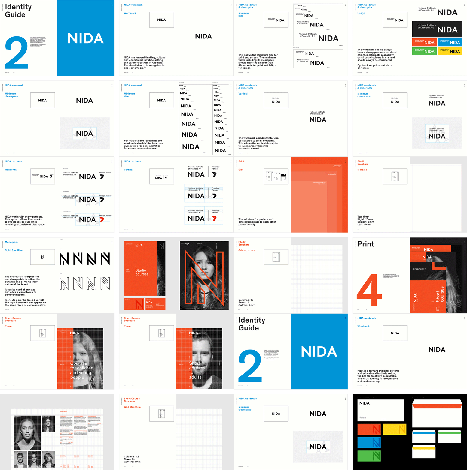
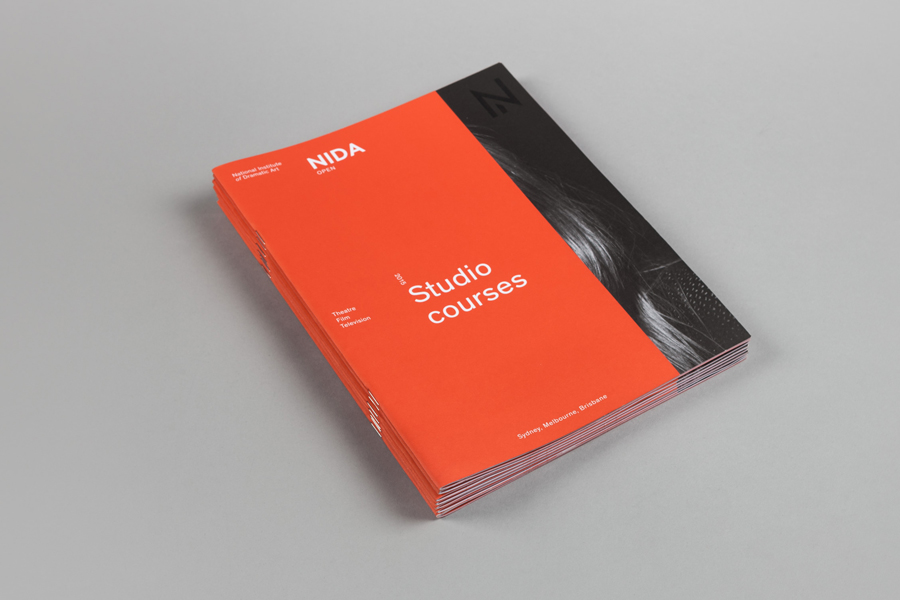
Maud’s campaign work juxtaposes the practical, efficient and robust qualities of the visual identity alongside the faces of those that make up NIDA’s student body. Performance, diversity and inclusivity is effectively communicated through the full bleed images in print, captured by renowned photographer Derek Henderson, and although the colour palette perhaps lacks a level of sophistication together, its bright and convivial ink in moderation and in isolation alongside the photography, enhances and emphasises the images, and provides an aesthetic impact. More from Maud on BP&O.
Design: Maud
Campaign Photography: Derek Henderson
Additional Photography: Irenaeus Herok
Opinion: Richard Baird
Fonts Used: Theinhardt

