Mita Chocolate Co. by Moniker
Opinion by Richard Baird Posted 18 November 2015

Mita is an artisanal bean to bar chocolate business grinding and moulding on a single site in Bogata, and sourcing its beans from across Venezuela, Peru, Ecuador and Colombia. Mita worked with San francisco based graphic design studio Moniker to create a visual identity and package design system that would easily scale as new products are introduced.

Although a small project with few assets there is plenty of room for variation and moments interest. Contrast is used to good effect. A variety of bright flat spot colours, which provide much of the packaging’s initial appeal, are punctuated by the visual texture of fine monolinear lines, while the ornamental qualities of the logotype sit above the more reductive and functional nature of a sans-serif. Areas of space, clear typesetting, product information, logo and illustrative weight feel well-balanced and consistent throughout.


A connection could be made between patterns and traditional South American cultural artefacts such as woven rugs, in the shape and thread-like qualities of the lines, and between carved iconography and the logotype, however, these appear more like subtle references rather than an explicit communicative intention. This does, perhaps, work in its favour, where such imagery can seem tired and familiar and there is a preference for the current. Provenance is addressed front of pack with a small stamp component in the bottom right-hand corner.
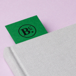
Although there is a slight disparity between irregular and precise lines, which is a touch bothersome, neither different enough or clear in communication intention, pattern and logotype look distinctive and interesting, are current in their rendering and add visual texture, alongside the physical texture of uncoated paper, to a compelling colour palette. The logotype works particularly well running along branded box tape and oversized and cropped across the business cards.

The result is simple—a fair refection of brand honesty and product purity—but with enough components to create a system that is impactful from a distance, has a layer of detail up close, straightforward and contemporary in its communication and aesthetic, and addresses provenance. It gives a small artisanal brand a consistent, good-quality and recognisable visual style.
Design: Moniker. Opinion: Richard Baird