Park Distillery Vodka by Glasfurd & Walker
Opinion by Richard Baird Posted 25 November 2015
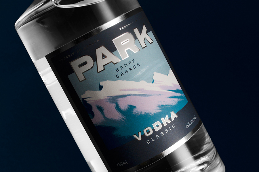
Park is a bar, restaurant and distillery located in the Canadian resort town of Banff, within the Banff National Park, and the province of Alberta. It is a region of diverse natural beauty, with mountains, prairies, forests and desert badlands that attract walkers, campers and skiers.
Park Restaurant is a celebration of Banff’s alpine history and lifestyle. This runs throughout its interior, campfire-inspired menu and a brand identity by Vancouver based graphic design studio Glasfurd & Walker which plays with the visual vernacular of mountain trails, camping equipment and walking clothes through type, colour and texture. Check out the project and BP&O’s review here.
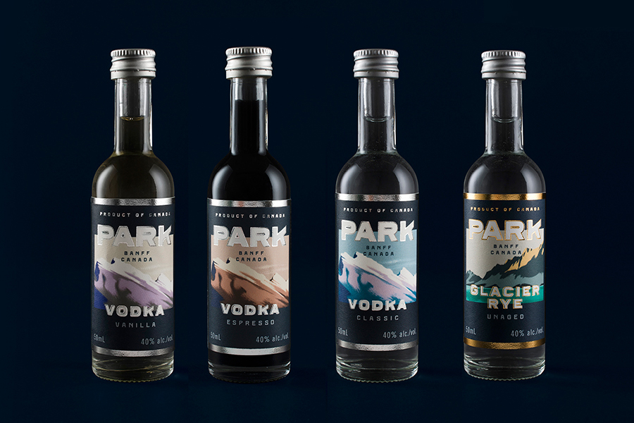
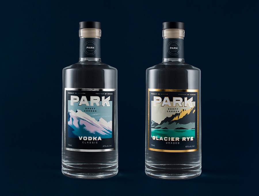
Glasfurd & Walker continue to work with Park, designing packaging for its distillery business, and its range of vodkas, using the opportunity to build out brand identity with the introduction of illustration by Cristian Fowlie, the perceived value of a silver foil, choice of structure and further material texture.
As expressed in BP&O’s review of Park’s brand identity; where the restaurant’s menu and interior draws on and celebrates the flavours of open fires, the communal experience of shared tables and the alpine spirit of log cabins, Glasfurd & Walker expands on this with the visual vernacular of mountain trails and the utility associated with walking and camping through colour, robust type and texture. This continues through to the packaging of Park Distillery’s latest vodka range, but with a couple of neat additions.
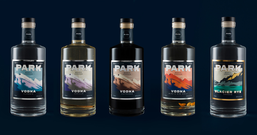
Cristian Fowlie’s illustrative work introduces a layer of detail to an identity of bold geometric type and simple colour pairings through organic brush texture, more colour, depth of colour, and some nice motion within the strokes.
Where Park’s identity drew on general camping and mountain walking associations, illustration is firmly rooted in the area, depicting the iconic mountains of the Banff National Park.
Although it might have been nice to have more variety in form, perhaps multiple crops of a larger more detailed panel or renderings from a number of vantage points, these are lovely, and colour works well to introduce difference, divide the range with an almost seasonal quality—which ties in well with the ageing of spirits—and hint at flavour.

Like Park’s brand identity, there is an element of retrospection. The illustrations have a quality not too dissimilar from illustrated postcards of the past. As such, these play with nostalgia, the themes of age and heritage without being disingenuous, and the qualities you might associated with or want from a souvenir, making the most of its ties with the area and leveraging the experiences of its visitors.
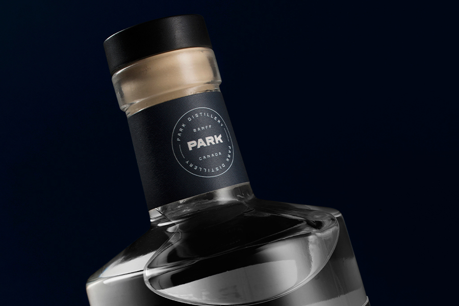
The choice of structure, cork, cap and print finish suggest good quality, while the bottle’s width works well in conjunction with the illustrative panels. An icy silver and warm gold block foil (perhaps another seasonal or flavour cue) frames image and logotype, and adds an element of contrast to the uncoated surface of the label, which is in keeping with the materials utilised across the restaurant’s menus, and adds a physical texture to the visual texture of the illustrations.

Park Distillery Vodka makes good use of a quirky logotype through proportion, is full of memorable character, in keeping with the spirit of the Park Restaurant, and does a good job of touching upon age and provenance in a distinctive and compelling manner. More from Glasfurd & Walker on BP&O.
Design: Glasfurd & Walker. Illustration: Cristian Fowlie. Opinion: Richard Baird. Fonts Used: Ferry & Kumla.
