The Hope Singers by Bedow
Opinion by Richard Baird Posted 1 March 2016
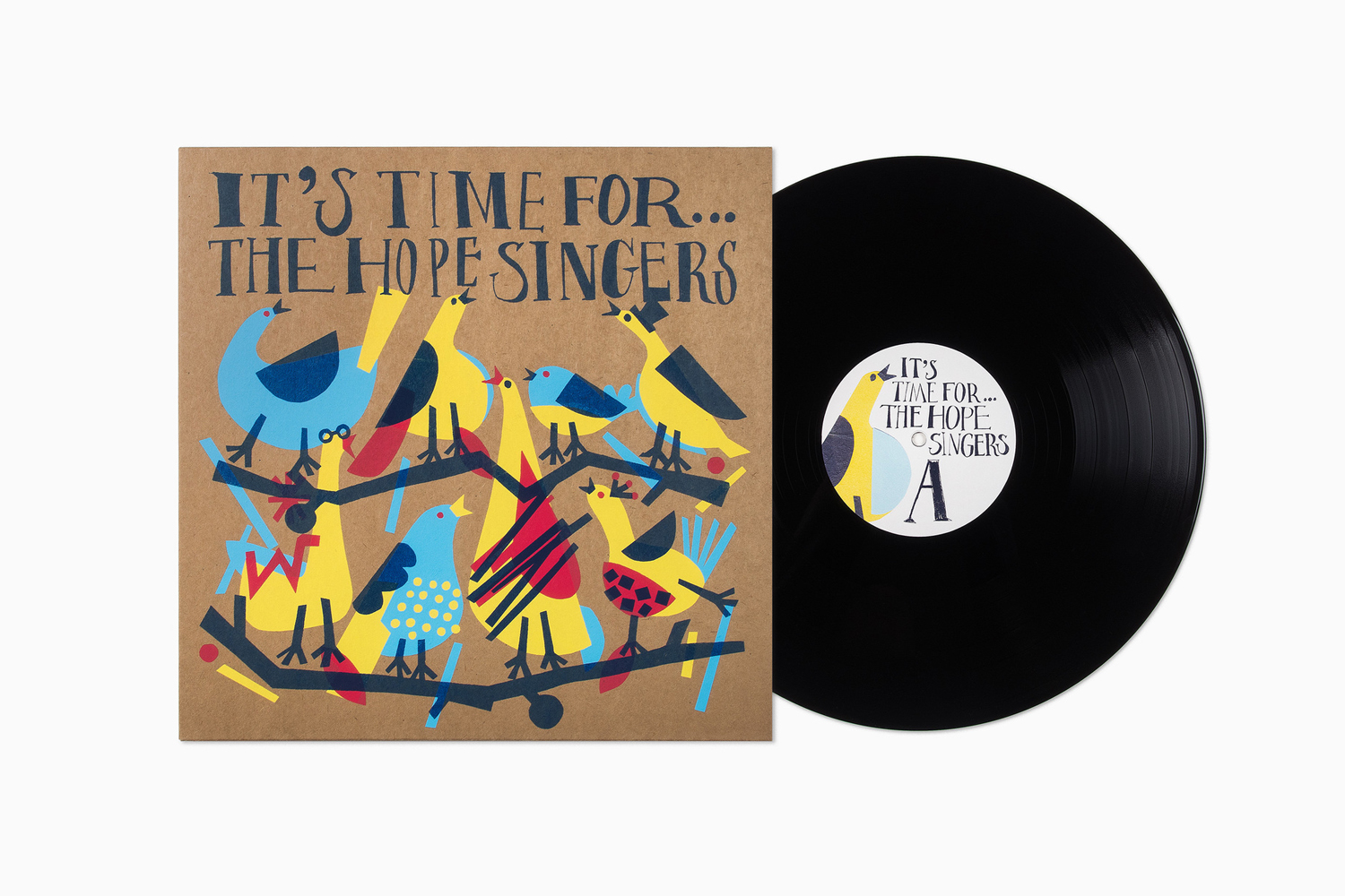
Scandinavian graphic design studio Bedow have recently completed work on the record sleeves for The Hope Singers debut album It’s Time For…, which will be released on the Sing a Song Fighter label as a limited edition LP. Bedow mix a well-illustrated approach with loose hand drawn typography, and applied these using a four colour screen print process across uncoated and unbleached board. The result is cheerful, individual and distinctly crafted.
The irregularity of form, much like cut paper, a dense composition and a preference for the angular, alongside a bright yellow and red ink, emphasised by darker but complimentary shades of blue, give the illustrations a playful, visually rich and energetic quality.
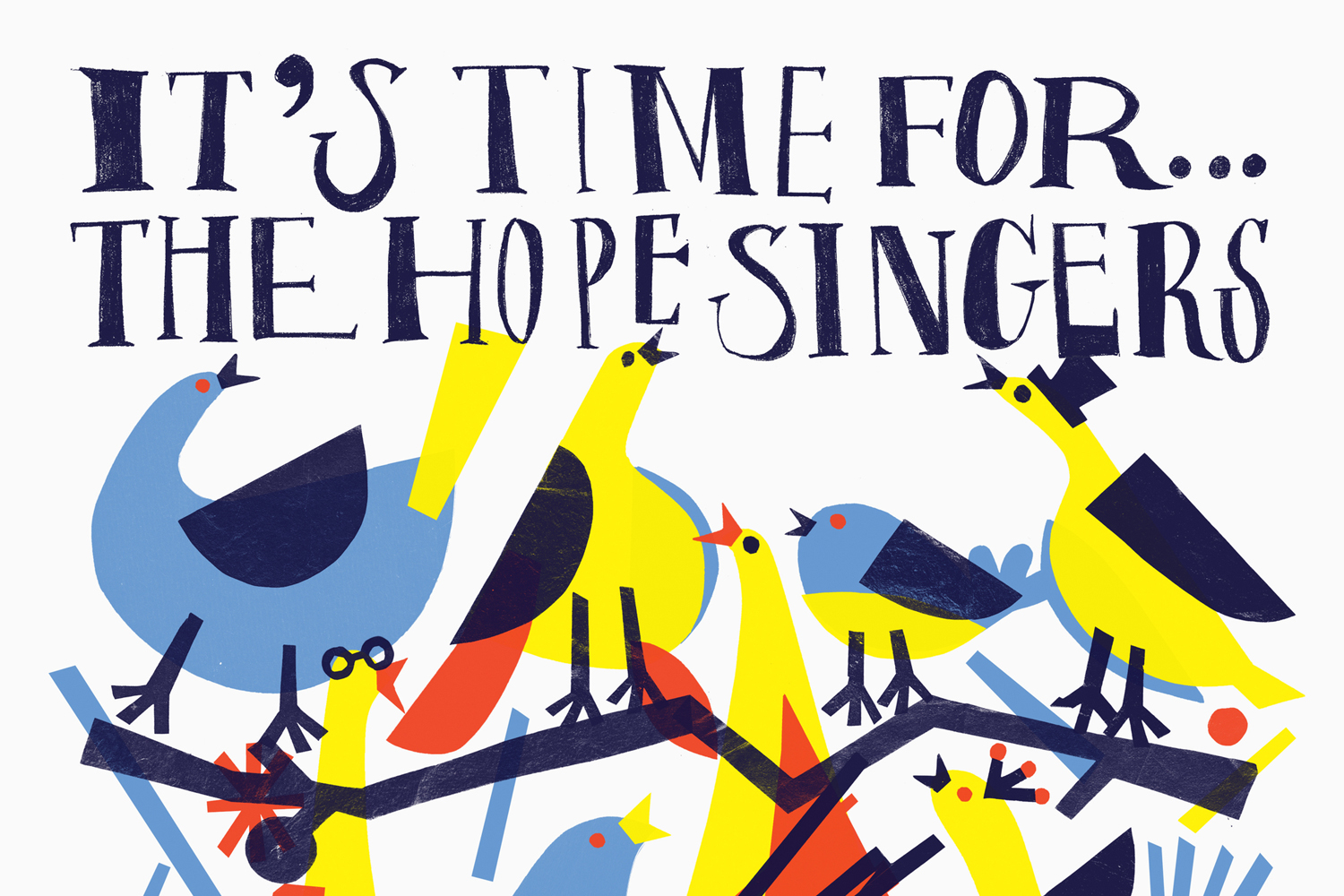
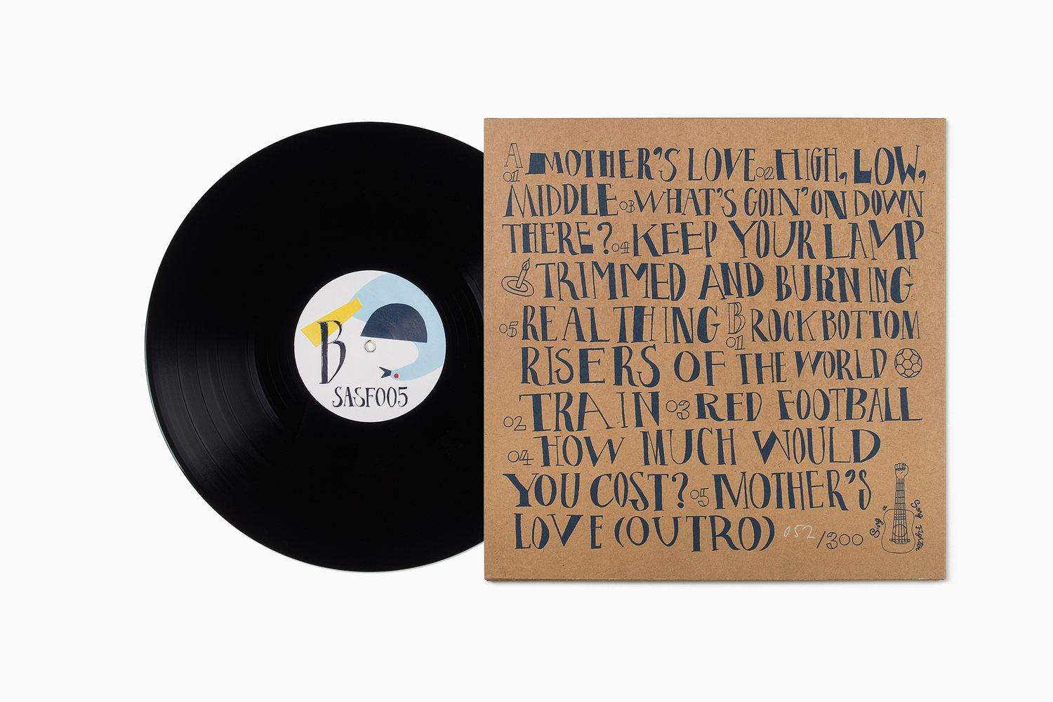
Type is characterised by high contrast strokes, carved serifs and an irregularity much like image. Letters are personable and quirky in their expression and collectively avoid repetition with a true hand drawn rather than digital quality. This is enhanced by stamp-like visual and uncoated material texture as well as areas of overprint.
There are some interesting and individual letter shapes that, with a good eye for spacing, work well together as a block of text across the back of the sleeve. This crafted approach to type, illustration and material feels well-suited to a limited edition release.
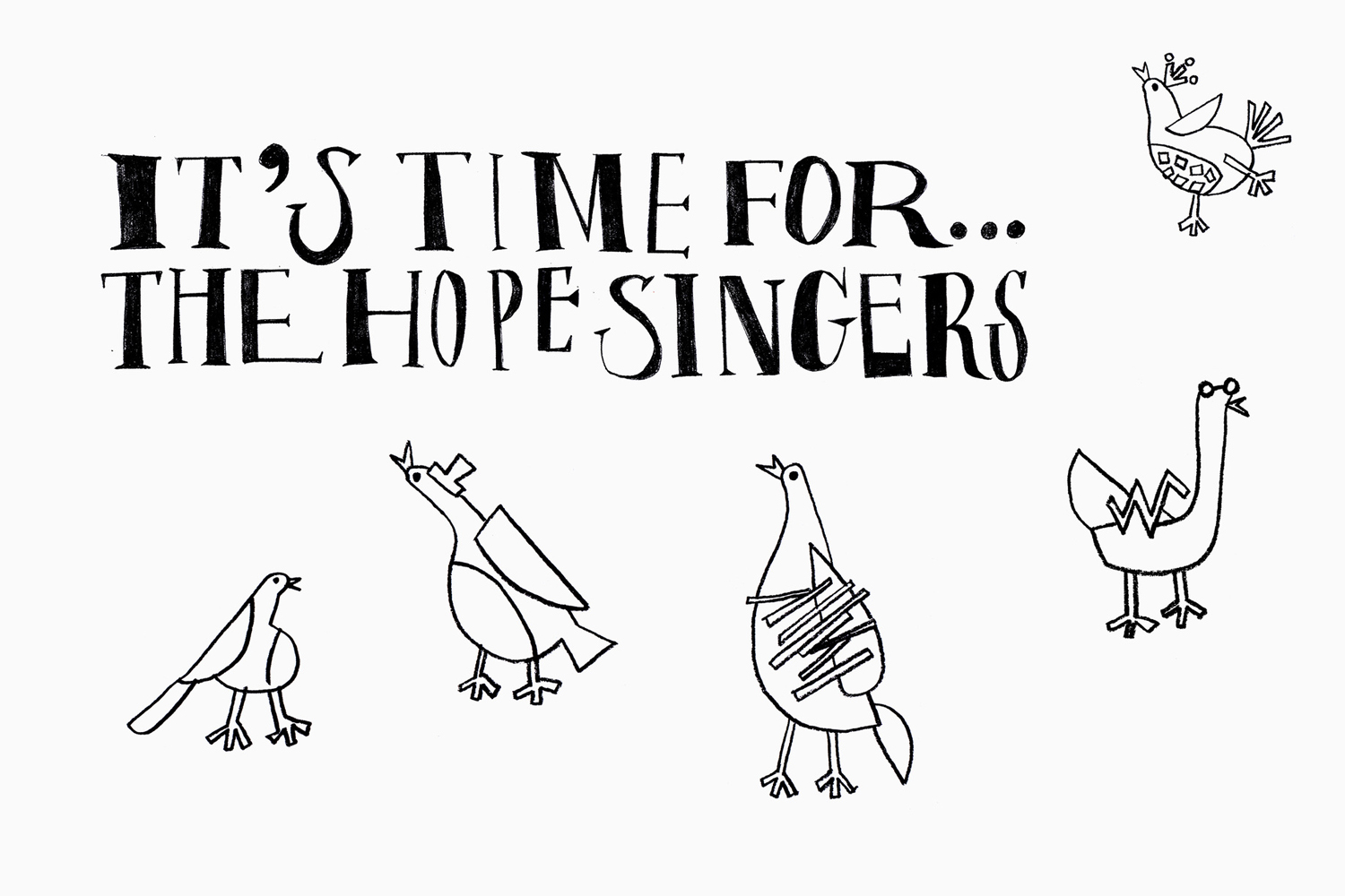
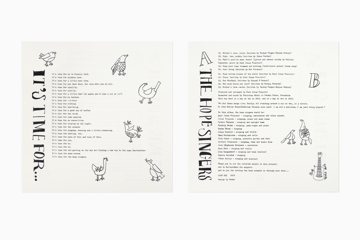
The birds have plenty of individual character but work well-together, and although rough and rudimentary in form, have a distinctive quality appropriately rooted in the group dynamic and energy of The Hope Singers. This is further explored within the context of the insert, which, in contrast, favours a single black ink and areas of space whilst retaining motion and texture. More by Bedow on BP&O.
Design: Bedow. Opinion: Richard Baird.
