EAT by Fable
Opinion by Richard Baird Posted 7 September 2016

EAT is the second installation of a two-year long series of exhibitions that draw on the gastronomic memories of residents from Jurong, Singapore. Graphic design studio Fable worked to create the visual identity for EAT which included a variety of printed collateral. These appear to take their cues from menus and street food packaging, a contemporary gallery aesthetic and juxtaposes these alongside colourful character and food illustration.

Fable’s work for EAT has a bit of a dual personality. Material, cuts and folds borrows a little from generic street food packaging and the structure of menus and is paired with the more personable qualities of character design, loose hand drawn food illustration, and a bright and earthy colour palette.


It is a curious and disparate set of assets that begins to make sense when considered within the context of food and the social interactions that make it Singapore’s pastime. The sleeves of the print work; a mix of uncoated and unbleached board and papers, holds, a little like a takeaway carton, insight into a diversity of food and those who come together to enjoy it, as expressed by bright and earthy colour choices and character illustration.

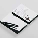
The use of simple typographical forms and a play with the idea of fulness through weight, either knocked out of colour, applied as a blind emboss or as a simple black ink, functions to link assets, while the materiality of identity, a mix of open stitching, embossed finishes and surfaces introduce an element of craft, something that ties in well with good quality food.
The playful nature of logotype, drawn from some simple and practical letterforms, also emerges in the menu like build of the Past, Present and Future document that takes a look at Singaporean hawkers.

The character illustrations are well drawn, with solid colour and a modern, monolinear outline. There is a clear continuity in their style but each is clearly defined and expresses the diversity of the residents of Jurong and those featured in the exhibition. Food illustration offers up another illustrative style, looser in line weight and richer in detail. These add a more spontaneous quality to what is a strict character style and robust typographical choice. This feels particularly appropriate across the document that takes a look at hawkers, a busy and shared open space with a lot of different food vendors.

Plenty of space, areas of unbroken white, black ink and the way an International Style-inspired type choice is used to create visual interest through weight, structure and layout, leverage a little of a contemporary gallery aesthetic.

The result is broad mix of assets and a bunch of ideas. Typographical austerity is infused with play, material utility is worked into a crafted finish, colour is set alongside the uncoloured, and the uniform alongside the irregular. It should not to work, but for the most part it does, balancing the need for an overarching and formal exhibition aesthetic that frames more personable and individual stories.
Design: Fable. Opinion: Richard Baird. Fonts Used: Intro Black & Alt Haas Grotesk.