The Best of BP&O — Graphic Design of 2016
Opinion by Richard Baird Posted 20 December 2016
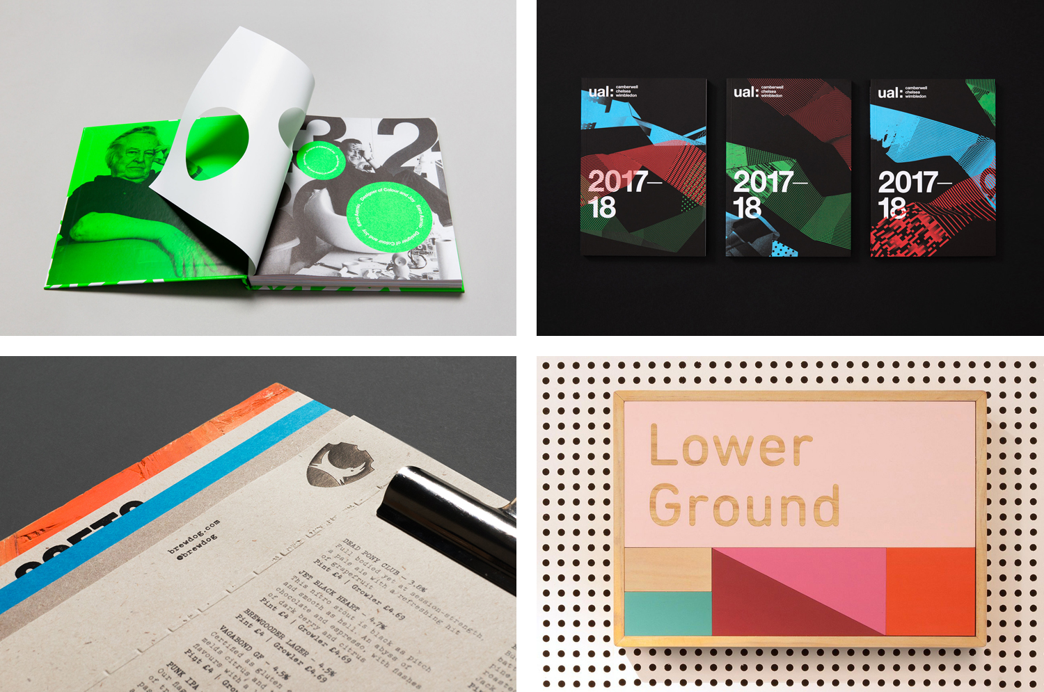
A new end-of-year feature for BP&O as the site intends to build out its reviews to include work beyond branding and packaging. This looks to cover individual brand assets new to established brand identity systems, and other pieces such record sleeves, posters, campaigns, books and wayfinding. Although only a few of these made it onto the site in 2016, this was an increase on last year, with five of these really standing out, making it into BP&O’s Best Of Series. This feature brings together the most interesting, unexpected or unusual graphic design projects published on the site during 2016 for another opportunity to be seen and shared. These balance a strong and appropriate concept with a compelling aesthetic that hold up individually or sit well within an pre-established brand identity system.
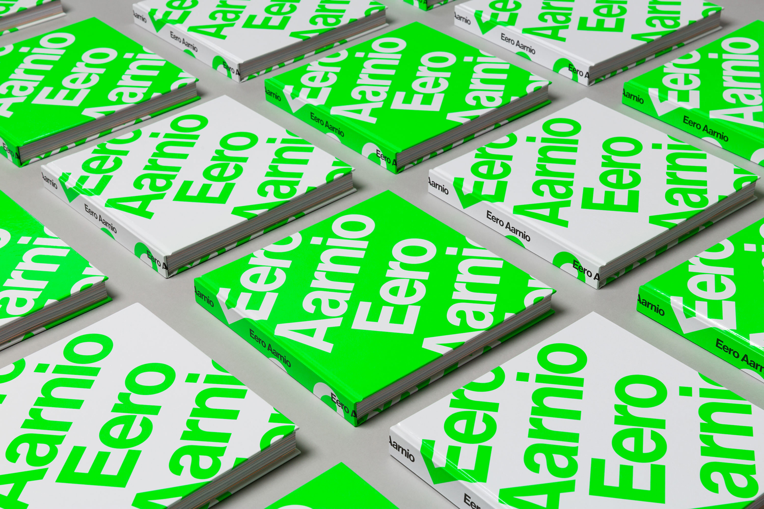
Eero Aarnio by Bond, Finland
Eero Aarnio is a Finnish designer and one of the great innovators of modern furniture design. He is perhaps best know for his Ball, Bubble and Pastil Chairs and Puppy toy, and his pioneering use of plastics and fibreglass during the 60’s. 2016 saw the release of a book, designed by Bond, that celebrates much of Eero Aarnio’s work, selected from a portfolio that spans several decades, and also provides insight into his life.
Much like the furniture and products designed by Eero Aarnio in the 1960’s, Bond’s design draws play from functionality, finding common ground in the international graphic style of the period and Aarnio’s modernist spirit. This is expressed in the variety of ways Neue Haas Grotesk has been typeset, the use of geometric form, both framing and punctuating image and breaking up text, and in the use of grids, colour and in the art direction of product photography.
See more of this project here
Boreal Network, Itasca Road Trip by Bedow, Sweden
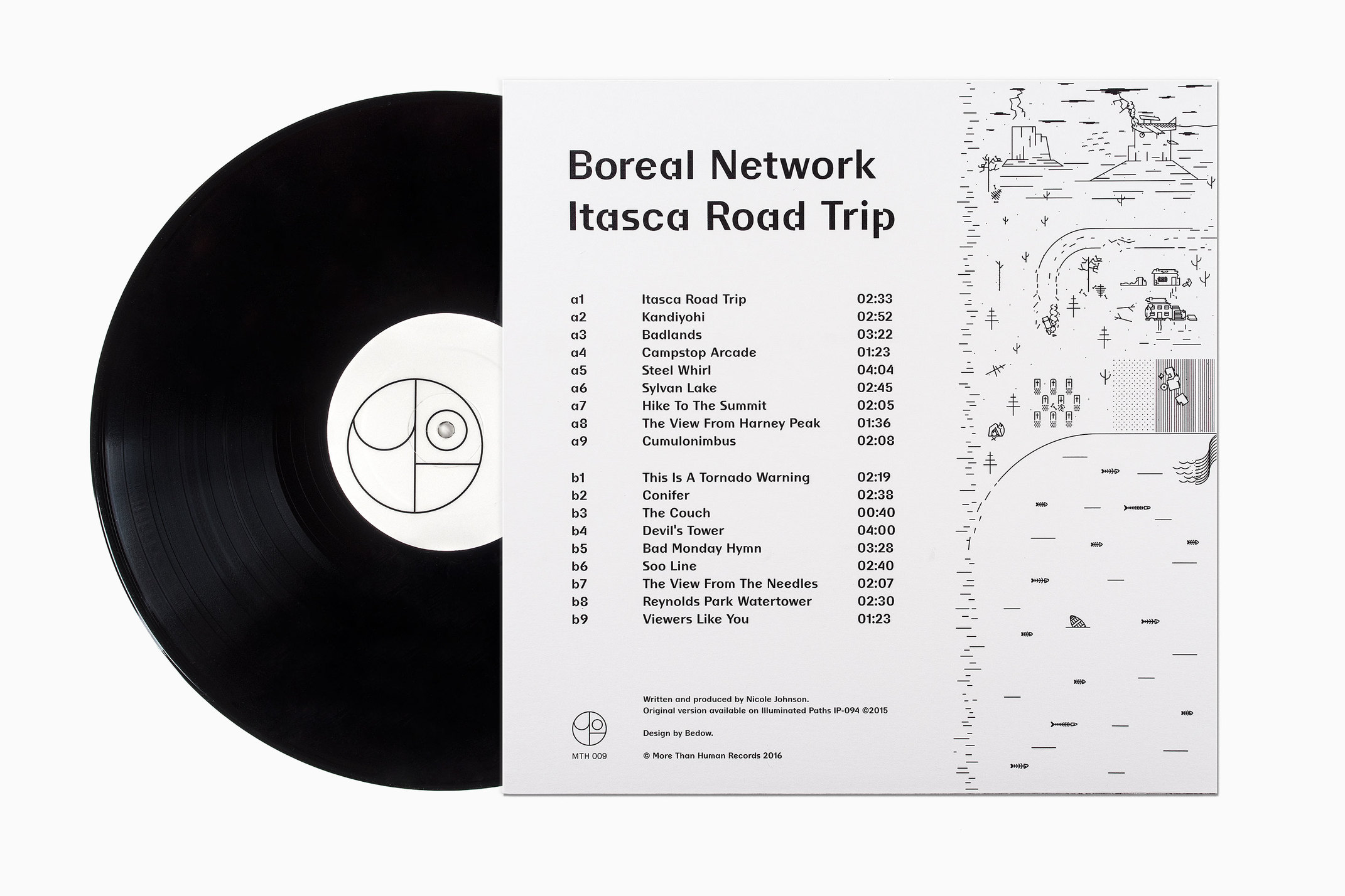
Nicole Johnson is a Seattle-based Minnesotan creating what Miles Bowe of Fact Magazine describes as “sun-drenched, foggily nostalgic electronica” under the name Boreal Network. Itasca Road Trip is a limited edition vinyl rerelease and trimmed down version of an earlier album by Boreal Network, distributed by More Than Human Records and featuring artwork by Swedish graphic design studio Bedow.
Bedow’s work is a neat, distinctive and contemporary interpretation of Boreal Network’s album. The relationship between album name, track titles, sound and artwork feels both visceral and evident, with unusual small details in image and type that demand a closer look and work well within the context of a large format release.
See more of this project here
Brewdog by O Street, United Kingdom
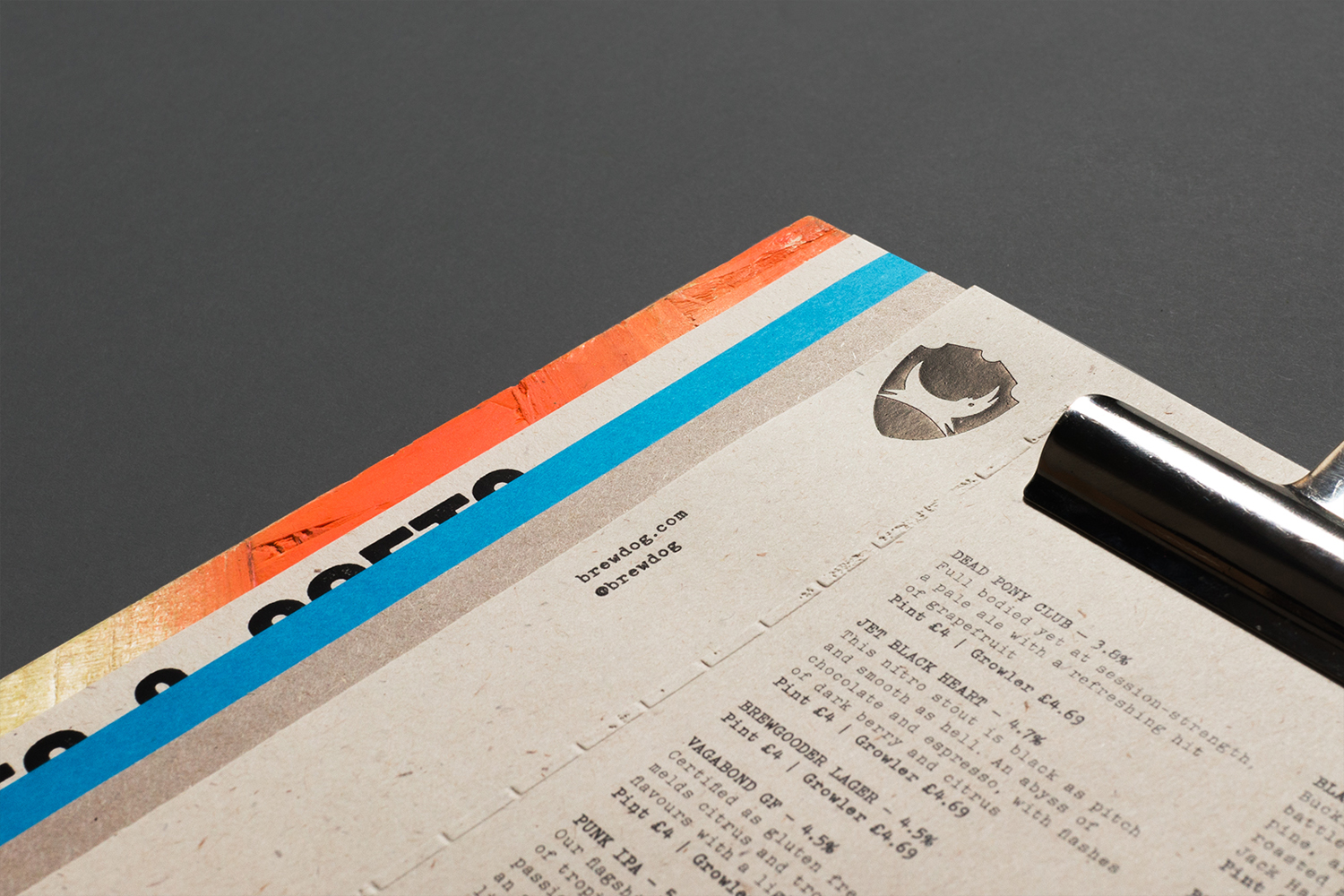
O Street worked with craft brewery Brewdog; best known for their beers and big attitude but also a growing hospitality presence throughout the United Kingdom, to create a distinctive menu design and system for over fifty of their bars. This included both a full menu which features a handmade backboard, and a Daily Drafts menu, individually finished at each location.
Through production, material, type and print finish, O Street taps into the spirit of Brewdog, its no-fuss urban attitude and craft foundations, building out brand with a robust, practical and memorable asset that reflects the materials of its bars whilst also standing out through colour.
See more of this project here
East Sydney Early Learning by Toko, Australia
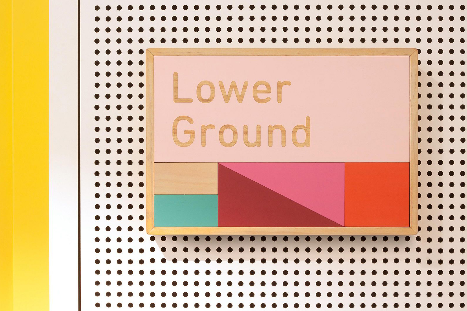
East Sydney Early Learning & Community Centre is a state of the art space located on Bourke Street providing childcare places for parents living or working in the inner city suburbs of Sydney. The centre, based around the concept of a “mini city” features five play rooms set over three levels, indoor playground on each floor and an open-air play area on the top floor. The space also features a distinctive signage and wayfinding system, developed by Australian graphic design studio Toko, inspired by children’s building blocks.
Toko’s signage and wayfinding system does a good job of connecting architectural concept and an interior of light colour, simple forms and practical materials with child’s play, and effectively utilises this to label spaces and direct traffic. The lexicon of modern architecture, the systematic principles of wayfinding and city infrastructure, and the modular nature of early learning share a commonality and feel like a natural fit and make for a distinctive design.
See more of this project here
UAL 2017–18 by Spy, United Kingdom
The University of the Arts London is Europe’s largest specialist arts and design university. It is made up of six colleges, each with its own unique character and programme, yet unified in their effort to deliver a high quality creative eduction. This united position is expressed through a brand identity system designed by Pentagram partner Domenic Lippa. Based around Helvetica, UAL’s visual identity affords each college the opportunity to experiment with its own approach to visual communication.
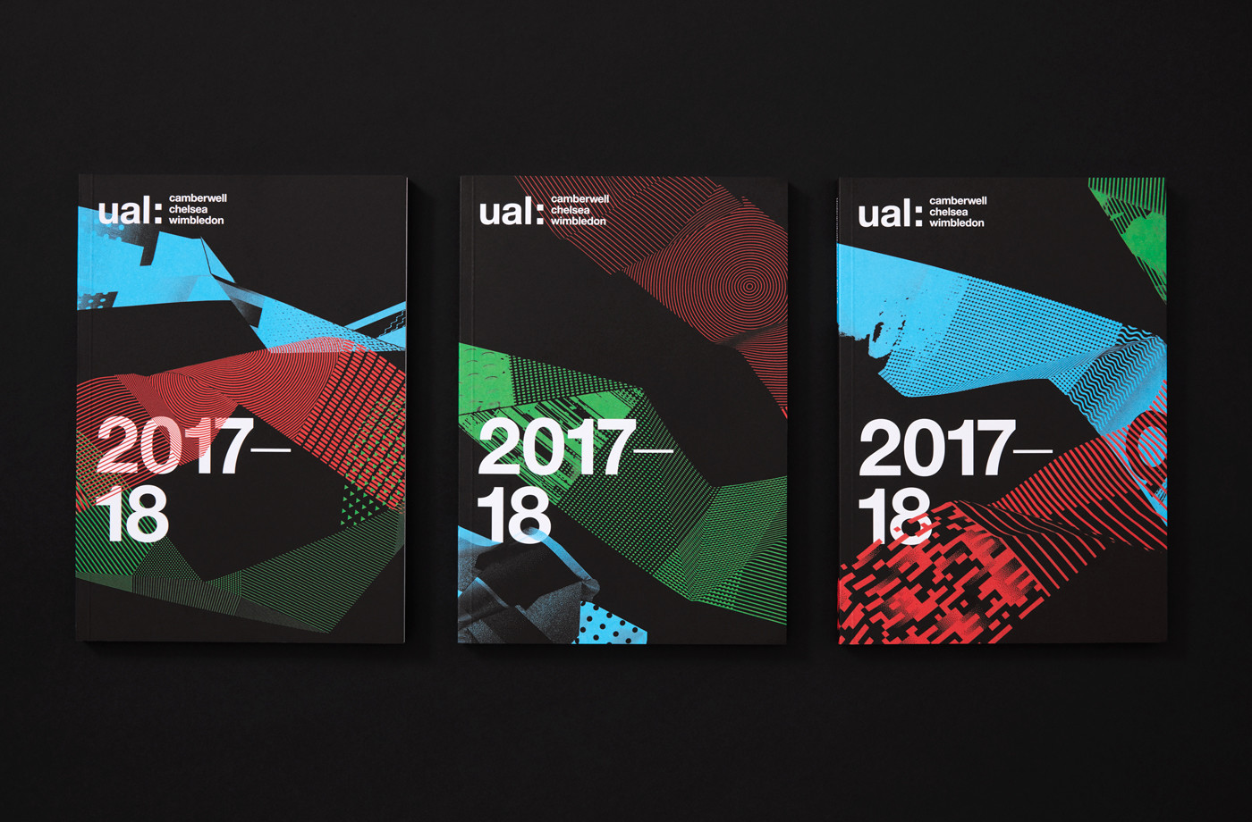
Spy were commissioned, for the second year, to develop an engaging brand campaign that would drive student recruitment and brand awareness through posters, brochure, flyers and animation.
Last year’s campaign was bright, light and clear in its crafted foundation. Built around the scanning and shooting of found materials, textures and objects from the campus this conveyed some of the spirit of each college and worked well within the context of Pentagram’s visual identity system. The 2016–17 campaign is darker and distinctly more digital in nature but shares a similar crafted foundation as last year, capturing the breadth of UAL’s educational programmes in a visually compelling way.
See more of this project here
