UAL 2017–18 Campaign by Spy
Opinion by Richard Baird Posted 2 November 2016
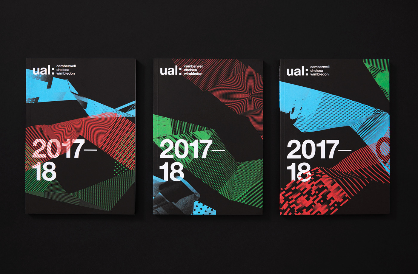
The University of the Arts London is Europe’s largest specialist arts and design university. It is made up of six colleges, each with its own unique character and programme, yet unified in their effort to deliver a high quality creative eduction. This united position is expressed through a visual identity system developed by Pentagram partner Domenic Lippa. Based around Helvetica, UAL’s visual identity affords each college the opportunity to experiment with its own approach to visual communication.
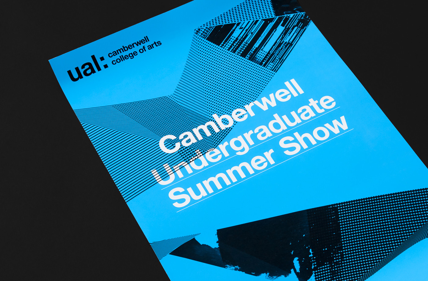
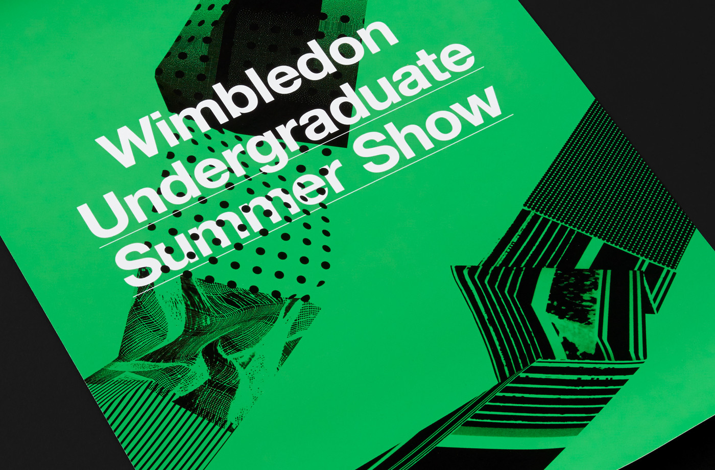
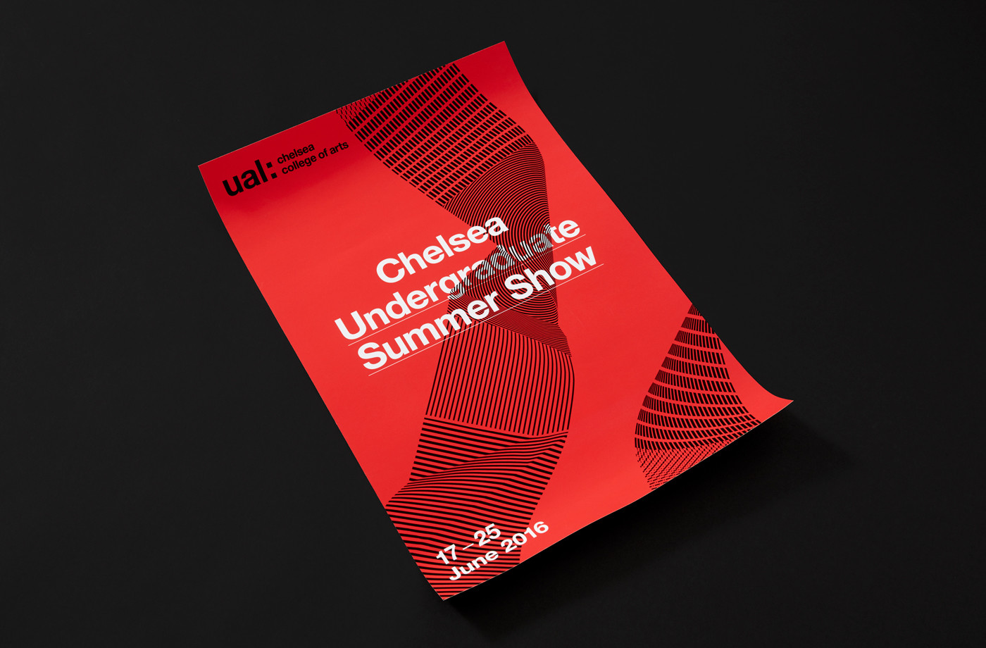
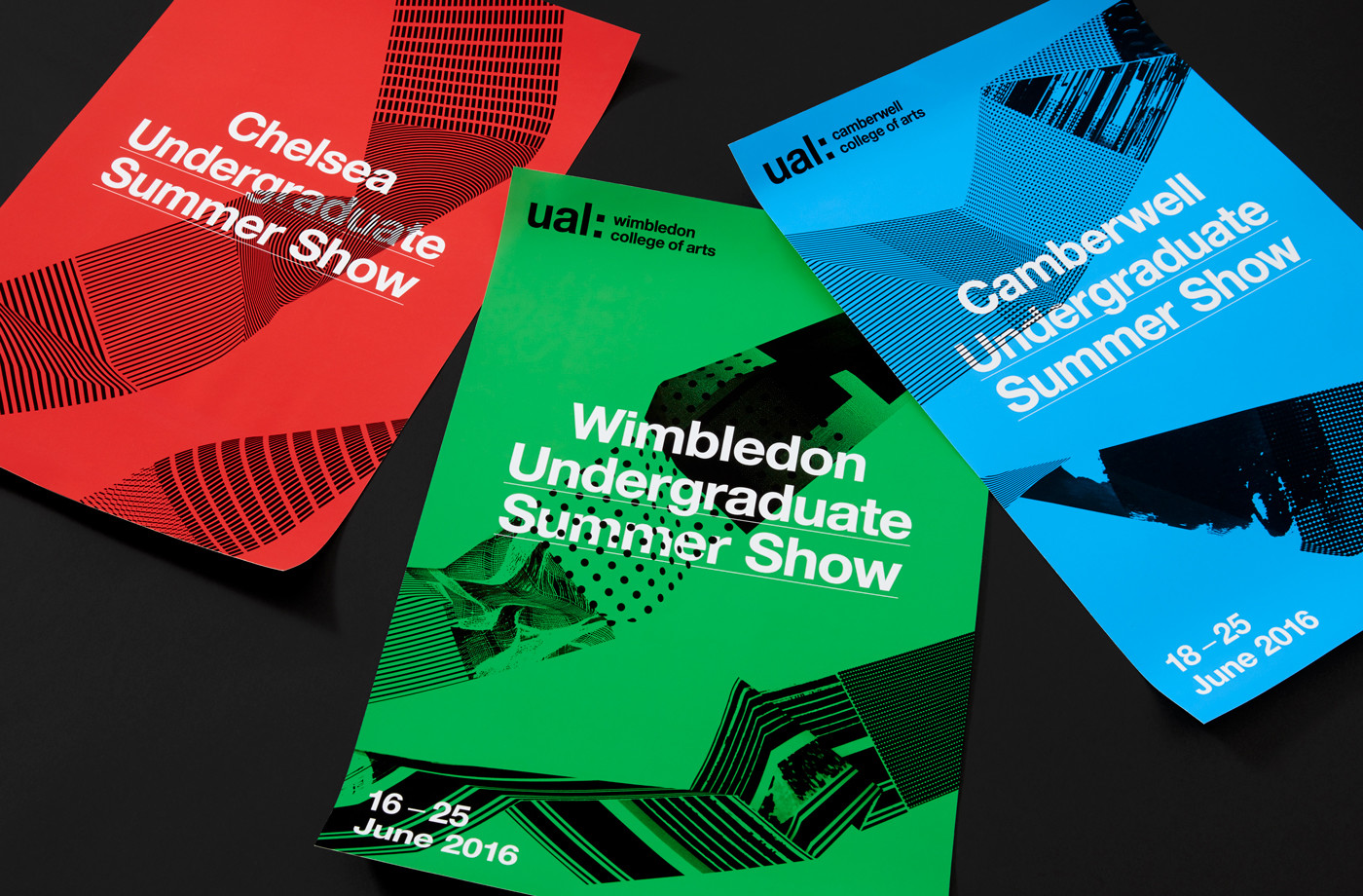
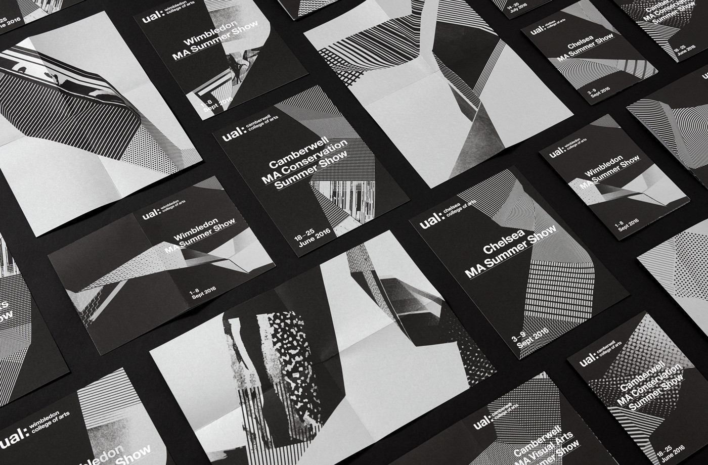
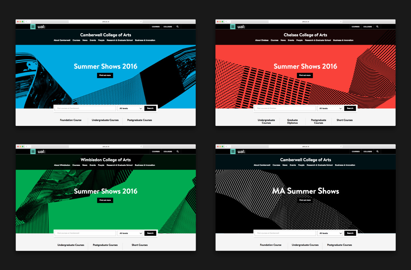
This week London-based graphic design studio Spy published images of their work on UAL’s 2016 campaign for the 2017–2018 academic year, developed for Camberwell, Chelsea and Wimbledon. Spy were commissioned, for the second year, to develop an engaging brand campaign that would drive student recruitment and brand awareness. The campaign included posters, brochure, flyers and animations.
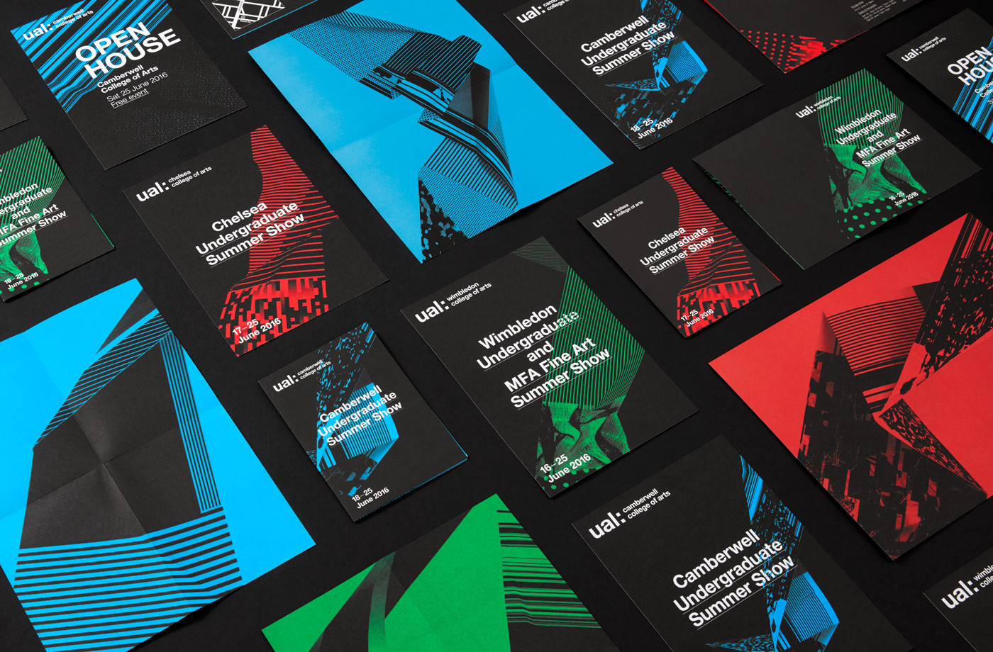
Spy’s work for last year’s campaign was bright, light and clear in its crafted foundation. Built around the scanning and shooting of found materials, textures and objects from the campus this conveyed some of the spirit of each college and worked well within the context of Pentagram’s visual identity system. The 2016–17 campaign is darker and distinctly more digital in nature but shares a similar crafted foundation as the previous year, and again shows the flexibility of Pentagram’s system to unite such different aesthetics and ideas.
The experience of being at art school is one of creative freedom, experimentation, curiosity and opportunity. The ribbons that proliferate Spy’s latest work for UAL are a visual expression of this and the educational journey. Although digital in their aesthetic these are, much like the 2016–17 campaign, physical in their origin. These began as printed strips of textures, images, patterns, materials and media collated from the colleges, sculpted and photographed, and finally, digitally manipulated to form fluid shapes. When static, these flow through printed materials over and under type, and online, twist across screen with a lovely sense of depth and fluidity.
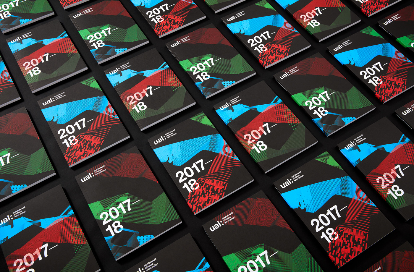
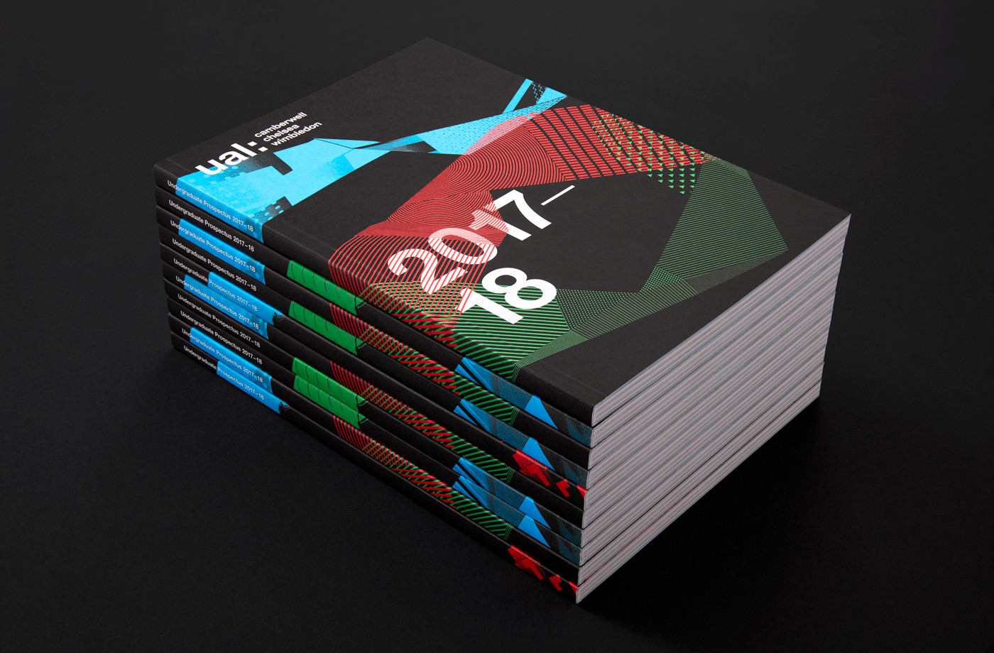
As mentioned in BP&O’s review of UAL’s 2015 campaign, brochure layouts take a conventional but well-implemented approach. Simple structures, type over image, appropriate typesetting, white pages punctuated by colour and photography makes sure that a lot of information is structured, broken up and not overwhelming. The approach to image layout; free from grid and occasionally overlapping, alongside the tone of content plays with the creative, personable and sense of place.
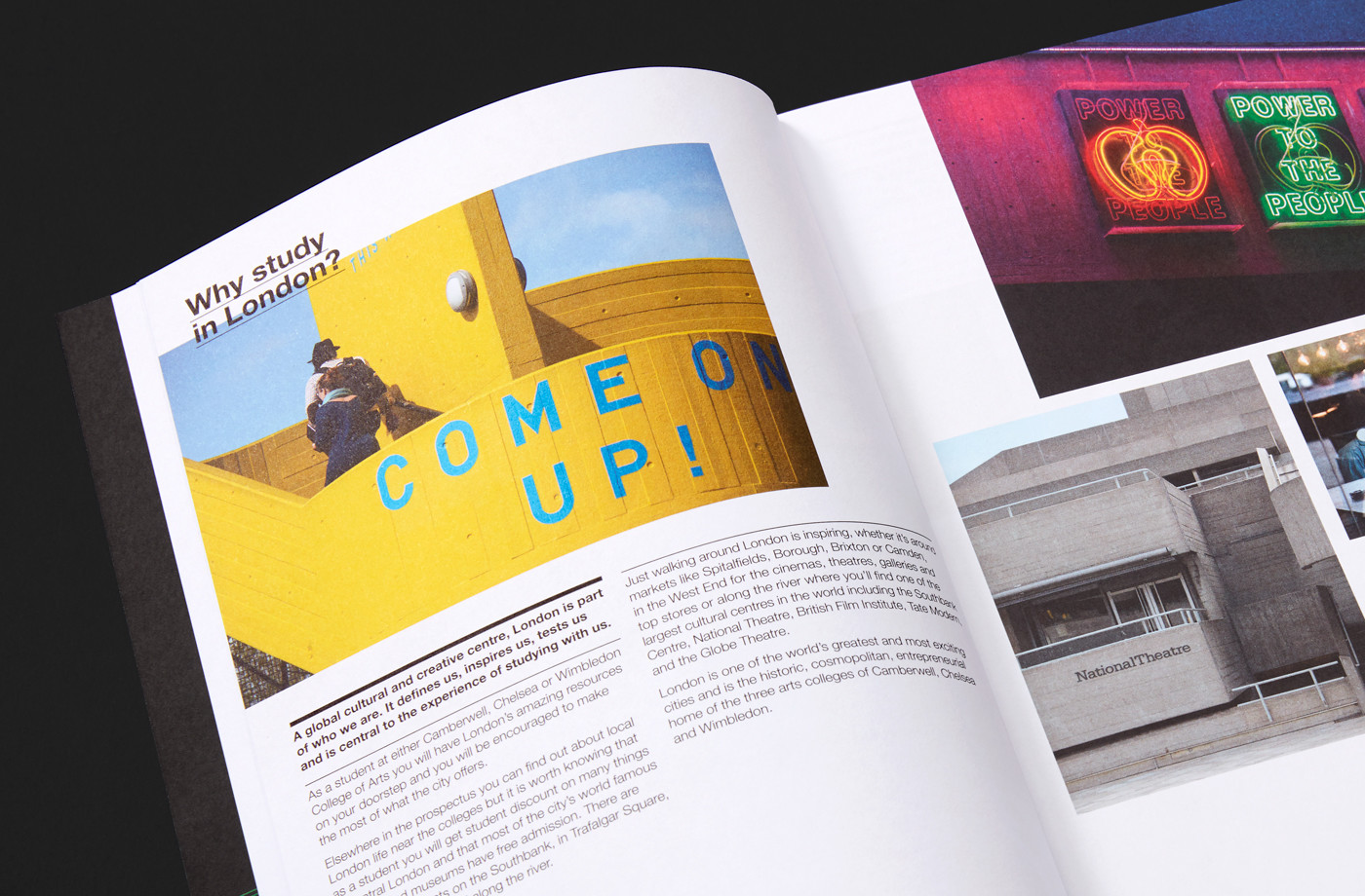
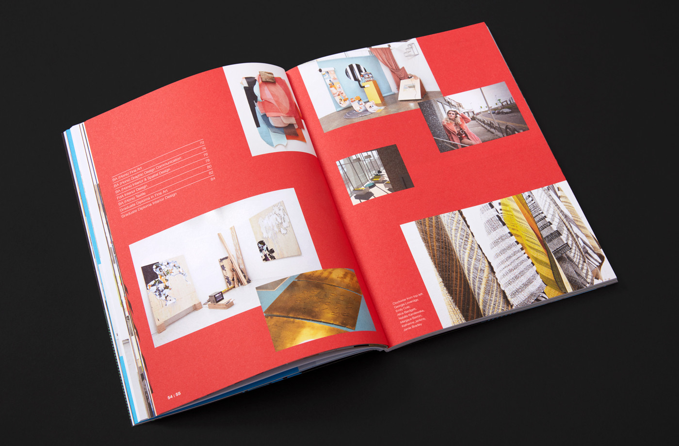
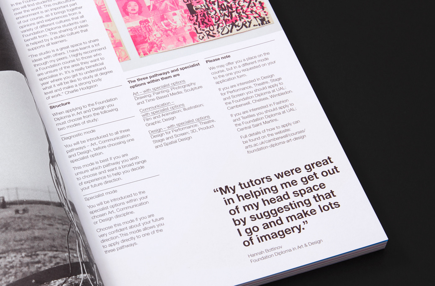
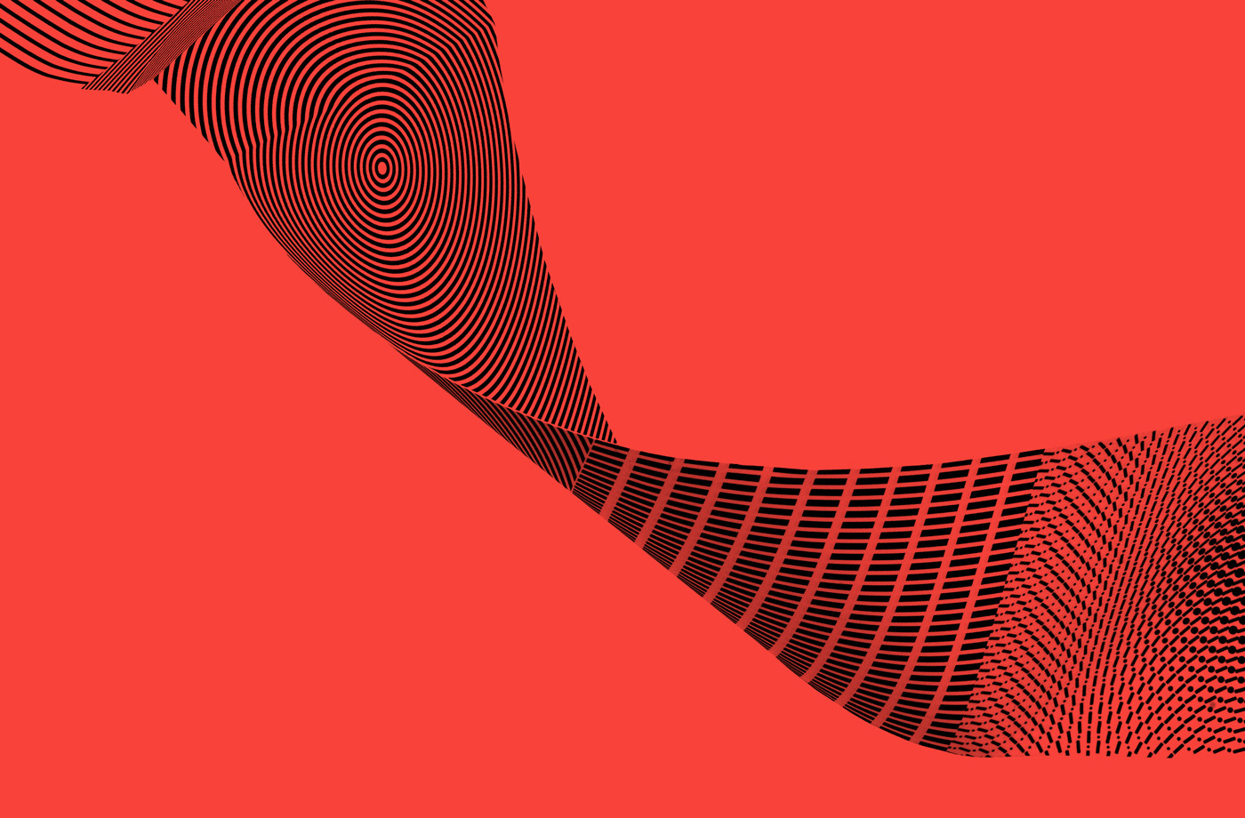
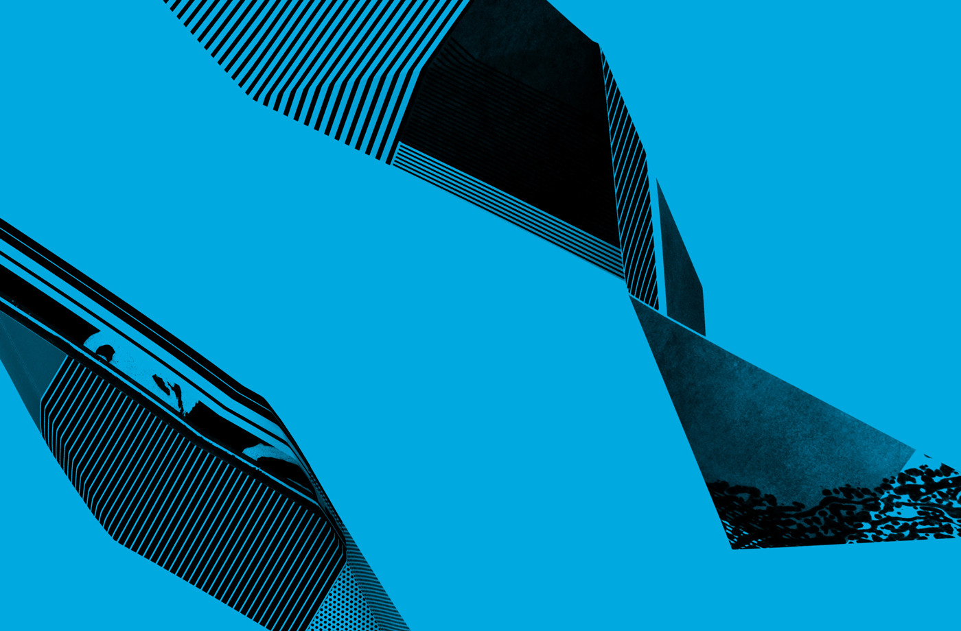
The ribbons are made up of media found at the colleges. These move between organised pattern, organic image and glitch. These are spliced together along ribbons, their single colour feeling like the negative of a photograph or continuous roll of a film, touching upon another part UAL’s programme of study.
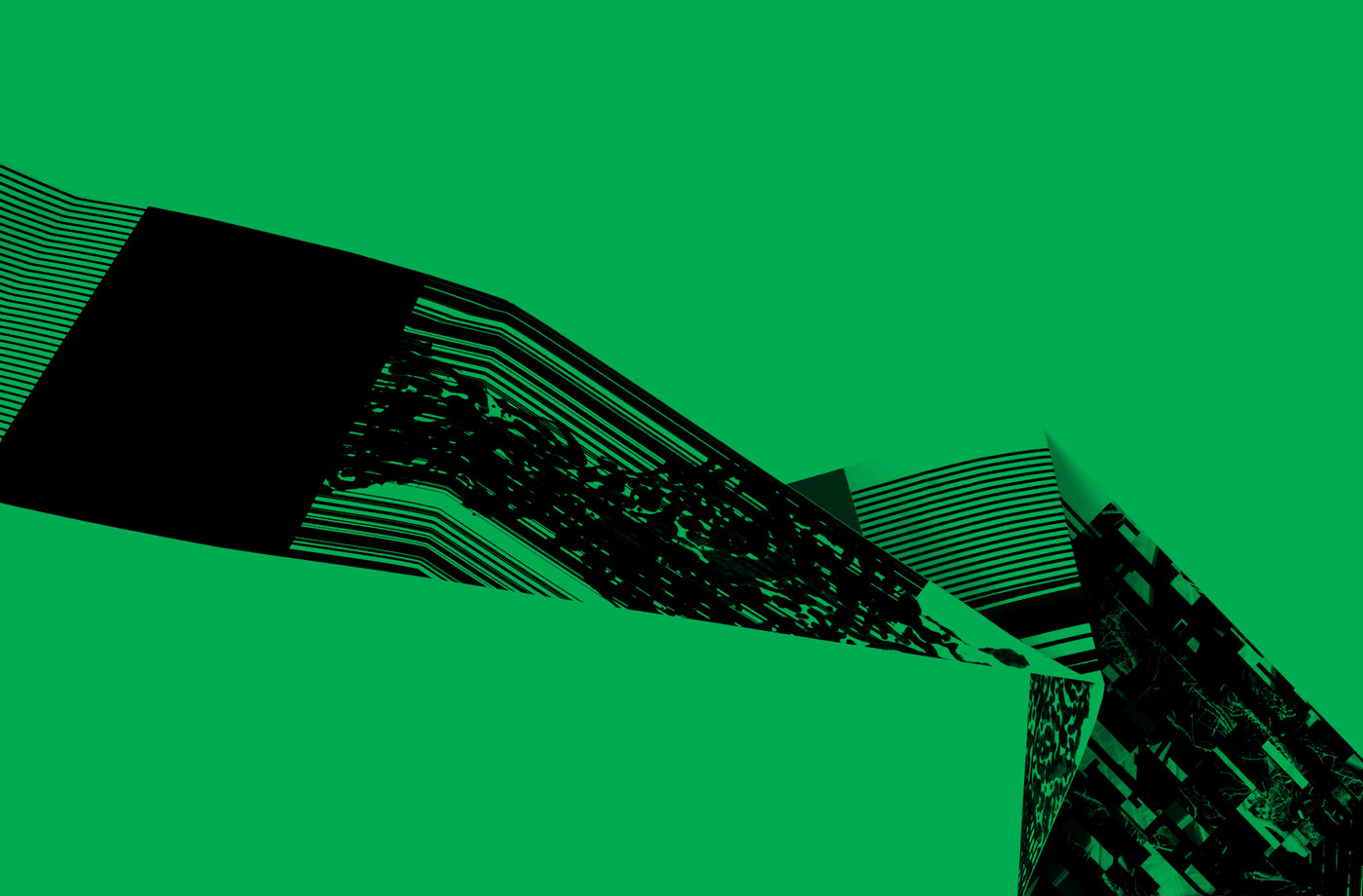
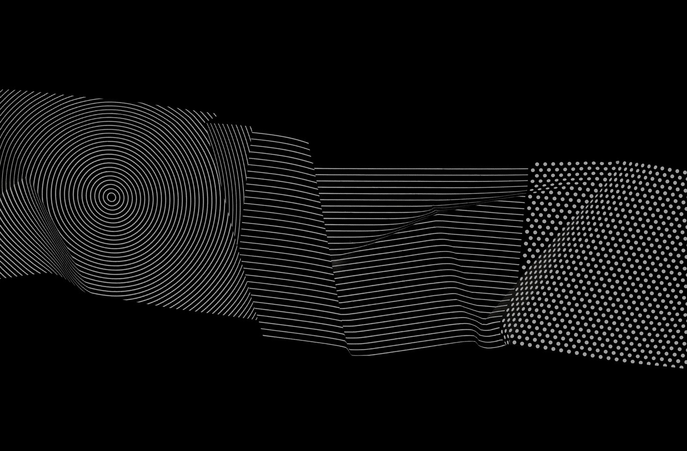
Spy manage to find a good balance between concept and intriguing aesthetic. The move between the physical and digital, the static and the animated, and the separation of RGB and use of black and white; adding in another screen-based and timeline component, works together the full compliment of today’s art curriculum and the available paths through it. Although the ribbons work best in motion, in print, the use of various crops, snaps shots of moments in time, provide plenty of variation across posters, brochures and flyers, deliver a nice sense of depth and detail alongside the more austere typographic identity system. More work by Spy on BP&O.
Design: Spy. Opinion: Richard Baird. Fonts In Use: Helvetica.
