Penley Estate by Parallax Design
Opinion by Richard Baird Posted 29 December 2016

Penley Estate is a family run winery established in 1989 by Kym Tolley and located in the wine growing area of Coonawarra, Australia. It produces wines that are described as having discernible regional character and are made from fruit grown in Terra Rossa soil; a red clay type created by the weathering of limestone. Penley Estate, since its inception, has produced a number of award-winning wines, and is recognised as the region’s leading producer of premium wines.
The winery worked with Parallax Design; a studio that, prior to this project, had spent time looking at the problems faced by wine producers of the Cabernet regions, to develop a new visual identity that would, not only express a change at Penley Estate, but also give Coonawarra Cabernet a more contemporary quality. This runs across new wine labels, website and livery.
Parallax Design’s work for stemmed from an investigation into the diminishing fortunes of the Cabernet regions of Coonawarra and Margaret River. Wine style, evolving tastes and brand were prominent questions and coincided with changes, informed by similar considerations, at Penley Estate.
With this shared understanding Parallax Design took the opportunity to relaunch Penley Estate with a mind for articulating the winery’s history in a way that would appeal to a younger market, but also present Coonawarra Cabernet in a more contemporary light. This can be seen in the proportionality of type, form, image, materiality and finish.


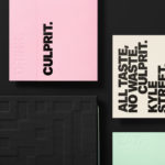
Parallax Design manage to draw a distinctive and contemporary visual expression from some familiar legacy cues. Where the high contrast strokes of wordmark, the traditional serif and etched illustration of labels and website work well to convey heritage, the use of laid paper, embossing, high build screen print and gold block foil print finish layer this with an umistakable sense of craft and quality.
This mix of the visual and material, impact from a distance and subtlety and detail up close are expected but well-suited to wine, a product of both prominent and more nuanced flavour profiles.
While visual and material cues are communicatively precise, discernible and well-intentioned, it is, however, the proportionality of these details that is of note. Type is downsized and simple form and image scaled up, with the division of the two further emphasised by orientation. The prominence of the Penley Estate globe is now elevated by its large coverage as a warm gold ink over a bright white paper, and in its juxtaposition alongside rich illustrative image.

The contrast of form and type, ink and space, detail and reduction emphasises each choice, its communicative intention and aesthetic qualities, taking the conventional and well-established cues of the wine industry and skewing these more towards the modern; an informed, impactful and concise visual expression.
Other highlights include the use of mythic rather than traditional wine making or provincial imagery, but with a similar etched quality, how brand story is better communicated, at length, online rather than on pack, and the way logo is an effective distillation of the richer qualities of label and the balance between contemporary positioning and an acknowledgment of heritage. More work from Parallax Design on BP&O.
Design: Parallax Design. Opinion: Richard Baird. Fonts Used: Lyon, Regular & Display. Papers: Killer White Uncoated.