Superkül by Blok
Opinion by Richard Baird Posted 26 January 2017
Superkül is an Canadian architectural firm with a portfolio that is described as having an understated boldness, subtlety and spacial richness, and a process that intends to find the essence of each project and remain true to this throughout design and development. Superkül has won many awards and is considered one of Canada’s most progressive architecture firms.
To celebrate their first ten years Superkül worked with Toronto-based graphic design studio Blok on a book that would both serve as a collection of work but also as a reflection of the firm’s unique philosophy and design approach. This was an exercise in discovery and a clarity of positioning which was then expressed materially through subtle paper transitions, finishes and printing techniques. This can be seen here.
Blok follows this up with the launch of Superkül’s new brand identity next week. Where book, in its comprehensive yet singular form could be seen as the strategic component of branding, one that clarified approach and direction, visual identity is the distillation and expression of this across of variety of new assets. These included wordmark, business cards, notebooks, packaging, stationery and website.

Much like architecture, the quality and value of outcome stems from a clarity of intention and a commitment to process, one that is strategic as much as it is visual. So, although a separate project, one conducted a few years prior to this, the book forms a key part of brand identity development, an exercise in positioning, the clarification of direction, values and principles. What is documented here is this article has its roots in the story presented in book, and in a similar way functions to give equal value to and make a direct connection between process and outcome. This book-first approach, although a product of happenstance, is a unique and unusual approach but grounded in the commonality of graphic and architectural practice.


Initially, brand identity appears graphically reductive, momentarily simplistic, and current in its expression yet there is a richness within this simplicity. Where other architectural brand identity projects might balance one or two ideas, Blok weave together, cohesively, quite a few, each rooted in Superkül’s understated boldness, subtlety and spacial richness.
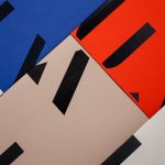
Individual shape and complete structure, concept, process and material result, light and shade, internal space and external space, detail and simplicity, the solid and the translucent are all touched upon. The value of these lies in their combination and weighting, their perceptible nature without identity ever feeling busy.

Blok’s work effectively plays with light and shade. You can seen this in the use of white and black inks and the shadow cast by a deep blind embossed print finish. However, and more unusually, this is explored in the use of gradation, giving two-dimensional image three-dimensional qualities, and the way that this is then more explicitly connected to the considerations of natural lighting within internal space, and how the passage of time, within the day and across seasons, effects this space. This is neatly articulated in the website’s splash page. Process, image and communicative intention combine with time-lapse photography that captures, over time, the forms–drawn out by light and shadow–of Superkul’s award-winning building Compass House. This is a particular highlight and gives value to the simpler uses of gradation in conjunction of form within the static contexts of print. Gradations appears across notebooks, postal tubes and website.

Contrast is used effectively to emphasises the communicative intentions of each element. It helps to draw greater value from fewer components, something that is a fundamental aspect of Superkül’s work.
Form and print finish elevate process and give further meaning to outcome. The best example of this would be in the intersection of wordmark and shapes that call to mind the work of British sculptor Richard Deacan. It is again worth noting that much of the value of these comes from perceptible rather than abstract ideas, and the clarity of their intentions. Although there is a nuance to the work, it feels rather more open to an objective rather subjective understanding, particularly within the context of an informed and design literate audience.
There are a few different juxtapositions going on within this simple graphic expression. Aside from the more obvious contrast of light and dark, wireframe structure and internal space, the robust and the dynamic, there is, in the process of silk screen layering, a lovely contrast between the opaque and the translucent. The building up of ink, its layered visual qualities and the intersection of colour and form says volumes, yet remains aesthetically simple.

Wordmark draws value from its commonality with previous iterations. It shares a similar favour for all lowercase typesetting and sans-serif forms, however, refines this, and with the addition of one simple gesture, which ironically involves removing something, manages to communicate a lot more, with less.

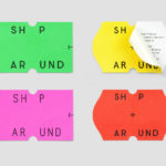
Where graphic motif and typographical form play with structure within a printed context, packaging and materiality of identity is more explicit in its relationship to the physical qualities of contemporary buildings. This is perhaps most clearly seen in the robust shapes and material of packaging, but also exits more subtly in the selection of papers and boards.
Again, a clear relationship between process and outcome is formed. Specifically in the sourcing of heavy papers and a printer that could tolerate such weights, alongside considerations given to texture, colour and imperfection that has more in common with concrete than paper. Greater value is given to these by pairing them with smoother, more refined substrates elsewhere.


Although identity is rich in process, material and finish, graphic expression remains minimal. A variety of wire frame forms, different shades of grey (which ties in with gradation and the light and shadow of splash page), solid inks, blind emboss, and packaging structure provide plenty of variety, breaking from potential of repetition, effectively using its few graphic assets as vehicles for the articulation of process and the material.


Much like Blok’s work on the Superkül book, website plays with process and portfolio. This is typically articulated through words and images, however, Blok finds a connection between the two in a number of ways online, not only in the splash page, but in the transitions between pages, which feature subtle movements designed to create a sense of flow, but also in the use of what the studio describe as interstice, or intervening spaces, that provide moments of insight in between project pages into the things that inspire Superkül architects. This is due to launch Monday. More work by Blok on BP&O.
Design: Blok. Opinion: Richard Baird. Fonts Used: Circular & Brown.

Material & Print Specifications:
G.F. Smith Colorplan Cool Grey
G.F. Smith Nomad, Grey Smooth
Offset printing
Silkscreening
Debossing