AIGA Design Conference by Mother Design
Opinion by Richard Baird Posted 17 February 2017
The American Institute of Graphic Arts (AIGA) is a professional design organisation with a membership that covers all forms of visual communication, from graphic design, typography and interaction to branding, motion graphics and environmental design. As well as supporting a community of over 25,000 nationwide members, advancing design as a professional craft, strategic advantage and vital cultural force, AIGA organises two biannual events; the AIGA Design Conference and GAIN: AIGA Design and Business Conference, which are held alternating years.
In 2016, the AIGA Design Conference became an annual event. This marked, after 100 years as standard-bearer for professional ethics and practices, a moment of transition, and the implementation of a new vision; to become a hub for “broader creative constituencies”.
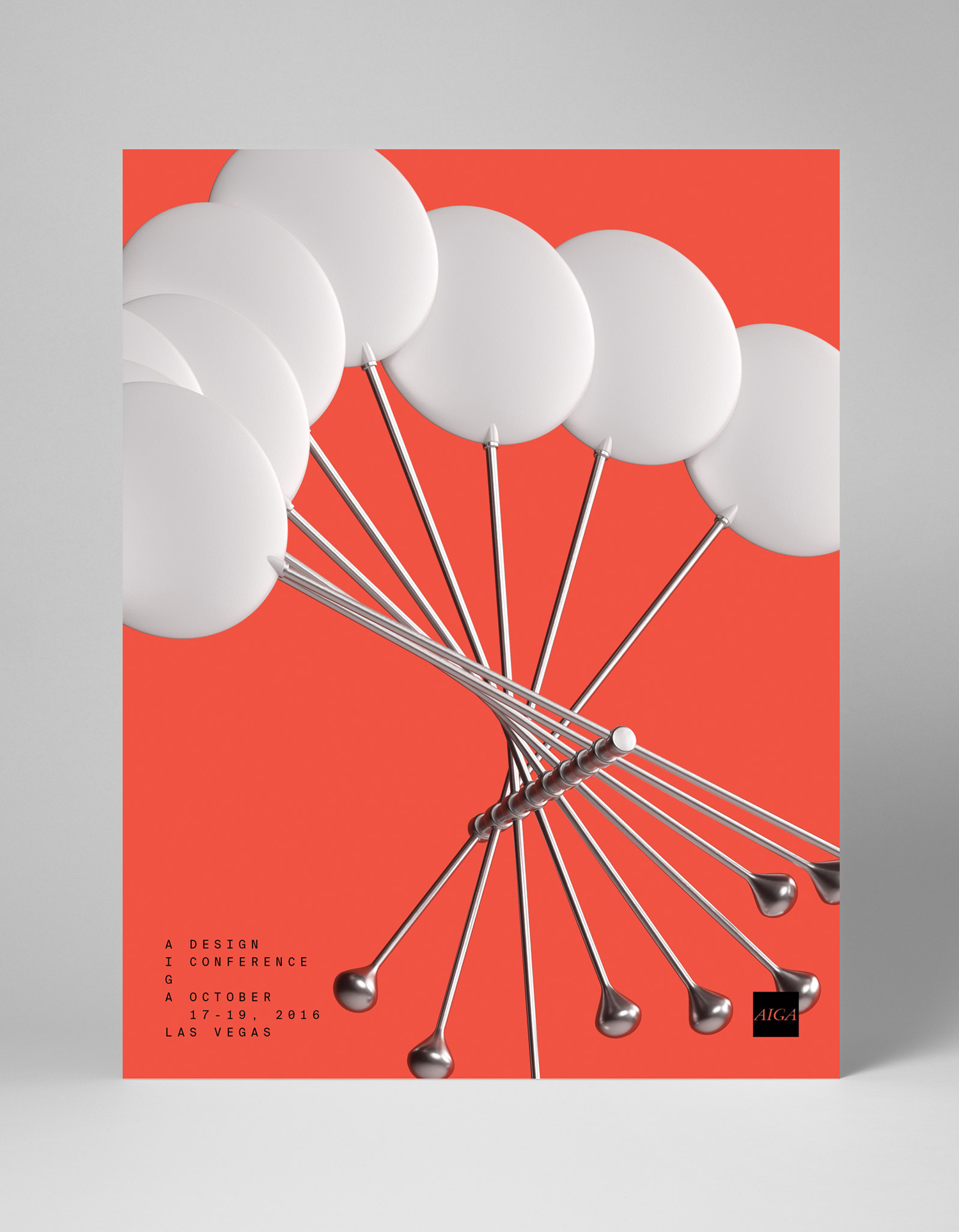
Taking inspiration from the evolving nature of organisation and the unexpected ways that a diversity of people and ideas come together in one place, New York-based graphic design studio Mother Design created a multi-coloured visual identity of unusual forms, juxtaposition and sense of change for the AIGA Design Conference. This was implemented throughout the Las Vegas conference which took place between 17 – 19 October 2016.
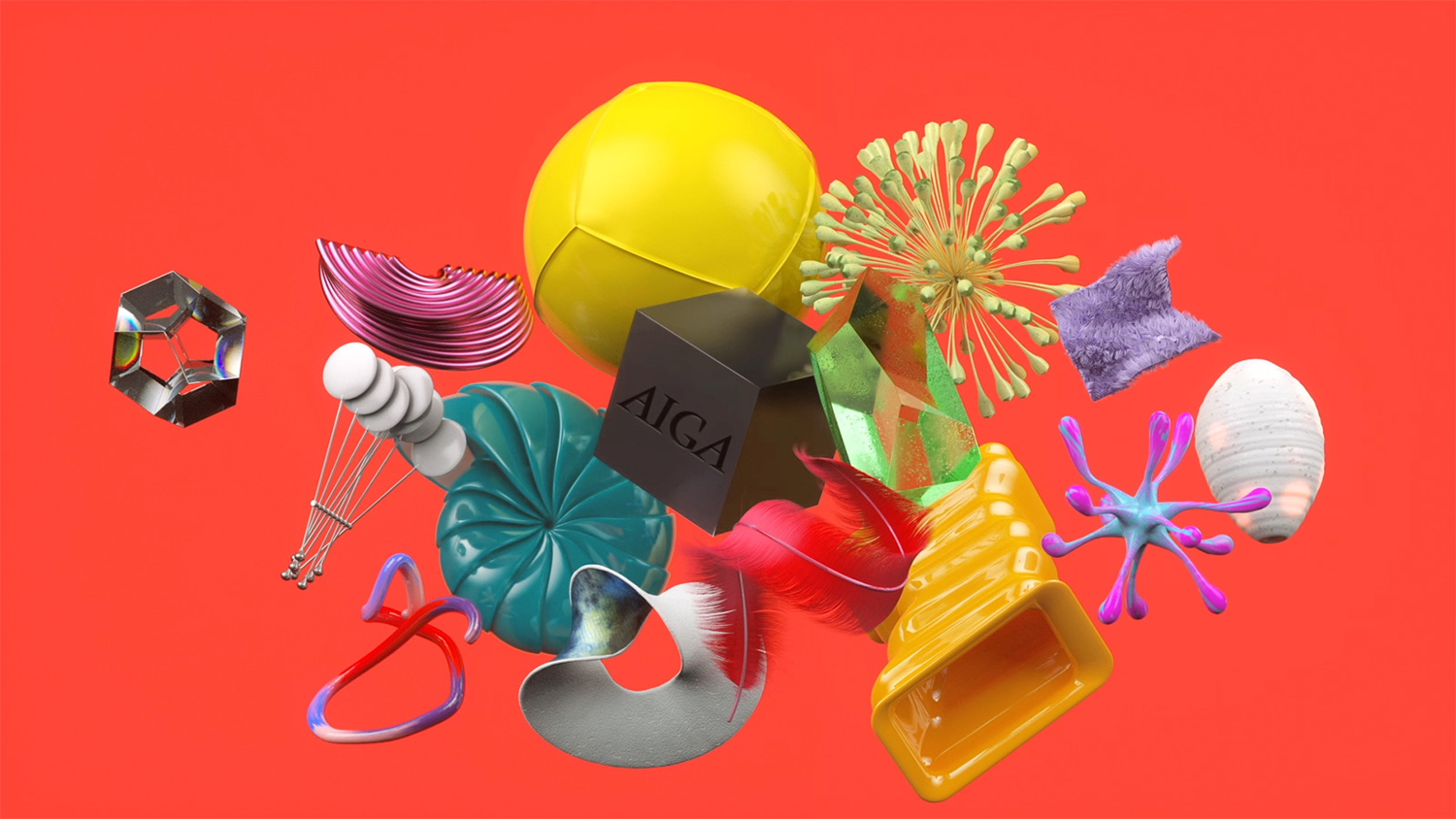
“Our design solution became a metaphor for the organisation and annual conference itself: evolving over time and embracing the beautiful, messy and sometimes unexpected ways that people and ideas come together in one place. Strategically, the AIGA “cube” represented a magnetic center of gravity–drawing design disciplines together while dimensionalising and fostering all kinds of inspiring interactions and collisions along the way.” – Mother Design
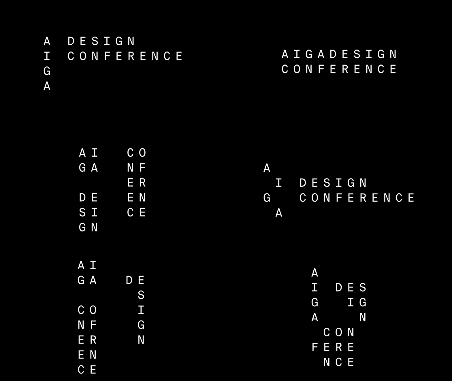
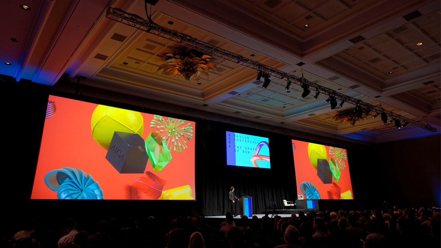
The idea of a magnetic AIGA cube, drawing together and uniting design disciplines, is perhaps distant as a static image but more explicit in motion, acknowledging compelling format (large screens), context (creative diversity) and environment (of motion and interaction), and builds out from there across a variety of print communication. Identity is made up of two opposing visual expressions, the mechanical and technical qualities of monospace type and its grid-based arrangement, and the dynamic, often organic and material qualities of image.
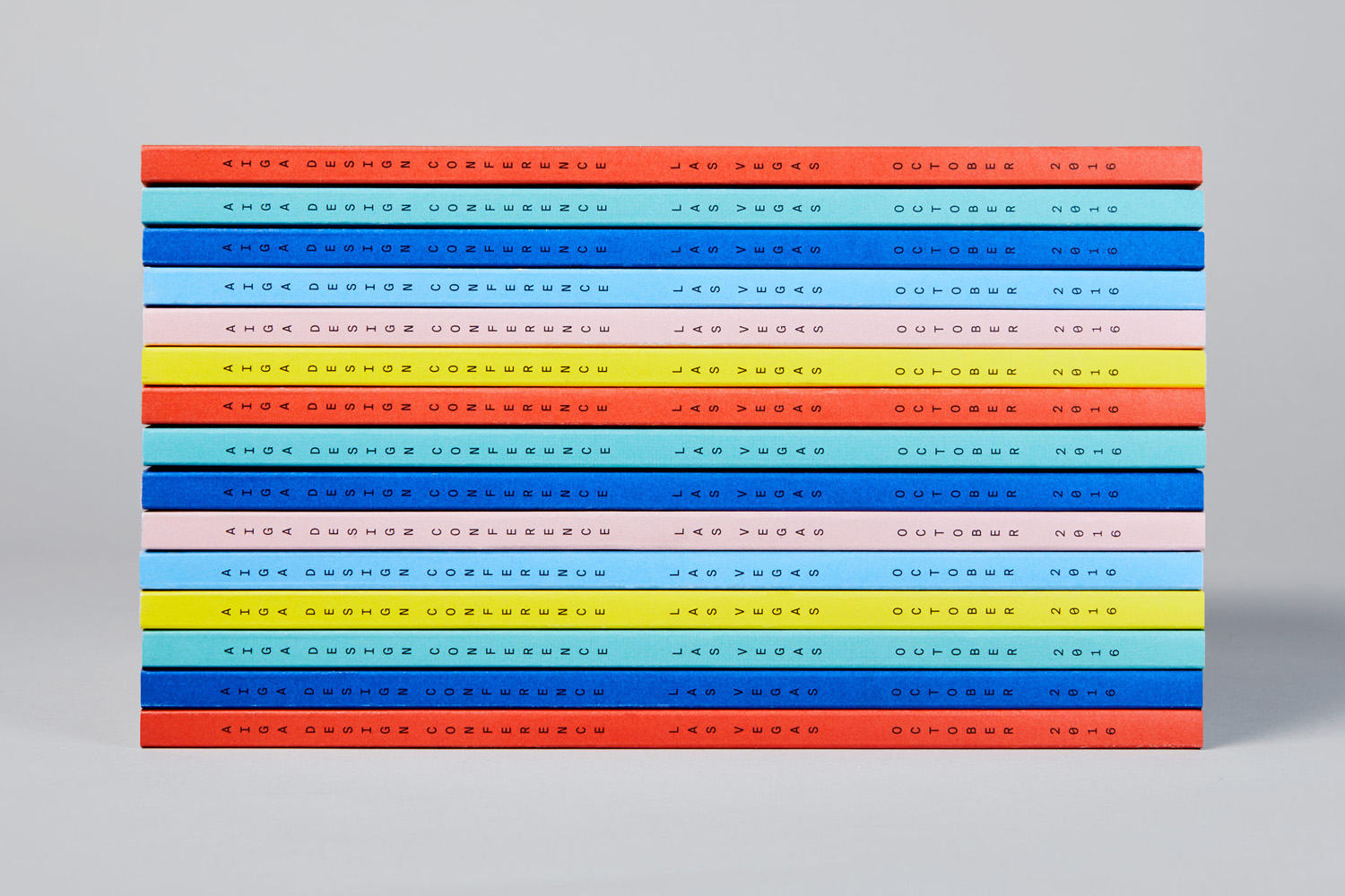
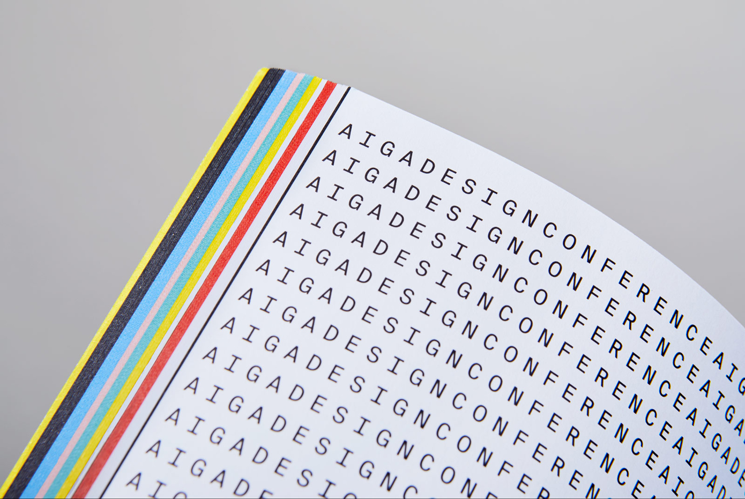
The singular and unwavering use of Swiss Typefaces’ Suisse Int’l Mono functions as an anchor to the motion and variety of image in its monolinear lettershapes, monospacing and grid-based arrangement. It finds a balance between the precise delivery of information and, more conceptually, reflects the often systems-based nature of design and the mechanical, electronic and digital reproduction technologies that aid its implementation. This feels particularly relevant for an organisation that is over a 100 years old.
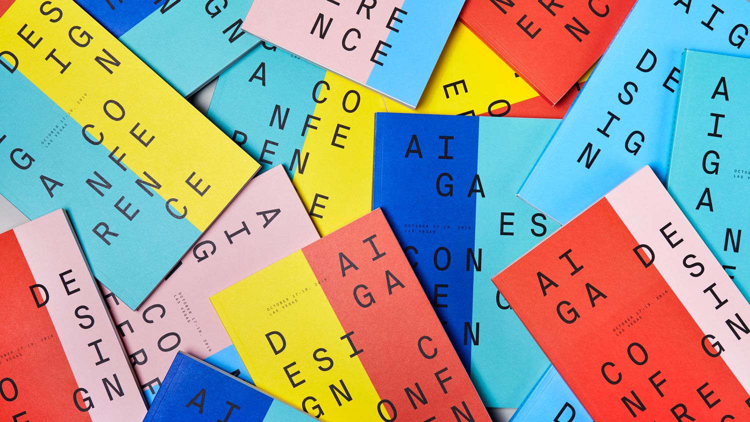
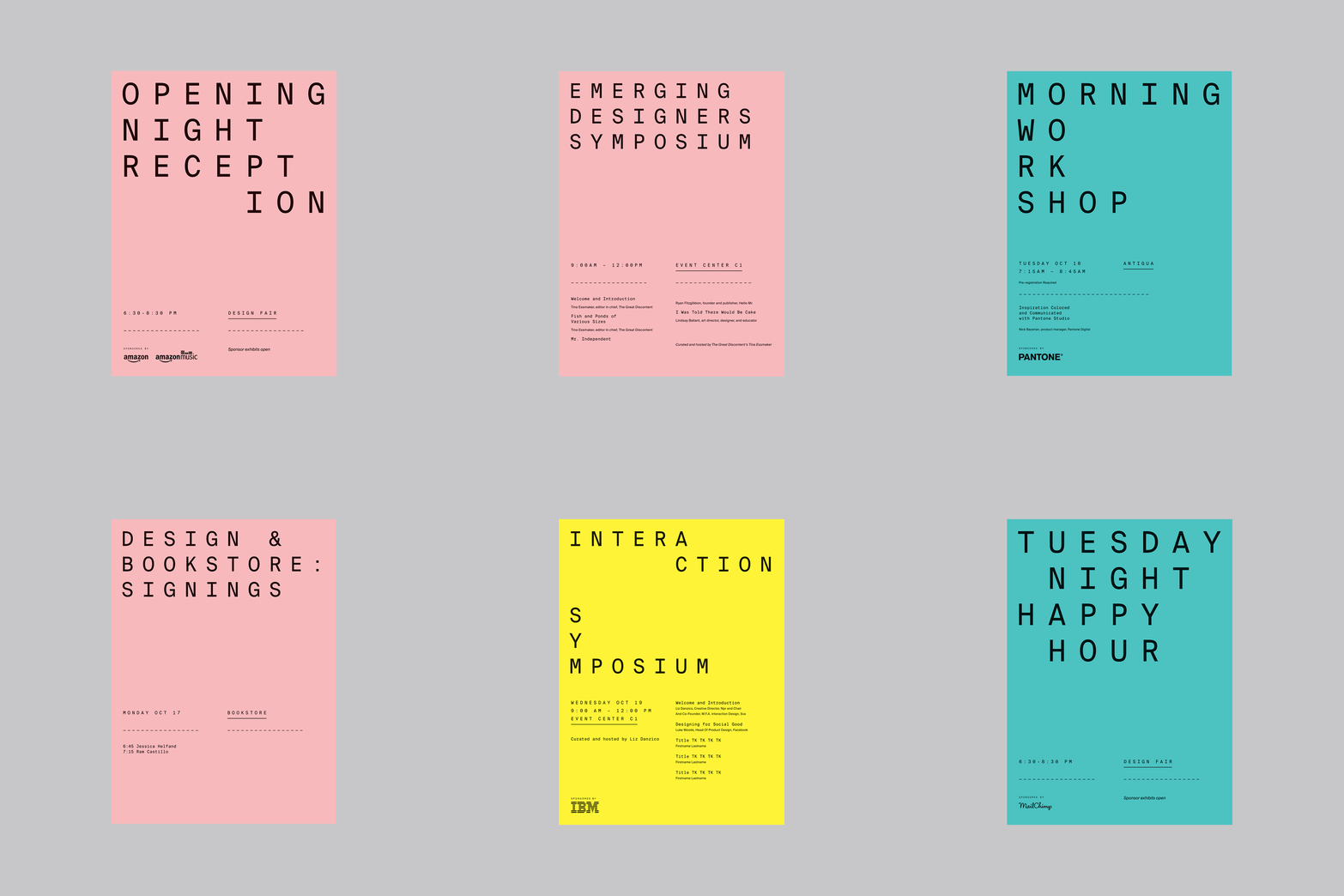
A broad and cheerful colour palette provides significant contrast to the impersonal and mechanical qualities of type and begins to work in a sense of diversity and character, which is then explored more explicitly through form. These have impact as single inks but also convivial and eye-catching in their pairings. Both type and colour are elevated by their oppositional nature and the way that these are worked together, conforming to grid, and with colour bisecting letters.
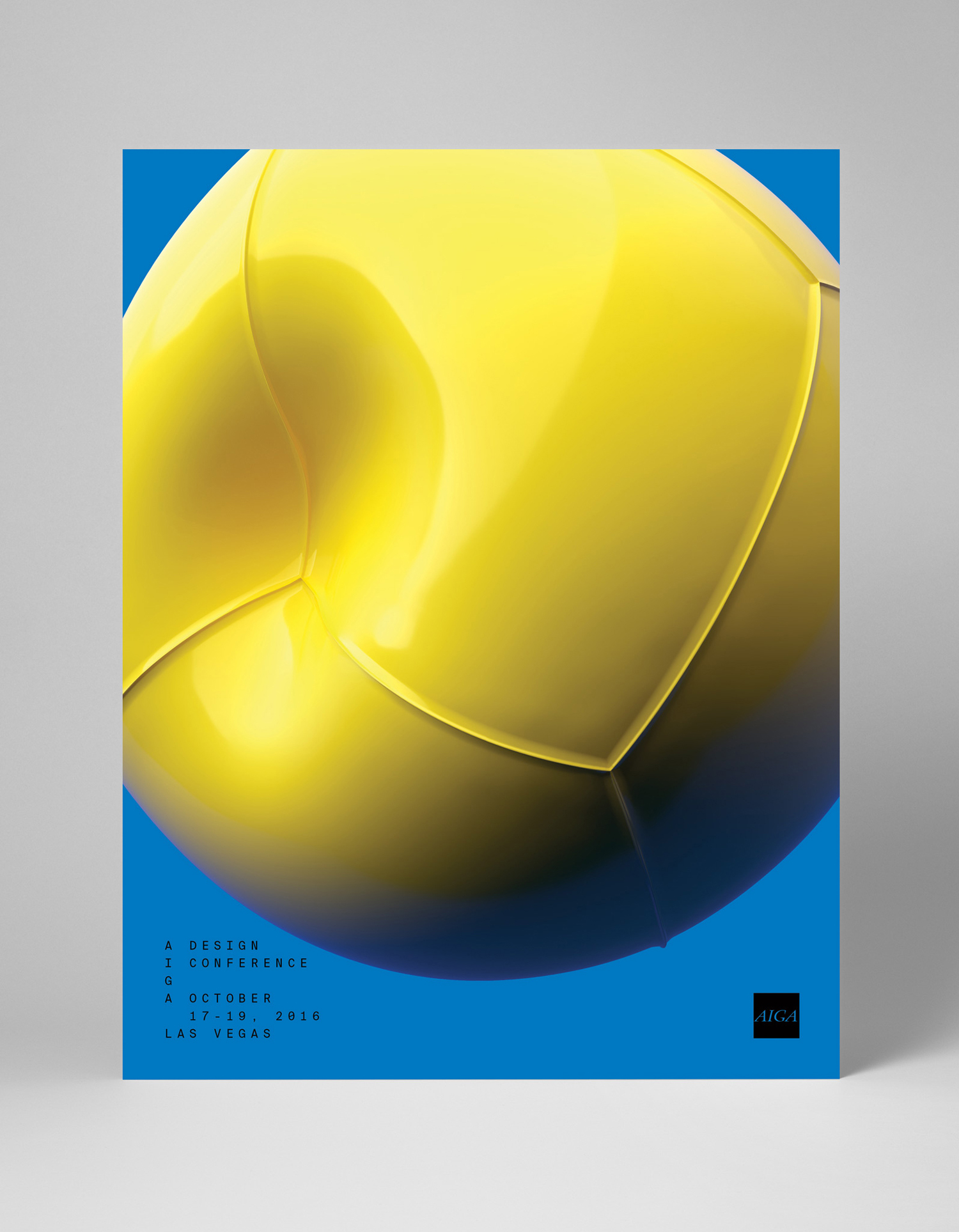
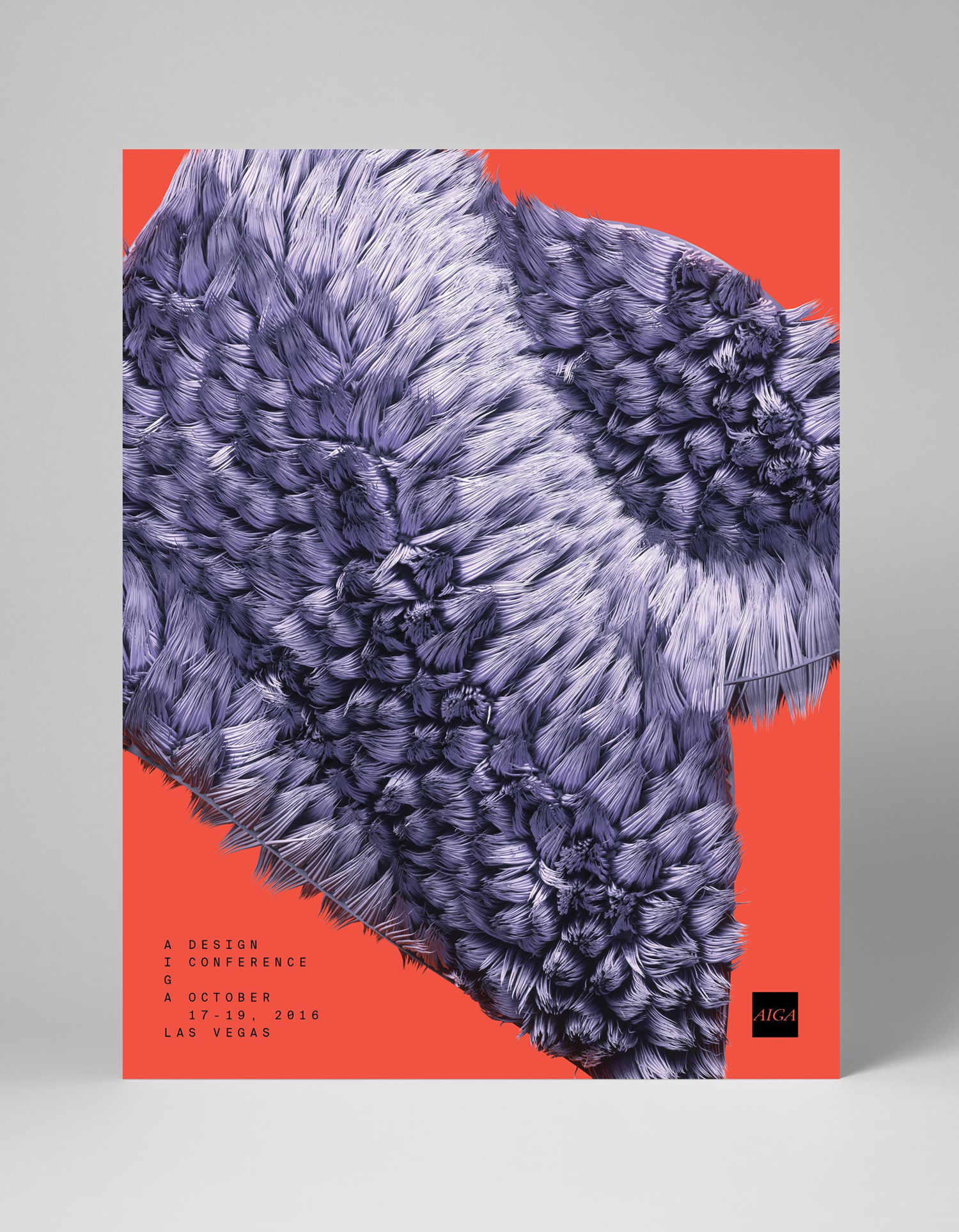
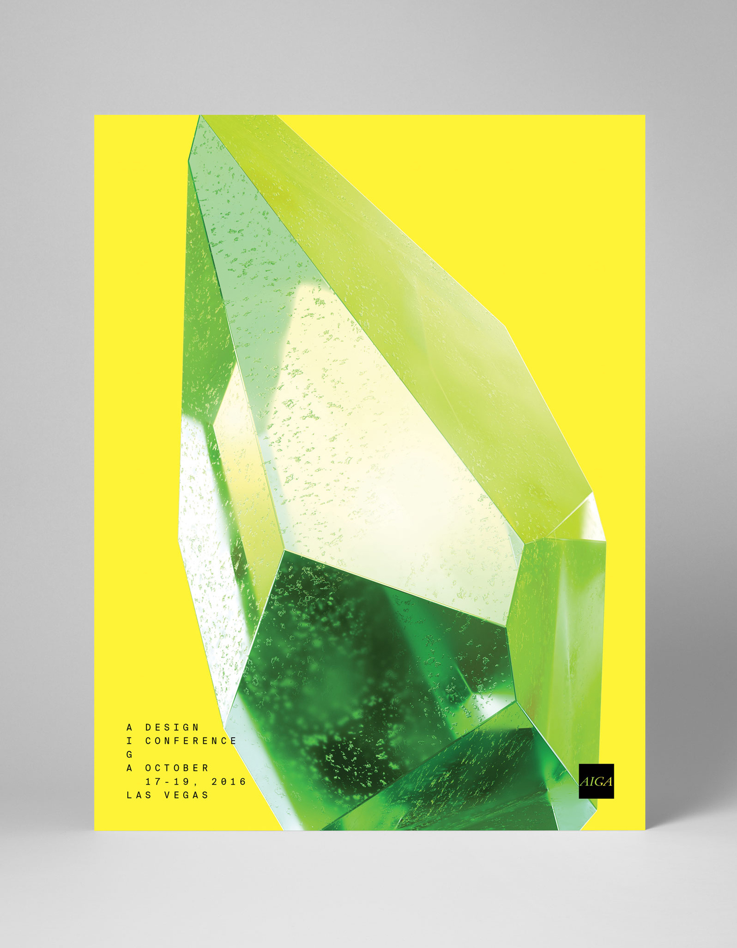
The shape, colour and texture of three-dimensional models work well as an expression of diversity and give the project much of its character. Where type is precise shape is impressionistic. There is a difference and visual interest to these, collectively and individually, with a good eye for finer detail and a sense of the material.
Particular highlights include the impurities of cut stone, the furniture-like joints and the seams of moulded plastic. These are unusual and disparate forms but share a “designed” quality. A good use of proportionality, juxtaposition and cropping provides shapes, within static contexts, a sense of being in motion or in transition.
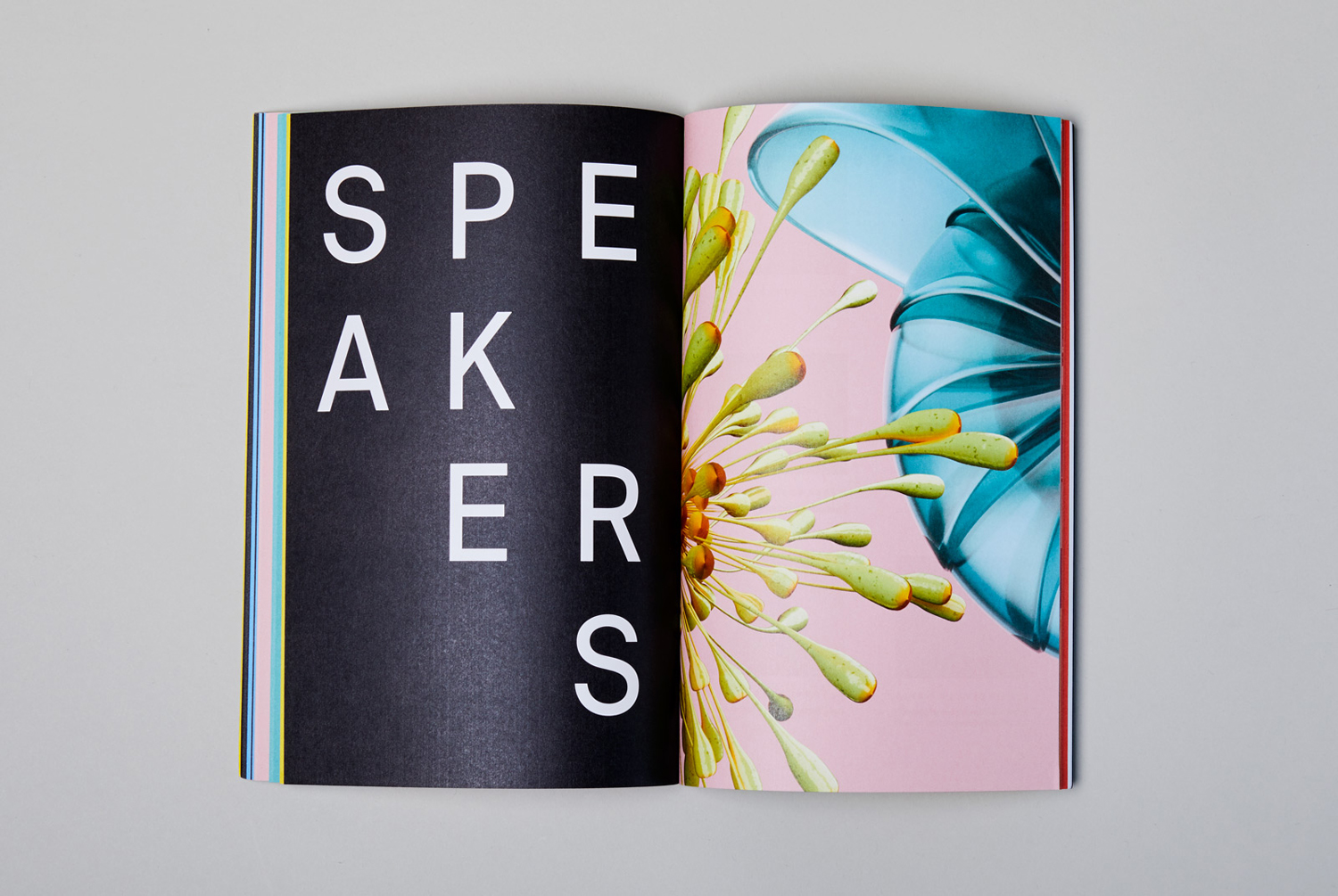
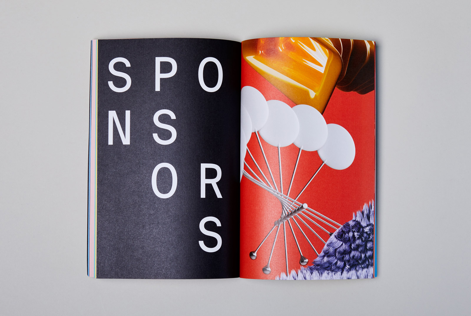
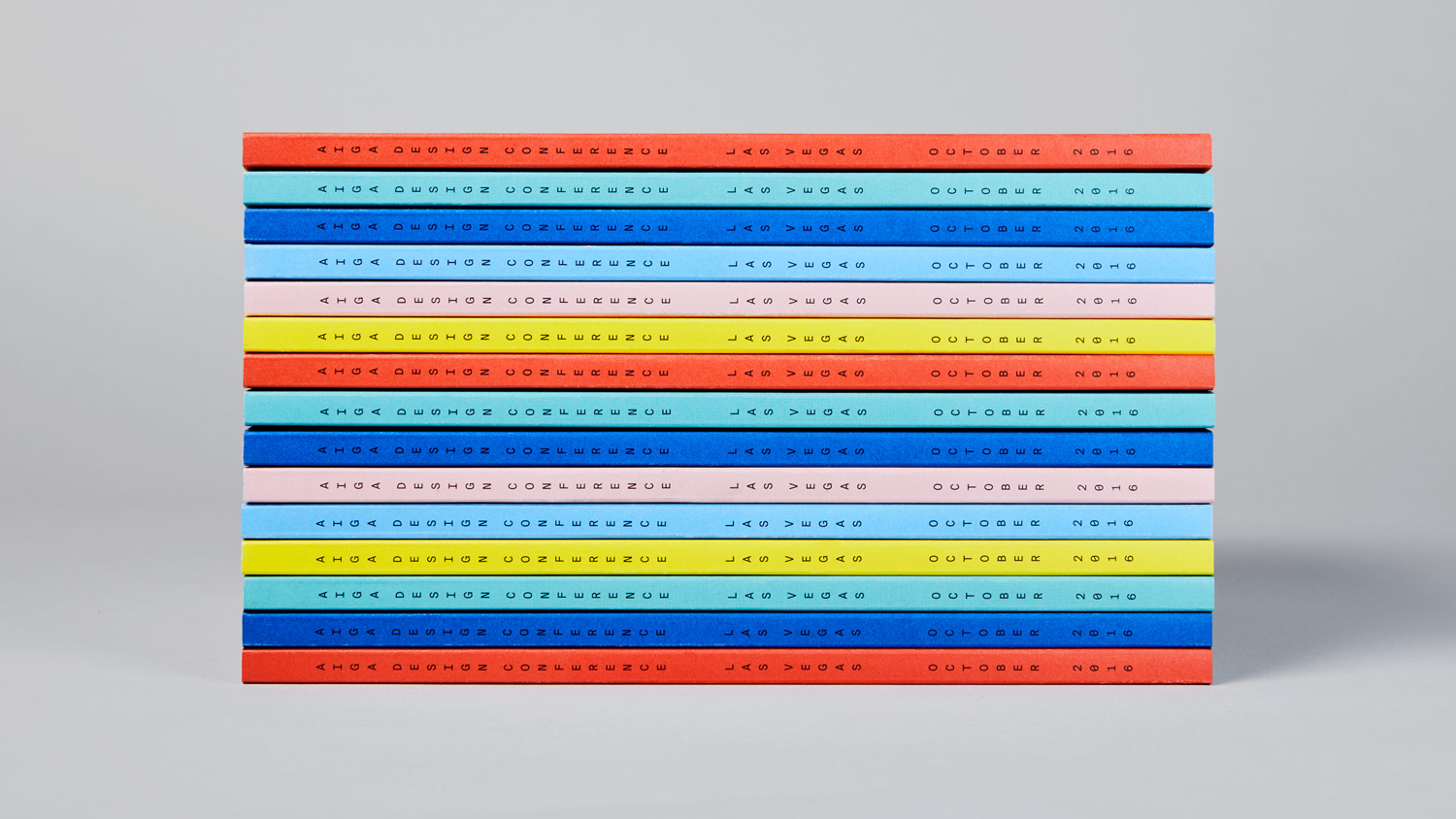
Although type, colour and image are disparate in tone; be that in the mechanical and impersonal nature of type alongside the conviviality of colour, or areas of single ink next to the detail of image, these are bound by a sense of change. For example, type is rearranged and animated within grid, it can be big or small, a single piece of communication or used as pattern. Colour is applied as a solid background, used with or without image, or paired and bisecting page. Elsewhere, shapes move and interact on screen and in print used individually, blown up and cropped across posters.
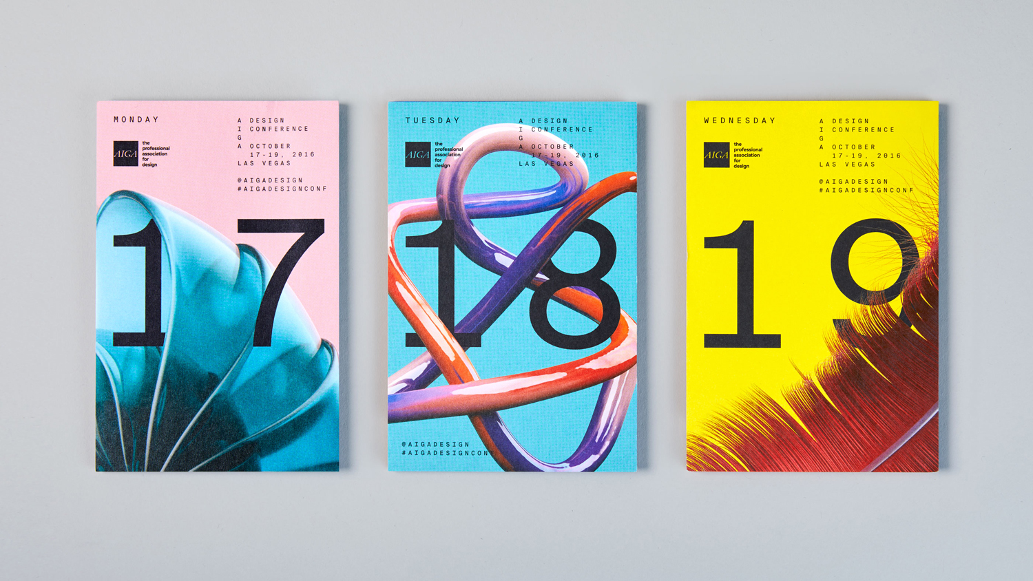
There is plenty of variation, and a good balance of concept, aesthetic interest and a clarity of communication. The work has a flexibility, an ability to dial up the visual and compelling (above) or down to single colour and black type, yet retains a sense of continuity. There is room to change. Colour palette and shape can be switched up to keep identity fresh and distinctive whilst maintaining conceptual foundation and an aesthetic commonality. More work by Mother Design on BP&O.
Design: Mother Design. Opinion: Richard Baird. Fonts Used: Suisse Int’l Mono.
