Galipette Cidre by Werklig
Opinion by Richard Baird Posted 27 February 2017
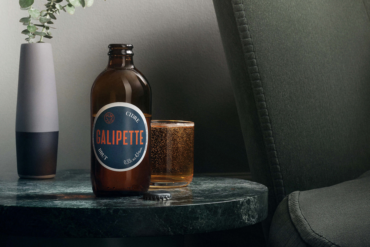
Galipette is a premium cidre made from 100% pure fermented apple juice (pur jus) pressed from apples that are hand picked from orchards in Brittany, Northwest France. Galipette is available as a Brut and a sweeter Biologique. These are free of gluten and added sugar and created for the international markets of Europe, North America and China by the Cider Supply Company, a businesses founded on the values of local craftsmanship and European cidre making heritage.
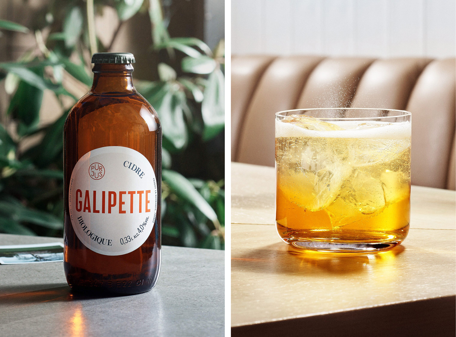
With the intention of engaging a market made up of urban, quality seeking people who appreciate freshness and the legacy of French Cidre, Scandinavian studio Werklig created a brand identity, packaging design and website that, rather than leveraging the rural aesthetic that proliferates the category, finds a comfortable balance between heritage cues and modernity, the familiar and the distinctive.
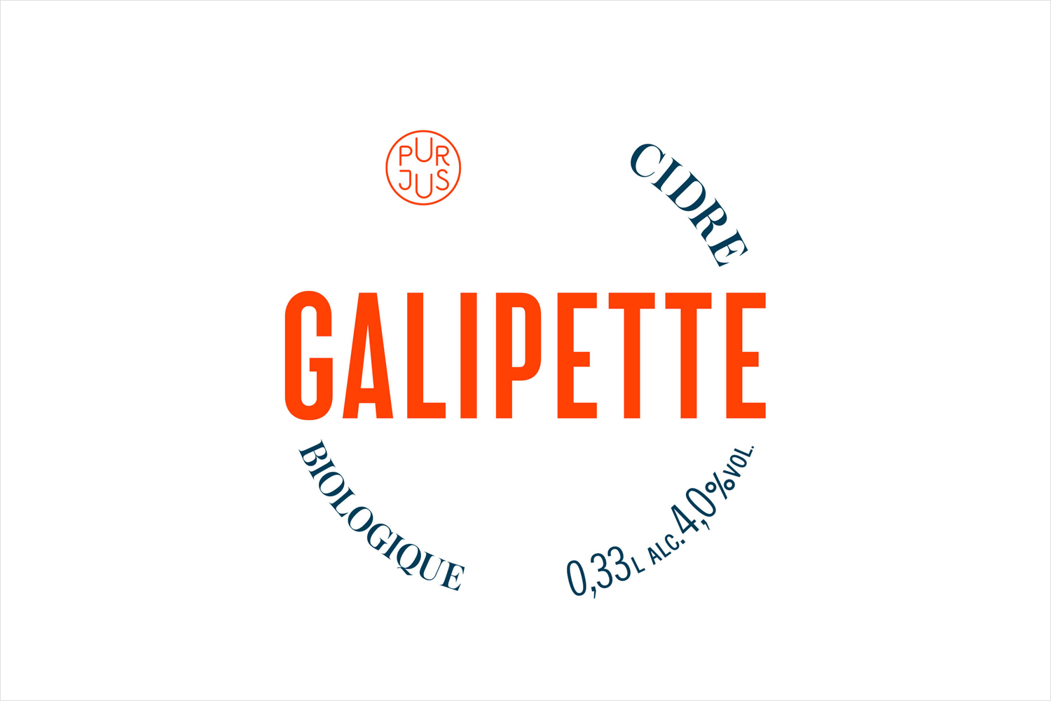
Drawing on the name Galipette, the French word for somersault, Werklig manage to draw a distinctive rolling quality from the more familiar meeting of heritage and modernity, impact and elegance. These can be seen in the juxtaposition of type, a mix of bold condensed sans-serif characters and the finer flourishes of a serif, the circular label and the layout of type, the use of space, and in the choice of structural design, a short amber bottle common to beers but, as yet, unused by cidres.
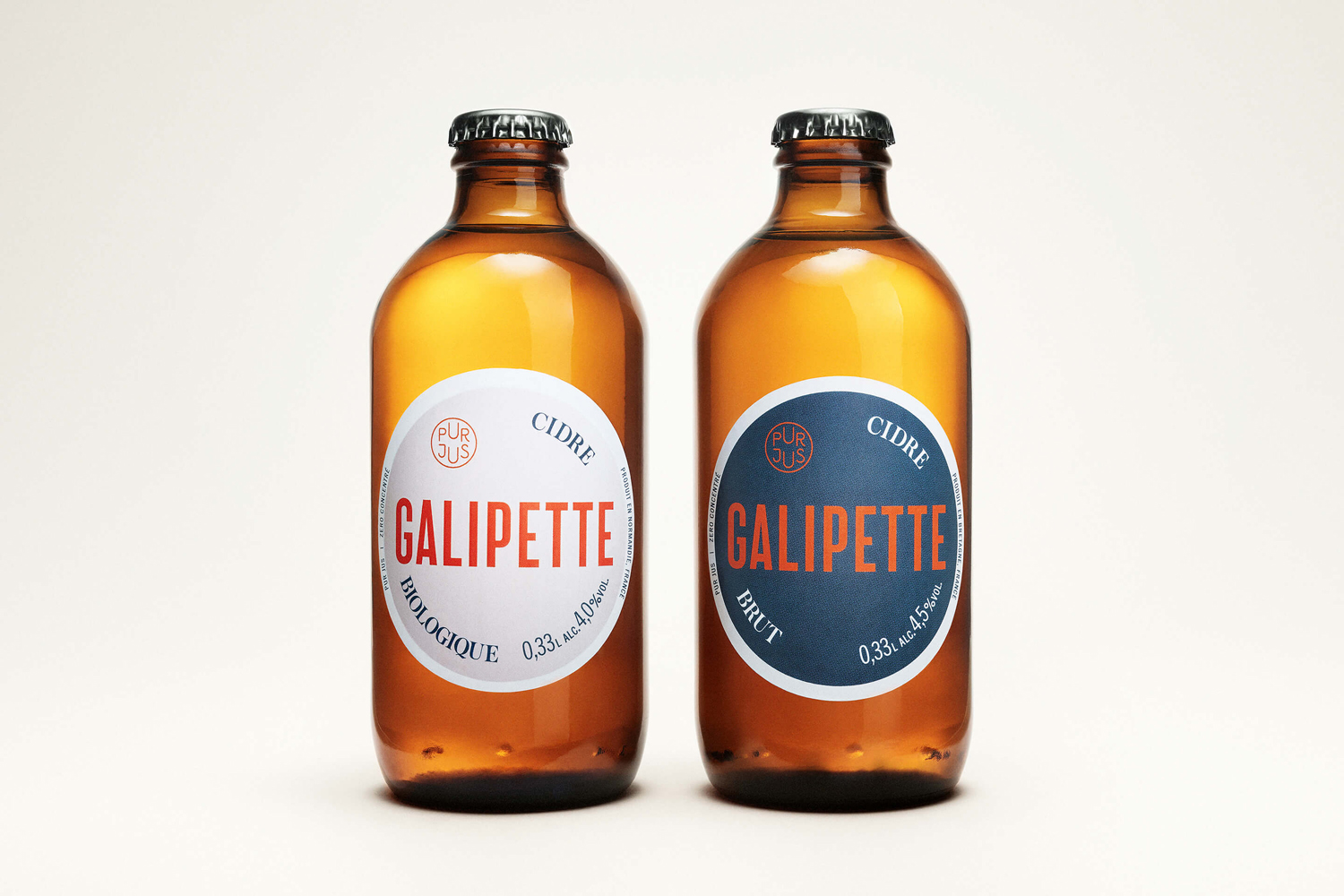
Type choice and layout, the radial qualities of label and typesetting, and the small, quirky and monolinear qualities of Pur Jus mark are aesthetically and communicatively familiar. These draw on well-established design language yet manage to look fresh, providing both bold initial impression and finer detail upclose, and a little conceptual character in the rolling of type. Logotype functions well to distill these ideas down into a simple two part graphic expression, a particular highlight, that has impact, is communicative clear in its contrast yet distinctive in its formatting.

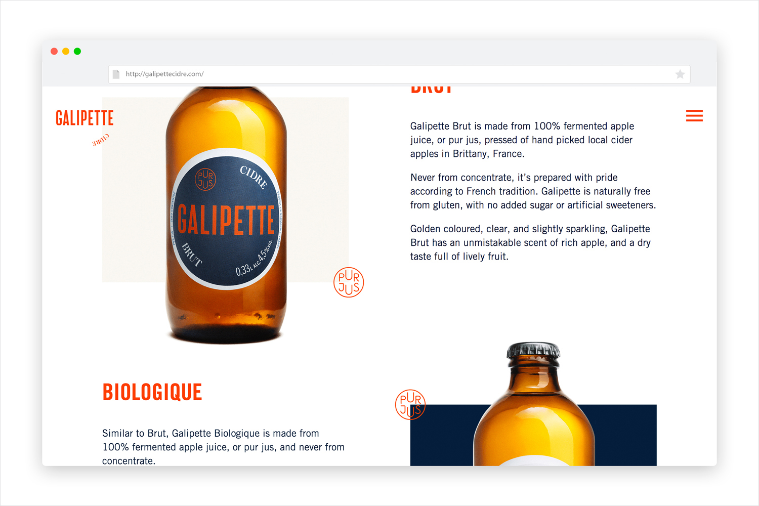
The concise nature of label is appropriately expanded upon online. Website delivers plenty of brand insight, covering product, process and provenance whilst maintaining graphic commonality with labelling with plenty of space, whilst introducing a balance of compelling image and thoughtful words, and playful motion, tied to name, in the spinning of type on scrolling. More from Werklig on BP&O.
Design: Werklig. Photography: KoskiSyväri. Opinion: Richard Baird. Fonts Used: Trade Gothic & Austin.

