Artek Helsinki by Tsto
Opinion by Richard Baird Posted 13 March 2017

Artek is a Finnish furniture and product design business and retailer with a flagship store in Helsinki. It was founded in 1935 by architect Alvar Aalto and wife Aino Aalto, the arts promoter Maire Gullichsen and art historian Nils-Gustav Hahl.
Artek grew alongside and shared many of the qualities of the 20th century modernist movement, blending art and technology, and making the most of improved technical expertise in mass manufacturing to produce well-crafted and functional products from good quality materials for everyday living. The company has remained true to these values, and its 2nd cycle initiative, a platform for reselling Artek furniture, is a testament to the aesthetic and material longevity of its products.
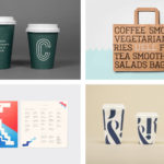
Artek worked with Scandinavian graphic design studio Tsto to build out the visual identity system of their flagship store, Artek Helsinki. The studio’s approach layers this system with additional type, illustration created from the partial forms of Artek’s product range and establishes a new set of visual guidelines. This runs across and links tags, stationery, business cards, packaging, magazine covers and shopping bags.

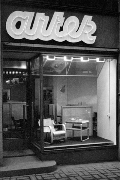
The Artek logotype and supporting sans-serif remain unchanged. The branding exercise plays more with its proportionality alongside the addition of secondary type and image. Although a more recent refinement of the original cursive design, logotype functions as a fairly straightforward visual articulation of the company’s mid-century origins, the accessibility and everyday functionality of its products and relationship to parent company Vitra. This comes through its balance of bold robust characters and its all lowercase typesetting.


Tsto’s visual identity work for Artek Helsinki clearly has its roots in previous collaborations, in particular, the studio’s brand identity for Artek’s 80th Anniversary celebration, and in The Outline Collection, a range of stationery, designed by Tsto, that feature the outlines of iconic Artek furniture. Although separate projects, there is a continuity to these that appear to, in retrospect, lay the foundations of the flagship store’s visual identity.

The weight and reduction of form is in the same spirit as logotype, yet offers more in the way of aesthetic character. Not individually but collectively. These have impact, deliver visual interest and draw on the timeless forms of Artek’s furniture. The choice to use details rather than the full form of furniture is confident and similarly iconic. These are elevated by their prominence, in size and proportionality in print.
There is difference and variation that keeps identity interesting, while the cropping of image, and their arrangement within squares establishes a useful continuity. Although simple, there is further variety to their implementation, as seen across tags, bags and business cards, but also how this intersects interior through the cutting, rearrangement and mounting of furniture on walls.


Inverted colour palette introduces further variation and functions to divide assets, and introduce a material quality in the use dyed uncoated papers and print finish. The black folder makes particular sense when holding white paper.


The introduction of a high contrast typeface with pronounced serifs contributes to a visual and communicative duality working in a sense of legacy. This resonates well with the idea of furniture living long and many lives, and functions as a reminder of the art and craft that precipitates the mass manufacturing of products.
The success of this second layer really comes down to weighting, implementation and context. Serif is used to clearly divide information, works particularly well cut into geometric panels across window display (heritage and modernity collide), and as wayfinding that shares something in common with the architectural flourishes that remain prominent within a renovated early 20th century building. This is an identity exclusively for the flagship store and the choices acknowledge this and the philosophies that are the foundation of brand, its legacy and commitment to longevity, craftsmanship and accessible design. More work by Tsto on BP&O.
Design: Tsto. Opinion: Richard Baird.


