Brewdog’s Lone Wolf by B&B Studio
Opinion by Richard Baird Posted 30 March 2017

Lone Wolf—a whisky, gin and vodka range—marks Brewdog’s entry into the craft spirits market. These are produced by Brewdog’s distillery in Scotland, the only one to make base spirit from grain under one roof, a roof specially modified to accommodate a 19m high 60-plate rectification column to get the purest results possible.
The range features a brand identity and packaging design created by London-based B&B Studio. This is described as being in defiance of category codes and conventions, and features a stripped back label design and wolf’s head motif as expressions of product purity and the brand’s outsider stance. The range will be available at Brewdog bars, and as part of Brewdog’s equity scheme. This post was updated November 2017 with images and thoughts on the design of Lone Wolf’s new tonic water and G&T range.
Logo, in its mix of simplicity of form and use of metaphor—independent brewing and distilling and an outsider stance—is modern, conceptually intelligible and fits in well within the Brewdog brand. This continuity of brand is reinforced through the use of texture and rough edges in the implementation of logo. There is a pleasant commonality in the angles of motif and the simple forms, monolinear weight and diagonal cuts of type, and a good sense of balance in spacing.
Also check out O Street’s work on Brewdog’s menus and their brand identity and packaging work for Brewdog’s limited edition releases Abstrakt.


Packaging discards category conventions and favours the intentional rudimentary qualities of a single gridded sheet and rubber band, and the immediacy of a typewriter font. These choices capture something of the range’s experimental nature and is practical in the way it can accommodate frequent changes, or at least giving the impression of frequent versioning. Structural design also channels something of this in silhouette and lid but works in an element of quality and craft through elements of relief. The bright red of officialdom and the utility of black ink finds a comfortable balance between visual interest and the holding to concept while the grey of boxes feels distinctly urban.


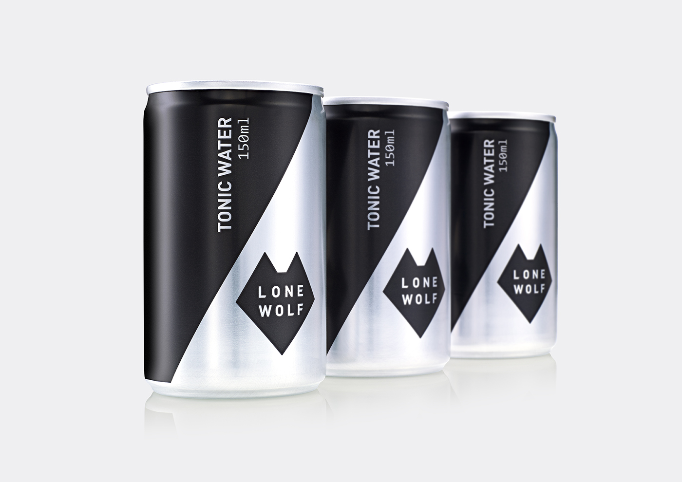
Lone Wolf Tonic Water and G&T
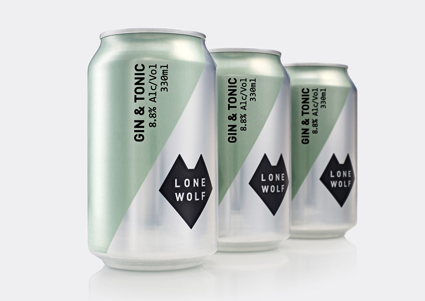
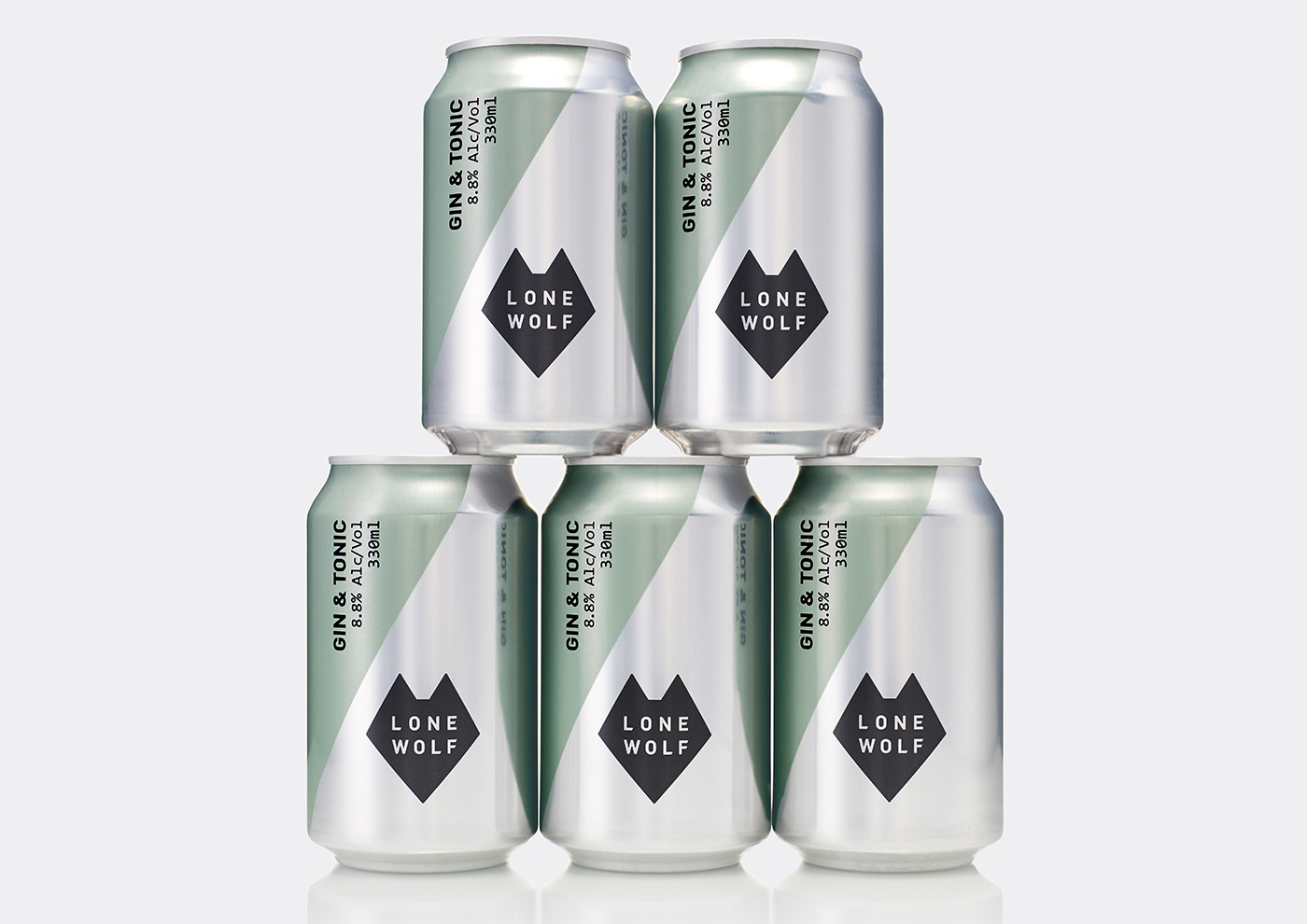
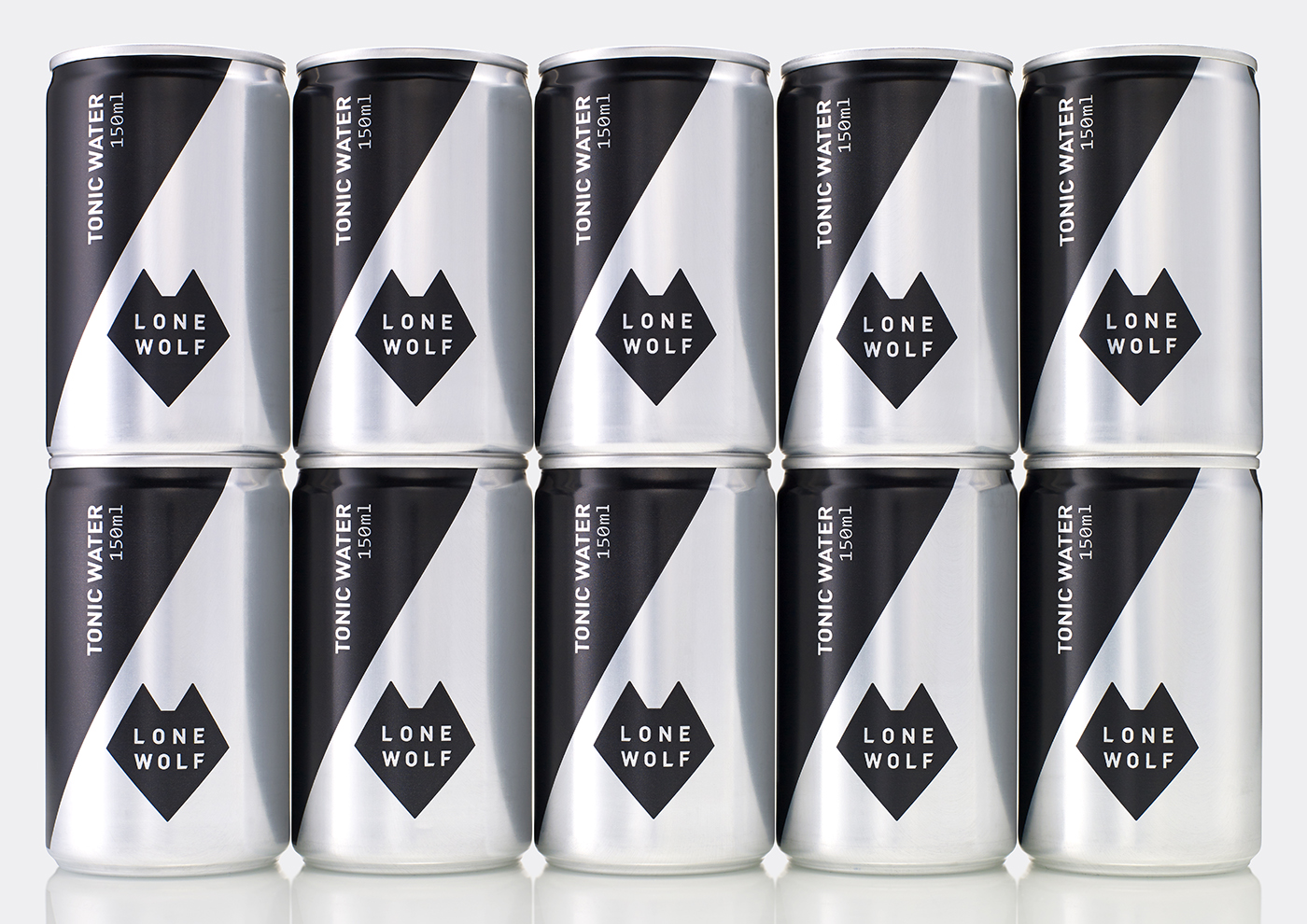
B&B Studio continue to work with Brewdog, following up with packaging for Lone Wolf Tonic Water to accompany the spirits range and a pre-mix gin and tonic. Both of these come in cans and intend to continue the pared back visual style and develop the anti-category positioning of brand.
Although the spirits range established a reductive and an on-the-fly visual style in the mix of type, paper and rubber band, it featured some high quality material details in the custom bottle and debossing.
With a lower price point comes the challenge of maintaining continuity without the expense of material flourish. This is where the wolf motif shows its strength as a useful unifying graphic marker. Its geometric build, clear form language and metaphor for the brand’s outsider stance works well to appear visually interesting, memorable and rooted in a communicative intention.
Logo is paired with, and appears clearly related to, an eye-catching diagonal. The communicative utility of type remains, however, a play with orientation gives the can a barrel-like quality. This continues through to the exposed aluminium. Although not unusual, it does feel in line with the ideas that underpin the spirits range. As a slight but well-intentioned deviation from reduction, the mint green hints at the botanicals of the G&T, and serves to differentiate it from the tonic. More work by B&B Studio on BP&O.
Design: B&B Studio. Opinion: Richard Baird.