Modern Recreation by Blok
Opinion by Richard Baird Posted 1 December 2017

Modern Recreation (ModRec) is an international coffee subscription service that offers its subscribers an ever-changing selection of the very best in micro-roast coffees sourced from around the world. ModRec takes pride in its positioning; the rejection of artifice, pretence and mass culture in favour of what it says is a realness, spontaneity and individuality. This attitude, and the unique character of ModRec’s coffee collections, is expressed throughout its graphic identity; in the remixing of colour, type and form, and alongside intimate imagery and in the individual and straight talking tone of voice used online. This was developed by Canadian design studio Blok with the result being a cheerful blend of the modern and personable, variety and discovery.

Although graphic identities are, by their very nature, systematic, some demonstrate their system more noticeably than others. This systematic visibility is how you might characterise much of Blok’s work. The individual components that make up their graphic identities are often emphasised by an acute contrast, an aesthetic and associative opposition that elevates and makes clear their communicative intention. Rather than a singular concept, these are frequently a confluence of ideas, linked by colour, image, composition or theme. ModRec is similar. There is a communicative clarity at play, an intelligible intention behind many of the choices, reaching beyond their initial graphic impact. Individually, these are often familiar, yet together, contribute to a more nuanced and unique sense of character.


While initial impressions might suggest simplicity; in solid colour, use of form, proportion and type, there is a richness that extends online, and includes tone of voice and art direction. This layers a striking and immediate graphic expression with a bit more depth.
Photography and language plays with the current and intimate. They focus on emotion, relationships and informality. The framing, absence of colour and apparent spontaneity gives image a photojournalist quality or edge you might associate with something like Vice. They imply an authenticity and links in with the shared experience of coffee drinking whilst avoiding the literal and ubiquitous. The smoking, as a visual shorthand for cool, however, as David points out in the comment section below, is a misstep.

Copy Opinion by Seth Rowden
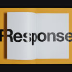
It’s just fkn copy – but it’s done well. ModRec drops in with two carefully balanced sentences on the home page. It’s confident, presumptive, and sets an irreverent tone that filters through to the rest of the site. Let’s start with the message: They’re speaking to a young and somewhat cynical audience who are tired of subscription models, who don’t want to sign up for anything. This is probably the main challenge for ModRec, so it’s brave of them to tackle it head-on. The ‘Okay,’ opening perfectly hits the mark. On the one hand it’s confrontational, but it also sounds like a response to an objection, like we’re entering mid-conversation. It reminds me of a line of dialogue that wouldn’t be out of place in a scene from Coffee and Cigarettes by Jim Jarmusch.
To temper this abrupt first sentence, they continue on a more positive note, leaving the reader hanging on a question. ‘Non-stop’ and ‘insanely good’ packs in two of the most important benefits, daring you to enter, promising something exceptional, and taking the edge out of the otherwise defensive tone. This creates a wonderful juxtaposition – I really do like this page. The ‘listen’ tab that links to Spotify is also a smart way of aligning the brand with a hip audience who care about music – typically people who haven’t yet given up on life, or lost their taste for expensive coffee. Naturally, the two go hand in hand.
As you venture further into the site, the voice spills over with relative ease. The roaster description for Iceland Kaffibrugghusid Roastery brings a sense of story with a few choice adverbs and adjectives (unabashedly, uncompromising, graciously) to add texture. I like the use of longer sentences, moving away from the clipped style of writing frequently used by coffee roasters and microbreweries. In many ways, this is what elevates ModRec above the competition. They don’t shy away from using specific and concrete detail in their copy. The words create a visual picture, hooking us in with facts about Sonja Bjork Grant’s life, while letting the sentences run and creating enough space to breathe.
This is a huge step forward for a brand in this category. There’s a fixation with the what’s cool, a rejection of using labels to make us feel complete, and I suppose a certain irony in that. In places they could hold their nerve more, tighten up the length of the copy, and say less. But overall, I think ModRec has crashed into a crowded market with a voice that demands to be heard. I was impressed to find the word ‘rad’ buried deep within one of the footer pages – it pretty much sums up their tone of voice.


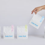
The graphic component embraces moments of contrast and visual impact, leading with a colour palette of variety, mixing kraft paper with pastels and cheerful spot colours. Type builds on this, similarly playing with variation, weaving together a visual language of modernity, importation and craft through the grouping of a sans-serif, stencil cuts and serif. While communicative and visually interesting, these function, alongside size and proportion, to set hierarchy.
Form touches on enduring and specialist coffee making equipment through simple yet recognisable silhouettes, emphasised through their proportion both in print and online. There is a push and pull between tradition and modernity, utility and craft throughout. The latter can be seen quite literally in the customisation of off-the-shelf packaging that uses a range of colourful stickers.
Contrasting elements are held together by some interesting arrangements and intersections, a logotype of monolinear strokes, broader and dividing line, and a series of grids that run over, link and frame.

When you break the ModRec graphic identity down, you begin to see the extent of the elements employed, the simplicity of system, and the visual breadth and character that this can achieve. This range of expressions, the immediate visual impact of colour and form, and residual impression of language and photography, feels well-suited to a brand of change and variety, of unexpected combinations and discoveries, and aimed at a specific group of people. It is intentionally absent some of the more universal and conventional quality cues but like the approach to copy, is firm in its intentions. More work by Blok on BP&O.
Design: Blok. Opinion: Richard Baird. Fonts: Maax & Libre Baskerville.