Business, Banking, Law and Finance
Precise by Design Bridge
Mortgages aren’t exactly the most sexy or fun concepts, nor are the companies that offer them. Likewise, the sector isn’t exactly known for a bold or forward thinking approach to brand design. But it’s often the more traditionally dull-leaning brands or companies that make for the most creative – not to mention difficult – branding projects. Perhaps that’s part of...
Sendwave by DesignStudio
The concepts of ‘money transfer’ and ‘community’ don’t immediately seem to go hand in hand: the former feels cold, slightly dry, potentially confusing and rather literally transactional; the latter is all cuddly and feelings and people-y. But uniting these two seemingly disparate worlds is exactly what DesignStudio did recently in its rebranding of Sendwave, a digital platform offering money transfers...
Fluz by Koto
It can’t be easy designing the identity for a brand or company that’s hard to define, or which isn’t easily explained by that ‘new product, familiar ideas’ trope – the sorts of things described as ‘Like Tinder, but for cats!’ or ‘CityMapper for life decisions’, or ‘Uber for people who want to try dogging but can’t drive’ (if any investor...
Frank Penny by Bedow
Frank Penny is a consultancy specialising in AML – anti-money laundering. Knowing next to nothing about financial matters, I had no idea such companies existed. But like pretty much any other business, to succeed and stand out against their competitors, at some point or another anti-AML consultants need to think about their brand identity. Stockholm studio Bedow was recently tasked...
Kikin by Koto
When you think about the world of financial investments, an image of woven Scouts’ patches isn’t typically the first thing that springs to mind. Other contemporary brands (like Monzo, Chip, and Plum) aim for visual simplicity over complex personality development or extended world-building. But while a rugged outdoor theme might feel incongruous in the fin-tech space, Koto has skilfully capitalised...
Be Equitable by For The People
There are many kinds of rebrand. There are rebrands that tread lightly, reverently refining and polishing what is already there, like archaeologists delicately exhuming sunken lucre so that it can once again gleam (National Portrait Gallery). Then there are rebrands that are a little more decisive in their handling of the raw materials—imagine our similetic Time Team creatively re-assembling the...
Expensify by The Collected Works
According to The Collected Works, one of the main reasons its recent client Expensify was looking to rebrand was to remedy a perceived mismatch between the ‘wacky’ vibe of the brand’s marketing and ads (namely its 2019 Superbowl commercial), and its core visual identity. Which begs the question – how far does a brand identity itself have to mimic or...
Partech by Koto
Certain sectors lend themselves beautifully to innovative, eye-catching design – things like craft beer, perhaps; or beauty; or small-run editorial publications. Investment firms aren’t traditionally among those sectors that engender more outre, bold design work. And that’s partly the reason that this work for Partech, a global tech investment firm headquartered in Paris, stands out. Created by brand and digital...
Future Factory by Dutchscot
‘Lead generation for creative agencies’. It’s one of those lines that makes complete sense to some but sounds like gobbledigook to everyone else. ‘Lead generation’ is a general mystery, unless your job depends on it. And what is a creative agency after all? But of course, so far as branding is concerned, ‘everyone else’ really doesn’t matter. Hitting the spot...
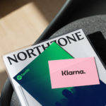
Northzone by Ragged Edge
Northzone is an early stage venture capital fund with the insight necessary to cut through the hype of funding and recognise strong teams doing good work. From their offices in London, Stockholm and New York they partner with founders at Seed, Series A and Series B stage across Europe and America. London-based Ragged Edge worked with Northzone to create a brand identity that would...

Norwegian Banknotes by Metric Design
If you consider all the tangible expressions of a country’s brand, money, with its essential function as a measure of value, could easily be considered one of the most important touchpoints. In this sense a country’s banknote is often the first point of physical contact with that place prior to travel. The shape, feel, colour, language, security features, artwork and heritage of...
WeWork by Gretel
Founded in 2010 and headquartered in New York, WeWork began as a workspace provider and has grown to offer a broader infrastructure of community management and support, event programming and virtual network management for small and large businesses, entrepreneurs and freelancers. With significant and rapid growth WeWork worked with Gretel to align its visual identity with its purpose. “Framework”, a graphic route that...