Expensify by The Collected Works
Opinion by Emily Gosling Posted 5 December 2023

According to The Collected Works, one of the main reasons its recent client Expensify was looking to rebrand was to remedy a perceived mismatch between the ‘wacky’ vibe of the brand’s marketing and ads (namely its 2019 Superbowl commercial), and its core visual identity. Which begs the question – how far does a brand identity itself have to mimic or dictate its ads?
Sure, the main point of any identity project’s strategic phase is to ensure that there’s a holistic, recognisable, consistent brand world that translates across every touchpoint, from its signage and email signatures, to social media posts and tone of voice. Everything visual, verbal, and aural has to come back to that brand’s core ethos – it’s branding 101. But do branding elements themselves – the logo, typography, illustrations, colours – need to be directly mirrored across, say, packaging to TV spots?
One of the best ads of all time, the iconic Jonathan Glazer-directed Guinness Surfer, has nothing to do with Guinness whatsoever until the last minute – let alone mimic its logo or imagery. The film would have been rather different were it peppered with Guinness toucans, and had the voiceover not have been Scottish, and were it not shot in the distinctly-not-Ireland location of Hawaii.
In short, brands can be cohesive while also modulating their mood. No-one, and no brand, is always bouncing-off-the-walls cheery, as Expensify seems to want to be. And in many ways, its new branding reflects this: the logo in its static form (and to an extent in motion) remains largely neutral, since it’s almost entirely down to the illustrations (and, sometimes, the playful typography choices) to do the legwork when it comes to showing just how ‘fun’ the company is through bright colours and out-there characters.

Obviously it’s an unusual direction for a finance brand; but it’s debatable how smart that approach is. Clearly it’s usually no bad thing for a brand to shake off the shackles of its sectors’ cliches, and rebel against historical expectations around how it should or shouldn’t behave. But on the other hand, who are we kidding: does anyone honestly get this fired up about expensing – so pumped that they’d want to wear a baseball cap with ‘Receipts’ emblazoned across the front, or a pin badge of their chosen software’s logo?
![]()

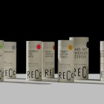
While we’re on that point, can we make a plea for brands not to get so excited about a rebrand that they make rafts of rather pointless ‘swag’? See Reddit’s patches; Feeld’s jewellery/weird potion – part of an otherwise-superb rebrand from Made Thought; and here, Expensify’s logo pin badges, caps, and water bottles (sure, they encourage re-use, but ultimately didn’t need to be made at all). Surely by now we all get the whole ‘climate crisis’ thing (and the fact most of this stuff probably gets binned).


The new colour palette does away with Expensify’s former rather corporate, conservative blue; opting instead for a green ‘hero colour’. As with the playful, more ‘wacky’ branding elements, green is a great choice in terms of setting Expensify apart from other financial software brands. Its downside is that (to me, at least) the ‘E’ roundel logo now looks distinctly like it should signal a recycling plant, or sit as a standardised marker on packaging to tell you which bin it goes in. Once you see that, it’s very hard to unsee it. Which is ironic really, considering the whole issue of the pointless merch.
The green is accompanied by a range of mostly vibrant secondary colours to help the brand work across a wide range of applications, as well as considering accessibility and inclusivity through a ‘range of skin tonalities for human characters’. The Collected Works, ‘established a few primary colour combinations and usage guidelines, which allow for lots of flexibility but take out the second guessing when anyone on the team is creating a new asset’.


For all our gripes, we’re not saying The Collected Works hasn’t done a good job here: the branding is visually rather lovely. And it’s a brave project too, for the aforementioned bucking of financial sector trends in both style, and in the and motion- and illustration-led approach.
The suite of illustrations by Augenblick Studios is undoubtedly the standout aspect of Expensify’s new identity; and it’s interesting to consider the skateboard sticker-like aesthetic applied to a non-FMCG brand. The slightly goofy, thick black outlined, 90s MTV style is certainly having a moment: in recent months we’ve seen it on Robot Food’s identity for Goldmine cannabis gummies (a fitting application if ever there were one); Earthling’s high-octane designs for Top of the Mornin’ Coffee; and Giselle Guerro’s brilliant work for Nobell Foods.
Augenblick’s relationship with Expensify predates The Collected Works; with the Brooklyn-based studio having worked on the animated portion of the 2 Chainz-studded Superbowl ad, titled ‘EXPENSIFY TH!$’, that seemingly catalysed its rebrand (it’s around 2 mins 43 seconds in, if you were wondering).
‘After the success of [the 2019 ad], Expensify couldn’t stop thinking of the portal to the animated universe that they had just opened: a world where expense reports don’t suck, and receipt scanning can be done in outer space,’ says The Collected Works. ‘Together with Augenblick Studios we dove much deeper into this world, introducing a new set of characters, vignettes, and backgrounds, as well as simplified illustrations that can work iconographically, that bring the product and messaging to life.’
And there’s no denying how great these icons are: they work brilliantly as everything from navigation to editorial spot illustrations on the Expensify site. And very simply, they’re a lot of fun.
The typography also reflects that deft interplay of joyfulness and usefulness: The Collected Works introduced three new customised type families – Expensify New Kansas, Expensify Neue, and Expensify Mono, created with type foundries CoType and Newlyn. As a result, all of the typefaces have shared DNA in their letterforms, and look great both in digital and physical executions.
Newlyn created New Kansas originally as a modernised version of the perennially ubiquitous (and undeniably charming) Cooper Black. Like skateboard-style illustrations, the colour green, and quirky motion graphics; Cooper Black has some applications that feel like a no-brainer (t-shirts, record sleeves, countercultural-leaning book covers) and others that feel a bit off. As Pentagram partner Michael Bierut pointed out, it’s not ideal for, say, a newly restored 1885 Carpenter Gothic church. ‘Cooper Black is a perfectly good font, but in my mind it is a fat, happy font associated with the logo for the National Lampoon, the sleeve of the Beach Boys’ Pet Sounds album and discount retailers up and down the US,’ he told the New York Times. ‘I wouldn’t choose it as a font for St. Agnes Church even as a joke.’
As to whether Expensify’s assets will prove to be a Pet Sounds or a St Agnes, only time will tell.