PizzaLuxe by Touch
Opinion by Richard Baird Posted 21 January 2013

PizzaLuxe is a restaurant located on London’s Brick Lane that hand makes good-value, freshly baked pizzas using locally sourced, ‘deluxe’ ingredients. To coincide with an expansion into the Westfield centre, Stratford, the brand approached Edinburgh-based design studio Touch to develop a new visual identity that would communicate their core values within a more ‘polished’ environment.
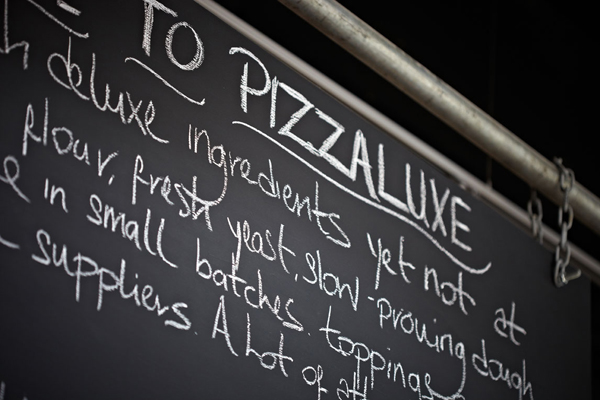
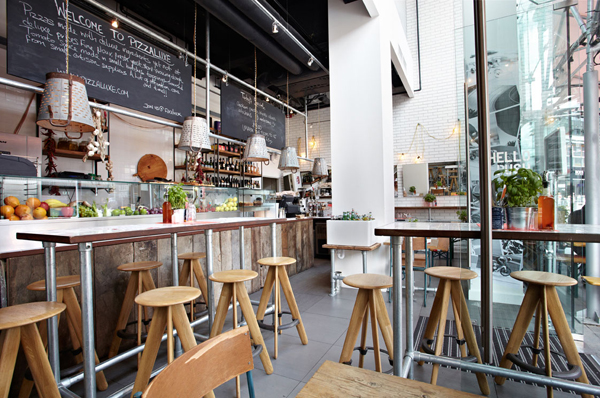
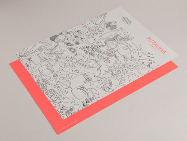
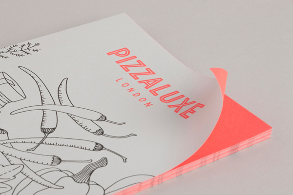
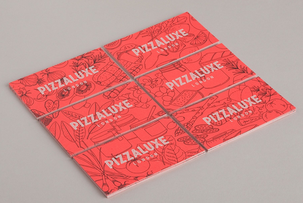
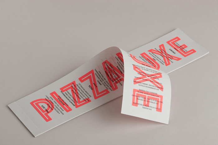
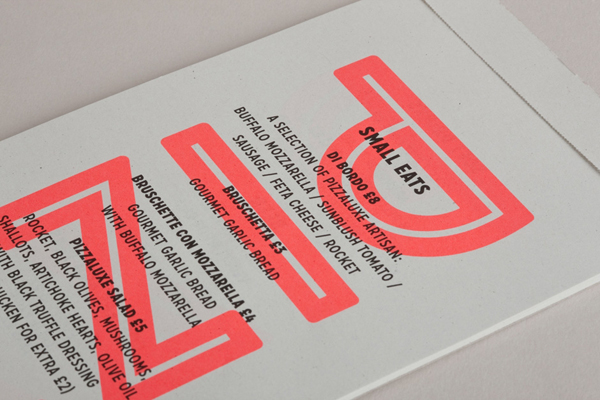
“Our solution was to create something iconic, using a custom typeface, as well as commissioning illustrator Joanna Basford to communicate the brand story via a series of bold, line drawings. This pared-back approach was then contrasted with the fluorescent ink on menus and printed materials, while a neon sign and wall-graphics worked well with the utilitarian chic of the venue itself.” – Touch
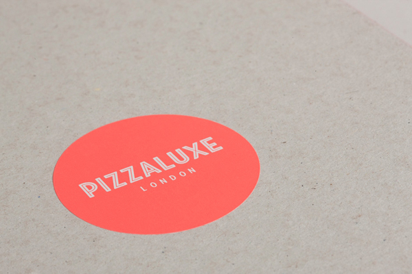
Conceptually it is a pretty simple solution but one that, through the juxtaposition of the urban and ‘polished’ character of a custom logo-type built from a well spaced combination of tall and slim, uppercase, inline sans-serif characters – setting a professional high quality sensibility – alongside the earthy, honest and local industry qualities of Joanna Basford’s organic, hand drawn, single line weight and monochromatic illustrations, achieves a clear and communicative duality. A single, economical, neon spot colour adds a sense of energy and contemporary creativity to the identity without appearing superfluous within the utilitarian context of the interior design.
