The Coal Pot by Port Clarendon
Opinion by Richard Baird Posted 3 December 2013

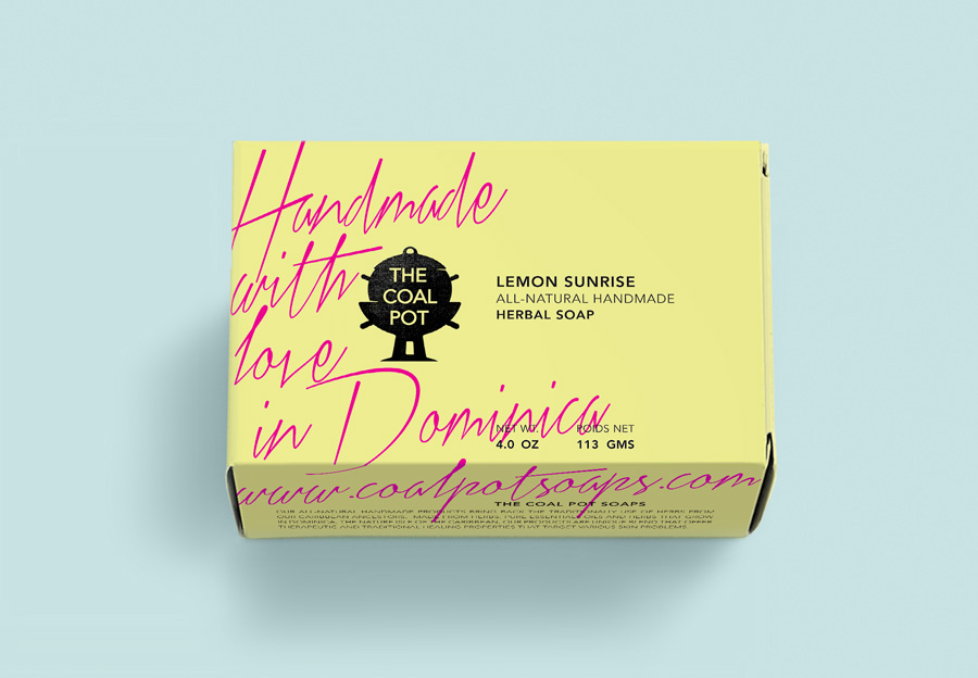
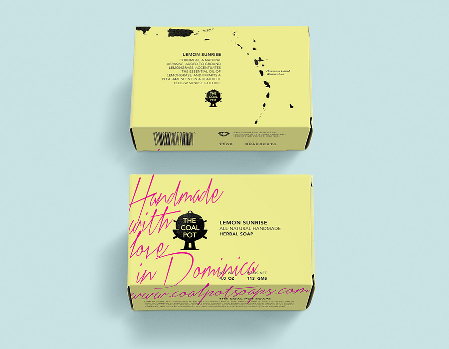
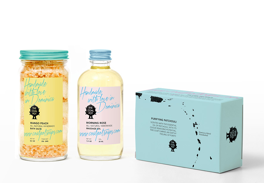
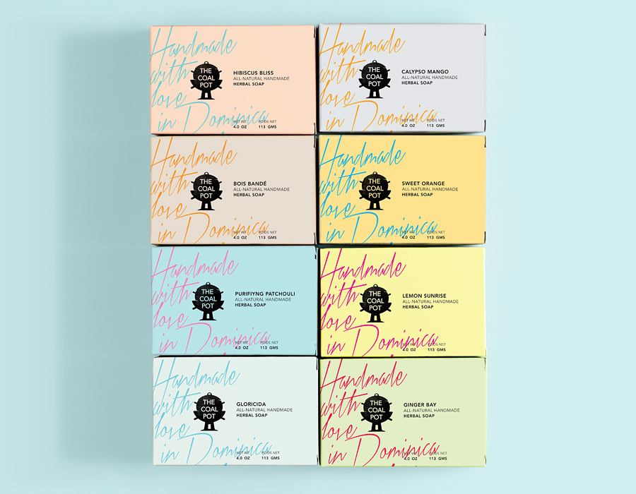
The Coal Pot is a range of natural soaps, creams and oils made from herbs and fruits grown in Dominica using traditional handmade methods. Italian design agency Port Clarendon were recently commissioned to develop a new visual identity, brand architecture and packaging solution for the range that would ‘articulate and clarify each of the line’s unique proposition in relation to the parent brand and to the competition’ and position these as more ‘up-market’.

By taking the organic energy of a large, well rendered and authentic looking script – an approach that draws to mind handwritten letters and annotated cookbooks – and executing it as a subtle over print treatment above the functionality, geometry and smaller size of a n uppercase sans-serif, Port Clarendon’s solution is clear in its use of aesthetic contrast to derive communicative duality, neatly balancing the individuality of handcraft with a reliable and tested effectiveness.
This polarity is reinforced by the spontaneity and density of type to the left and the clinical neutrality and space to the right, as well as an on-trend pastel colour palette, charcoal black and the texture and detail of ink splashes and stamp-like finish. The result is communicatively by the book, leveraging established and understandable devices, but delivers these with distinction and personality.


