Basket Snacks by Peter Gregson
Opinion by Richard Baird Posted 4 December 2013
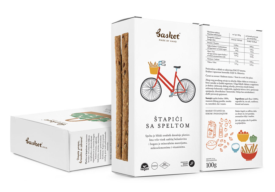
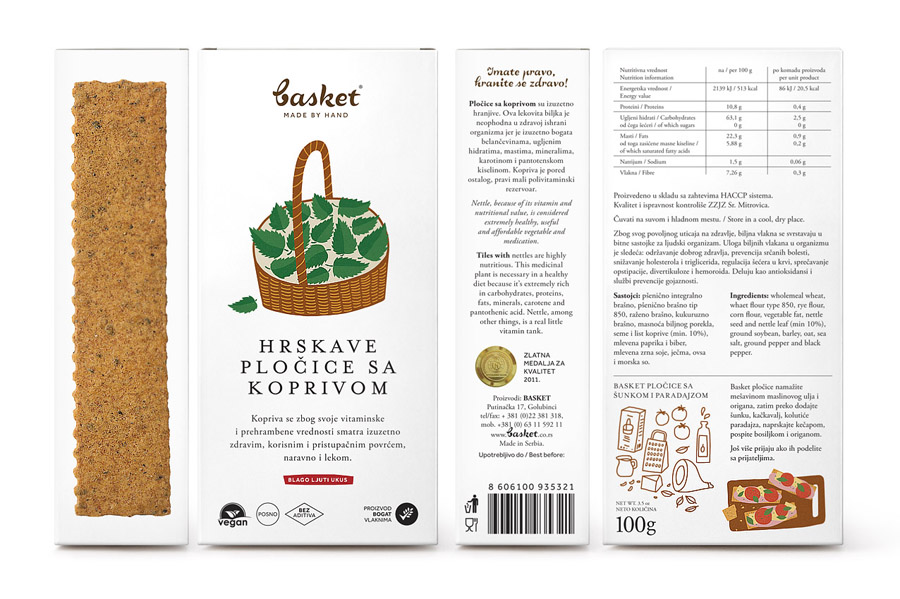
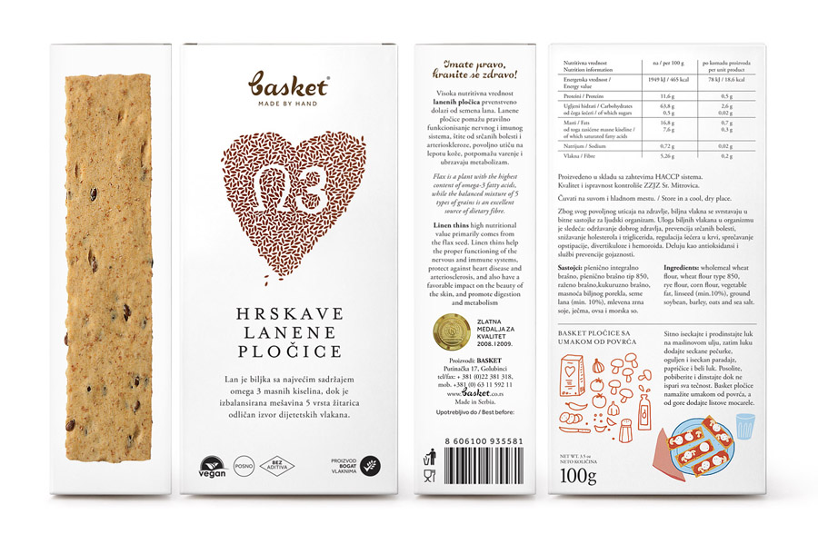
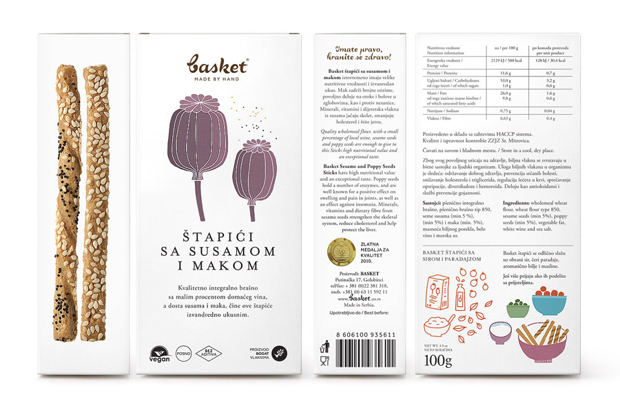
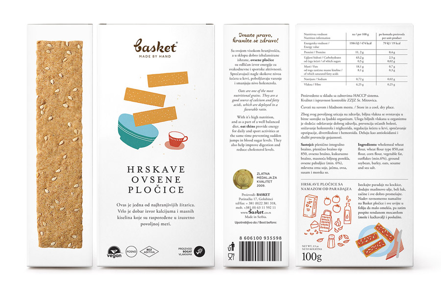
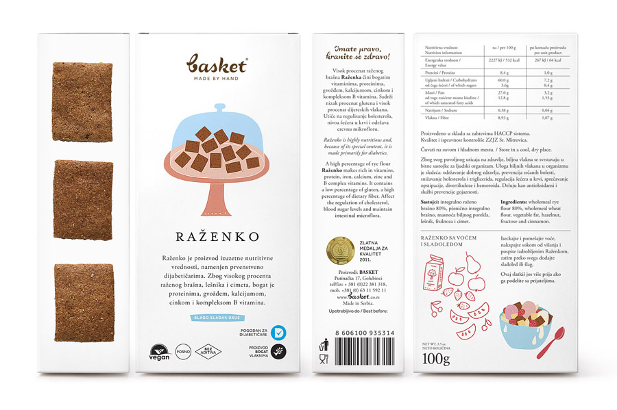
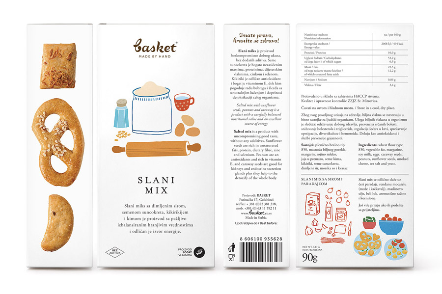
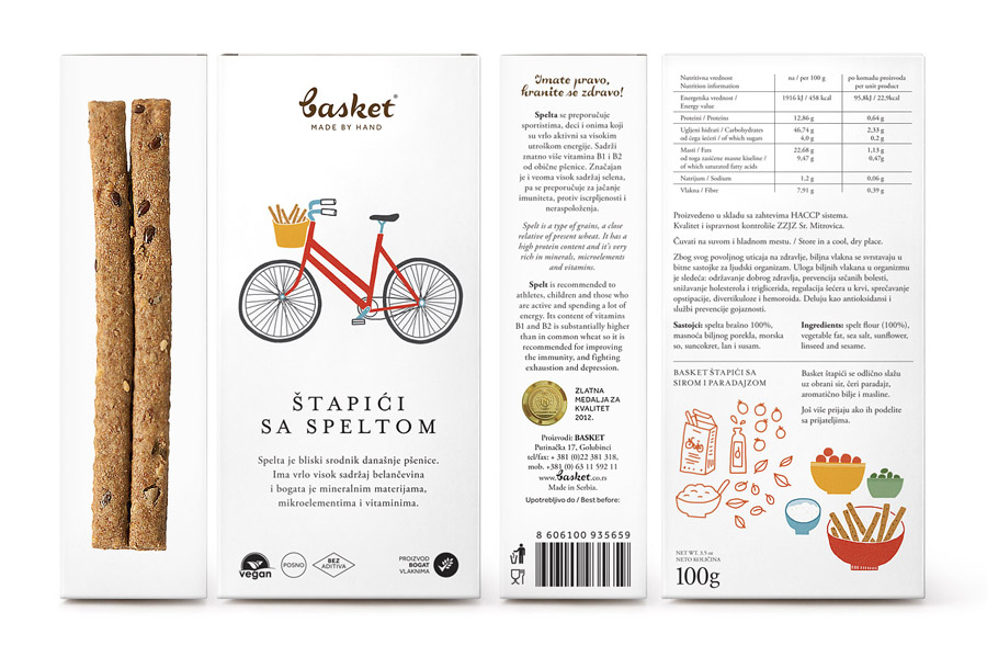
Basket is a family run business located in the Serbian village of Golubinci who produce baked, additive and preservative free foods, made by hand from whole-wheat flour. Replacing a local but rudimentary aesthetic with a more commercial and communicative resolution of design conventions, Peter Gregson, working in collaboration with illustrator Marijana Rotthat, utilised contrasting type, plenty of white space, certifications front of pack and a loose illustrative style to neatly convey authentic regional hand craft and high quality in a contemporary way.
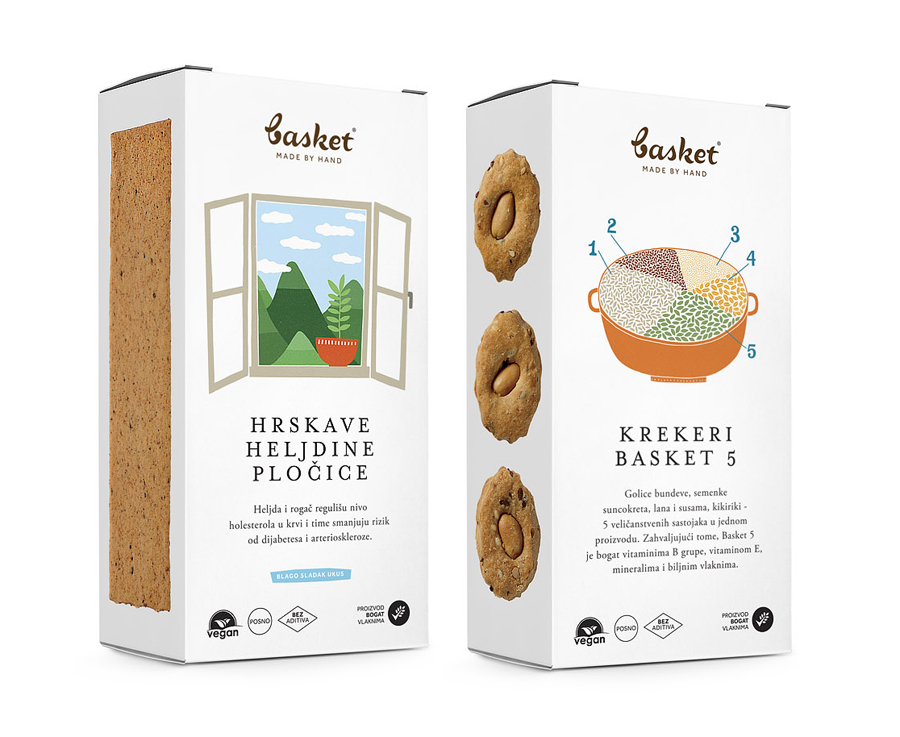
The illustrative work provides much of the initial impact. Its loose child-like perspectives, natural colour palette and fills are rendered with a clear intention and neatly mix the themes of locality, the countryside, health and home cooking to keep the range communicatively varied yet cohesive. The convention here is honesty, simplicity and well being which continues to be an effective direction for the market. The images are enhanced by what I tend to describe as a kitchen white, the use of plenty of unprinted space to reflect the clean, professional environment the snacks were created in and borrow from established premium conventions.
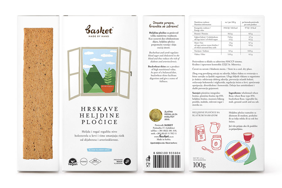
The typography is a little problematic but communicative both in its content (brand story and product benefits) and character choice. The juxtaposition of script and uppercase serif is evident in its resolution of handcraft and high quality but also establishes an important distinction between brand and product, unfortunately the logotype does not appear particularly well executed and the serif over-spaced.
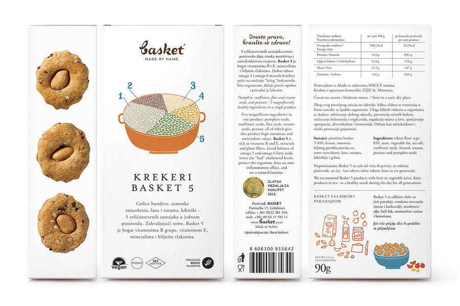
The product photography looks solid and functions well to capture the organic detail, texture and baked colour in a way that avoids what is now the ubiquitous die cut window of honesty, biscuits break and are not always as well served by such an approach as they are with good shots.
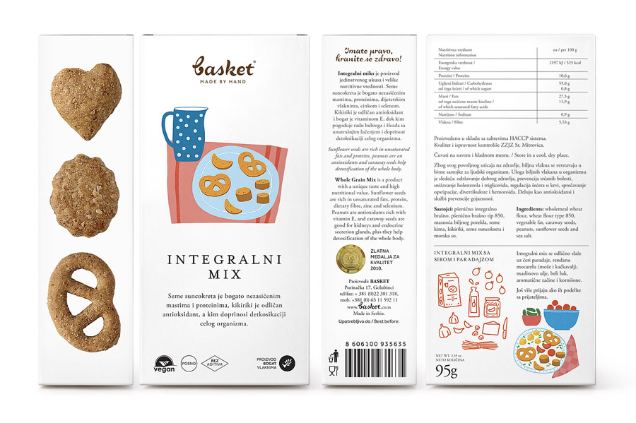
Front of pack certifications and a gold foil seal on the reverse places significant weight on international standards, perhaps an important distinction within the Serbian market where further west these are expected. There is an authority and reassurance to these, and their appearance at the foot of the front panel anchors everything above it.
