Chrome
Opinion by Richard Baird Posted 9 March 2011

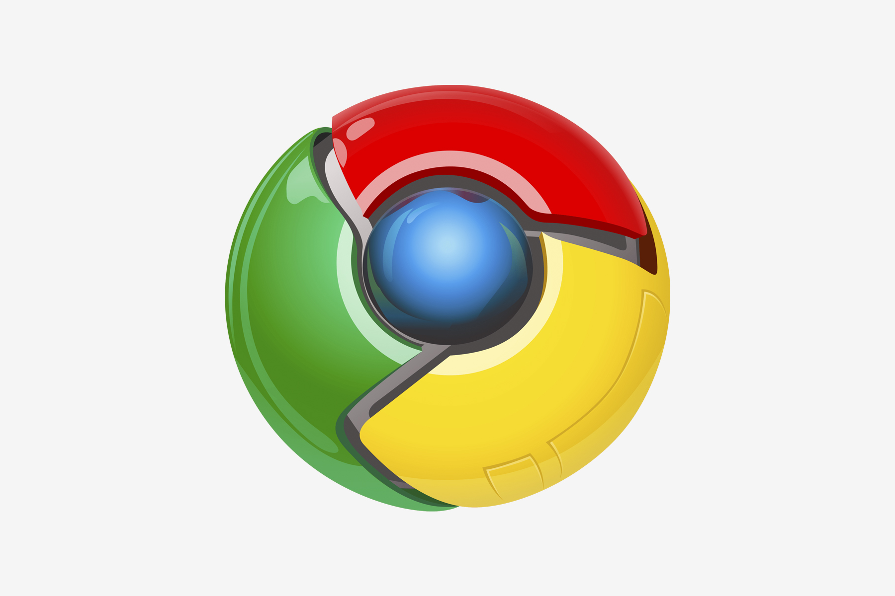
A number of news sites are reporting a change to Googles Chromium source code that contains a new logomark. Although not confirmed this is certainly an improvement and moves it away from the bright shiny robotic Manga ball and towards a more restrained geometric, abstract disk.

The blues are just for Chromium (the open source part of Chrome) and are likely to be replaced by the standard Google colours (See below for a mock up). The contrast is a bit too subtle especially on the shadows so the mark suffers from a lack of depth and this blue version has an almost early Mac feel. This isn’t going to be an instant classic but it does give Chrome a more considered and modern aesthetic. Google has started rolling out this new identity on its development side, see the final version here


