Aker Brygge by Bleed
Opinion by Richard Baird Posted 7 September 2011
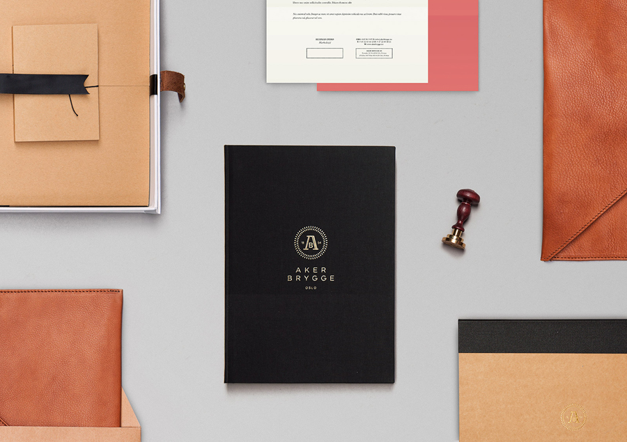
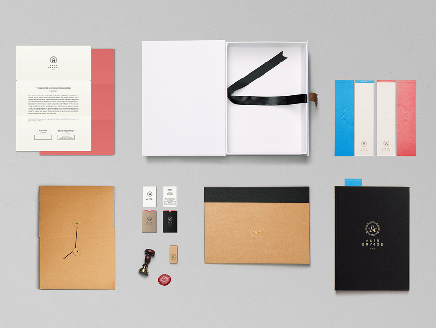
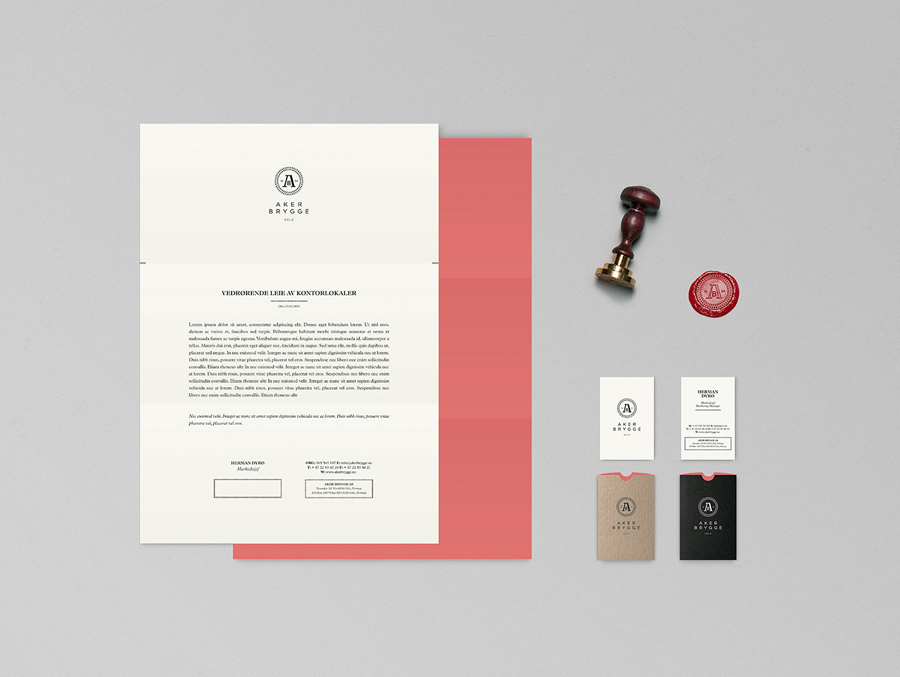
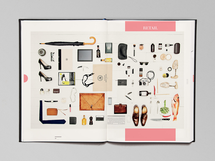
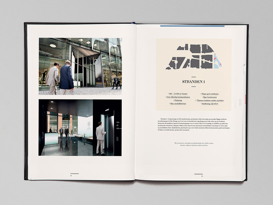
Aker Brygge is a waterside district at the heart of Oslo currently under redevelopment. As part of this, design agency Bleed worked alongside and collaboratively with property developers, architects, landscape architects and exterior lighting designers to bring together and brand this new vision due to be completed in 2015.
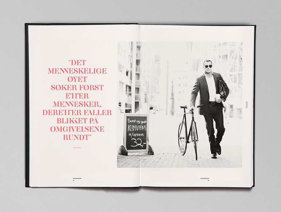
“The main qualities of the new identity are intertwined with the core values of the New Aker Brygge, with emphasis on quality and contrast, and an open and dynamic street environment.” – Bleed
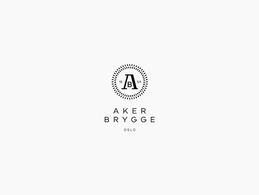
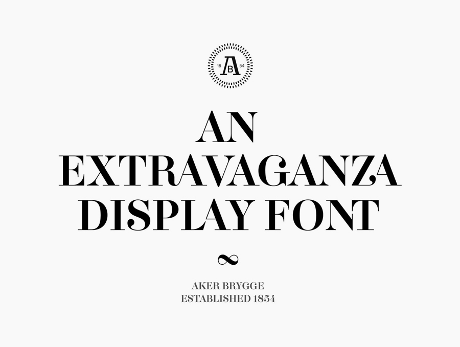
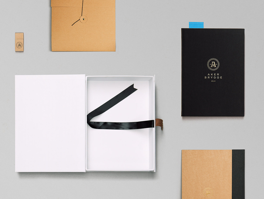
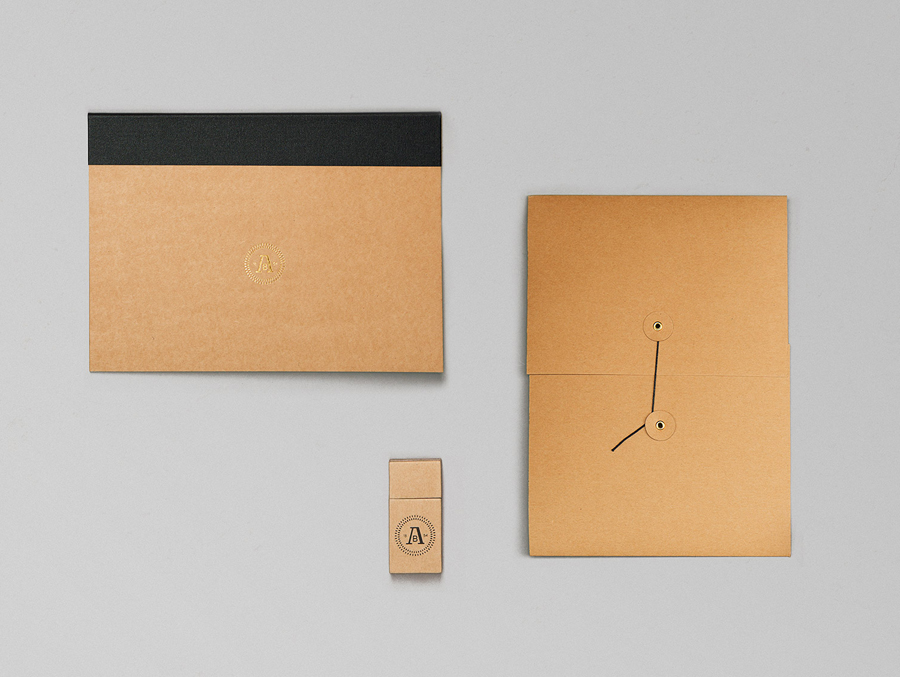
There is a very modern sophistication to this identity that speaks volumes about the ambitions for the area. The classic seal aesthetic has been reinterpreted and given a contemporary spin predominantly achieved through simple geometric forms rather than the detailed script and flourishes of the past. At the heart of the lock-up is a very simple and restrained monogram that blends both a minimal serif and a sans-serif solution with a split date balancing out the proportions and the weighty structural form of the ‘A’ with an underlying nautical navigational aesthetic that subtly hints at the districts proximity to a harbour. The concentric rings (created from the union of individual components) circling the monogram neatly draw together the ideas of community, sustainability and the co-operation involved in the development of the area.
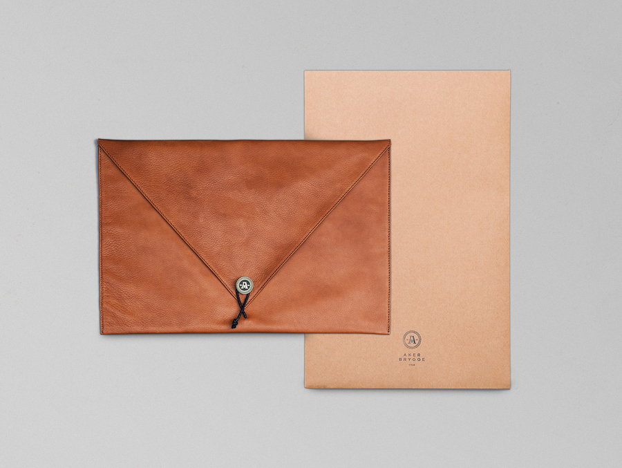
The accompanying logo-type is clean, sharp and well distributed helping to emphasise the idea of well kept open spaces but with an icy chill common in Scandinavian identity.
