Bricos by Anagrama
Opinion by Richard Baird Posted 7 November 2011
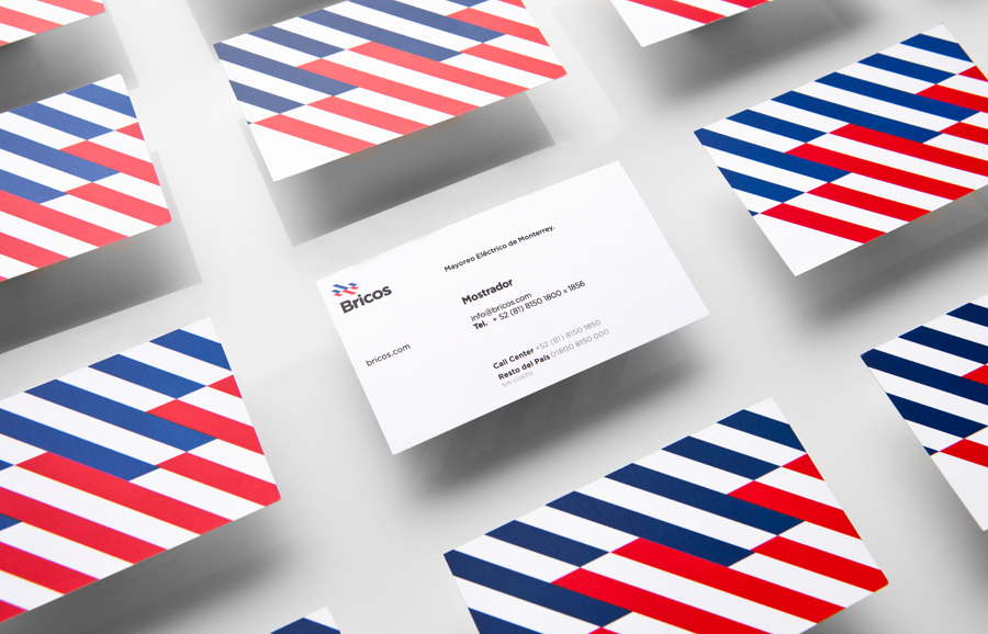
Bricos, originally named Mayoreo Electrico Monterry, is an electrical hardware store servicing the North East and Monterry regions of Mexico. As part of an expansion plan the company approached design agency Anagrama to create their new identity, packaging propositions and retail environments with the consistency expected from international customers.
“In order to develop the Branding Strategy, we thoroughly researched the project commercial aspects, and we executed a deep brand diagnostic. This resulted in a solution that helps the company heighten their values such as service, honesty, responsibility, experience and kindness, all of which have been key to the company’s success throughout the years.
On the other hand, the company needed to attract qualified personnel and make these employees feel proud of working for Bricos giving them a sense of belonging.
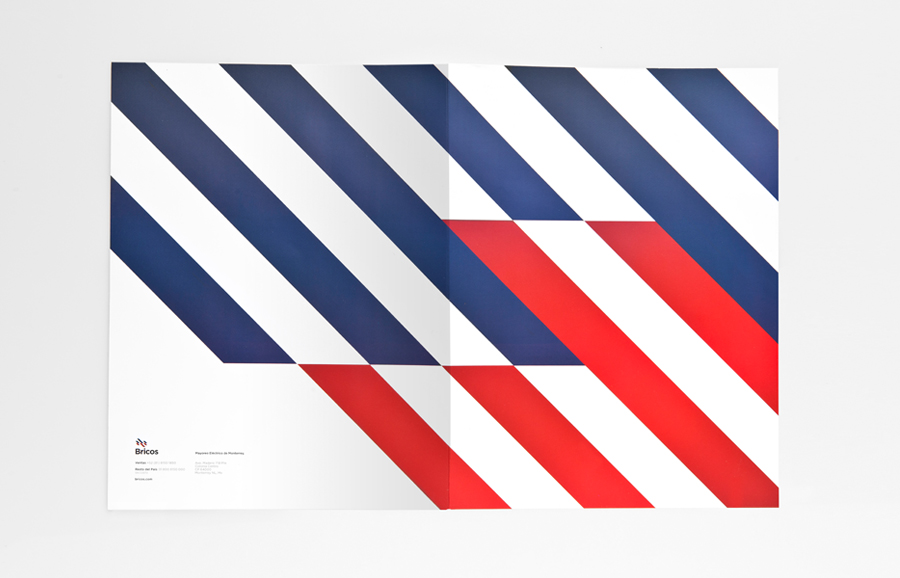
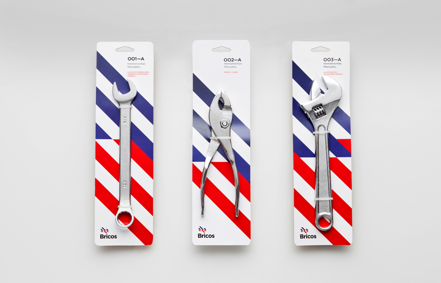
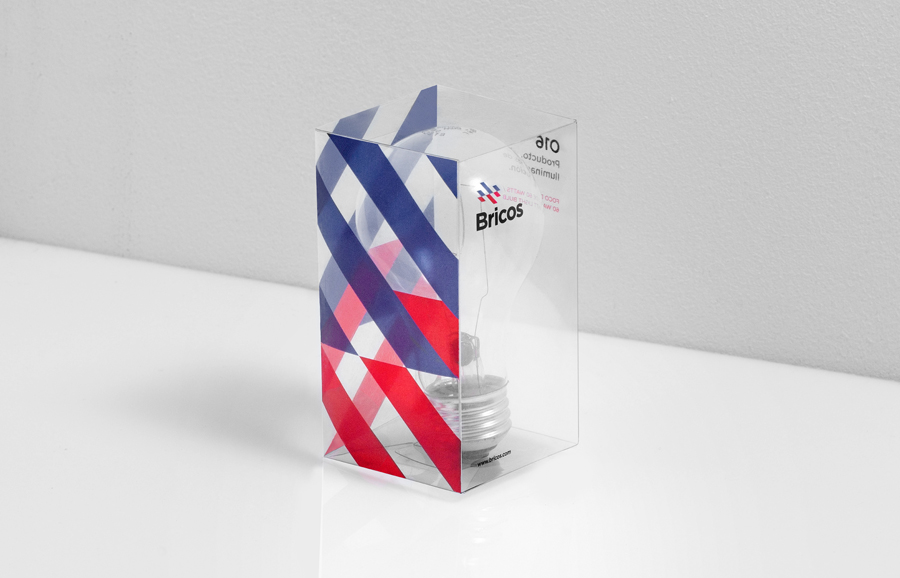
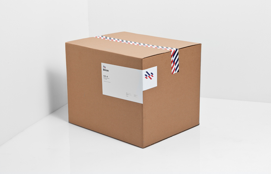
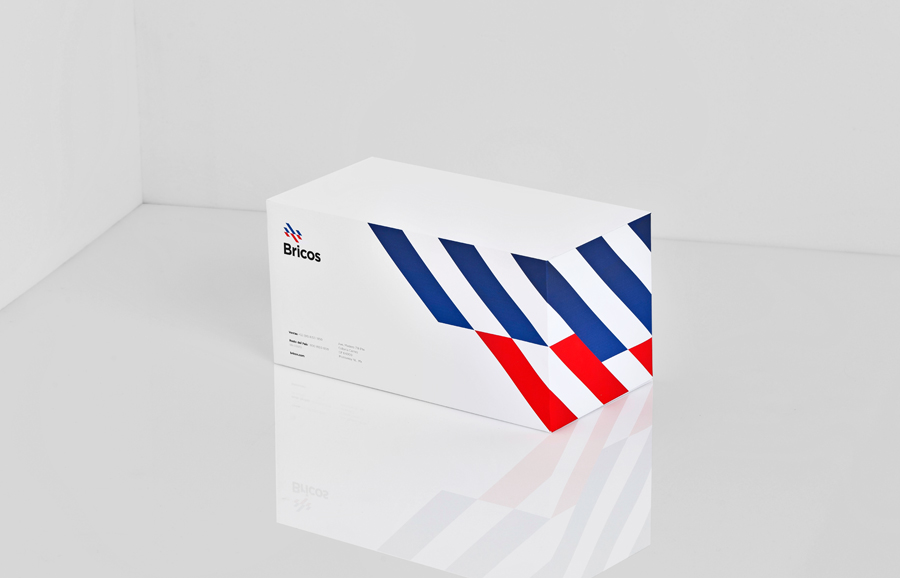
The project’s design decisions included creating a timeless brand with a completely different icon from any of its competitors. We used a very clean typographic language and an institutional pattern that can be easily applied to any object. These elements turn Bricos into a brand ready to compete internationally.” – Anagrama
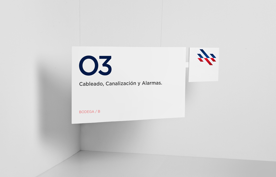
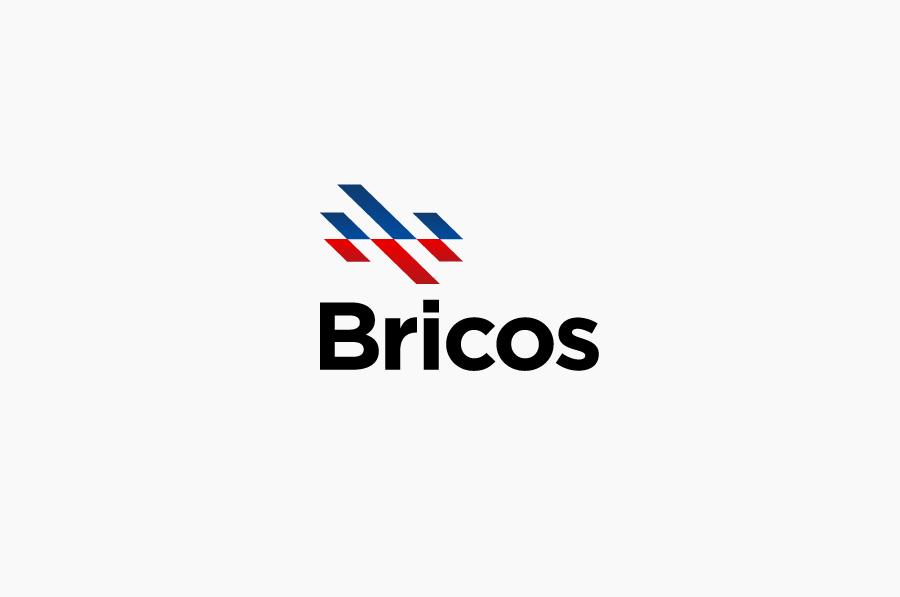
The logo-type is fairly straightforward in its execution utilising Proxima Nova’s bold letter-forms, customised width and black finish to neatly establish a practical and efficient foundation. The chevron visual device provides the weighty and static logo-type with a dynamic juxtaposition. This is applied as a pattern across stationary, own brand packaging and signage in a repeating linear fashion reminiscent of barrier tape that resolves the various heavy industries they intend to supply too. The contrasting red and blue colour palette has an underlying utilities sensibility that introduces heating, energy, water and plumbing to the mix all within a very minimal and modernistic expression. The execution of the identity across the print work is simple, effective and consistent and should be easily replicated across new ranges and future retail environments.
For such a simple mark there is a smart resolution of multiple themes that will be perceived differently depending on which trade a buyer comes from leading to a neat sense of inclusivity.
