Architecture PLB by Sea
Opinion by Richard Baird Posted 8 February 2012
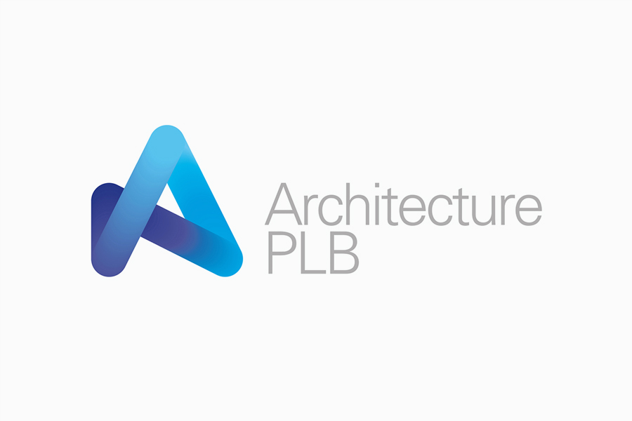
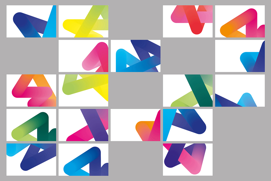
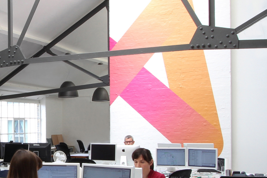
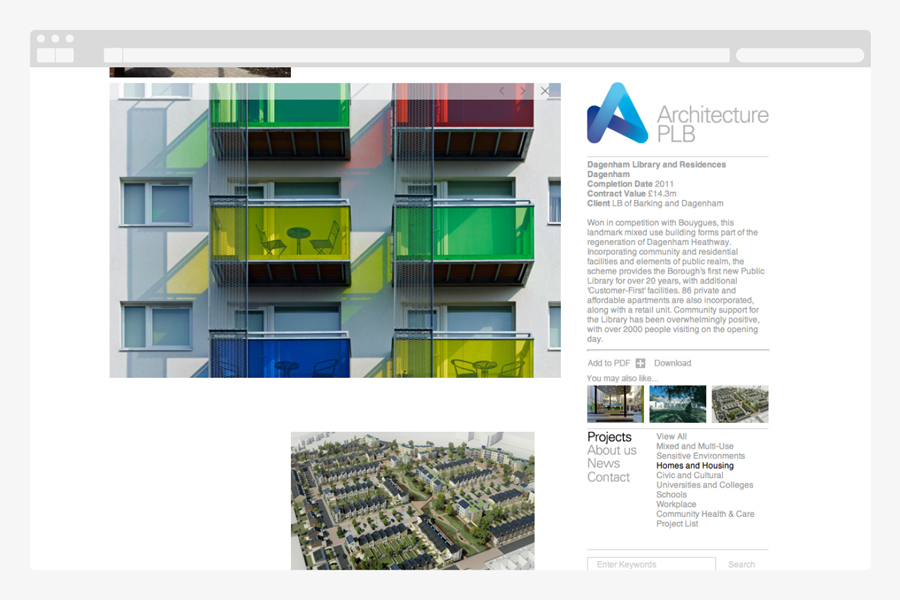
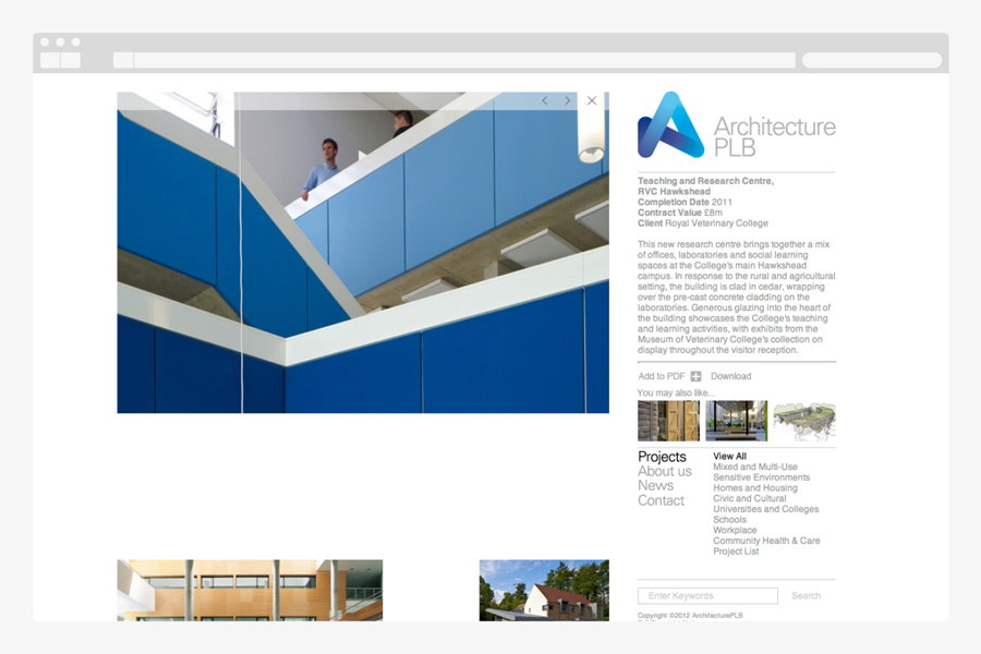
Architecture PLB is a design-led practice working across both the public and private sectors with offices in Winchester and London. Their new brand identity, designed by communications agency Sea, unites the three dimensional aspect of the architectural world and a sense of sculptural creativity with a gradated ‘A’ logomark and the utility and corporate neutrality of a well-spaced, light grey san serif logotype.
I am not a massive fan of gradients but they have been suitably utilised here to achieve a strong sense of depth and structure. The variations, (which I think are different perspectives of the primary mark) work well to capture a company that views projects from multiple angles and one that delivers innovative flexibility. The logotype is a fairly straightforward sans-serif construction but with a clear and contemporary professionalism that brings balance to the energy of the mark.

