Casa Bosques Chocolate by Savvy
Opinion by Richard Baird Posted 4 June 2012
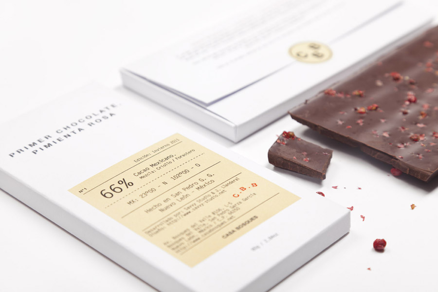
Casa Bosques is an initiative, founded by Mexico based design studio Savvy, to develop a variety of seasonal and sustainable products through a collaborative process across multiple disciplines. The initiative’s first product line, a range of 12 chocolates inspired by the months of the year, were created by master chocolatier Jorge Llanderal using high quality Ecuadorian cocoa fused with spices selected by experts.
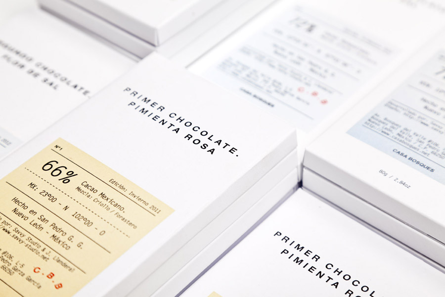
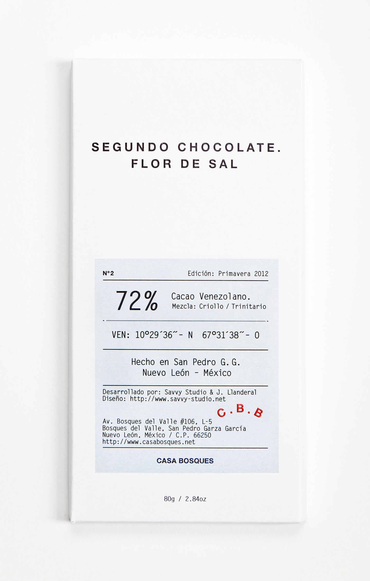
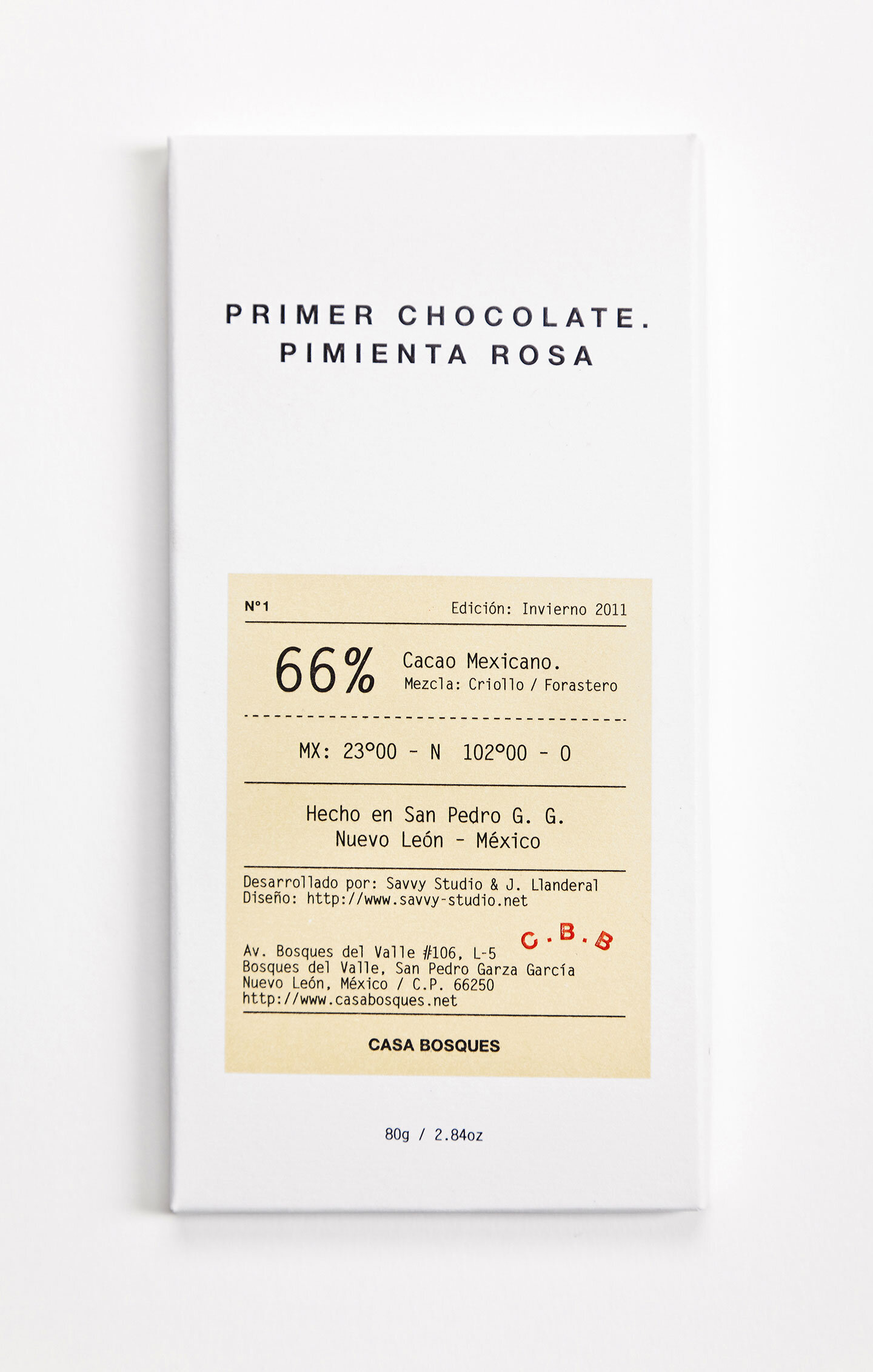
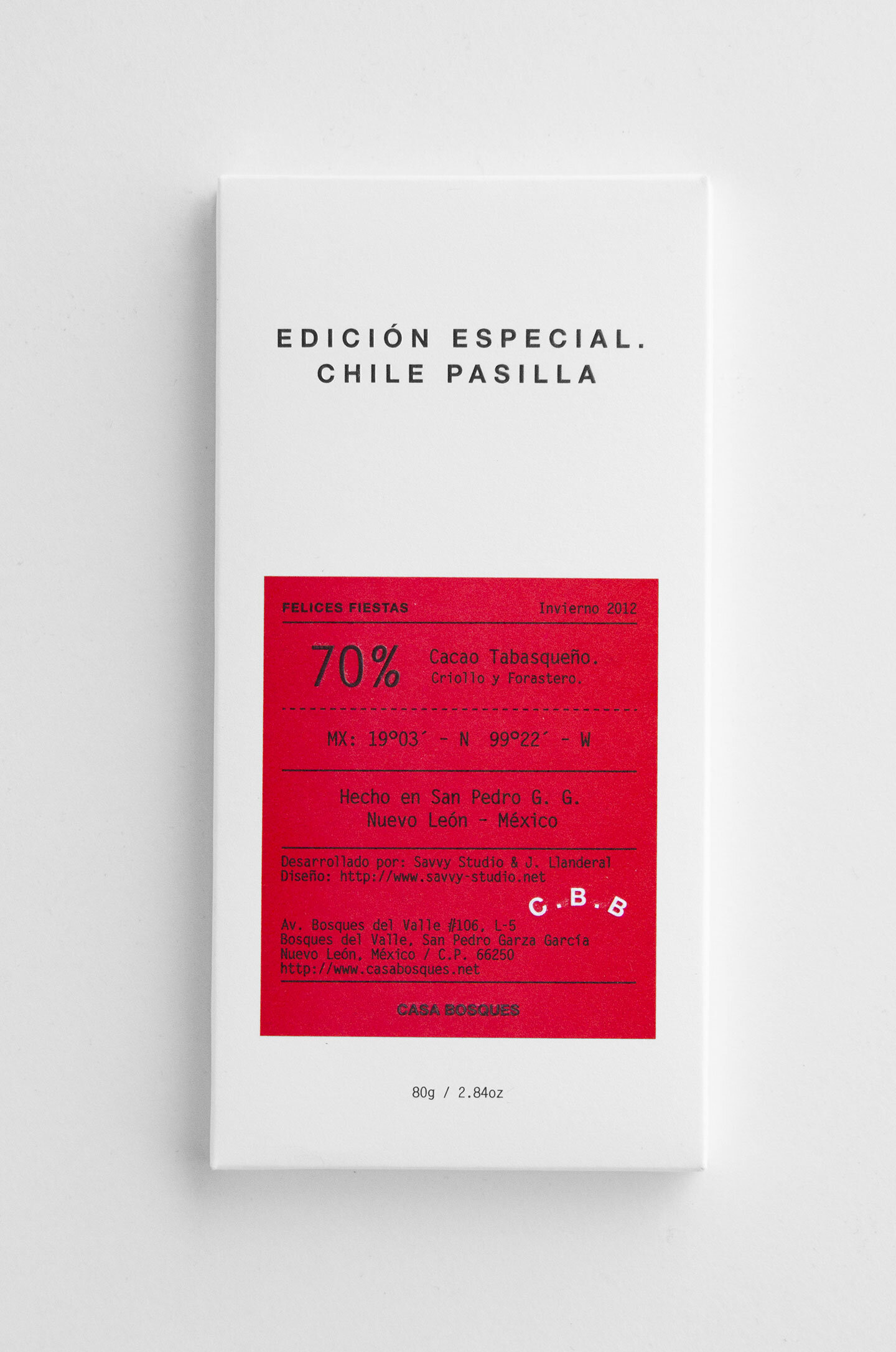
This is an incredibly interesting and unusual piece of chocolate packaging that presents the careful formulation of raw ingredients with a clinical and scientific resolution of a white substrate, adhesive label, space and the technical sensibilities of a broadly spaced, sans serif selection with a tall X height. The rejection of rich colour and the premium design conventions of the category, in favour of an information heavy, typographic solution (that confidently mixes type size, weight and line detail to deliver a practical hierarchical layout) appropriately places significant weight on cocoa content and provenance. It neatly avoids the superfluous without appearing under-designed, communicating a genuine and honest sense of quality.
The pale blue and orange highlights of an uncoated, self-adhesive label introduce a subtle craft-like and postal aesthetic that resolves the handmade qualities of the finished chocolate but also the raw, exported nature of the cocoa. The uppercase and embossed sans serif logo-type (suitably isolated in the top half of the pack) juxtaposes the functionality of the label and offers a more conventional premium aesthetic that stops the concept from becoming too abstract and unclear in its high quality proposition.
The elemental nature of the packaging perhaps presents the chocolate as more of a good quality cooking ingredient rather than a high street brand but its inversion of the darker packaging conventions of the sector makes it appear very distinctive and unique.
