Simplified Sending by Designworks
Opinion by Richard Baird Posted 16 August 2012
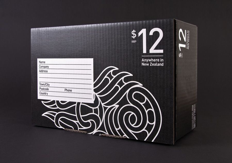
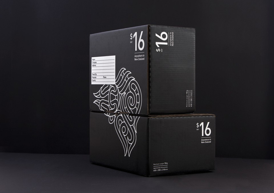
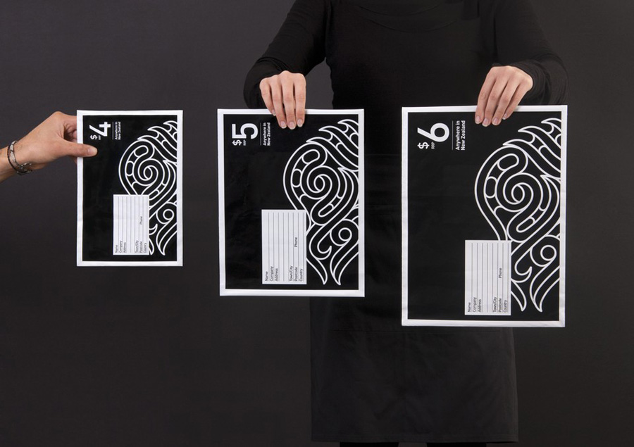
Simplified Sending is a complete package and post solution from New Zealand’s postal authority that simplifies the process of sending parcels to anywhere in the country. Created by Designworks the result is an interesting mix of utilitarian functionality, contrasting illustrative flourish and a monochromatic colour palette that takes the expected black on white print treatment and confidently inverts it.
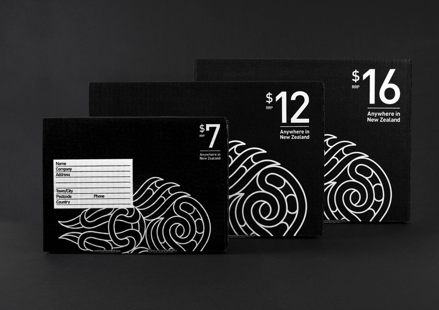
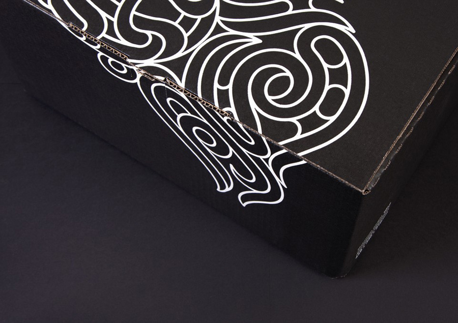
A lot of proprietary character is derived from simply inverting the familiar and economical qualities of a black on white print treatment. Along with a simple corrugated card structural solution, bold sans serif typography and straightforward language choice, these achieve a clear sense of functionality, accessibility and distinctiveness within a fairly conventional market. The illustrative detail offers an unusual contrast to the utilitarian postal aesthetic, neatly blending what looks like the themes of postal routes and connections (neatly running across multiple boxes) with an almost tribal and thumbprint sensibility that perhaps hints at the cultural and historical identity of New Zealand, while its consistent line-weight and geometry gives it a contemporary and technological twist. Together the illustrative and typographic combination and layout neatly mirrors that of a postage stamp, cleverly communicating the combined box and delivery tariff.
