Blue Hawk by United
Opinion by Richard Baird Posted 29 August 2012
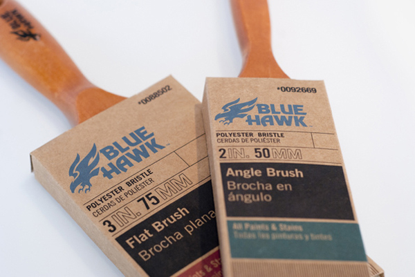
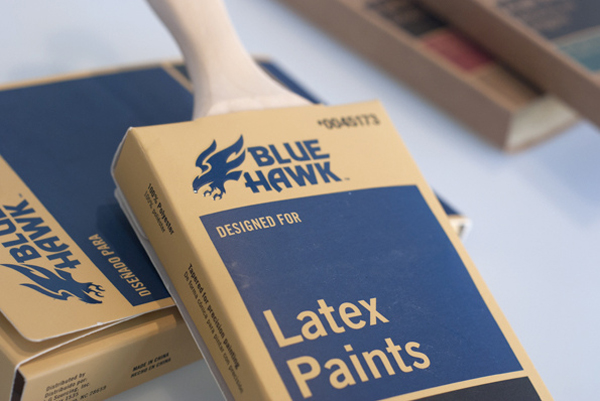
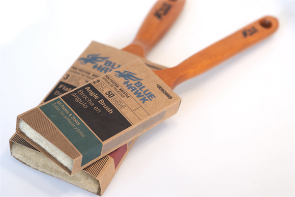
As part of an identity and packaging overhaul of three of US home improvement store Lowe’s product lines, an extensive process that included naming, brand language and architecture, in-store media, packaging extensions to 250+ items, production, brand guidelines and photography, design studio United were tasked with developing the Blue Hawk brand into a proposition with more contractor credibility.
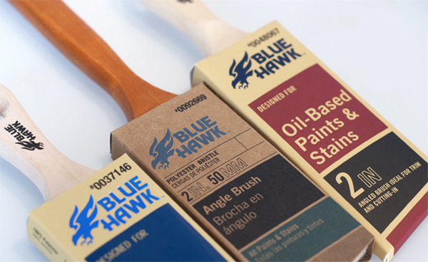
The result is an interesting structural solution that mixes unbleached, uncoated and coated material choices with foil detail that feels ideally representative of the painting and varnishing process and which functions well to divide product type. And a graphic design direction that combines the masculine and energetic aesthetic of an illustrative visual identity, the utilitarian functionality and communicative priorities of a clear packaging layout and hierarchy, the practical qualities of a tall and neutral typeface and fine line detail and textures, to deliver a strong, hardwearing and professional sensibility with an eye for high quality finishes.
