Platform by Substrakt
Opinion by Richard Baird Posted 13 September 2012
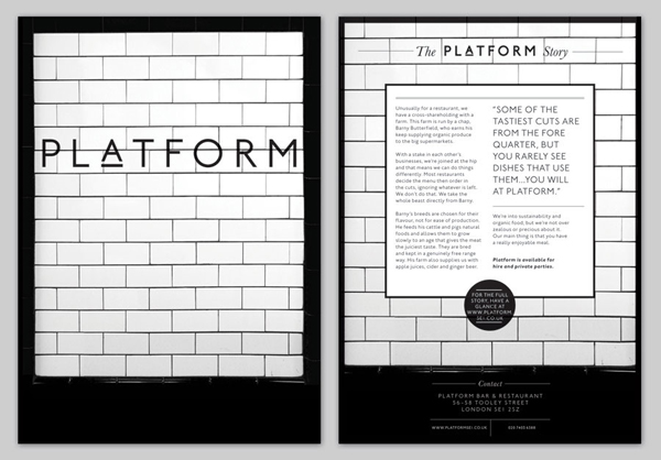
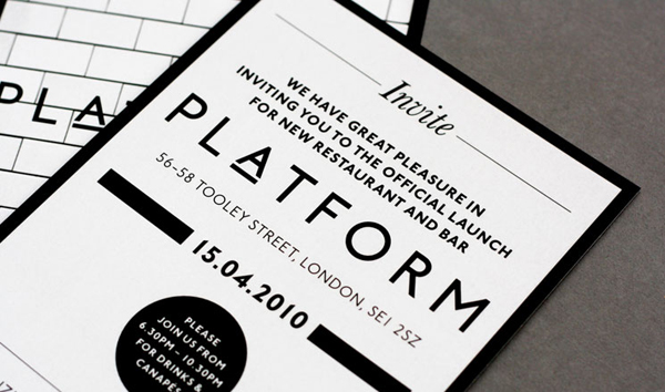
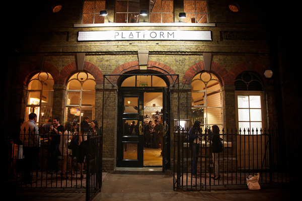
Platform is a bar and restaurant located on south east London’s Tooley Street that serves simple, honest food made from British farmed organic produce. Developed by digital design agency Substrakt, Platform’s visual identity mixes a simple logo-type with the iconic tiles once associated with London’s transport network, a key feature of the restaurant’s interior, to offer a more unique and sophisticated take on the organic and fair-trade dinning experience.
“We were approached by long standing client Tony McKinlay to produce a brand for a new joint venture with a traditional Devon farmer Barney Butterfield – a new restaurant nestled within the heart of SE1, under the history-steeped arches of London Bridge station. Diverting from the organic, fair trade, ‘gate-to-plate’ dining described to us, our eyes turned to the building. Named Platform, the restaurant sits in the archway under the oldest of the London railway termini and one of the oldest stations in the world. We explored the design of London transport systems; the black and white gloss brickwork, the humanist typefaces synonymous with the tube networks and railways of London. Taking inspiration from these devices we developed a branding system and signage for the venue which in turn determined the visual style of the website.” – Substrakt
Breaking slightly from the latest news format of BP&O, this project is a little older but follows yesterday’s Sailors Club project quite well sharing a similar mix of period typographic and pattern work executed with contemporary restraint and simplicity.
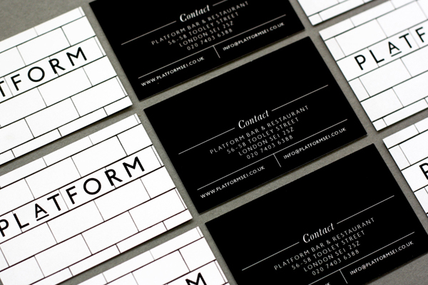
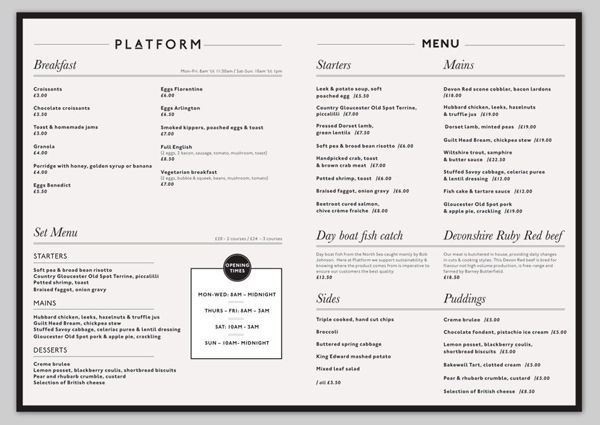
The consistent line weight, combination of wide and slim, broadly spaced sans-serif letter-forms, and the raised and underlined detail of the logo-type, clearly draws inspiration from late 19th century signage that delivers a retrospective authenticity, a period perceived to have good traditional values based around the ideas of locality and community. The monochromatic colour palette and simple geometry of the containers, frames and layouts across the collaterals appropriately reflect an honest but high quality menu free of superfluous detail. A number of small script details introduce a more conventional and sophisticated quality but remain largely complementary. The tile photography is remarkably simple but blends the aesthetics of traditional butchers with Victorian transport infrastructure to introduce a rich duality alongside the type, cleverly combining a sense of quality, personal service and provenance with the themes of honesty, practicality and truth to ingredients.
