ITI Computers and Diventa by Bunch
Opinion by Richard Baird Posted 12 October 2012

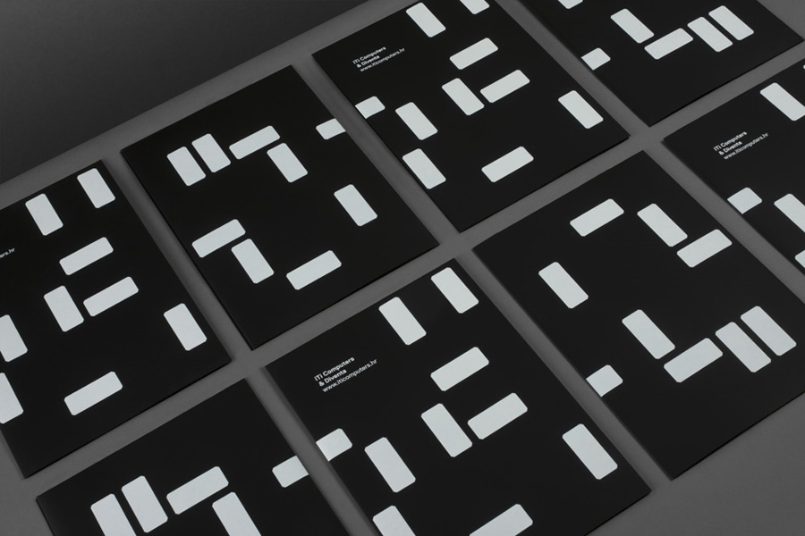
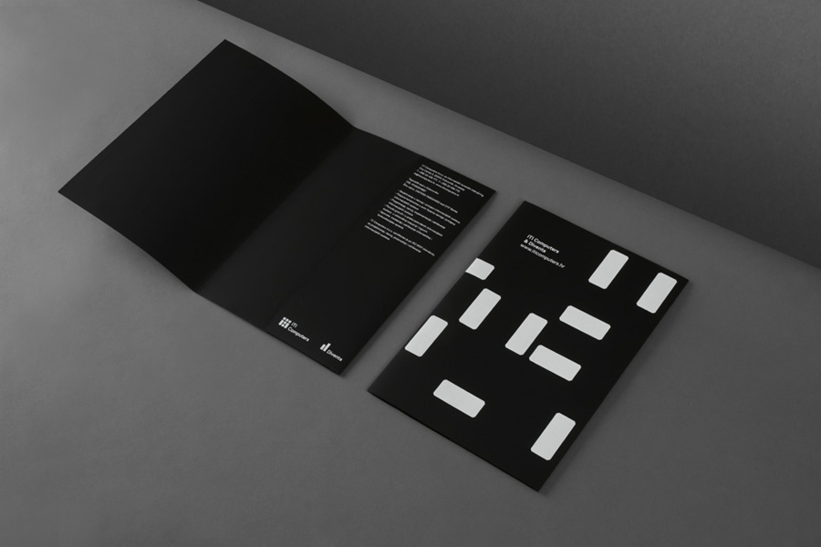
ITI Computers is a Croatian-based software company that specialises in the development of IT solutions for the leisure, tourism and hospitality sectors. Bound by a consistent typographic and monogrammatic design solution but divided by an organic and systematic contrast of context, creative agency Bunch developed a new logo and print solution for ITI and its leading management product Diventa, which delivers an interesting richness to familiar technological cues.
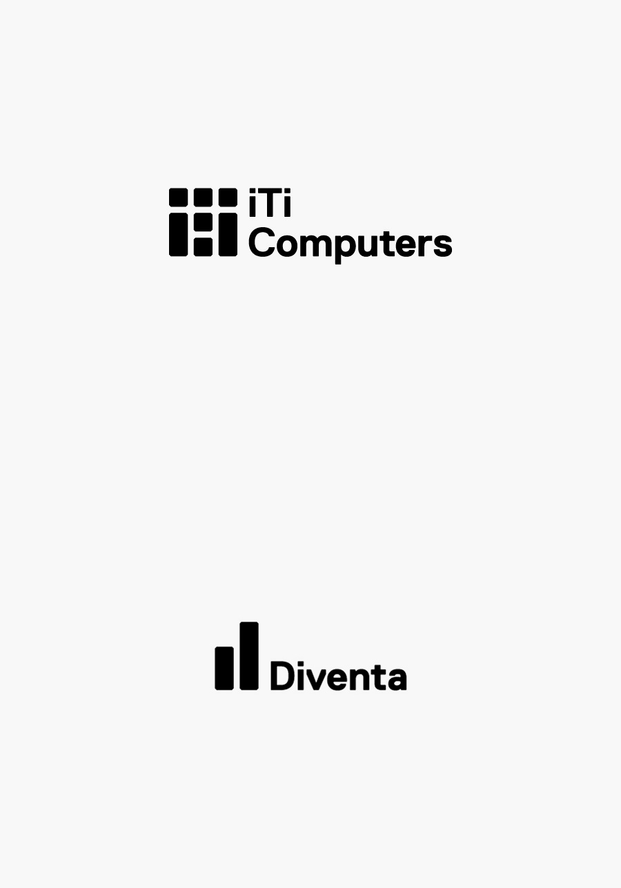
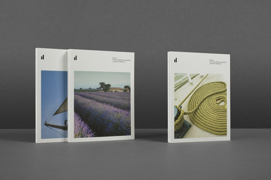
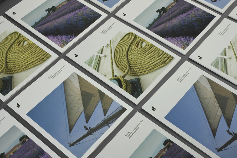
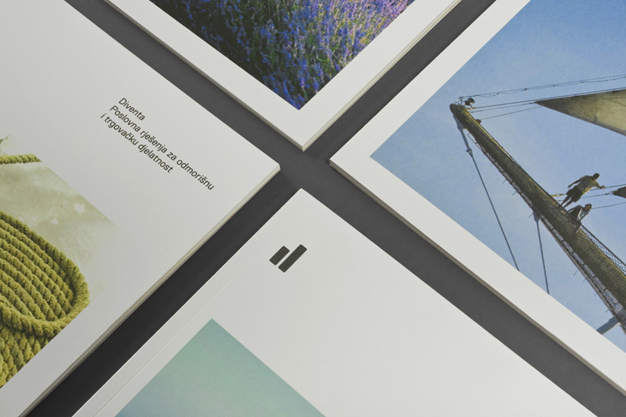
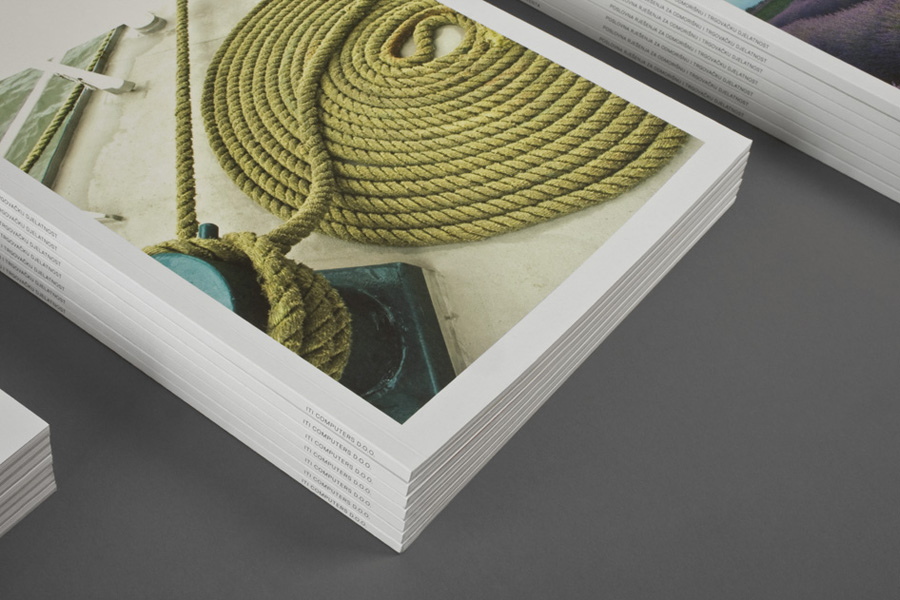
Both logo-types share the same authoritative weight, lowercase accessibility and solid spacing of Replica characters and the technological mix of simple geometric form, diagonal cuts and grid-based compositions of their marks. Together these are clear in their resolution of analytical growth, positive forecasts, bar charts, structure and statistics but with a smart monogrammatic duality that suggests individualised results. In contrast their brochures could be considered polar opposites, most notably in their division of colour. ITI follows a dark, techy and abstract approach with a sense of movement based around grids and systems while Diventa is white, light and airy utilising rich organic photography with an earthy colour palette and a lot of fine texture.
Unified under a consistent technological and analytical theme but divided by a broader and more communicative context, Bunch’s identity solution is an interesting juxtaposition of systems-based organisation and everyday accessibility. It cleverly draws together the statistical aspect of what is an emotionally driven consumer experience, the analytical power of the business and the management of personal data. A duality that perhaps draws its inspiration from the front and back-of-house structure of the hospitality industry.
Design: Bunch
Opinion: Richard Baird
Fonts Used: Replica

