Ogopogo by Bunch
Opinion by Richard Baird Posted 22 October 2012

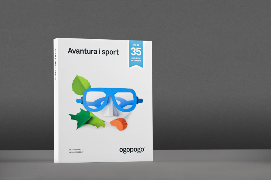
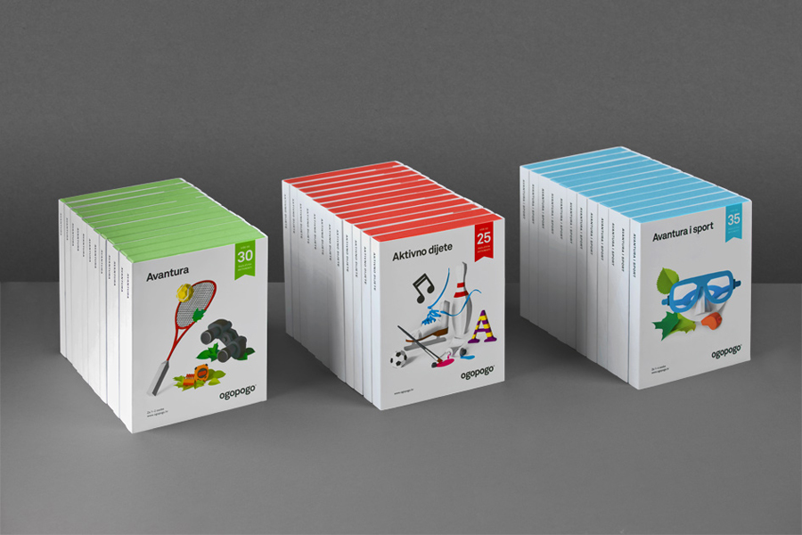
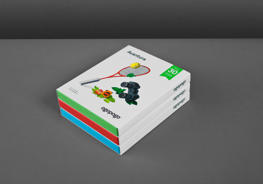
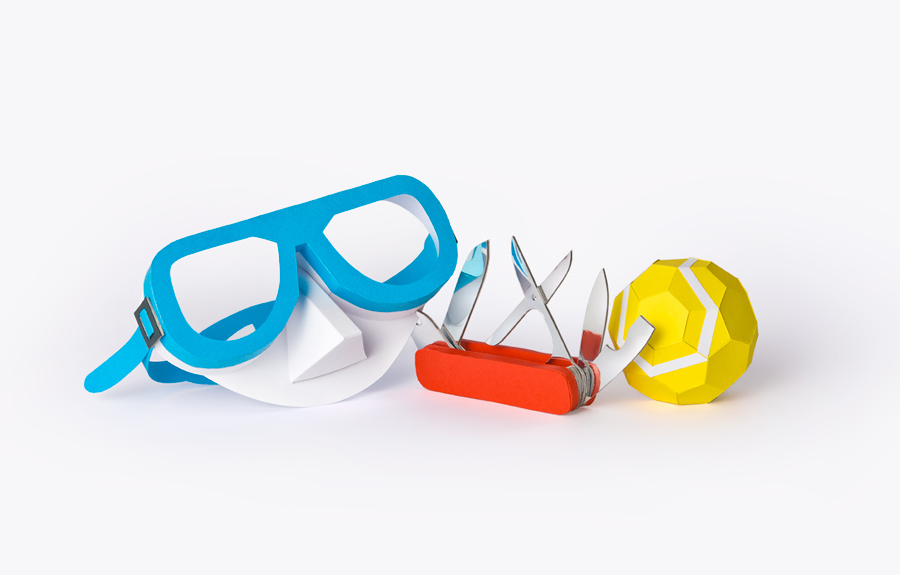
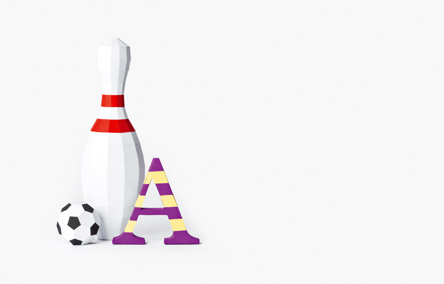
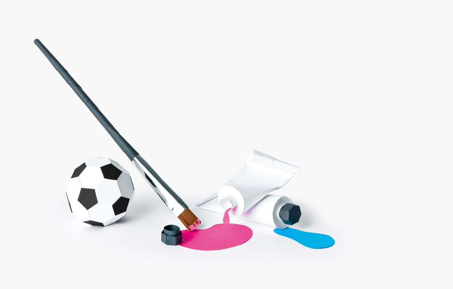
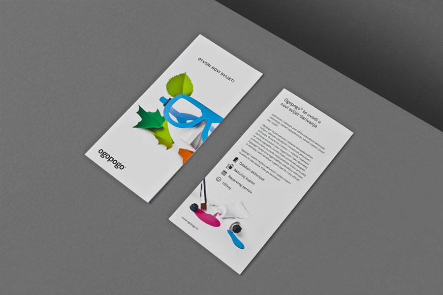
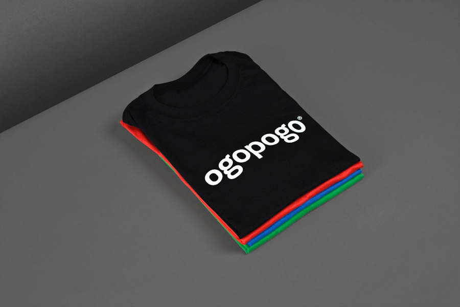
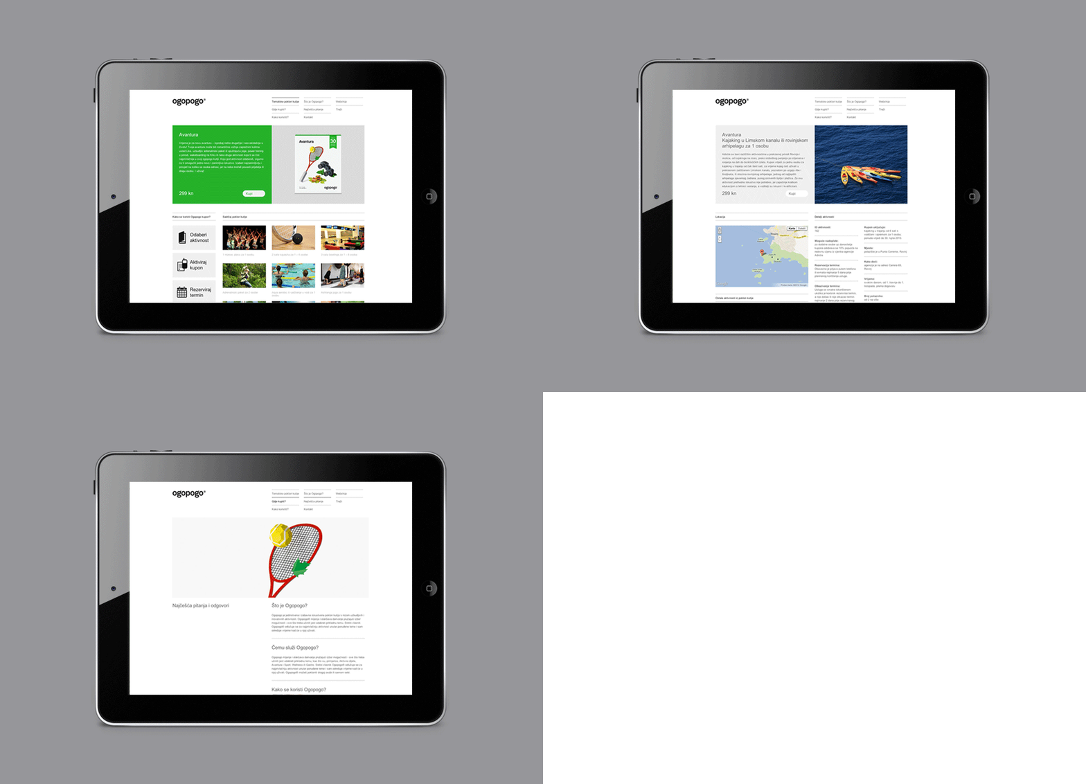
Ogopogo is a start-up that is introducing the boxed experience concept to the Croatian market. Their new brand identity, which include logo, print, packaging and website design developed by Bunch, juxtaposes the corporate formality and geometric consistency of a simple sans serif logo-type with the bespoke, crafted and playful qualities of bright folded paper photography.
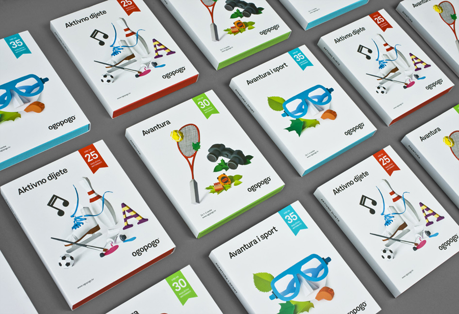
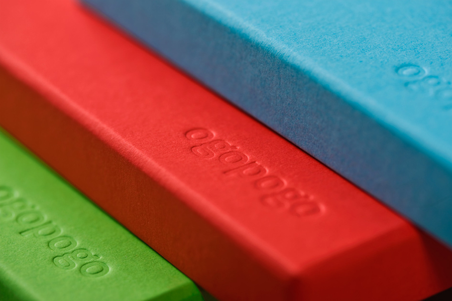
“Ogopogo allows you to choose from a selection of destinations and activities within a given theme. It consists of a gift box containing a brochure, with details of each activity and a voucher to redeem the selected experience. Bunch developed the Ogopogo brand, including naming, tagline, visual identity, website and the product design which features bold visuals hand crafted with paper cut-out models built by Tena Letica and beautifully photographed by Mladen Šarić. Great attention to detail was applied in production stages, especially in paper choice, to ensure that the tactility of paper models extends to the product.” – Bunch
The consistent line weight, square terminals, recurring bowls and black colour of a sans serif logo-type, while conventional in its distillation of reliability and professionalism, maximises the unique verbal qualities of the name and its unusual repetition of characters through simplicity. It appropriately leverages the compressed loops of the G’s to deliver a coiled energy that resonates well with the theme of activity and neatly creates what is perhaps the typographical equivalent of an onomatopoeia. Its formality is tempered slightly by the use of lowercase letter-forms and provides a subtle but valuable link to the lighter tones of the packaging.
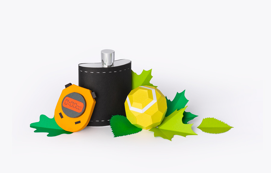
In contrast, the images introduce a richness through colour, shape and fine detail. Their hand-folded construction, quirky composition of unassociated objects and a bright colour palette across the ample white space of each box establishes a playful and contemporary personality. And although there is a slight disconnect between packaging and experience (usually achieved through stock-photos) these image work well to suggest that each experience has been uniquely ‘crafted’ and are far from generic while also tapping into the youthful excitement associated with receiving creative gifts.
The result is a smart and communicative duality delivered through the juxtaposition of hand craft and professional quality – clearly split between type and image – that makes it appear fun but structured.
