GR Communications by Ascend
Opinion by Richard Baird Posted 1 November 2012
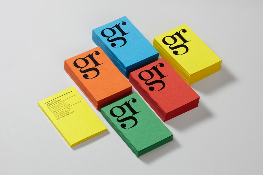
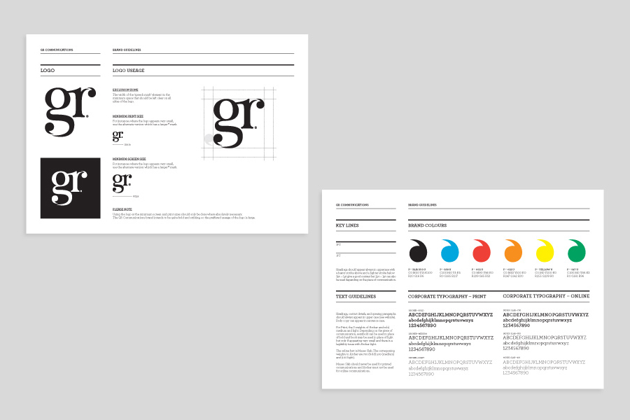
GR Communications is a London based PR agency that is described as being made-up of a ‘close knit group of progressive and forward thinking experts’. Their visual identity, designed by independent brand, graphic and web design agency Ascend, captures the idea of unity, communication and creativity through a simple ligature detail, single quotation marks and a diverse, vibrant but complementary colour palette.
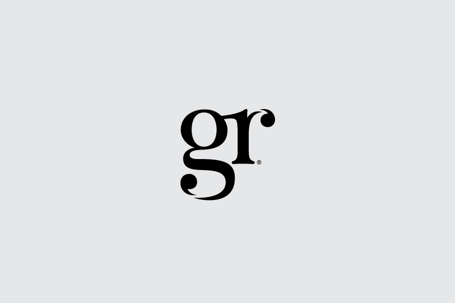
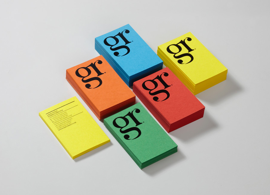
The monogram, set at the very heart of the visual identity through its large application across the stationery and website, contrasts classic serif detail with the practicalities associated with stencil cuts. These draw out single quotation marks that feel obvious but appropriate for a communications firm, whilst a simple, unforced ligature and tight letter-spacing introduces a subtle sense of unity and integration.
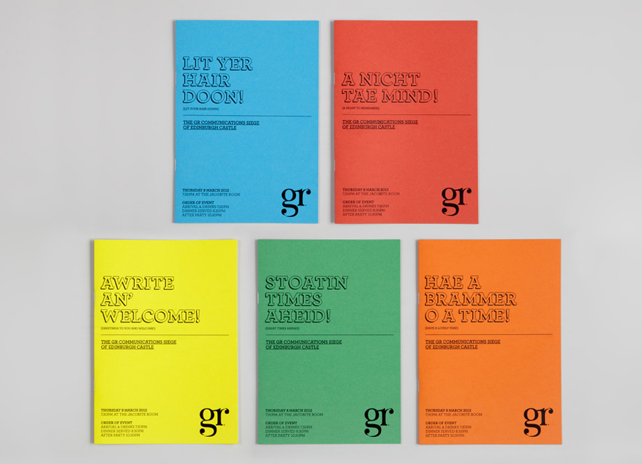
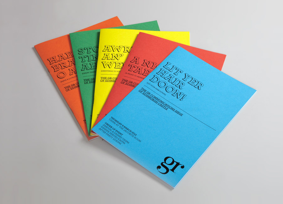
An underlying industrial and economical quality resonates through the slab serifs of Museo on-line and Archer in print and the block shadows and manual-like layout of the collaterals. A bright colour palette of dyed, rather than surface printed uncoated substrate choice, and playful tone of voice introduce a creativity and cheerfulness that introduces a nice balance to both the functionality of the type and the classic embellishments of the monogram.
Design: Ascend
Image Credit: Matt Le Gallez
Opinion: Richard Baird
