Tin Can by COOEE.
Opinion by Richard Baird Posted 20 November 2012

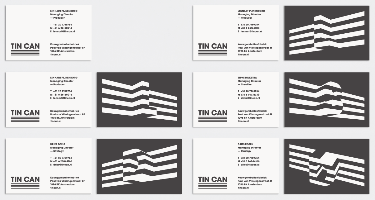
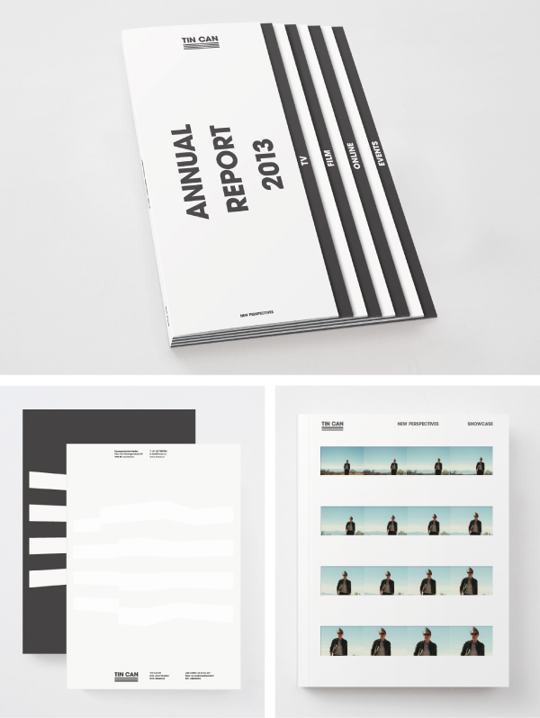
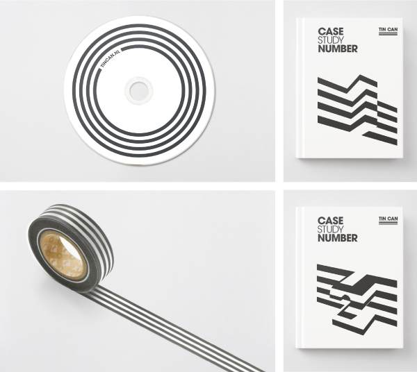
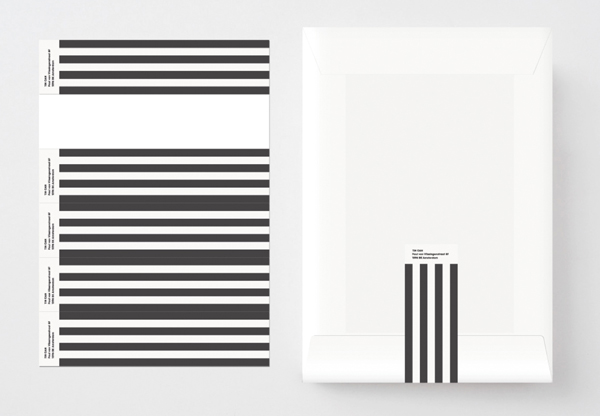
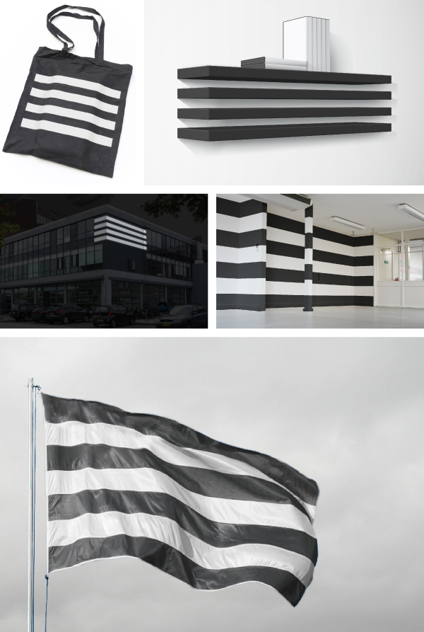
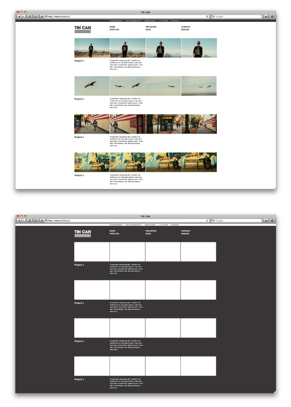
Tin Can is a Dutch production company that specialises in the ‘development and production of formats in the field of television, branding, online and events’. This on-screen and environmental multi-disciplinary ‘bridge’ is reflected through an identity solution, created by editorial and visual identity design studio COOEE., that pairs a simple sans serif logo-type with four horizontal lines which move across and consistently wrap both digital and physical surfaces.
“As shown in the movie, the entire identity consists of two basic elements that constitute the logo; namely a basic typography and four basic lines. Each line refers to one of the four disciplines of their profession. These lines are the main ‘format’ for the entire identity and are adaptable to different types of content and applications.” – COOEE.
The logo-type is pretty simple, a well spaced combination of uppercase sans-serif characters built from Avant Garde Gothic conveys a professionalism, functionality and to some degree a neutrality needed to serve multiple sectors. Underlined four times, a simple conceptual idea drawn from the company’s multi-disciplinary approach, adds a sense of authority, confidence and corporate consistency. These four strokes, while not massively unique (see Adidas and Pentagram’s work for Republic Records), achieves a cross-platform distinctiveness through their wrapping of both three dimensional digital and physical environments. Animated and as stills these deliver both a dynamism and a sense of multiple perspectives across various collaterals that resonates well with the theme of format which is enhanced by a monochromatic colour palette that delivers a more abstract, experimental and creative quality alongside the conventions of the logo-type.
The visual identity’s relevance and relationship to the Tin Can name and its four-fold proposition is not immediate but like the weight of the logo-type it is incredibly bold and confident in its simplicity, and original in its dimensional application.
