Rummo by Irving & Co.
Opinion by Richard Baird Posted 21 November 2012
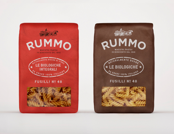
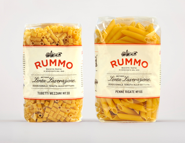
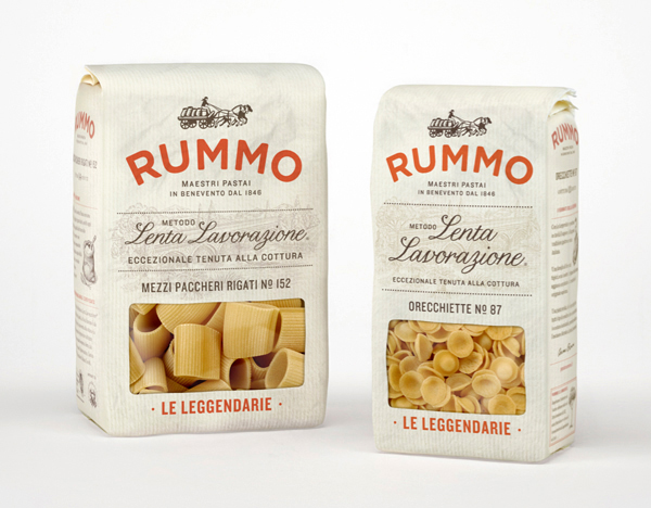
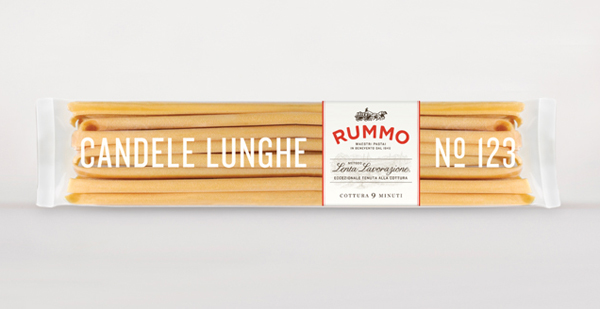
Back in June family owned Italian pasta manufacturer Rummo launched a new visual identity and packaging solution created by London-based independent communications firm Irving & Co. With the few images published on their website I described the new design in my original post as successfully delivering rustic charm, a sense of local quality and heritage through a craft colour palette, visual texture through fine detail, tactile materials and print finishes set alongside a script and contemporary sans-serif combination over a classic, etched illustrative background. The latest set of images continue to deliver on these sentiments but with the addition of a stencil cut typographical selection and a richer but economical single and two-tone flat colour choice across the Le Biologiche range that together add an almost retro industrial/agricultural utility that neatly reflects the commoditised nature of pasta.
“Rummo are a family owned pasta producer based in Benevento in the region of Campania. Their philosophy “Metodo Lenta Lavorazione” extols the virtues of taking time to make things properly. This vision is articulated through all levels of the brand from the simplicity and honesty of the logotype through to the tactility and texture of the brown cartons and paper bag based packaging used for the Leggendarie range. We’re continuing to build and apply the new concept in collaboration with the Rummo family and Charlotte Moore, an American born creative now living in Milan.” – Irving & Co.
