November’s Top 5 Projects 2012
Opinion by Richard Baird Posted 30 November 2012
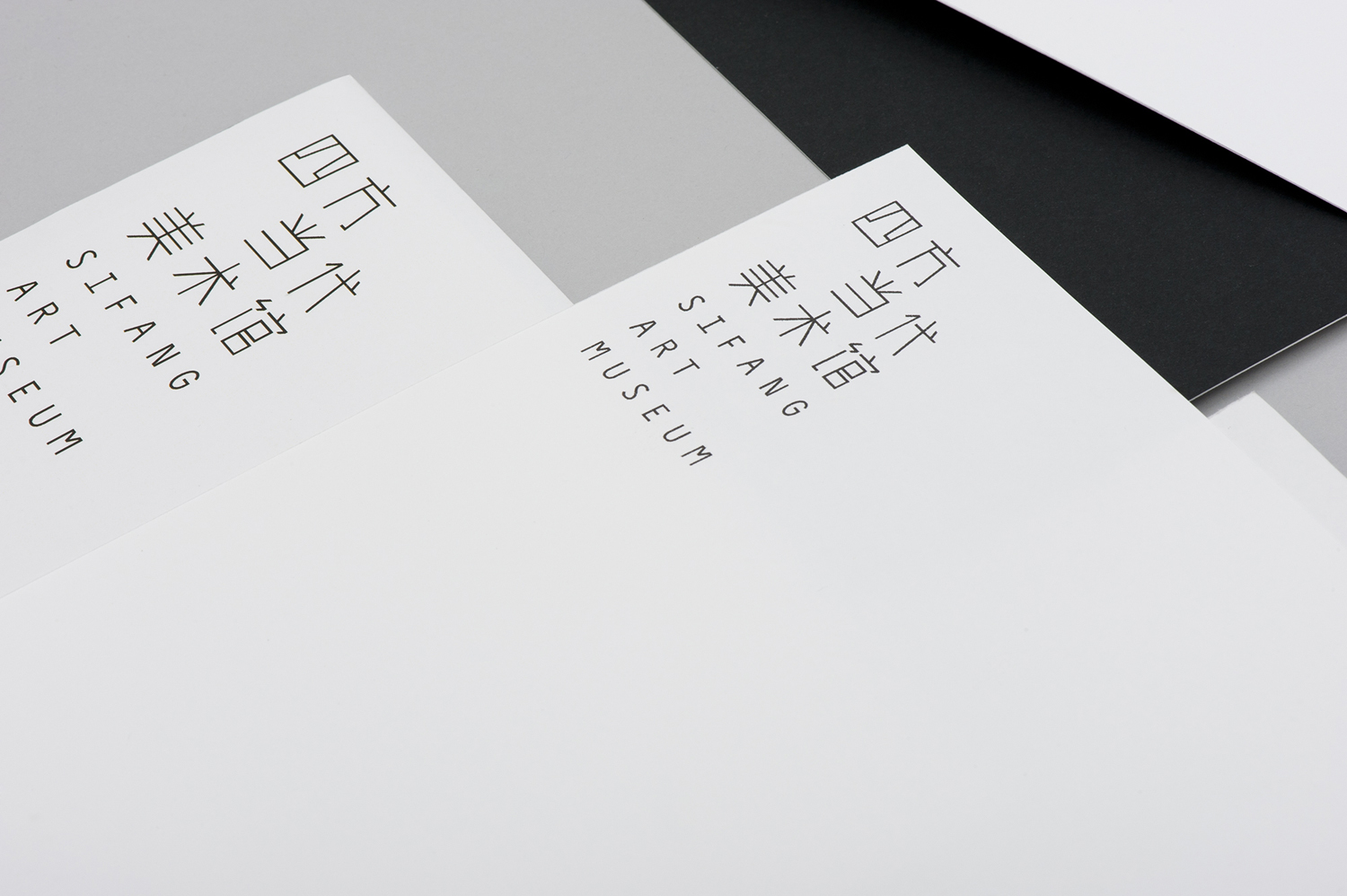
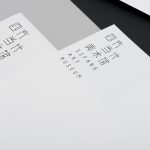
Sifang Art Museum is a gallery and creative space located in the Pukou region of Nanjing, China dedicated to art, architecture and international collaboration. Their visual identity, a bilingual logo-type set across a collateral of unusual trapezoidal cut detail and monochromatic material choice – developed by Singapore-based creative and strategic design agency Foreign Policy – draws together the themes of architectural space, the dimensionality created by light and shadow, the meeting of ideas and the built environment.
Read the review here
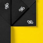
Hardpop is an electronic music venue located in the city of Juárez, México that plays host to both international and national DJ’s. Their visual identity, a contemporary interpretation of classic military insignia paired with a combination of familiar and unusual typographic forms bound by a consistent weight, and a collateral solution that reflects the contrasting nature of the name through material choice, colour and print finish, was created by ‘supermodernist’ design bureau Face.
Read the review here

Renata Noronha Cossio is a Brazilian-based provider of ‘sworn’ Portuguese, French and English translation services that cover official documents such as birth, marriage and academic certificates, passports and residential permits. Her visual identity, developed by creative design agency Studio Constantine, is a really interesting and unusual diagrammatic interpretation of a classic monogrammatic presentation of personal service. Its combination of fine line work, arrows, light geometric type, use of space and complete three-point structure conveys a closed system privacy, a full service proposition that brings together Renta’s linguistic experience of three languages and a technicality that implies a high level of ability.
Read the review here
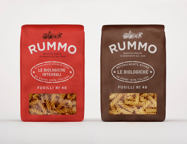
Italian pasta manufacturer Rummo have recently launched a new visual identity and packaging solution created by London-based independent communications firm Irving & Co. The solution conveys rustic charm, a sense of local quality and heritage through a craft colour palette, visual texture through fine detail, tactile materials and print finishes set alongside a script and contemporary sans-serif combination over a classic, etched illustrative background.
Read the review here
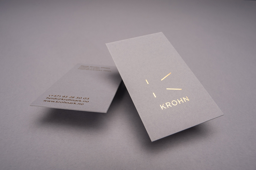
Krohn is a ‘young but experienced’ Oslo-based furniture, interior and architectural design studio that develops holistic solutions that strengthen and add value to brands through interior environments. Krohn’s visual identity, website and stationery, created by visual communications agency Commando Group, captures the multi-disciplinary nature of the studio and juxtaposes architectural structure and interior space with fine detailing through an abstract, multi-perspective logo-mark, interactive applet and the union of an uncoated concrete grey substrate and gold block-foil finish.
Read the review here