Doce Cielos by Anagrama
Opinion by Richard Baird Posted 11 December 2012
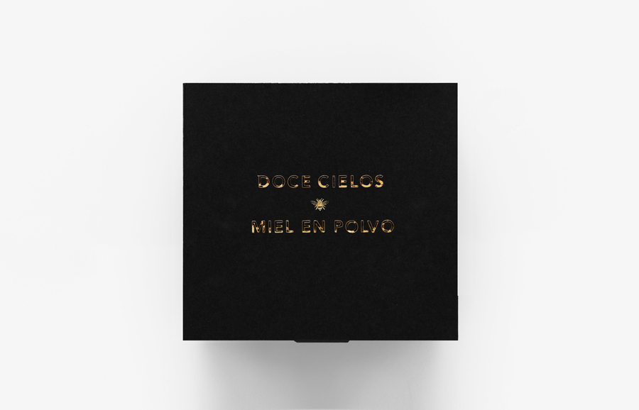
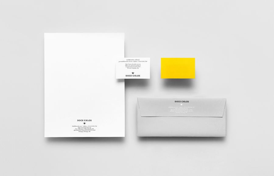
Doce Cielos is a traditional handcrafted Mexican honey brand with a mission ‘to encourage the recognition and consumption of native apiculture products’ and emphasise their ‘richness in flavor, texture, color and benefits to personal health’.
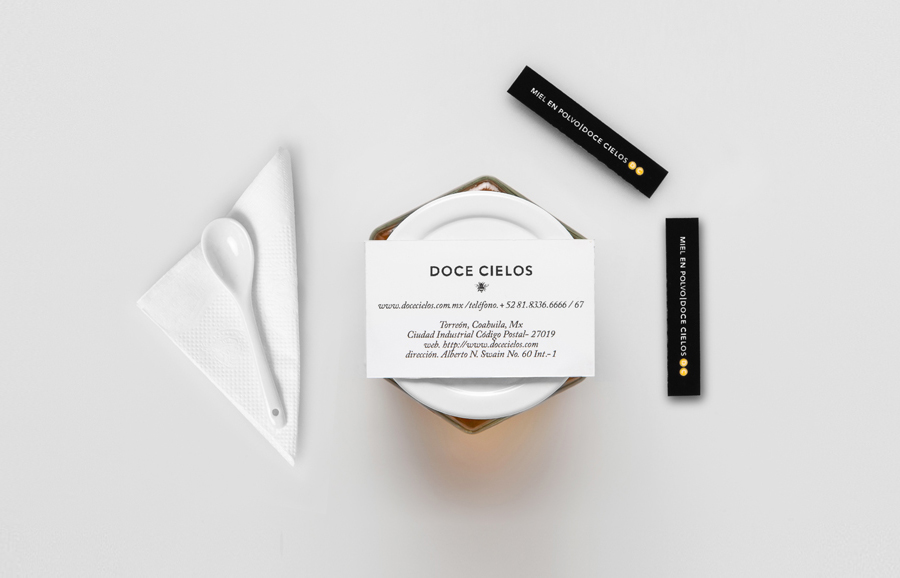
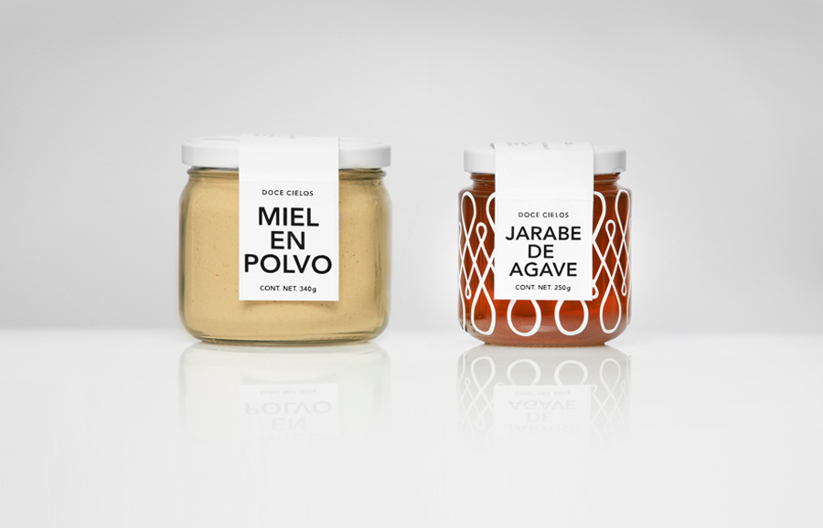
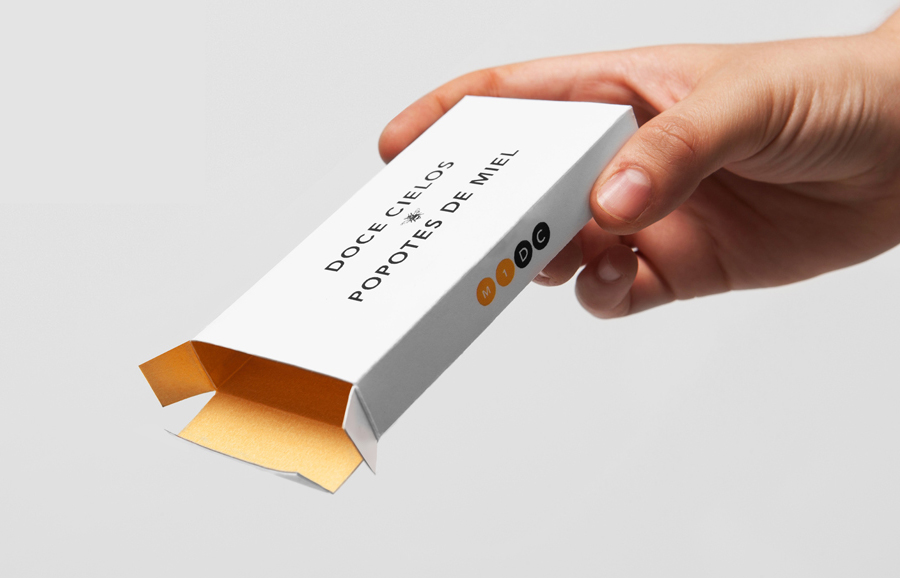
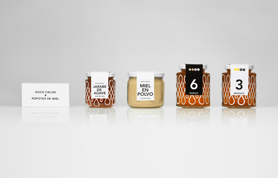
The brand’s visual identity and packaging solution, developed by independent design agency Anagrama, is an unusual craft and corporate juxtaposition delivered through a well spaced but fairly neutral sans-serif logo-type, the scientific numbering of products, plenty of space alongside the very fine hand sketched bee and a raised illustrative detail that avoids the hexagonal design tropes in favour of a honey drop loop – drawing together region and product – running across the circumference of the jars.
It is a direction that while incredibly restrained in its typographical approach manages to not only balance an almost clinical consistency and high quality with a sense of handcraft and local industry but also offers an originality and conceptual richness to a visually stagnant product sector.
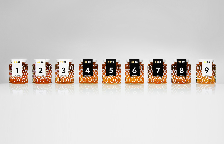
“The packaging lines make allusion to traditional handcrafted Mexican paintings and art pieces. Our proposal achieves a sophisticated link between the Mexican handcrafts heritage and the honey’s sweet traditional essence. Since the brand’s primary products are honey-based, we chose a bee for the logo. The packaging design praises the great variety of honey varieties using a categorization based visual system and nomenclature. The typography is meant to convey the cleanliness and elegance of the product.” – Anagrama
