Iannilli by Savvy
Opinion by Richard Baird Posted 18 January 2013
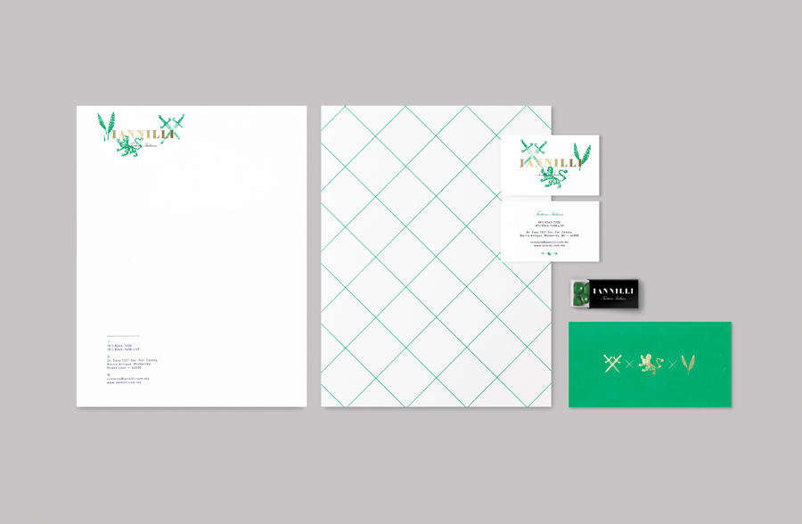
Iannilli is a traditional Italian restaurant located in the Mexican city of Monterrey. Its visual identity, recently revised by design studio Savvy, contrasts classic and contemporary design cues to satisfy an established clientele – expecting traditional food and service – while also appealing to a younger generation.
“With this project we proposed the creation of a graphic identity that gives honor to the Iannilli family, their restaurant and their loyal clientele that has accompanied them from the beginning, and, at the same time, to develop an identity attractive to a younger segment, fueling the growing interest of young people of providing an important space in their lives to the dining experience. Following the concept of the “Romantic Nostalgia”, Iannilli is defined as an intimate place to evoke memories and enjoy the romance of a good dinner. Tradition, experience and Iannilli’s past, at the service of their present guests.” – Savvy
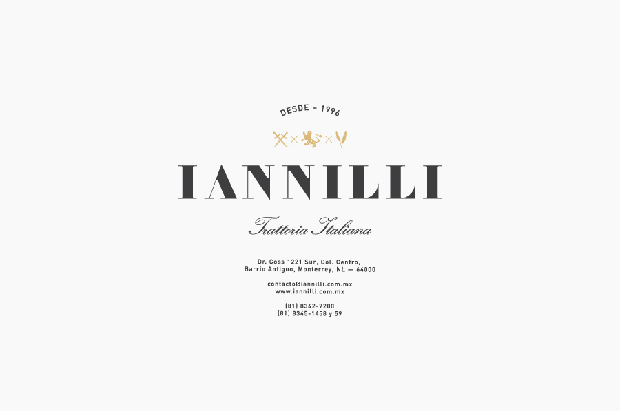
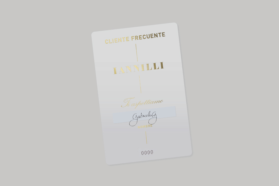
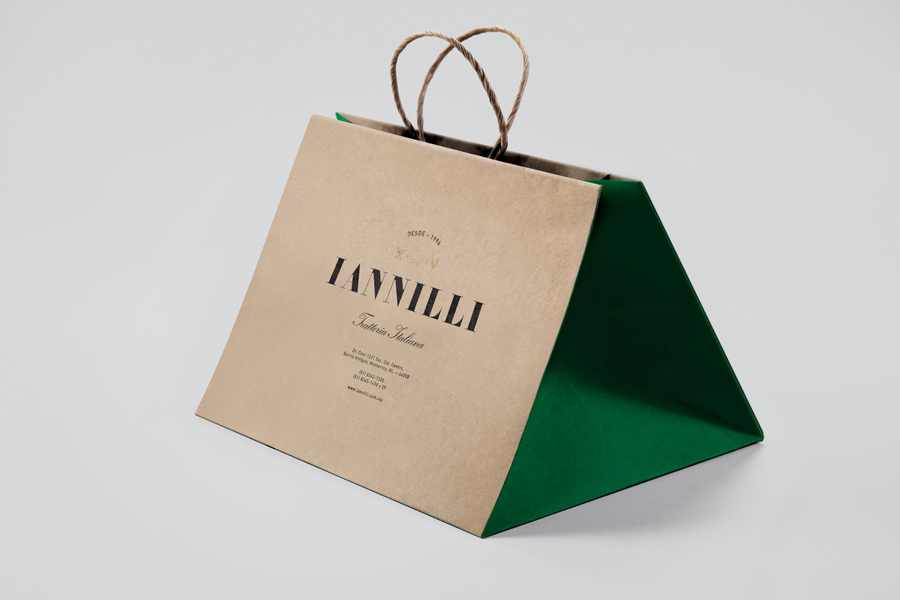
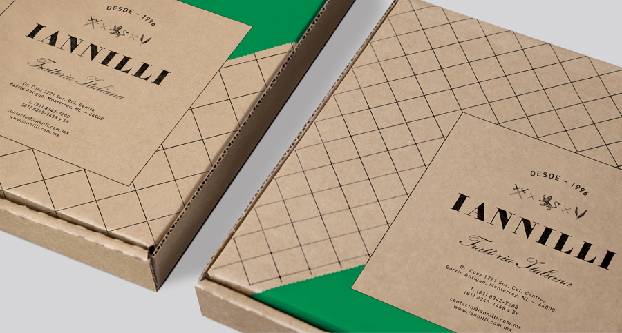
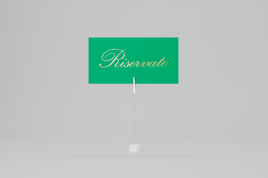
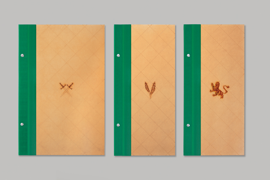
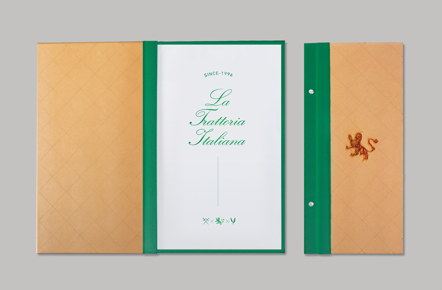
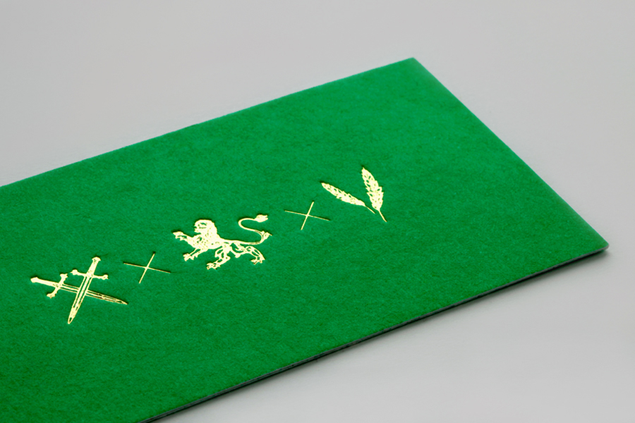
Savvy’s design solution is an interesting juxtaposition of the traditional – heraldic iconography, the flourishes and low x-height character of a script, a curved baseline, cross-hatch pattern, gold foil, heat-treated and stamp-based print finishes across tactile substrates – alongside the more recent sensibilities of a well-spaced, uppercase Didona logo-type – a digitisation of 18th Century letter-forms and itself delivering contrast through its union of bold and very fine strokes – a neutral sans-serif and bright green spot colour choice as well as the on-trend tinting of vintage photography across the website.
Together these achieve a smart and communicative duality that deliver distinction without appearing old-fashioned by appropriating heraldry as a communicative device rather than a authentic presentation of significant heritage, and infuse it with a craft and high fashion undertone that appropriately conveys a continued commitment to quality and service provided within a modern environment.
