The Honours by Touch
Opinion by Richard Baird Posted 24 January 2013
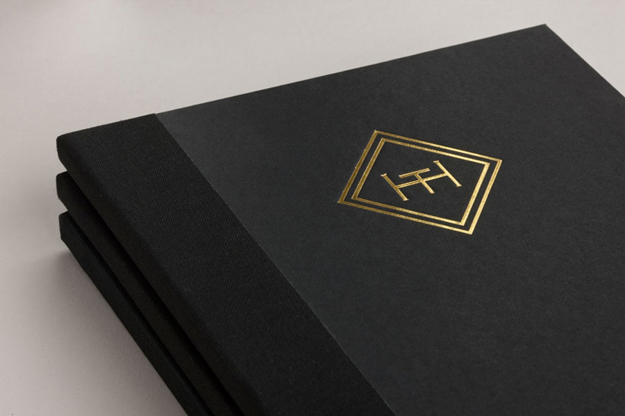
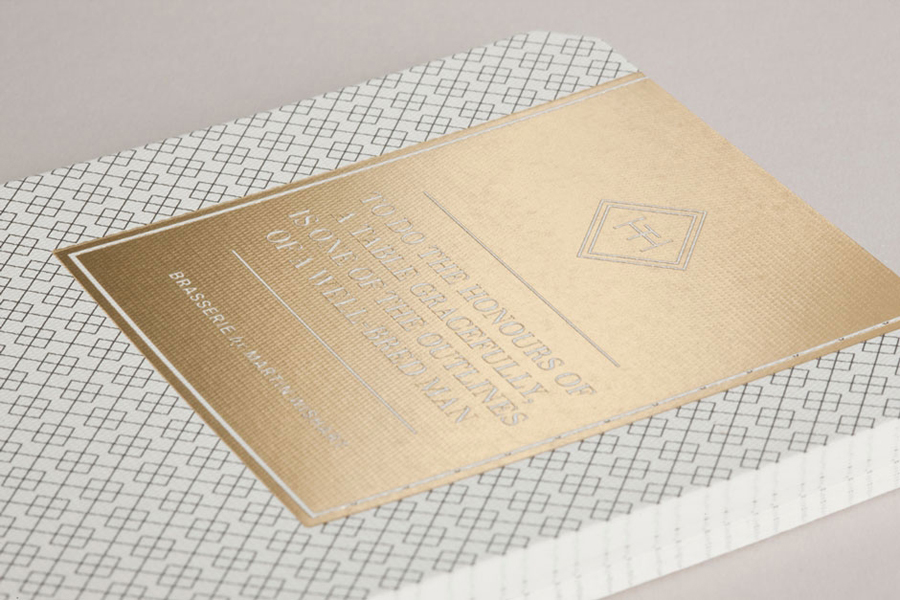
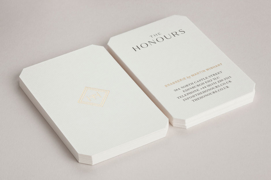
The Honours is an Edinburgh-based and Parisian-influenced brasserie owned by two Michelin-starred chef and restaurateur Martin Wishart. The brasserie’s visual identity, developed by creative agency Touch – also responsible for the branding of Martin’s other establishments, combines a well-spaced logo-type, a creative monogram, black and cream colour palette, tactile material textures and a block foil print finish to communicate a traditional crafted approach to food, the use of high quality ingredients and personal service practices set within a contemporary environment.
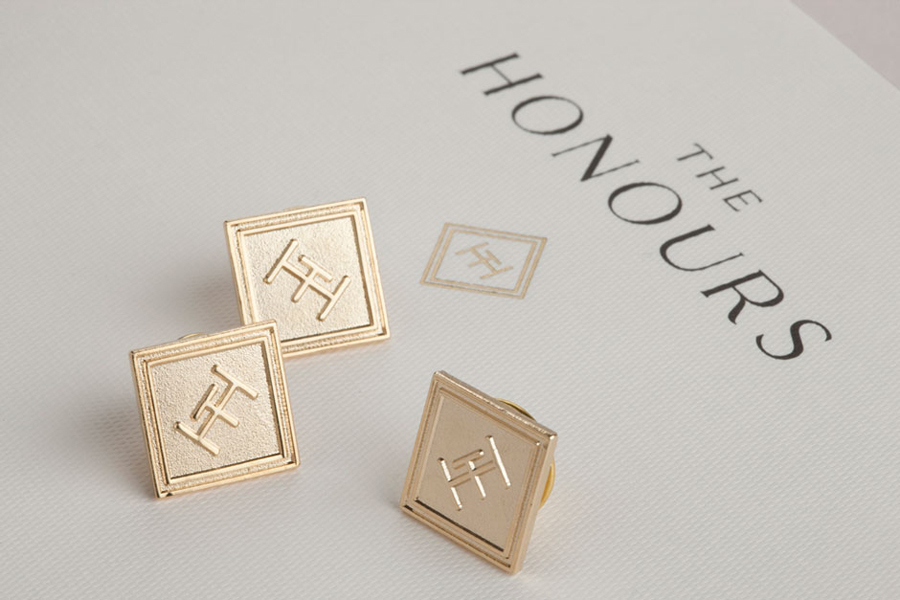
“Given its illustrious location on North Castle Street, near to Scots literary hero, Sir Walter Scott’s townhouse, we came up with The Honours. (In 1818, Sir Walter Scott famously unearthed the crown jewels – or Honours of Scotland – at Edinburgh Castle.) We then developed a stylish mark based on the initials ‘TH’, which also formed an abstracted table shape.
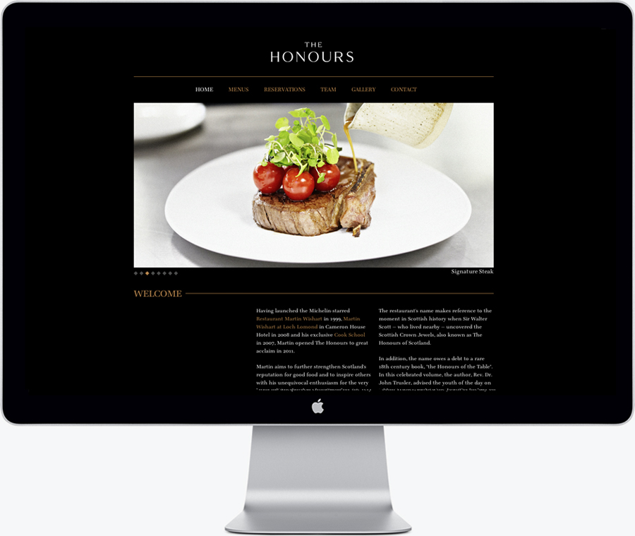
In addition to developing the brand identity, we were also responsible for the art direction on the project, working with photographer Matt Davis on a suite of stylised, reportage-influenced images that communicated the vibrancy and feel of the space. These were subsequently used in press advertising, pre launch material and a clean, modern HTML website with an integrated booking system.” – Touch
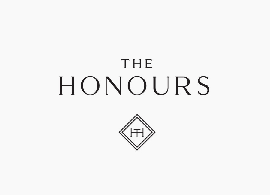
This is the second piece of work from Touch to feature on BP&O this week following Monday’s Pizza Luxe article. Both culinary experiences but with significantly different propositions. Rather than the urban cool of Pizza Luxe, The Honour establishes the formality and professionalism expected of a modern fine dining experience through the serif letterforms of a well-spaced, uppercase, logo-type which features a lovely variation in stroke width.
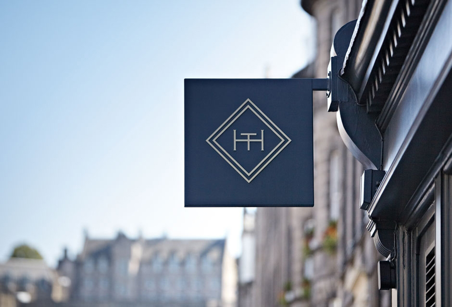
A TH monogram with an table and chairs duality, executed with the contemporary sensibilities of a single consistent line weight—conveying craftsmanship and personal service but with a distinctive and creative twist, and the perceived luxury and timeless quality of a gold block foil—enhanced by the delicate fine lines of the pattern work, the tactile finish of what looks like a Gravure emboss and the classic cream and black material combination of the collaterals.
