Metronet by Work In Progress
Opinion by Richard Baird Posted 2 April 2013
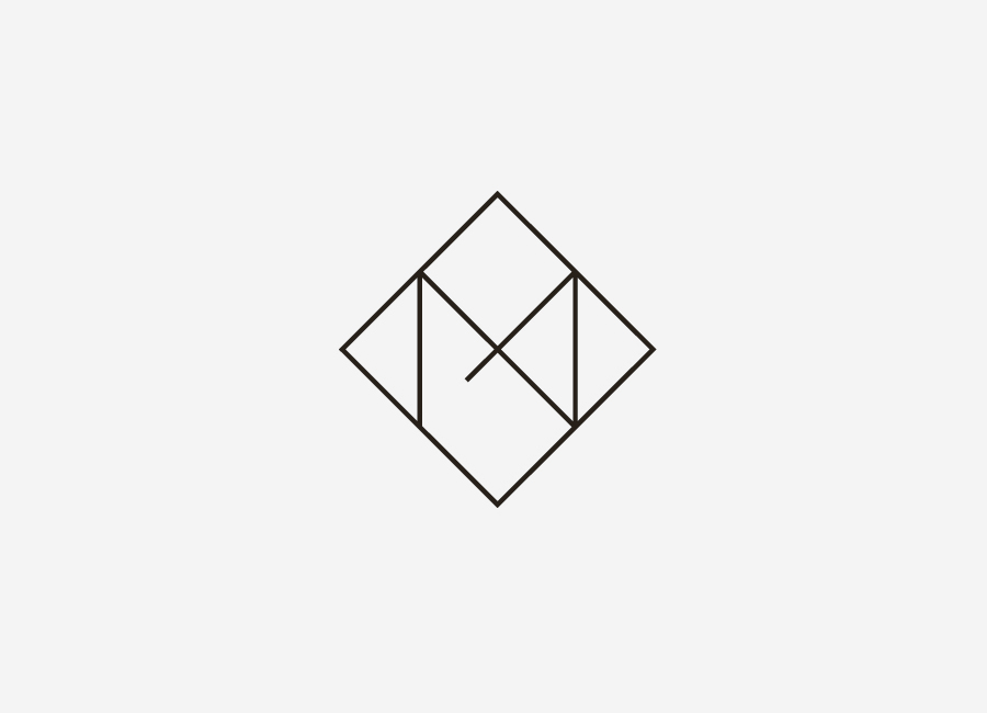
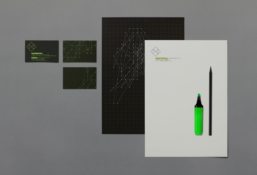
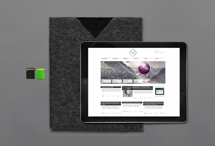
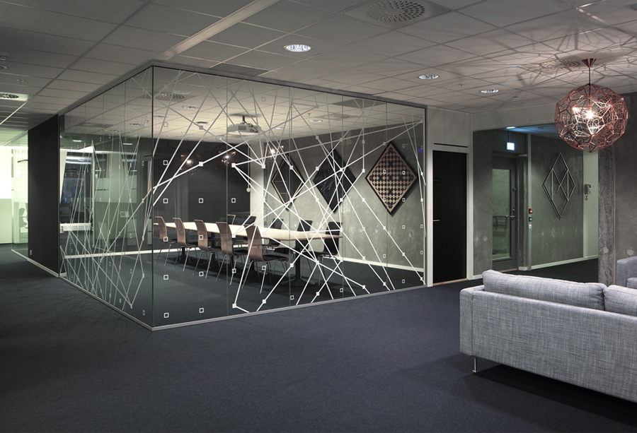
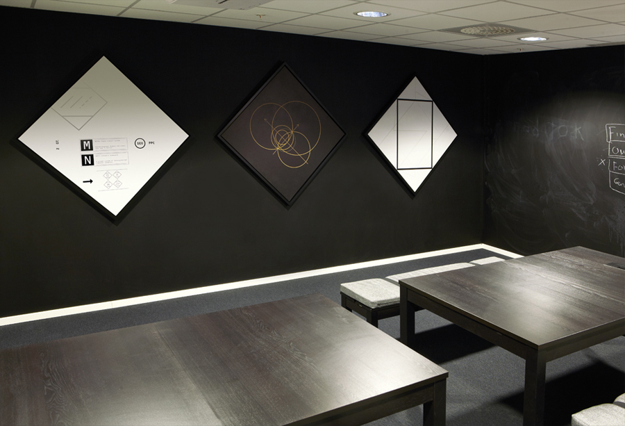
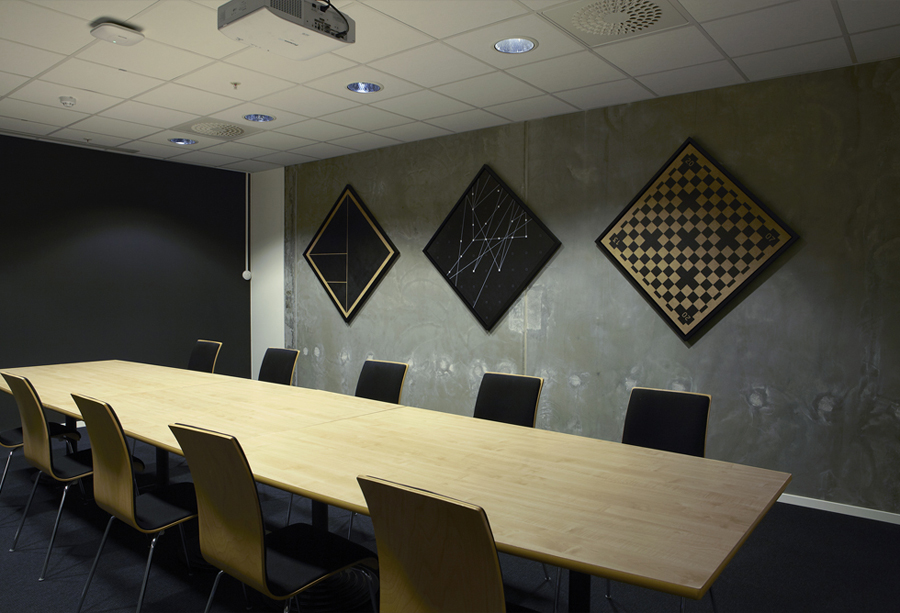
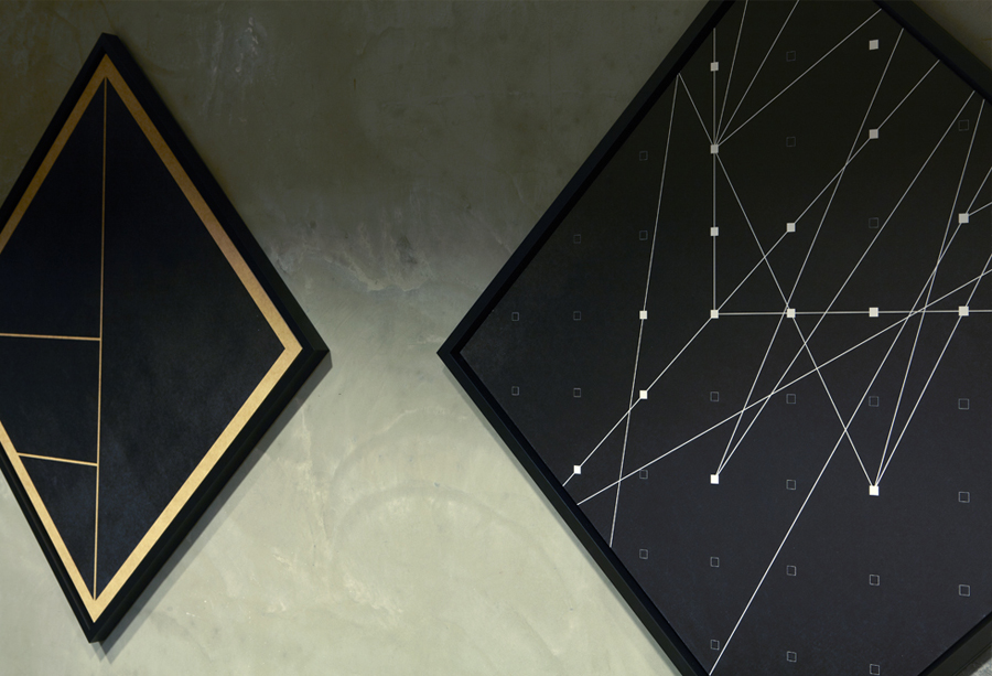
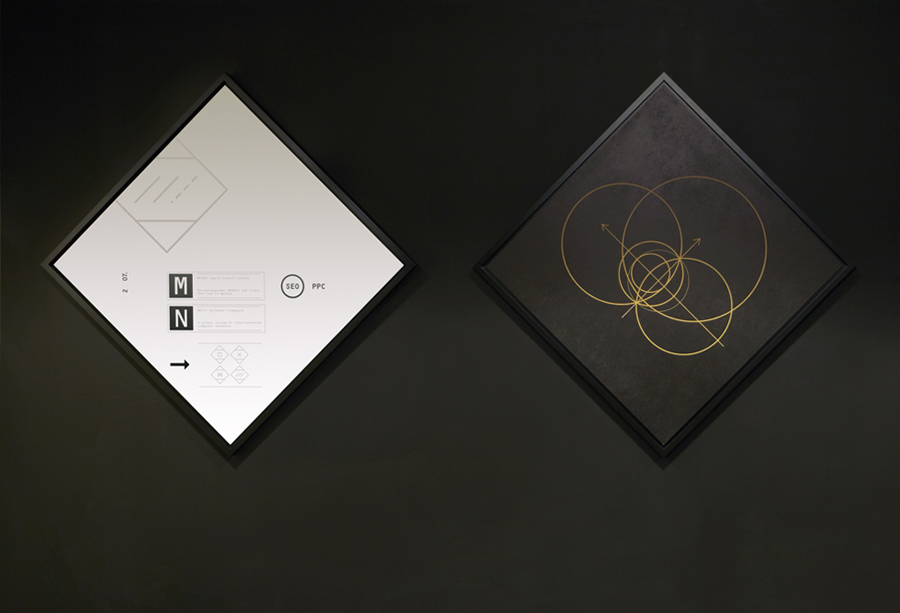
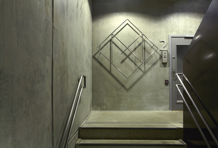
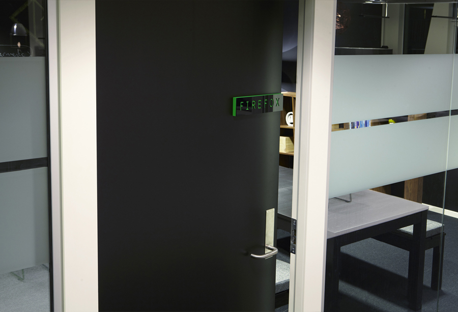
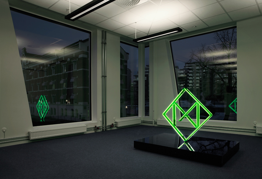
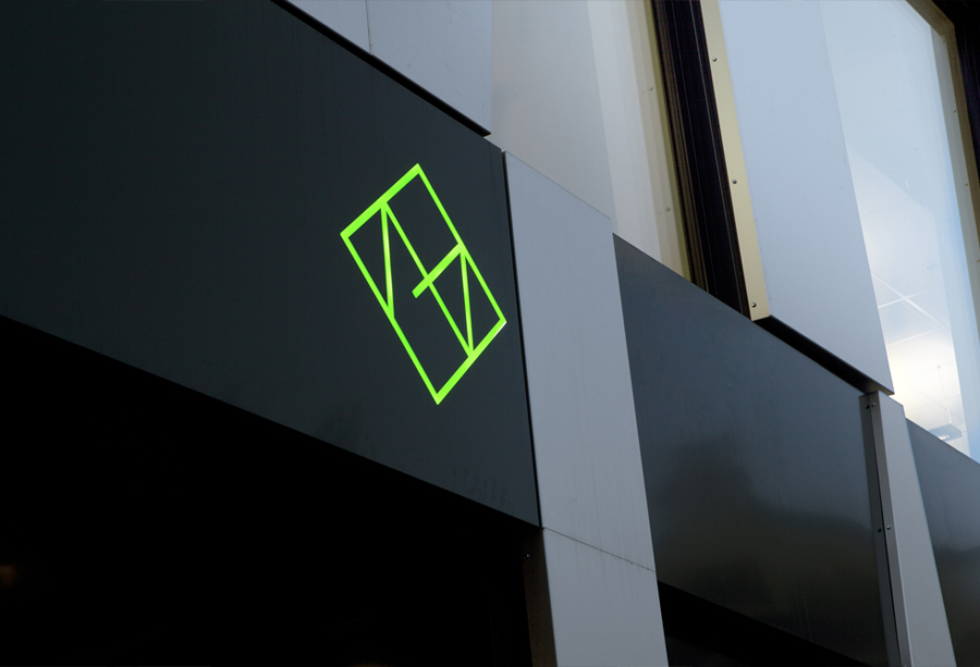
Metronet is an Oslo-based consultancy that provides strategic SEO, PPC, e-commerce, social media, web analytic, design and development services to a wide range of international clients. The consultancy’s visual identity, developed by Work In Progress, mixes the established technological conventions of simple geometric forms, fine line weights, grids and a mono-spaced typeface with abstract interior artwork and a retrospective undertone to convey digital networks, creative thought and experience. This extends across business cards, stationery and neon signage.
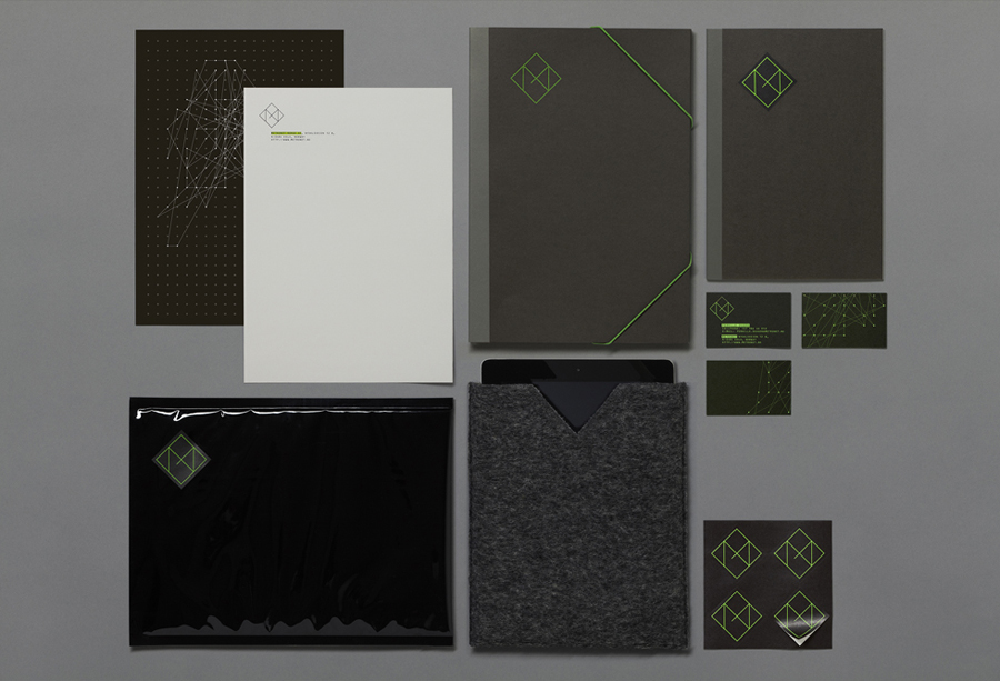
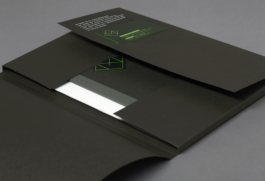
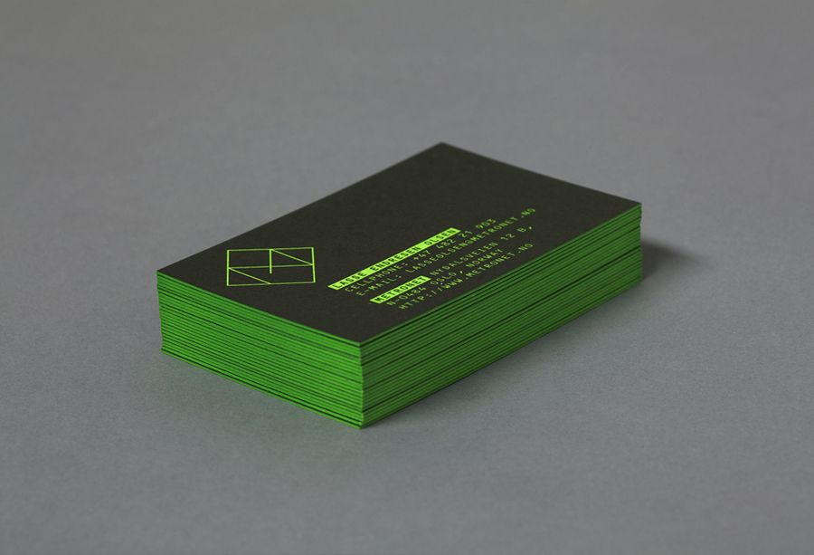
Executed with a striking neon ink print finish that works really well to create a backlit on-screen sensibility across the collateral, a contemporary single line weight, a good sense of internal space and geometric structure, the monogram, alongside a number of original prints, bound together by a diamond frame, manage to extract a cohesive richness and broader artistic creativity from the familiar and saturated concept of connectivity.
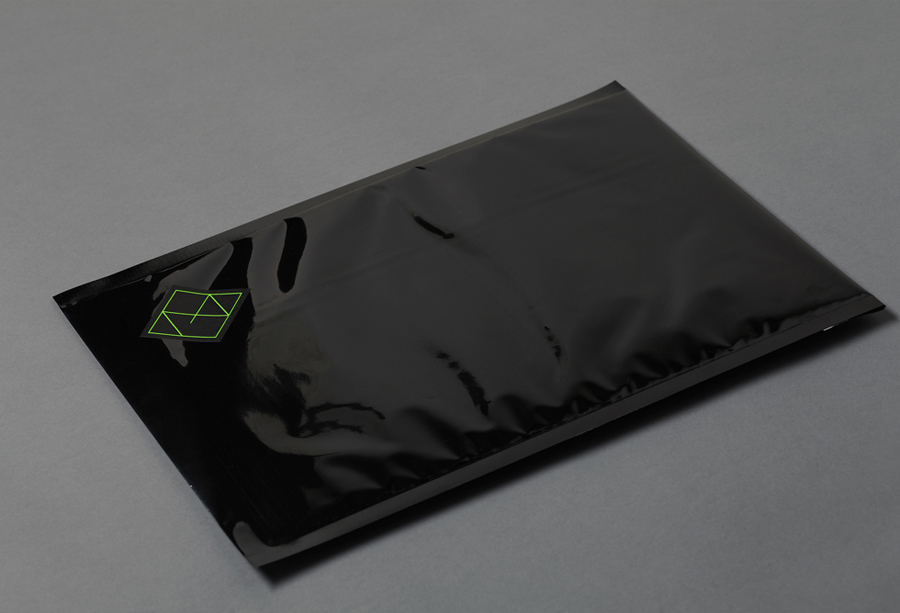
The use of Frutiger’s 1968 OCR-B typeface, in conjunction with the green of early monochromatic monitors, provides a retrospective dimensionality – without appearing old-fashioned – that perhaps hints at an experience that covers the full technological age. This is idea is reinforced by the more recent tactile invasion of uncoated substrate textures and stickers into the industry that now provide more a humanistic element and not just a cold, technological functionality.
