Highpark by Face
Opinion by Richard Baird Posted 10 April 2013

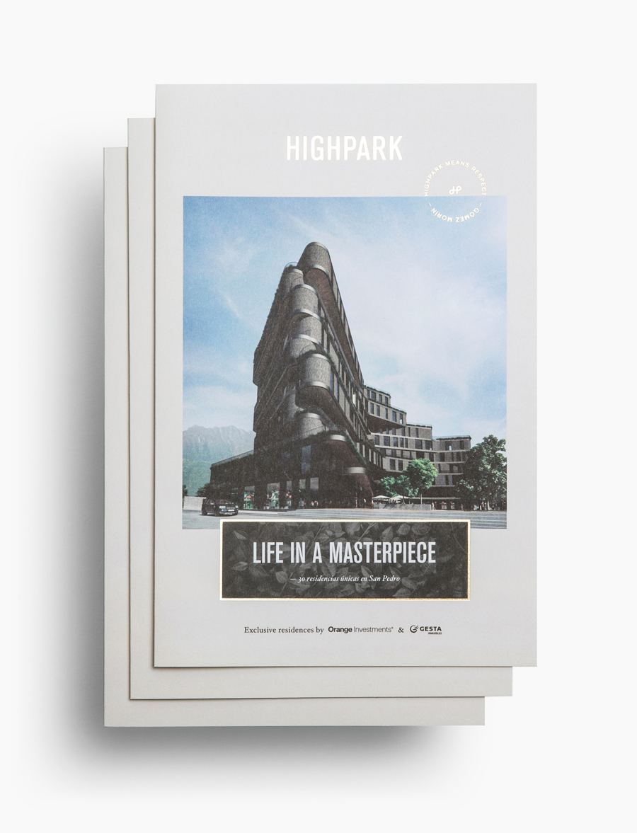
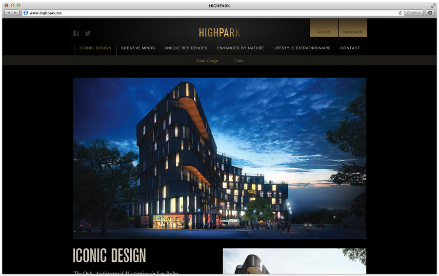
Highpark is a new residential project located in the middle of San Pedro Garza García and described by Face – the agency behind the development’s visual identity, print work and website – as ‘arguably one of Latin America’s most affluent municipalities’ and widely credited as an “architectural masterpiece”.
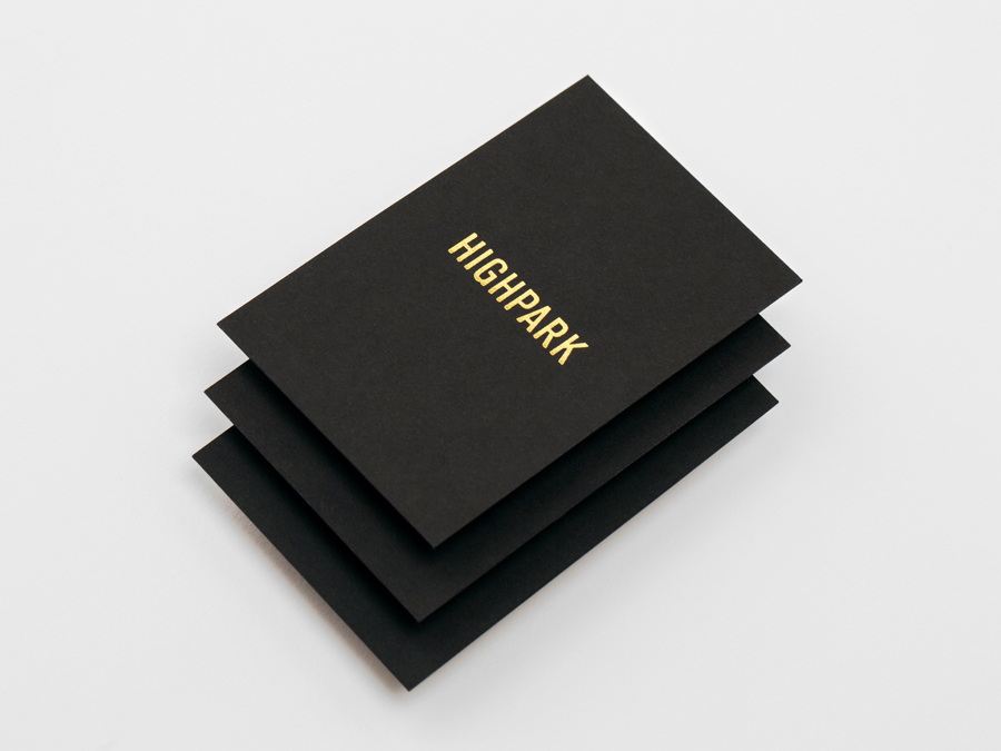
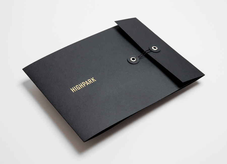
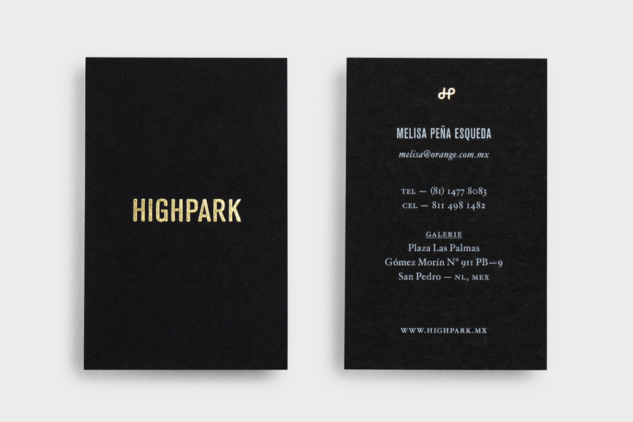
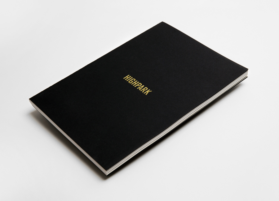
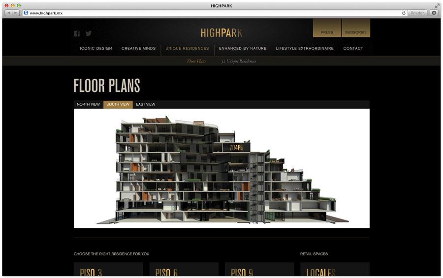
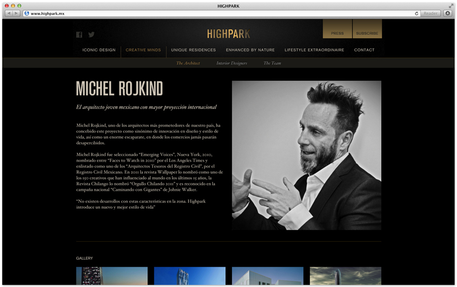
Face go on to say that the “project needed to speak volumes about the brand’s commitment to creativity, sophistication, and quality of lifestyle. It was conceived by superstar Mexican architect Michel Rojkind, and envisioned as an urban development of luxury residences in northern Mexico’s most exclusive corner.” As such Face created a “clean, polished, unobtrusive aesthetic designed to beautifully showcase the project, using sharp, classic typography, and the fool-proof duo of black and gold.”
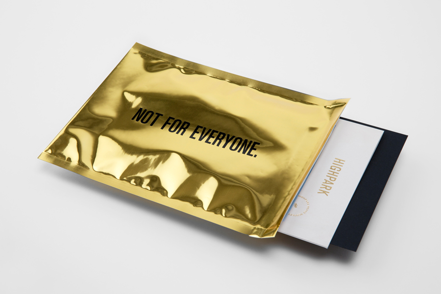
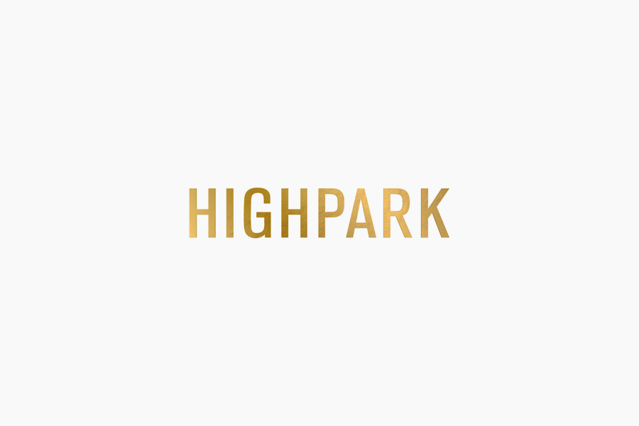
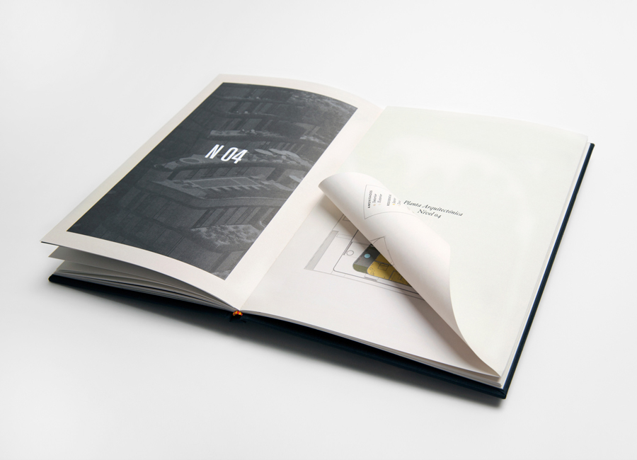
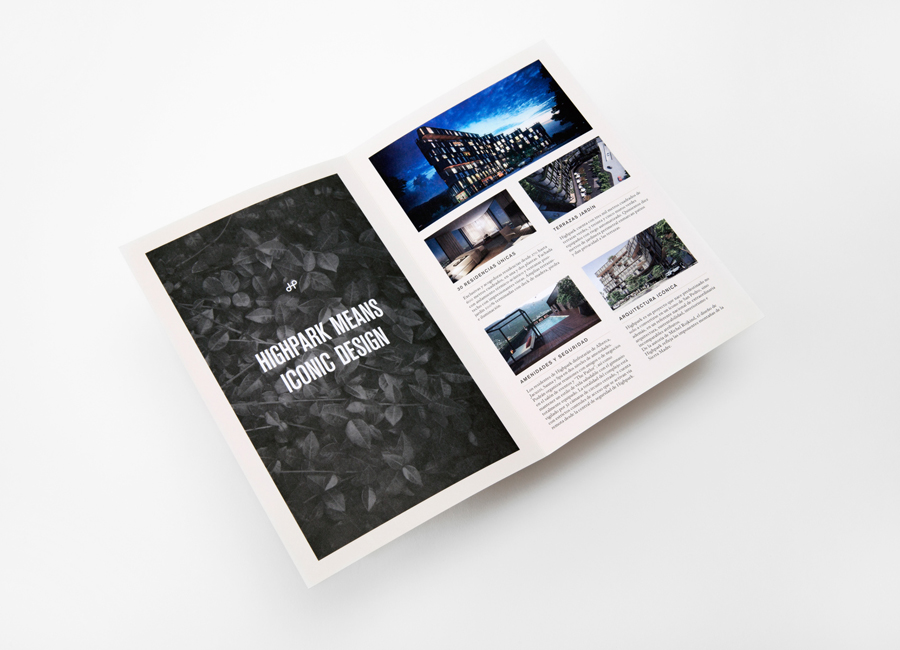
While perhaps, in a period of global austerity, the language choice lacks subtlety, the gold foil across black dyed substrate works really well to leverage established perceptions of exclusive luxury with an appropriate restraint. A logo-type constructed from tall, uppercase and broadly spaced sans serif letter-forms – its convention improved by a foil treatment across the collateral – deliver a high-rise authority alongside the more traditional character of a classic serif and a neat, understated but contemporary, single stroke weight HP monogram. The uncoated material choices, surface textures, layouts, binding and heavy borders of the brochure – framing the development with a look-book quality – introduces a high fashion, editorial sensibility that adds a little more depth to the familiar aspects of the print finish.
