Dalaco by Believe In
Opinion by Richard Baird Posted 22 April 2013

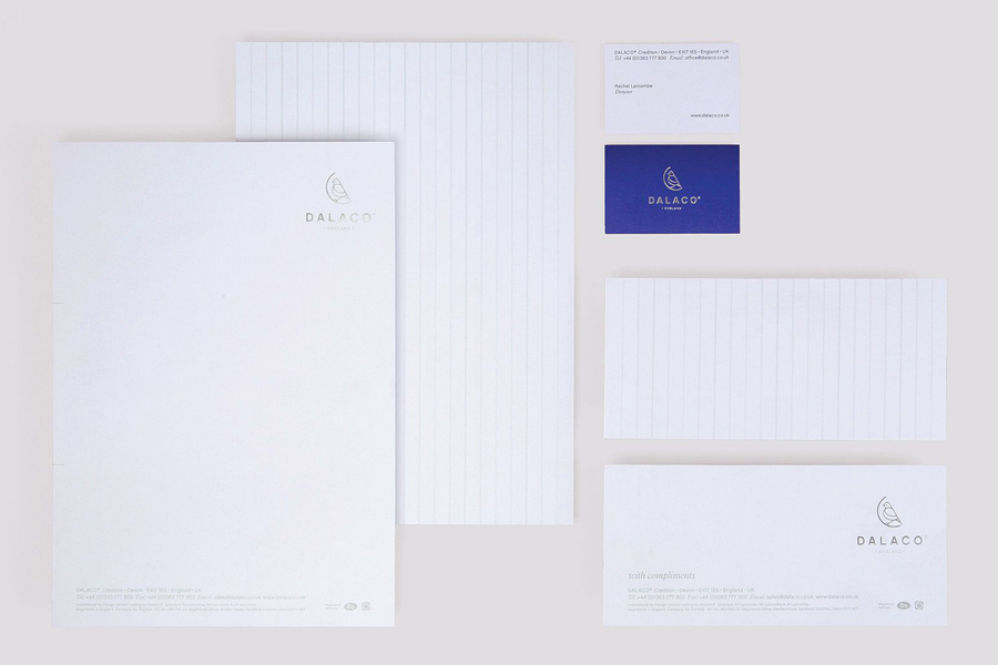
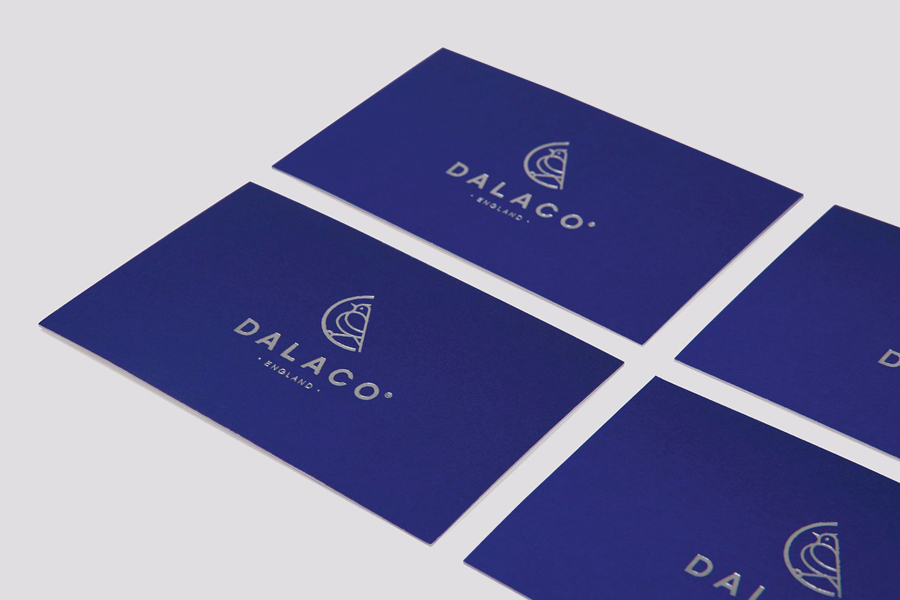
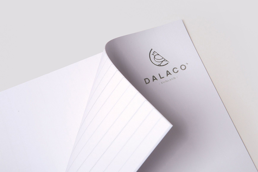
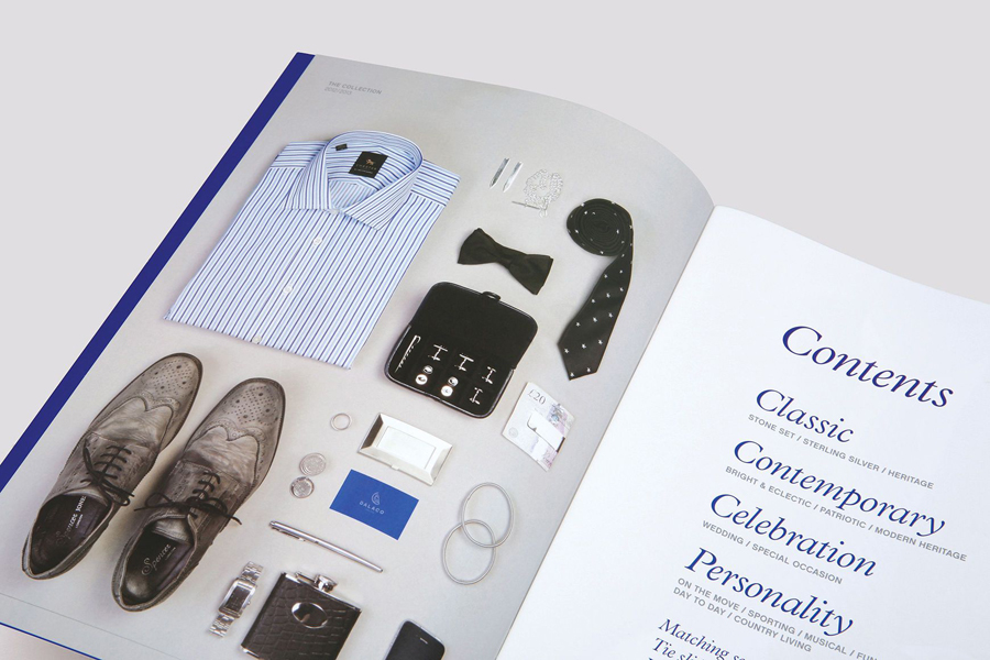
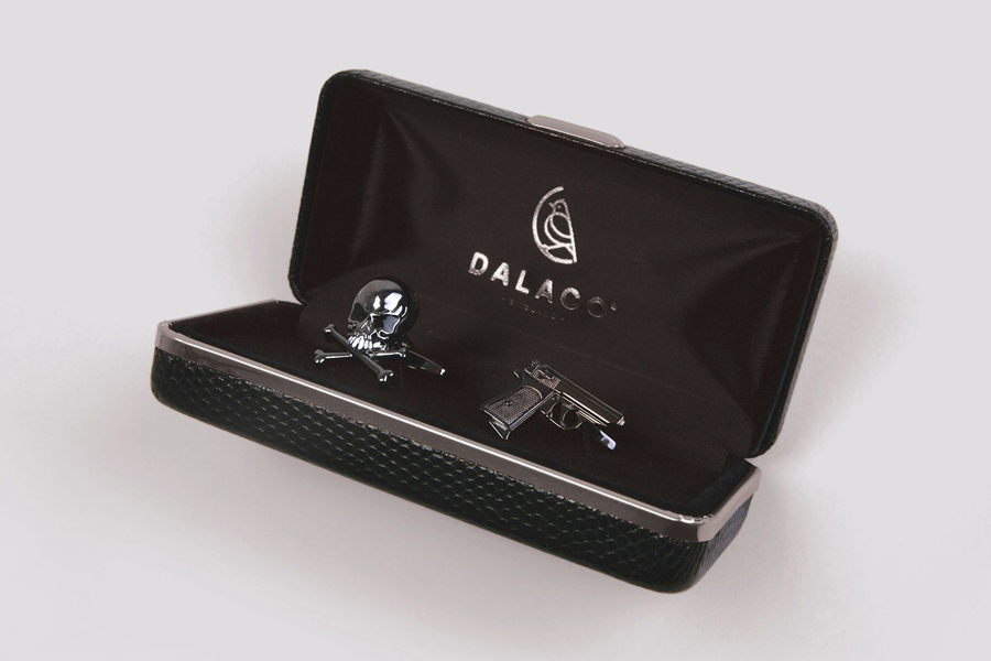
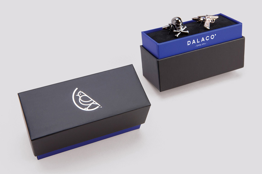
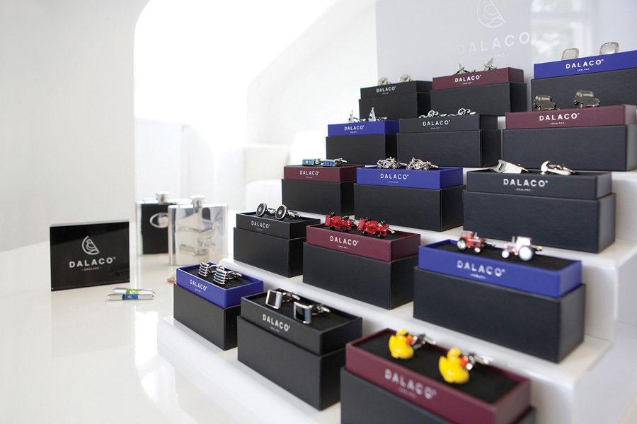
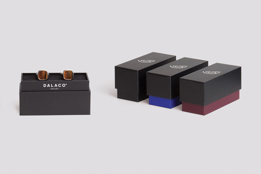
Dalaco is a UK-based family run cufflink and accessory business that has been designing for and marketing to jewellers for over 30 years. Their new visual identity, developed by design agency Believe In, marks the passing of the business from one generation to another through the contemporary rendering of a lark, a songbird that signals the dawn of a new day, that was inspired by the heritage of the family name and acts, much like a craftsman’s monogram, as a symbol of pride, care and a guarantee of quality.
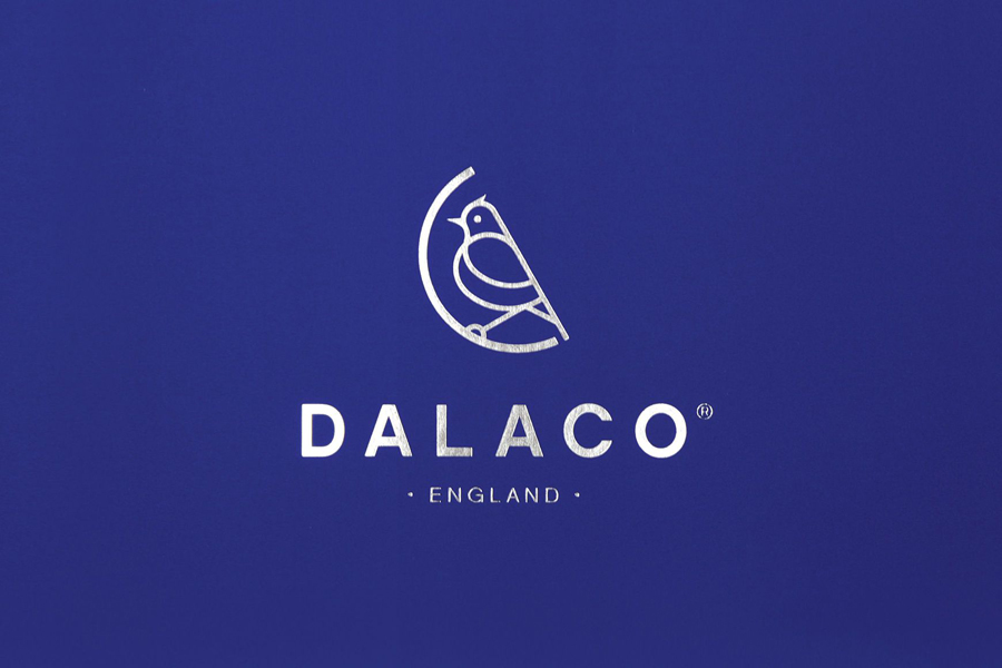
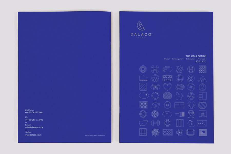
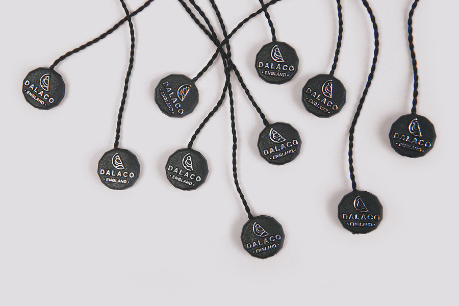
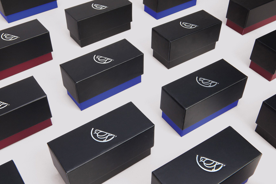
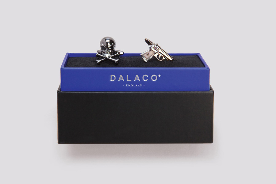
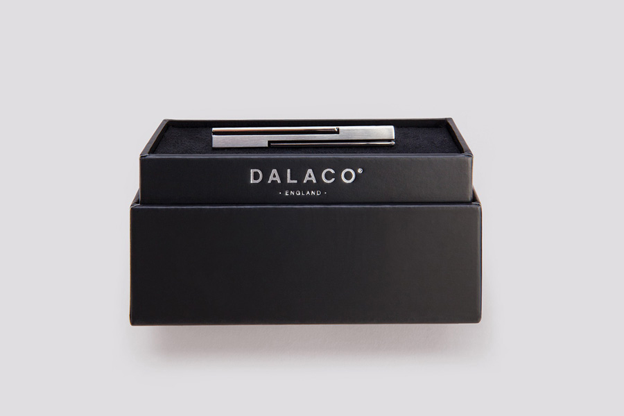
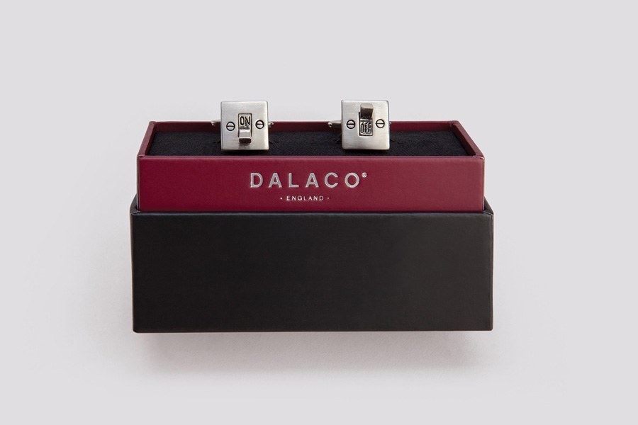
As a single stroke weight illustration, the lark manages to convey, in a fairly simple manner, traditional values with an understanding of modern aesthetics. It sits well within the heavier curve of a half circle with a nice diagonal stroke that makes the two components feel like a well resolved whole with a solid balance of internal space and subtle geometry that appears distinctive. The mark is paired with the similar forms of uppercase, broadly spaced sans-serif characters which have a largely conventional corporate efficiency that appear professional and consistent while the overall central alignment, the addition of dots and provenance introduce a subtle but classic sense of heritage. These are juxtaposed alongside the far lighter, thread-like qualities of fine illustrative iconography, united by a silver foil and a deep blue colour palette that has a contemporary restraint and a lasting high quality finish.
