Cocolobo by Anagrama
Opinion by Richard Baird Posted 22 May 2013

Cocolobo is described by Anagrama – the multidisciplinary design agency behind their new visual identity – as a ‘high-end shopping boutique that caters exclusively to strong women with a confident and in vogue fashion sense’. For the name, Anagrama played with the patrons’ ‘characteristic duality’, with a ‘catchy and fun’ compounding of “Coco” (coconut in Spanish) and “lobo” (Spanish for wolf), which helped to define the ‘Cocolobo woman’ as ‘not only feminine and sweet, but also independent, aggressive, sensuous and daring’
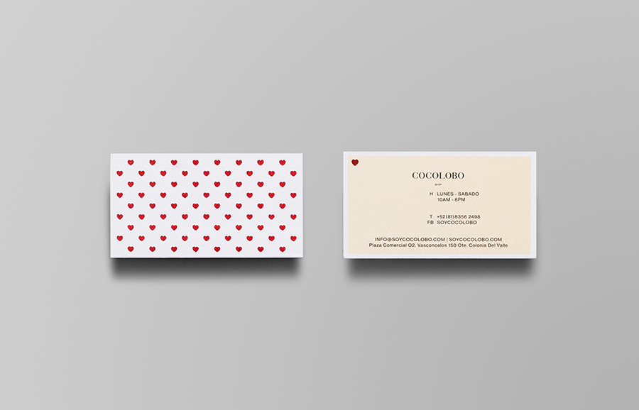
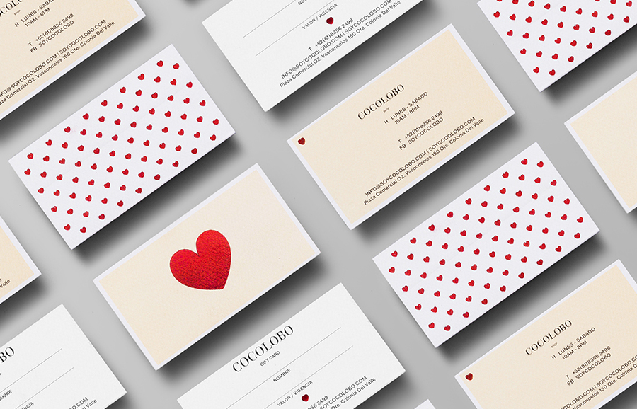
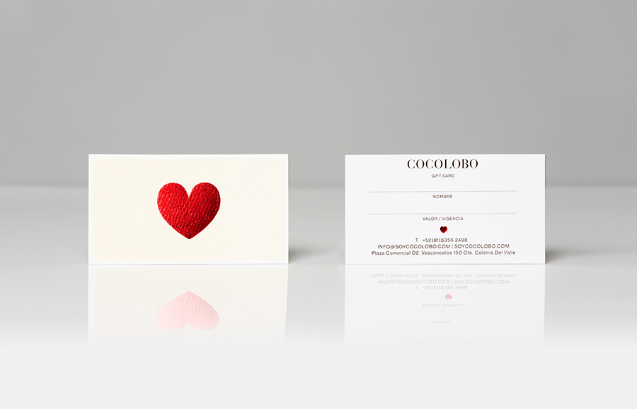
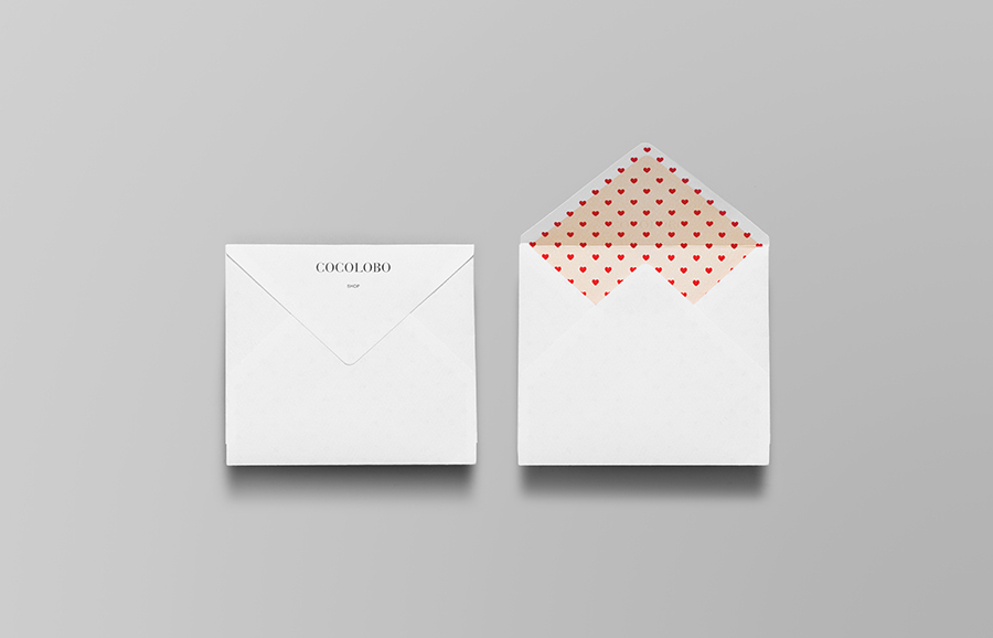
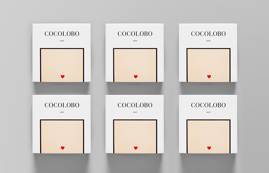
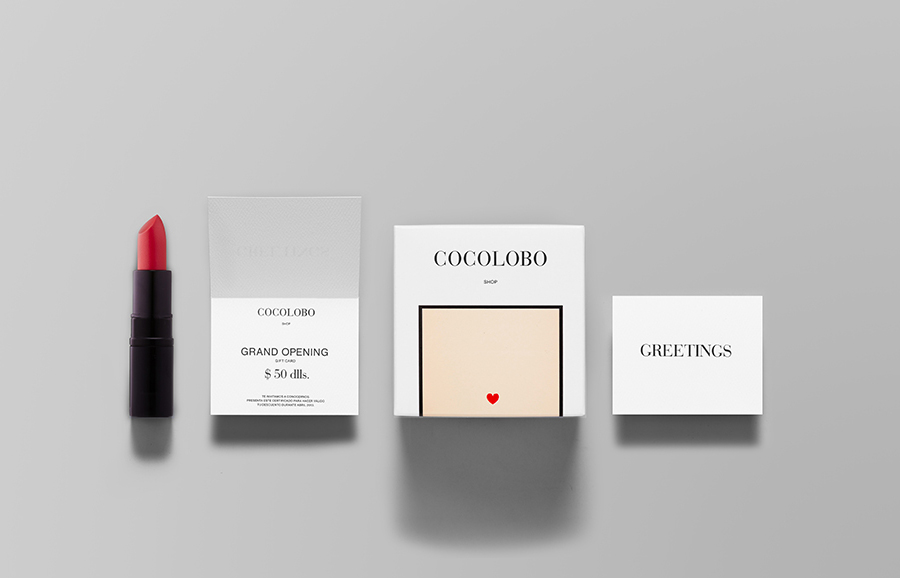
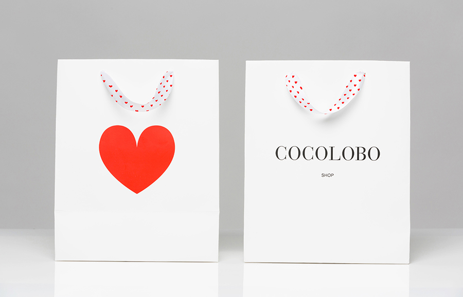
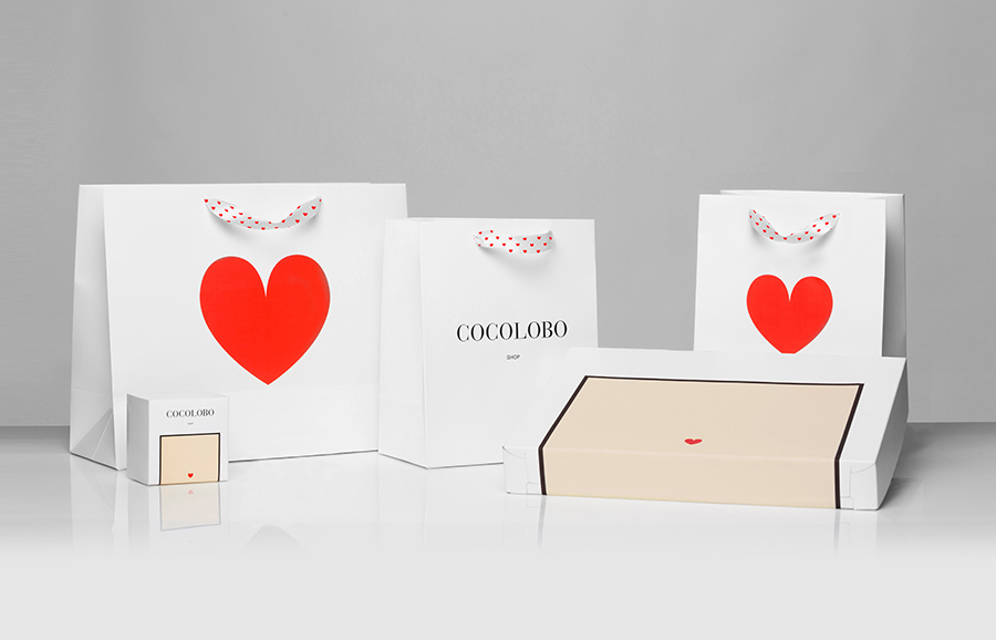
The agency captured and conveyed this duality in print through the combination of a black and white colour palette ‘portraying the elegant, sober aspect of the brand’, a red highlight to represent ‘all that is feminine and chic’, and the contrast of the logo’s playful familiarity and the logotype’s sense of exclusivity. These run across business cards, stationery, swing tags and packaging.
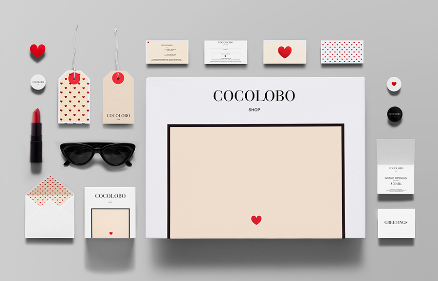
Although I would not have described the project as particularly reflective of the aggressive or daring nature of the ‘Cocolobo woman’, Anagrama have managed, through size and pattern, the tactile, high and subtle craft qualities of an uncoated, debossed material texture and foil print finish, to infuse a distinctive and proprietary quality into the very generic form of a heart. This universality has been appropriately tempered by the conventional but high-fashion sensibilities of the well-spaced, uppercase characters of a modern serif logo-type, the borders you might associate with Chanel and the timeless restraint of a black, white and cream colour palette.
