Tourean by Anagrama
Opinion by Richard Baird Posted 29 May 2013
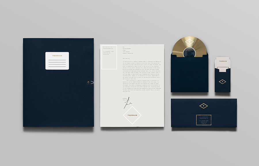
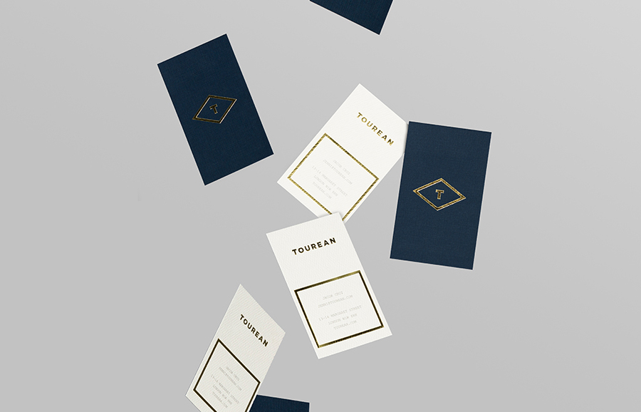
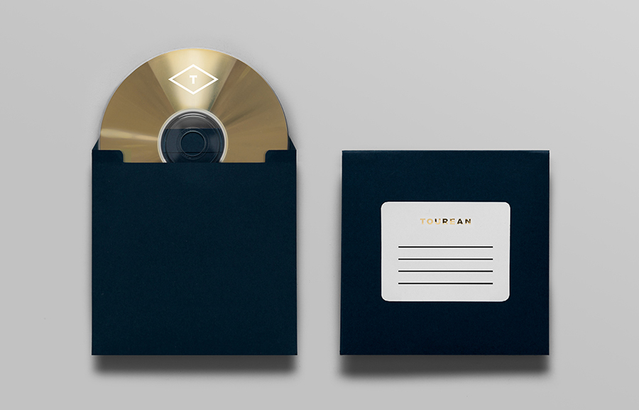
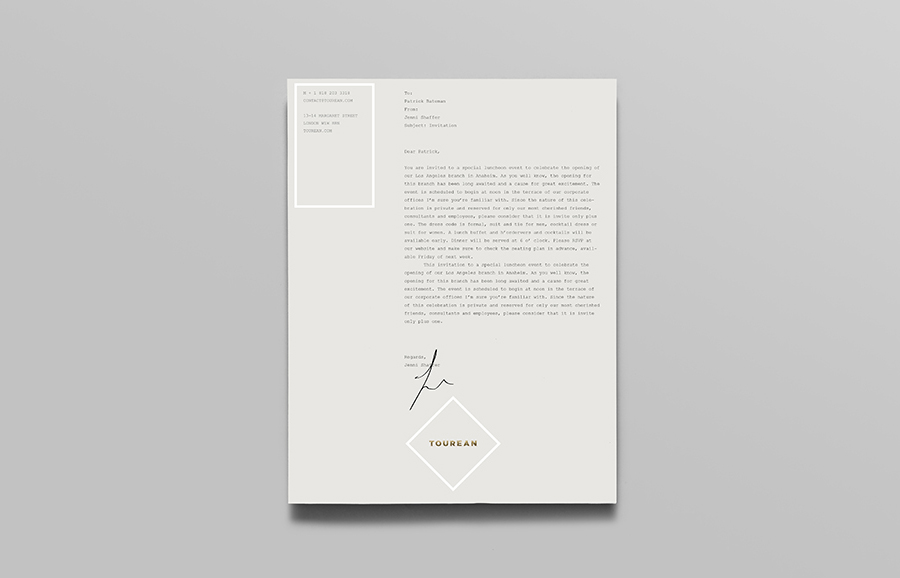
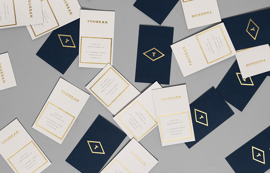
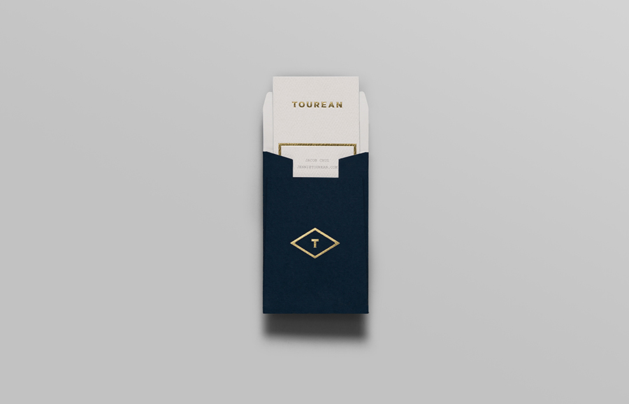
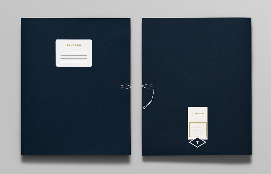
Tourean is a British multinational venture capital firm that manages a variety of lifestyle subsidiaries within the music, design, events, social media and fashion industries. Their new visual identity, developed by design agency Anagrama and drawing inspiration from the Tourean name – a compounding of the words taurean and tour created to convey the values of strength, fortitude, courage and integrity as well as the company’s worldwide reach – fuses Gotham Black and Copperplate Gothic into a single logo-type described by the agency as ‘modern and earnest’ and sets it within the context of a ‘serious and somber’ colour palette and the high qualities of heavy paper with debossed surface textures and gold foil detailing.
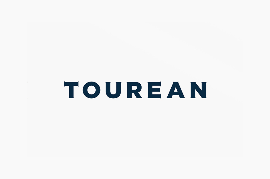
The diminishing communicative impact of Gotham’s efficient geometric characters – a result, in my mind of broad and often inappropriate use – has been subtly tempered by the detail of Victorian typeface Copperplate Gothic but without its extended width. It is odd but distinctive and while perhaps optically unbalanced, the forms of the O and the A have not been compensated for with a little tightening of the letters around it, the contrast of bold single line width and fine serif of an uppercase logo-type and monogram combination manage to deliver a sense of history, experience and authority without appearing either old-fashioned or generic.
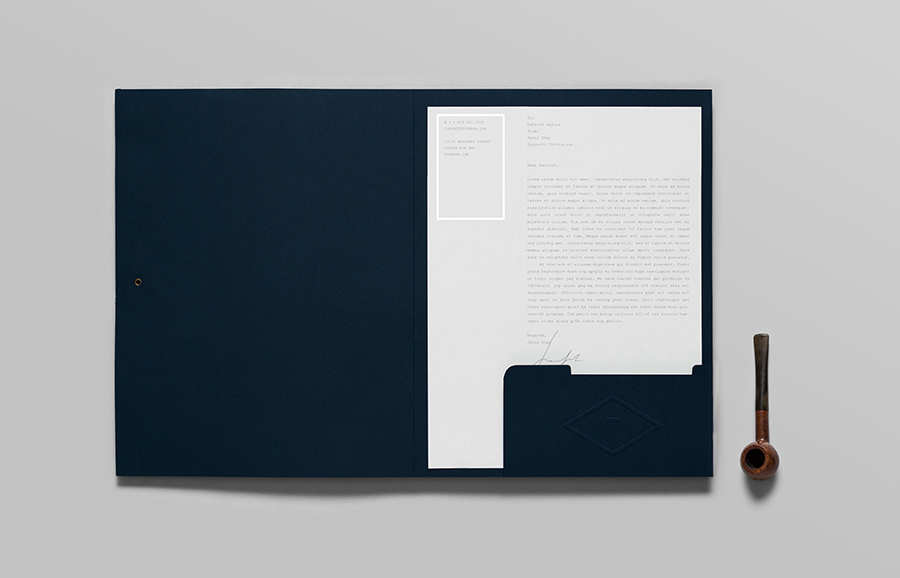
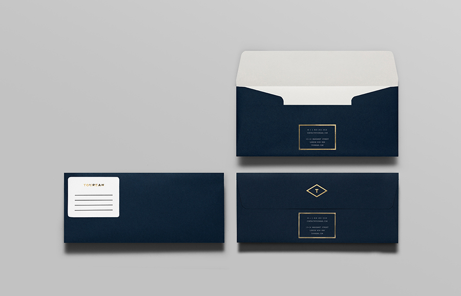
The rectangular borders, diamond frames and what looks like a typewriter slab serif across the stationery add a mid 20th century sensibility that connects the old Victorian typographical reference with the modern understanding of multi-faceted identities that make good use of material textures and weight, glossy and tactile print finishes and interesting layouts, introducing further communicative depth and keeping the project from becoming logo-centric.

