Ryan Edy by Founded
Opinion by Richard Baird Posted 8 August 2013

Ryan Edy is a UK based, award-winning advertising and editorial photographer whose clients have included Vodafone, Wilkinson & Wetherell and Innov-8. Design studio Founded worked with Ryan Edy to develop a brand identity treatment that, based around a simple, familiar but communicative framing device, also went on to include both print and digital portfolio design.
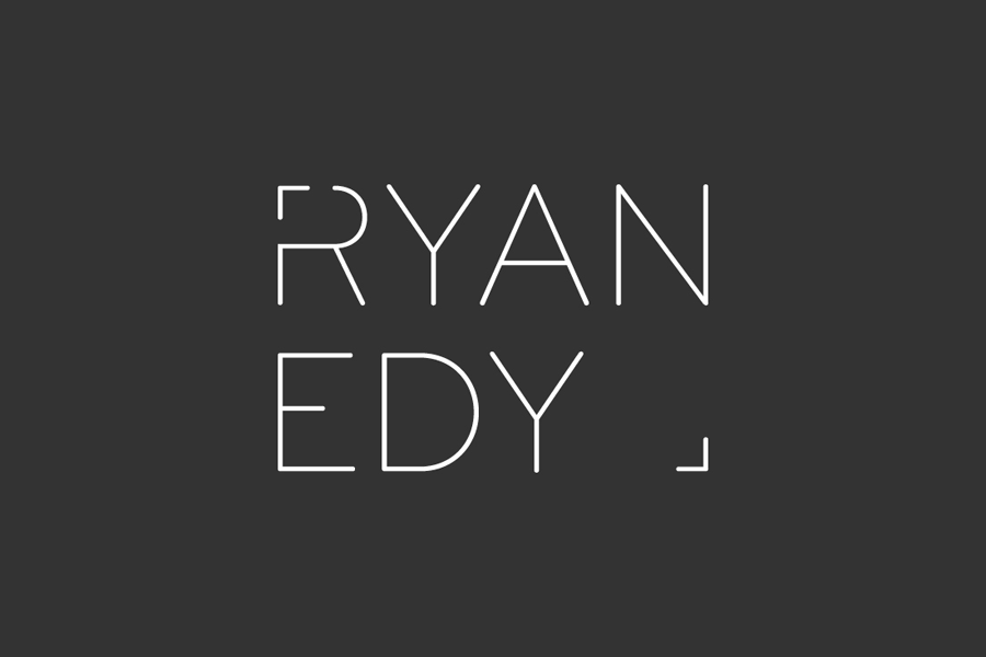
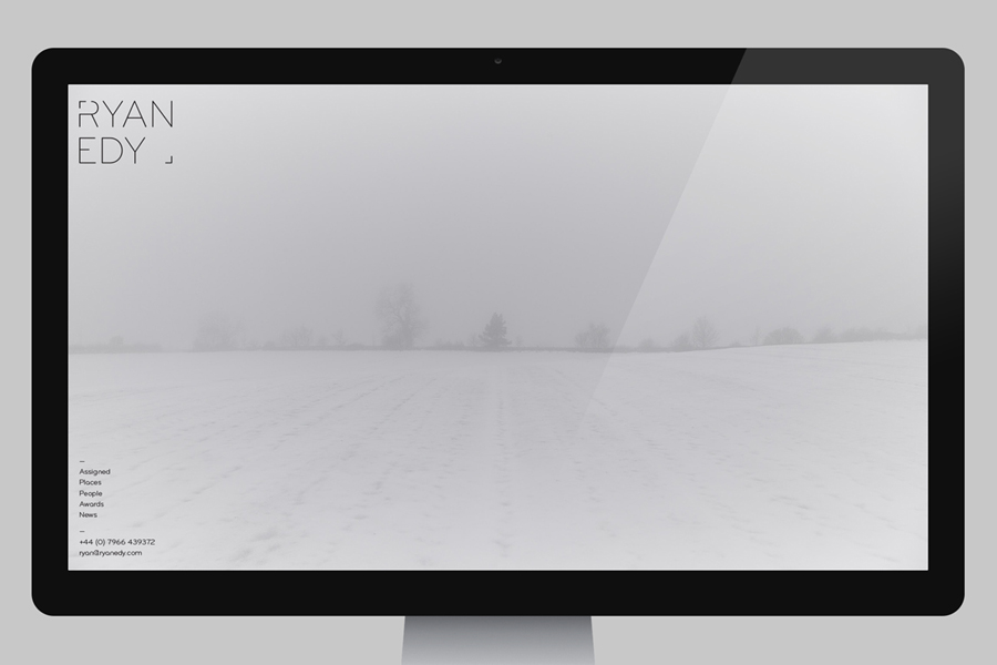
“Introducing obvious icons from a client’s professional field to form part of their identity is something we would normally avoid. However when approached by the incredibly talented photographer Ryan Edy (pronounced Eedy), we couldn’t resist the opportunity to create something beautiful with the right angle in the capital ‘R’ and break one of our own rules. The identity is stripped back to just the view finder frame elements when overlaid onto Ryan’s stunning images, or used within promotional material such as emails or digital portfolios.” — Founded
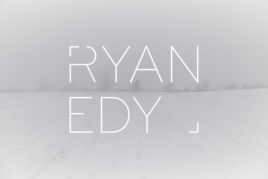
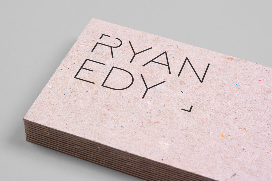
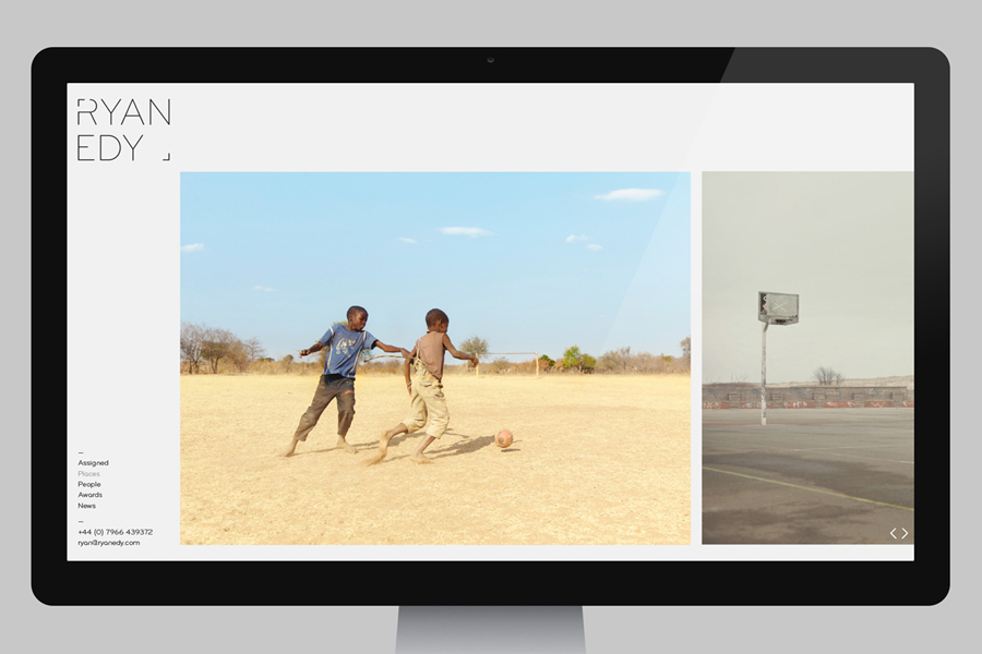
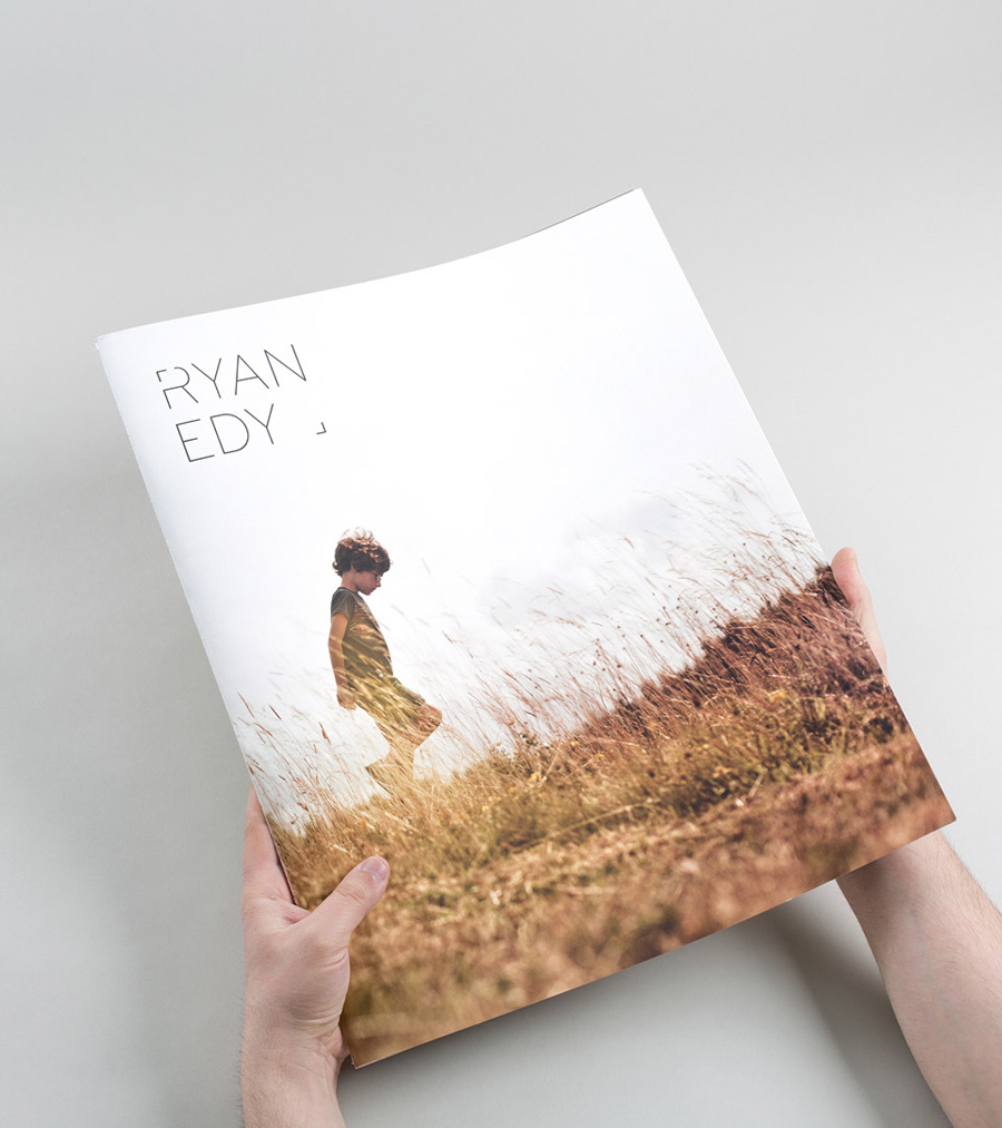
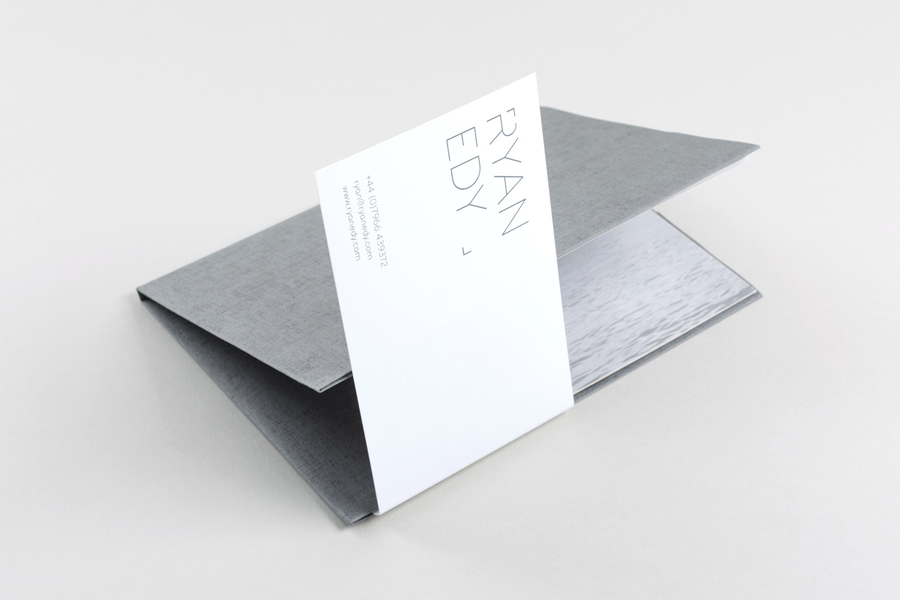
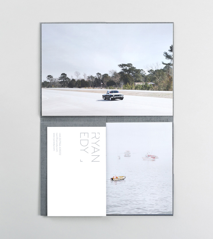
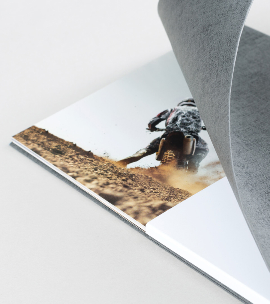
Built around a logotype of light, monolinear, sans-serif characters, plenty of space and cut across the R, Founded’s visual identity treatment neatly conveys, with an uppercase authority and sense of contemporary experience, photographic framing in a familiar but distinctive way. The logotype’s fine lines and plenty of internal space has a lightness that sits well over Ryan Edy’s work. The mixed fibre substrate of the business cards and texture of the folders adds a tactile, crafted quality and a little more depth to the identity that extends beyond the visual nature of photography and typographic play of the logotype.
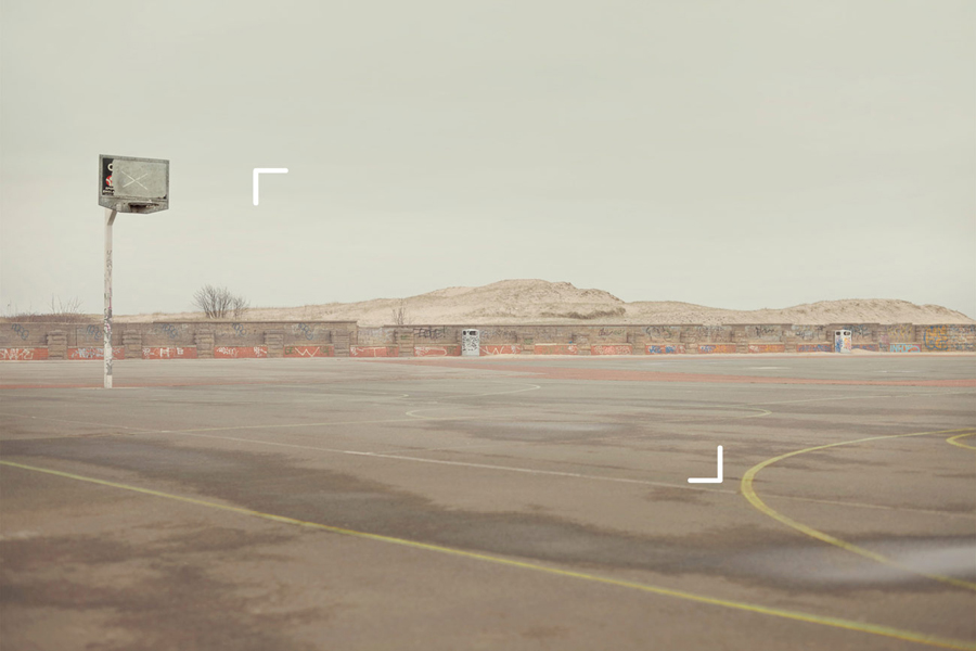
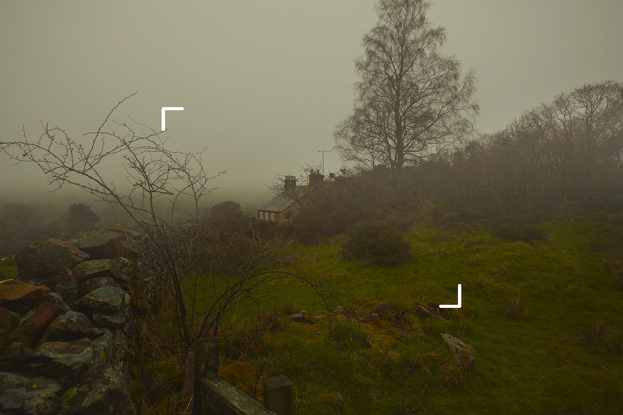
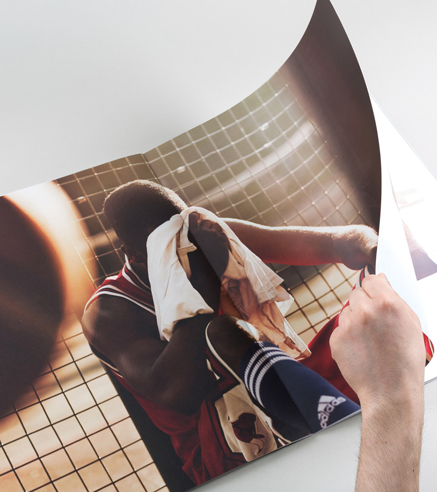
As acknowledged by Founded, this approach does rely on what could easily be described as an industry trope, however, it would be difficult not to acknowledge the communicative clarity universality offers but also the challenge it can also pose. Simple and unforced in its execution, within the context of some compelling and well-shot images, and alongside a couple of interesting material textures, the approach to print tempers familiarity with detail and distinction.
Design: Founded
Opinion: Richard Baird
