Insiders by Garbett
Opinion by Richard Baird Posted 13 August 2013
Insiders is the membership program of Sydney Opera House launched to nurture customer loyalty, increase market share and raise the frequency of attendance through priority booking, discounts, dress rehearsal ‘sneak peeks’ and invitations to meet staff and artists.
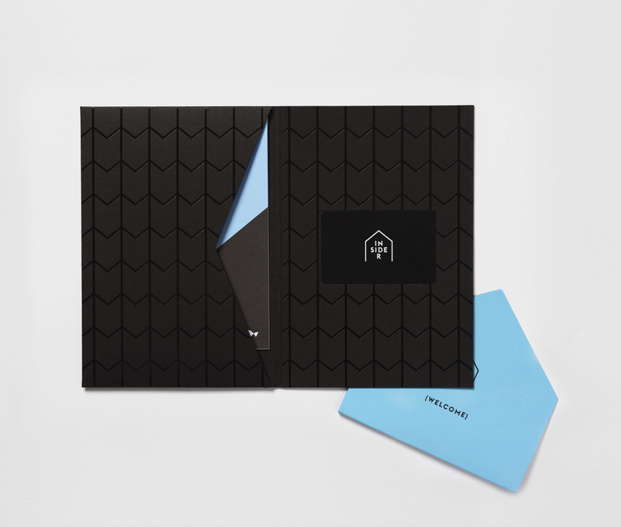
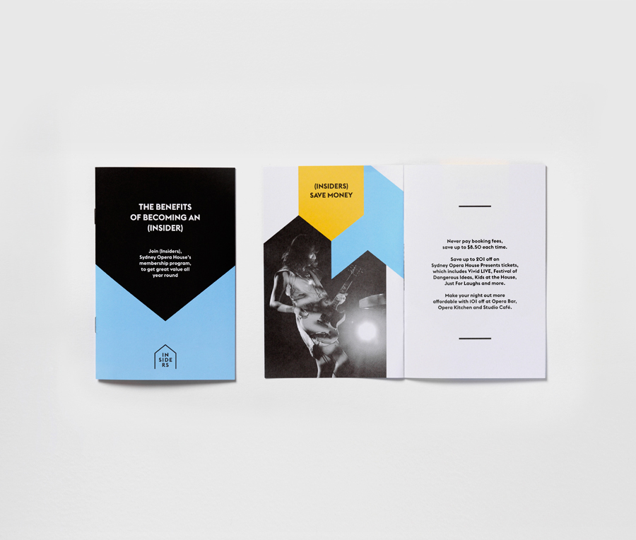
Multidisciplinary design agency Garbett were commissioned to ‘evolve’ the Insiders visual identity, positioning it as a retail product with greater focus on communicating the value proposition for members, to meet the changing focus of the Sydney Opera House program and represent the shifting perceptions around the brand. The project involved trademark design, posters, welcome pack, brochures, membership card, digital advertising and brand guidelines.
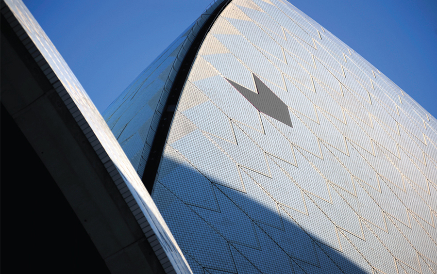
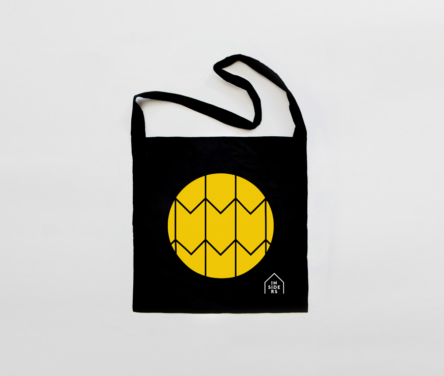
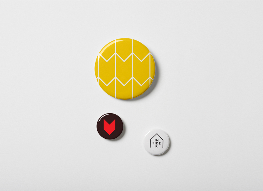
Like a lot of gallery and public space identities, Naughtyfish have drawn on the distinctive architecture of the building to form the foundation of a new visual identity. However, rather than the universally recognised silhouette of the Sydney Opera House they have utilised the individual tiles that cover the surface of the building to offer a small, detail orientated and divergent counterpoint to its bold structure.
The logo-type, a combination of uppercase sans-serif characters with a single consistent line weight and a mix of flat terminals and sharp junctions broken into three lines, is unusual and distinctive. It is a little unclear as to the motivations of such a layout beyond fitting neatly into ‘inside’ the frame but to me these appear as rows of seats from above or stacked stalls from the front.
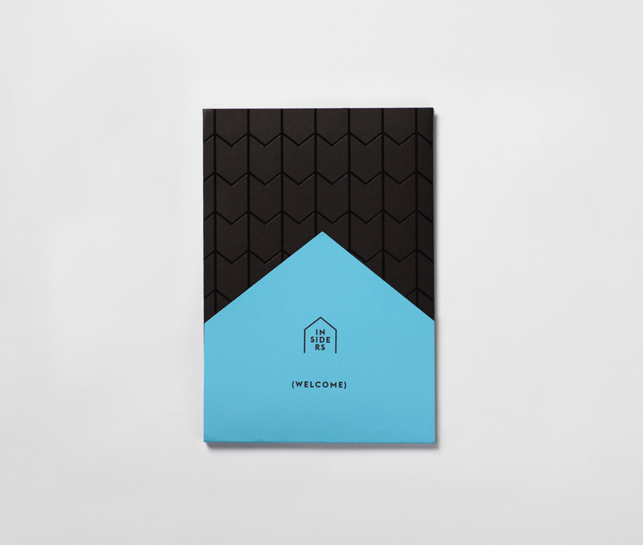
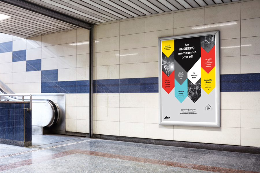
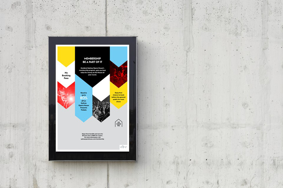
Executed in-print as a pattern that mixes block colour (a neat combination of sky blue, sunshine yellow and silhouette black), contained photography, die cuts and a UV varnish, Naughtyfish have intelligently utilised the individual tiles of the opera house’s surface to not only deliver an interesting, cohesive yet varied aesthetic but one that works well as a metaphor for the members that support its artistic programs, whilst also leveraging the similarities the tiles have with the universal form of a house as a symbol of inclusivity.
It is an incredibly simple form that, through smart observation, has been infused with a two-fold relevance that can be appreciated by those ‘Insiders’ who engage with the Opera House brand regularly and appreciate both its external structure and internal performances. More from Garbett on BP&O.
