Holzweiler Agency by Bielke&Yang
Opinion by Richard Baird Posted 20 September 2013
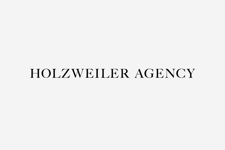
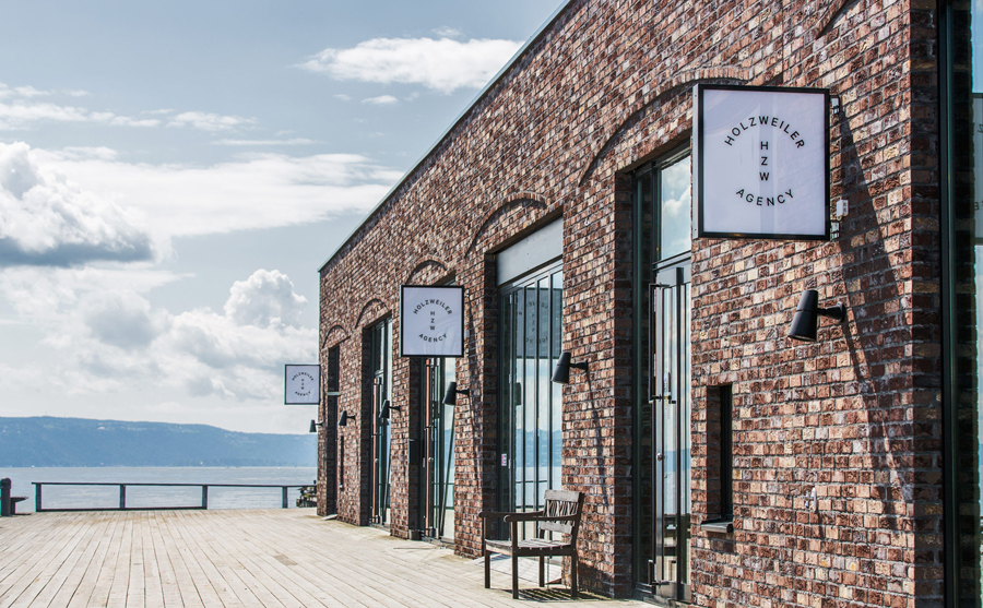
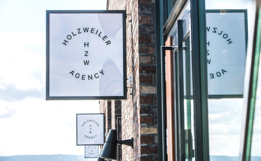
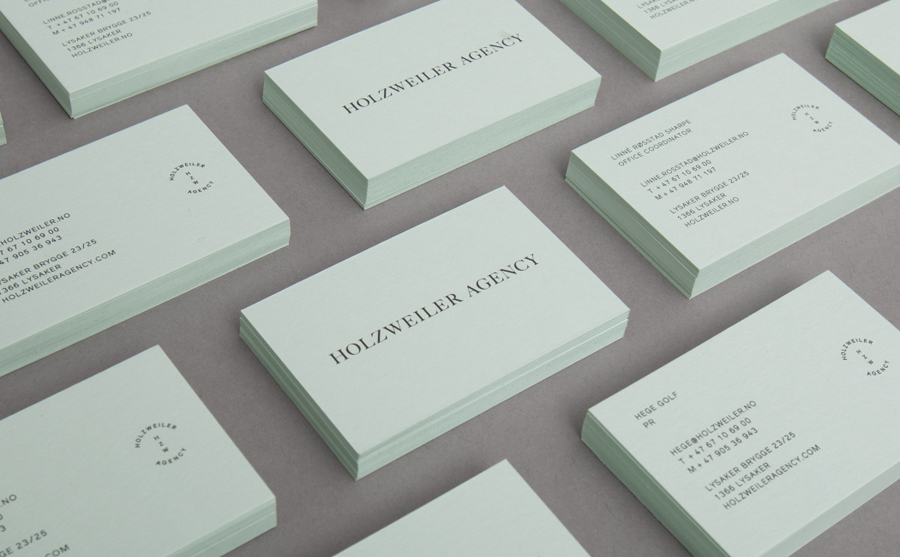
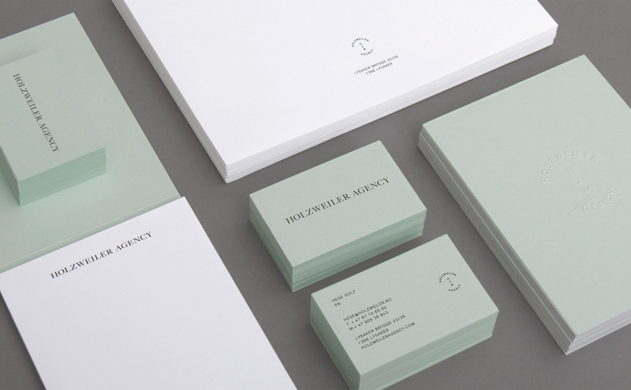
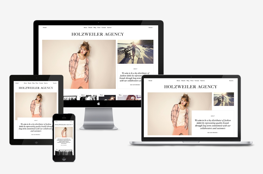
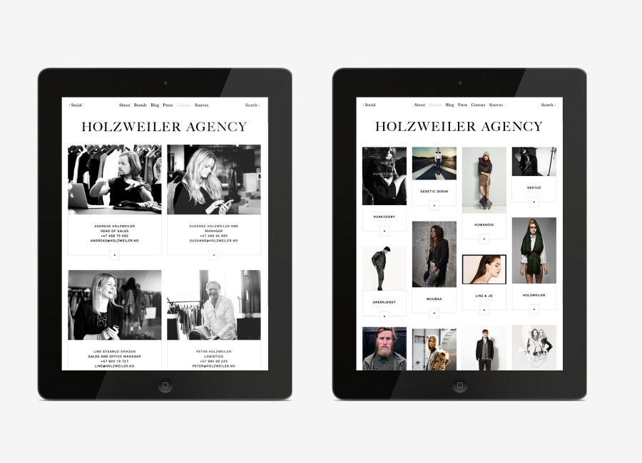
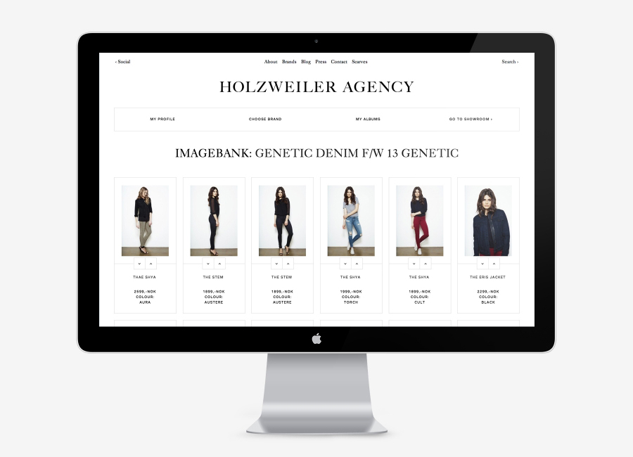
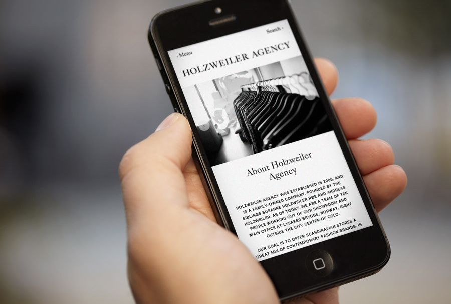
Holzweiler is a Oslo based, family run, contemporary fashion distributor that supplies stores right across Scandinavia. Their new brand identity, developed by Bielke&Yang and which includes two logotypes, stationery and a responsive website developed by Dekode, utilises typographical contrast, good quality materials and subtle print finish to resolve the high qualities expected of high fashion garments and the efficiency required of distribution services.
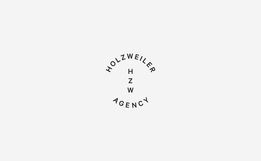
In contrast to the material and illustrative detail of their work for Food Studio – featured on BP&O yesterday following a recent update to their website – but sharing slight similarities in logotype structure, Bielke+Yang’s identity solution for Holzweiler Agency has a strong sense of restraint which is careful to balance the two aspects of their business, style and shipping.
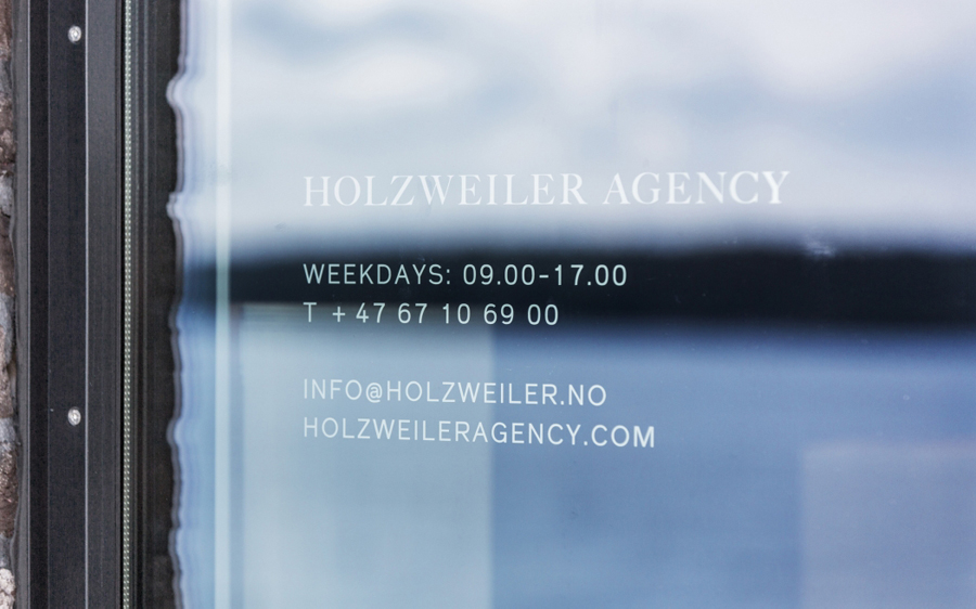
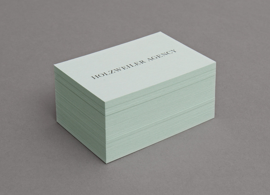
This balance is achieved through the simple but communicative typographical juxtaposition of uppercase serif Caslon 540, an industry convention that functions well to convey a sense of heritage, experience and classic detail, alongside a sans-serif efficiency. These disparate assets deliver a precise and understandable duality that works well to represent both fashion and distribution which is then reinforced individually through their differing signage applications but united in print. The use of a mint green board and bind emboss add depth and sense of tactile quality to the identity without appearing superfluous or contradicting the supply rather than consumer focused nature of the business.
Design: Bielke&Yang
Opinion: Richard Baird
Fonts Used: Caslon 540
