Valentto Olive Oil by Anagrama
Opinion by Richard Baird Posted 25 September 2013
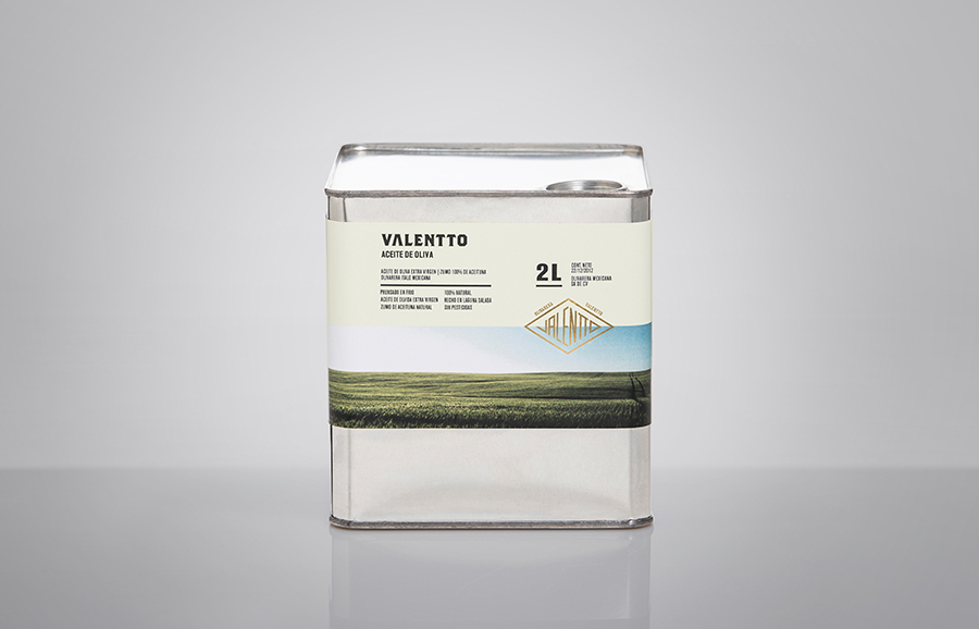
Valentto is a Mexican cold-pressed virgin olive oil produced by Olivarera Italo-Mexicana – a Mexican Italian collaboration – created for commercial kitchen and restaurant use. Multidisciplinary design agency Anagrama recently developed a new brand identity and packaging solution for Valentto that juxtaposes the natural detail of Italian landscapes alongside the industrial utility of a square tin structural choice, described by Anagrama as being “reminiscent of an old-school automobile oil canister”, to reflect the origins of the company, the natural quality of the oil and its target market.

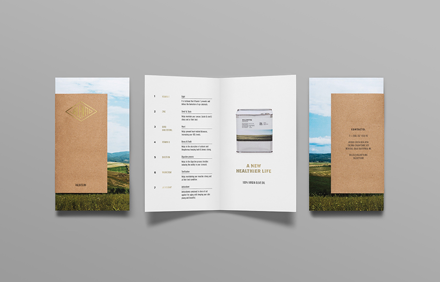
Although aimed at the commercial sector, Anagrama’s approach rejects a wholesale design mentality in favour of established retail design cues to generate a striking aesthetic and communicative impact through the contrast of rigid metallic structure and the organic detail of the photography.
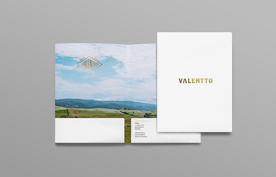
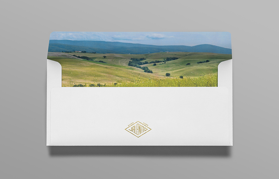
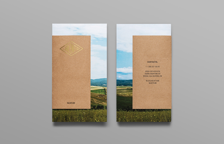
While conventional, landscape photography remains an evocative tool that has been used to great effect here. Each image individually appears well shot and expansive, and together cohesive yet diverse through a solid mix of open plains and rolling hills. These have been well executed in print as full bleeds and wrapped around the can to achieve a clear duality that balances natural and consistent commercial quality.

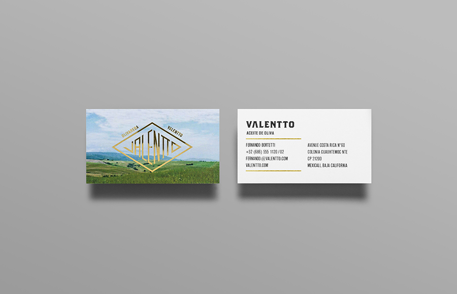
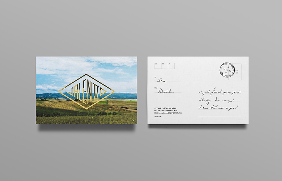
Much like the structural choice, the diamond logotype has a mechanical sensibility much like the badge of a classic car. It is unusual and distinctive, not without flaws – the V appears as a J and there is an odd sense of perspective – but it certainly has a vintage character that implies experience through longevity.
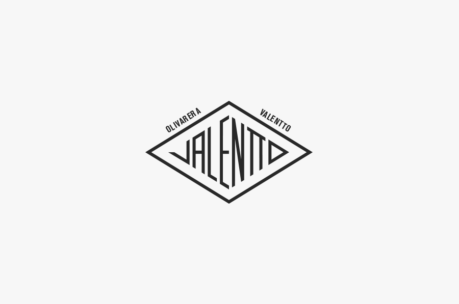
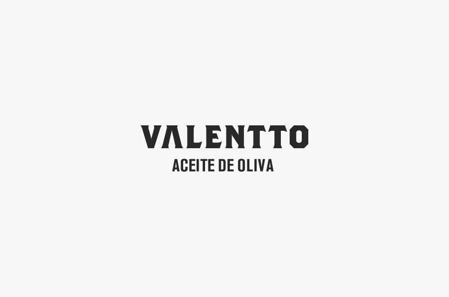
A secondary, more conventional logotype, set along a regular baseline and using the stone cut letters of a typeface similar to Brother Bold, reaffirms a sense of heritage but appears a little more traditional and crafted compared to the significant personality and quirks of the diamond. I appreciate the proprietary and reductionist aspect of the absent bar from the A and the way it mirrors the V, but when you have the detail and impact of structure and photography – as well as a number of materials and print finishes – this feels a little much.
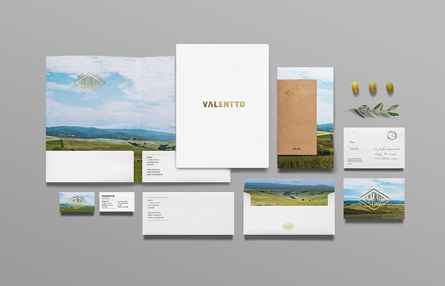
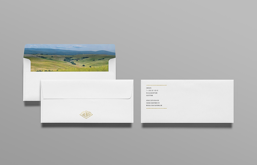
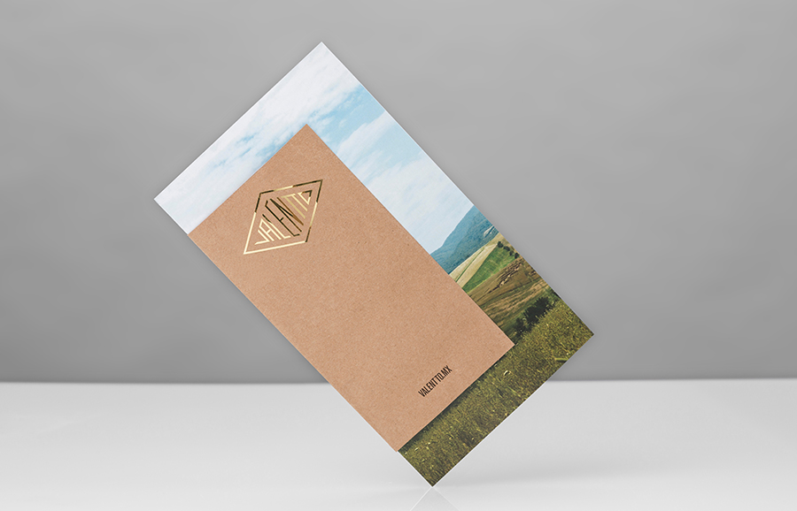
The contrast and value conveyed by photography and structure, reinforced by the logotypes, is complemented by a number of finer details that subtly draw out a range of other brand values. The postcard and frank, gold foil print finish, uncoated unbleached paper and hand written detail across the collateral while subtle hint at the theme of exportation and discovery, premium quality and the craft of olive oil production respectively.
Each element feels like its existence is well weighted with the context of the primary aesthetic, are unapologetic in their convention but are resolved in both a communicative and proprietary way with a richness that is familiar yet still distinctive.
