Traveller Espresso Bar by TCYK
Opinion by Richard Baird Posted 5 November 2013

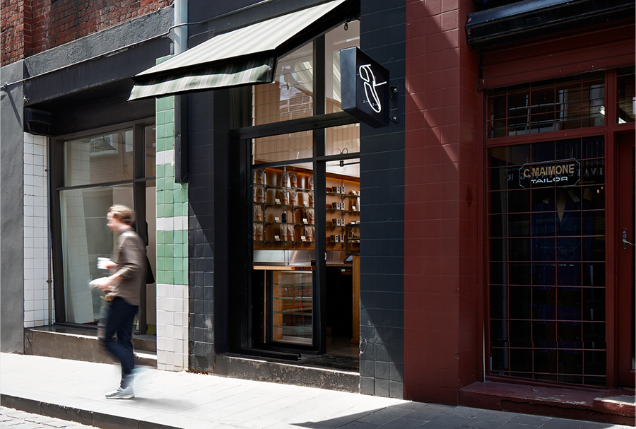
Traveller is the Melbourne based espresso bar of speciality coffee roaster and cafe operator Seven Seeds. Design agency The Company You Keep (TCYK) recently worked with Seven Seeds to develop a new visual identity solution for the Traveller that reflects an interior architecture of details such as ‘moulded plywood, vinyl and soft curves’ inspired by ‘the golden age of caravanning’, through period typography, signage shape, a simple illustrative mark and a single ink print treatment.

Our research uncovering a bevy of graphic language; caravan club pins, rally recognition plates and soft ‘60s palettes. We kept the approach simple and subversive – veering away from the repetitious use of the name and instead developing a simple stepping foot as the primary marque, that almost intuitively says Traveller, even on your first encounter.”
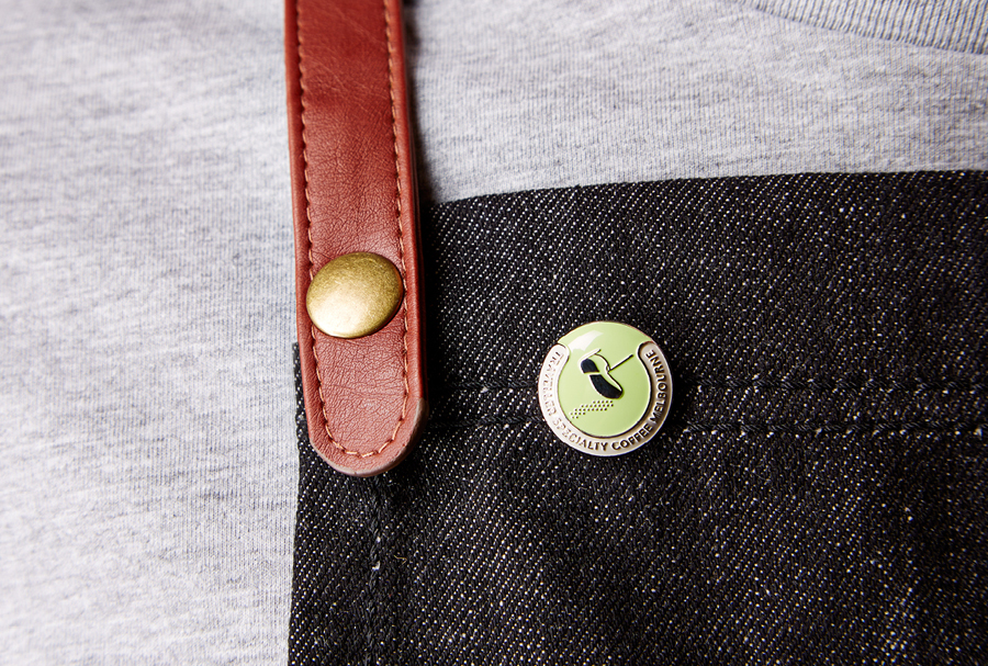
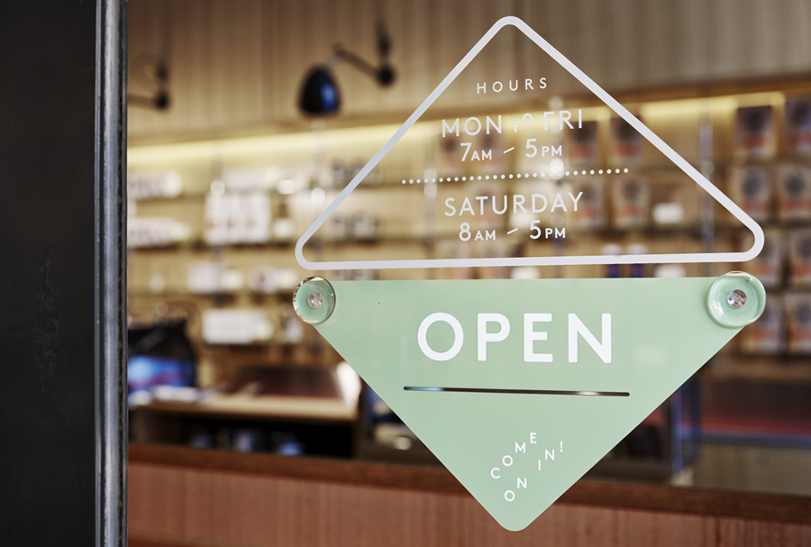
“The sweet simplicity of this marque mirrored the professional ease and restrained offer of the tiny venue. We then built a supporting typographic marque that referenced vintage Airstream branding and used the rich caravan language within the brand; an acrylic diamond open/closed sign being a contemporary take on the rally recognition plates and uniform pins that borrowed on caravan club member pins. The Crossley Street location is a hotspot of hospitality and retail royalty; Gingerboy, Pellegrinis, Lucy Folk et al, all of whom use neon as a language to engage with the street. We joined the conversation and continued on the subversive bent with a stepping foot neon as the sign post to the daytime venue.” – The Company You Keep
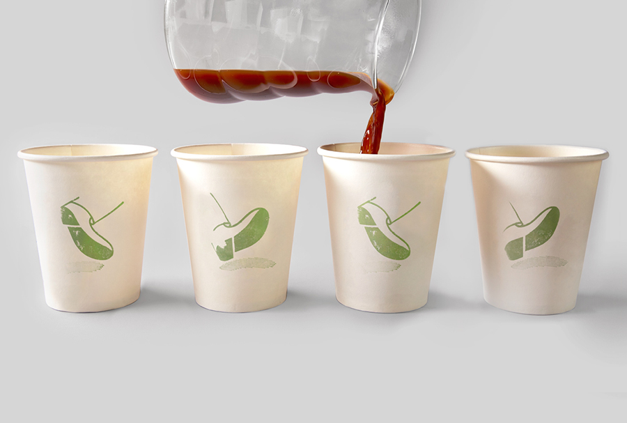
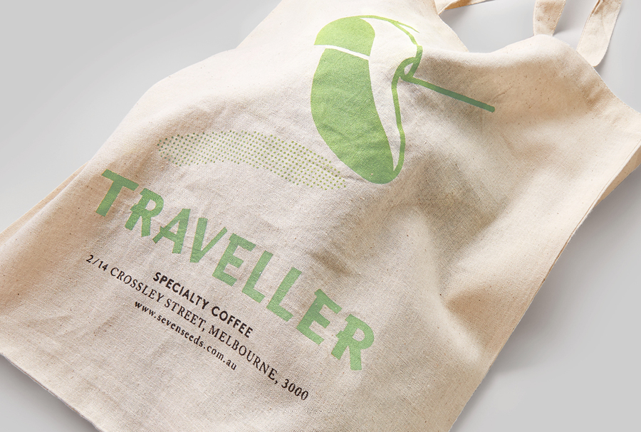
Without experiencing the interior (there are a few pictures here) its difficult to really get a sense of how well the identity has been informed by the environment or how well it exists within the space, but this relationship, often overlooked by an industry that frequently favours the familiar and retrospective combination of curved baselines and circular lock-ups, provides an appropriate foundation for the visual identity. It is not entirely absent a few of these, the ubiquitous tote bag, stamp textures, generously spaced sans-serif and the economy of a single ink all make an appearance but still work well to contribute to the small-scale and unassuming sensibilities desired by the chains.
The mark, while rendered with a vector precision, has a subtle period quality, one that for me brought to mind a running Tin Tin, a connection that is reinforced by the aviation and international travel influences and associations of the type choice across the bag. It establishes a solid sense of character, taps into the desirability of the being well travelled and informed as well as an on-the-go mentality, something that resonates with the hole-in-the-wall concept of the bar.
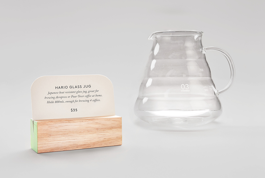
Although there is a logo-centricity to the identity in print the neon sign, door sign and decal combination, the light wood of the product cards and pin badge all add layers of differing physical detail and high quality that should complement the interior.
