La Florentina by Mucho
Opinion by Richard Baird Posted 25 November 2013

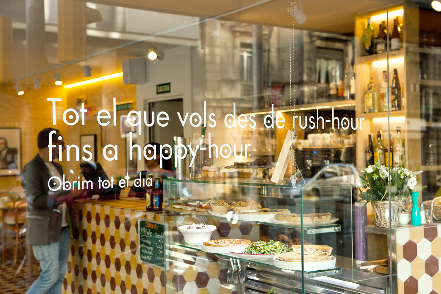
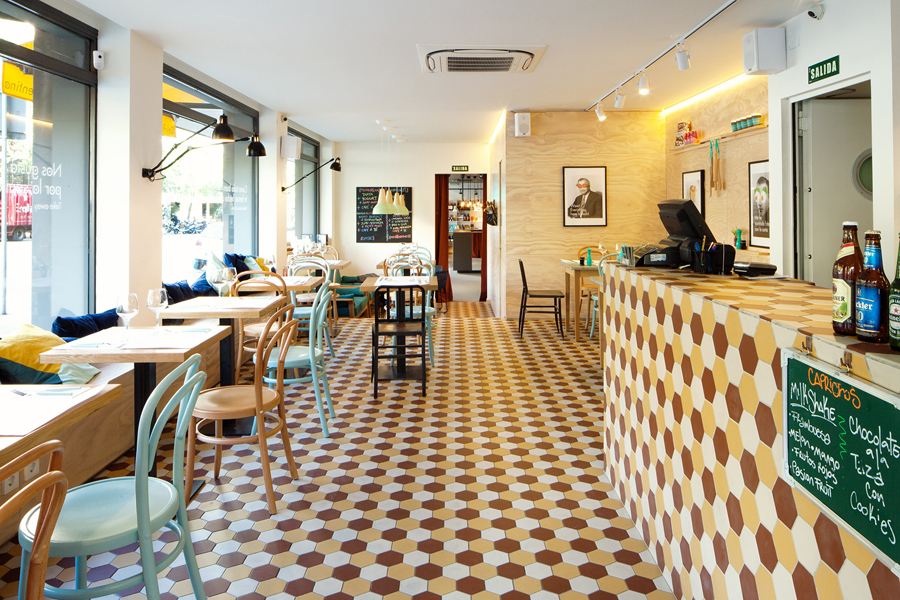
Mucho were recently commissioned by the proprietors of Barcelona based deli restaurant and all day cafe La Florentina to develop a new brand identity and graphic language which would extend across their interior, signage and printed collateral.
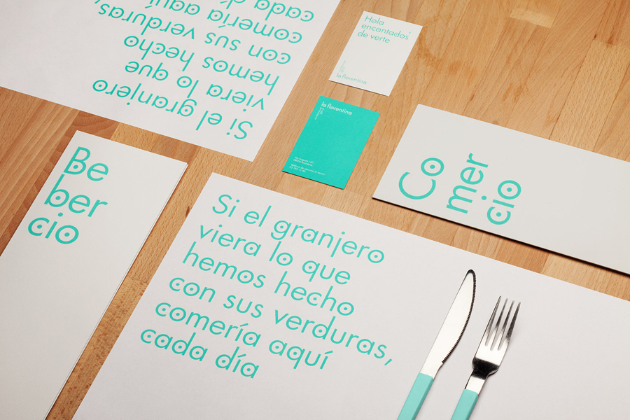
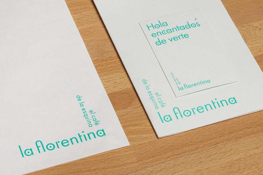
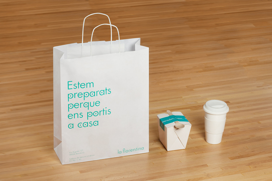
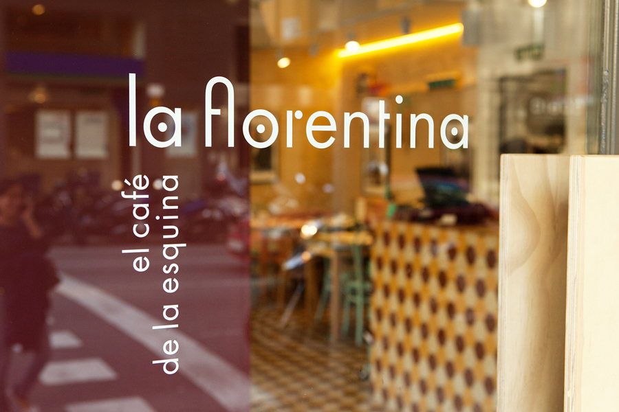
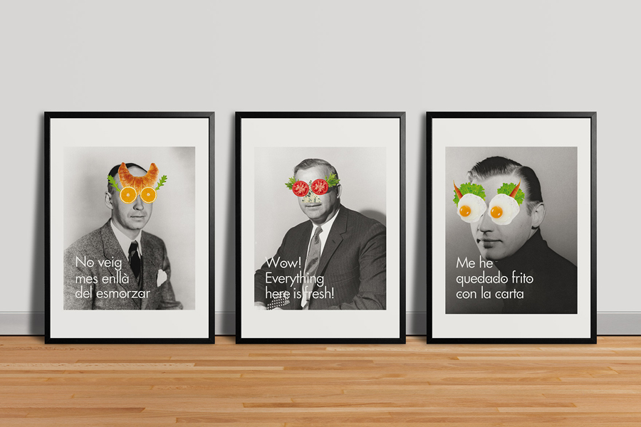
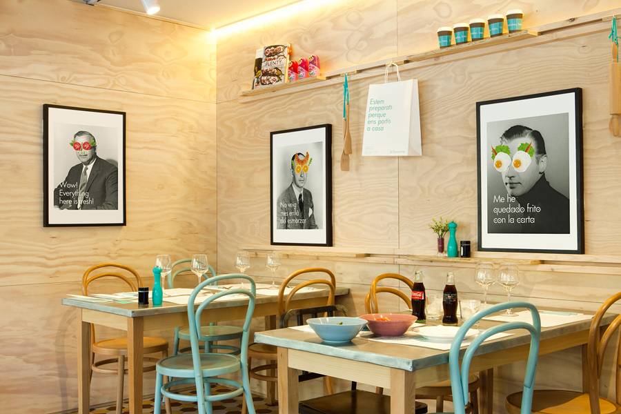
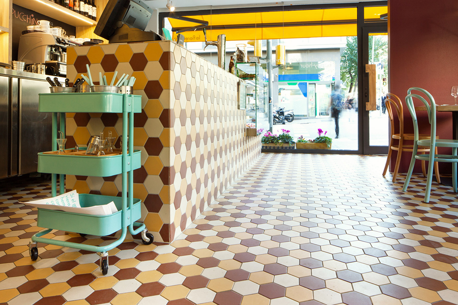
Based around an early version of Futura with an exaggerated dot motif to reflect the idea of “small ingredients spicing up the structure”, the logotype, typography, window decals and printed collateral – which utilise a single, economical fluorescent ink across white paper – offers a distinctive counterpoint to the detail of the interior and the quirky collages of vintage photography and ingredients designed to “link the food with the ironic character the client wanted”.
The result is a great example of visual identity being led by the most important, communicative and experiential aspect of the brand. Here the quality, character and detail of the environment sets the tone, is mirrored in part by the custom elements of the typography and its bright colour but given contrast through the use of plenty of space in print.
